Looking for Critique... Again!
-
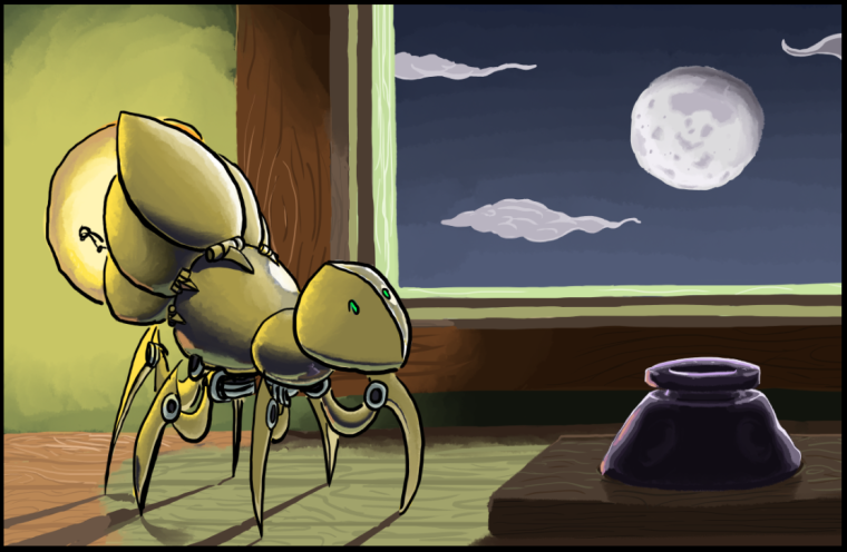
I'm just an amateur but I like it. The lighting looks nice and the reflections of the Moon and ink bottle (?) are cool as well. And I like the design of the creature. Is that a personal design?
Edit: also just noticed the grain of the wood as well
-
The composition is a little off. The window is competing with the creature for emphasis. You might try enlarging the creature and overlap it with the window. The lines are really nice and the lighting looks good.
-
Your key light is very bright and it would cancel out the shadows from your fill light
-
Thank you, thank you, thank you! I'll do the edits soon here and reply to this thread!
-
Alright, did a few things since the last upload, including desaturating the window, enlarging the creature, (I think I'll begin calling it the Lumenyr) and fleshing out the inkwell. I also made a series of edits and additions to the smaller details. Take a look, and please let me know what you think!
-
Hi Jabber- The lighting is a bit confusing to me, especially with the colors you are choosing for the moonlit areas of the wood. The color of the moonlit areas on the wood are the same hue as the bulb-lit areas on the wall and so it's not clear on which light source is illuminating which surface.
I'm offering a paintover that gives less emphasis to the moon/window area. I've lowered the contrast and made the moonlit surfaces a different hue than the bulb-lit surfaces. I've given more contrast to the mechanical creature and chose to darken him, which can be scary, but I feel adds to the mood and makes more sense with the lighting- in my opinion. I've also chosen to downplay the lighting that the moon contributes to the creature.
Anyway, just my thoughts, take them or leave them. It's a really cool idea and I love the mood you are setting up and the design of the bug. Really cool!
Website: www.tessawrathall.com
Instagram: www.instagram.com/tessawrathall_art/
-
@tessaw Love the lighting, love the colors, but not a fan of the texture of the creature in your paintover. However, you've made a lot of points visually that I'll be reworking my illustration with!
Pax
-
@jabbernewt Fair enough, but I'd like to point out that I didn't critique your texture. My aim was to provide color, value, and lighting advice rather than rendering advice. I wasn't focusing on textures at all. Just slapped some colors and values on there is all.
Website: www.tessawrathall.com
Instagram: www.instagram.com/tessawrathall_art/
-
@tessaw Okay! I see what you mean, especially in the greyscale version, and I want to say that I reeeaally appreciate that you've taken the time to do this. It's very comprehensive, and it's given me a lot to think about. Between the second take on color, tone, texture, and lighting, I think I'll be much better equipped to make my scenes make more sense in the future
")
-
One other note: I reaaally love the long shadows cast by the moon on the legs. But his bottom would also be casting a shadow the other way. And I was always taught cool light warm shadows and vice versa. What about a a second set of shadows crisscrossing the others that are warmly cast by his bulb? Extend the bottom of the page a little. The negative space may also emphasize your subject.
-
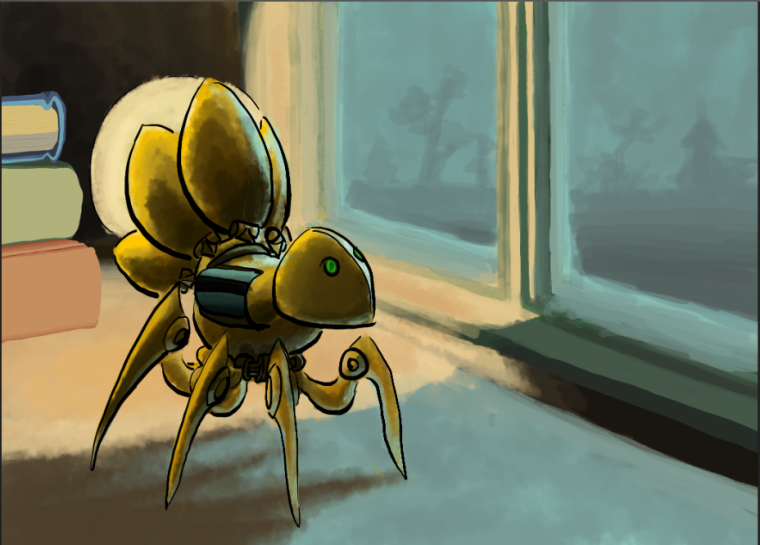
Okay! Been a little while, but I've redone the illustration and fleshed out the idea behind the little creature a bit. Here's the rework for the Luminyr:
-
@jabbernewt I love the composition of the latest one! The color choices seem to be working out nicely to me! So it looks like there's a light source from within the room and also the moonlight through the window. It looks great! I am curious to know more about the character. I see a few things for your consideration: (1) There is a thick linework on the character, but none in the background. So at first glance it feels that the character is pasted on there. Is there a way to blend both together? The background actually looks great without linework; I wonder how the character would look without linework as well. (2) The other thing is, the edges of both windows have the same shade of light blue/grey; the one on the left might work better with a brighter shade since there is a light source from the room on that side. (3) It feels like maybe a couple of legs are missing on the side away from the viewer? Or maybe it's intentional? (4) Lastly, the shadow might look more realistic with a sharper edge. Great job revising! Keep going!
-
@Jabbernewt I really like the design of your little creature. Looking really good!
I'd like to offer a critique of your workflow more than the specifics of what is working or not working in this image. One huge snag that i see a LOT in student work is that you are attempting to solve too many things at once. That is why the crits are all over the place. People are critiquing character design, texture, line work, lighting, rendering, color, and composition. This is going to dilute your image and probably just leave you confused.
I'd like to suggest breaking your image into a few different steps and it will make your life much easier and make it easier to get good crits from other people.
Here's the workflow I would recommend:
-
Concept: You need to let the audience know what you are trying to solve. Keywords and brief descriptions are great here. These you don't really need to show at first, but you need to know what the desired intent of the image is. If you don't know, how can your audience?
-
Layouts and Compostions: Once you have the concept locked down, do a lot of studies in black and white. I like to add value, but these can and should be pretty rough. You can bang out a bunch of them and then maybe post a few that you think are working the best at bringing out your concept. This is really where the forums can be valuable. NOTE: You only want composition and concept feedback here, you aren't trying to draw or render anything perfectly yet.
-
FInal sketch: After working through the problems in stage 2, you can clean up your drawing and fix anything you need. This might be the time to do a few character studies on the side to lock in your design. You can and should post those too in order to get feedback if needed.
-
Color studies: Once you have the final sketch in a tonal black and white image, post a few color studies. Again, trying to hit the emotional reaction that your concept dictates.
-
Final image: Now you are armed with a TON of information and you solved each problem in a logical way. Time to go to final paint and show us what you got. With all the work you put in during development, this stage is usually easy and enjoyable.
It may sound like a lot of work, but it is actually much faster to work this way. It keeps you moving forward rather than second guessing yourself and having a lot of re-starts.
Good luck! : )
SVS Faculty Instructor
www.leewhiteillustration.com -
-
@lisa-ngan Thank you for the feedback Lisa!
-
Yes, this is a failing of mine at the moment. I suppose I'm still in an experimental stage where I'm seeing what does and doesn't work, and I have steadily been leaning towards beginning to either go full tonal or to look into doing more in the way of linework across the board.
-
I see what you mean here. I think Lee is right in saying that I'm trying to do waaay too much right now, and so stuff like that totally passes over my head! Thank you for this observation
-
nooo... you're right, there's a few missing. I'll admit, I first saved this file as "Luminyr Study," because I wanted to flesh out the character a bit and give the rest of the composition, positioning, and background painting another go, but as a study. In my study haste I left out the back two legs on the left side of the Luminyr, I'm afraid. However, I think I'll be trying again fairly soon here, and this is an oversight that you won't see in V3
-
Okay, I see. Sharper as in sharp, or sharper as in less loose?
Thank you again for the feedback-- Gonna keep chugging on!
-
-
@lee-white Thanks! I've discovered that I've got a fascination with lightbulbs since I started developing the little guy
Oh my goodness, thank you so much for this little set of guidelines. The professors at my college are spread a bit thin, so we've done all of these steps, but never connected them with getting critique at each step along the way. It sounds perfect-- thank you! I'll see what I can do to belt out a few concepts.
-
@jabbernewt (4) I am no expert on shadows so maybe I shouldn't say anymore in case I am wrong. But I did get this piece of advice from Lindsay Ward - she looks at the shadow in real life so she can get it right. I'm glad Lee gave us that list! What great advice. Thanks Lee.