Drawing Challenge Artwork Critique
-
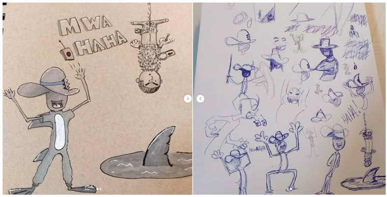
Are the pictures coming up super small and pixely for anyone else? I'm having the most difficult time posting pictures here. The same pictures are posted here https://www.instagram.com/p/BmEu2KLF0zR/

-
Here ya go:
-
Hi there,
I think your drawing is a lot of fun, and it made me laugh so mission accomplished. I can tell exactly what is going on from your drawing, and I dont think that every piece needs a background. If it's in a story book you need space for words. Being a bit of a page layout nerd in looking at your image I can see that I can arrange it to make a two page spread, page one has the laughing man with a block of text next to him and page two has the prisoner hanging down the center with a text block wrapped around him and the shark at the bottom.because art imitates life and life is beautiful
-
Glad you had fun! You can tell you did. I will also agree that it's clear what is happening in the scene. Well done!
As far as critiques on the finished piece go I have a few suggestions:
-
Composition: I think you could have played with how you conveyed space and depth a little more, especially since this appears to be a stand alone piece. If it was part of a comic for example, having a flattened composition without much depth could be appropriate. If you make the upside down man and the shark hole smaller, without any other change it would add a lot of depth and intensify the impact the villain has. On the flip side if you made them much bigger and the villain smaller, we'd be experiencing it more from the victims point of view.
-
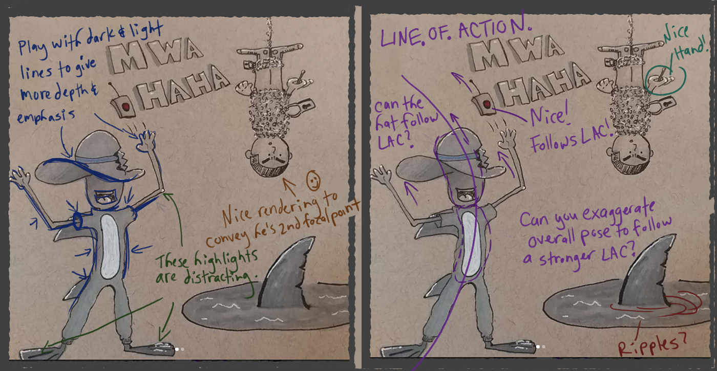
Rendering- I think you could push the shadows a bit. Get some darker tones on the villain's head under the brim of the hat, and inside his sleeve. Anywhere the light can't get into very well. It also appears you placed the highlights arbitrarily, instead of in a way the helps convey simple lighting.
-
Gesture: I like the exploration in your sketches as far as gesture and expressions are concerned. I suggest more study into these areas and also don't forget to study the gesture and expression of hands, as I feel they really add to what is being said about the character. The hands in the finished piece for example, could be be pushed further to enhance the scene. Calvin and Hobbes might be a good reference for looking at how hands are designed and posed. They are very simple, but effective in conveying the action and mood of the characters.
Those are my main thoughts. Good luck with your 30 challenge. It sounds like a lot of fun!
Website: www.tessawrathall.com
Instagram: www.instagram.com/tessawrathall_art/
-
-
@hilariousbosch I never thought about spaces for words....
 thank you I'll try to incorporate that. I'll also work on two page spreads and compositions. Thank you
-
@tessaw I definitely see what you mean about the composition. It comes off as a bit flat now that I see it. I'll also work on the shadows. I actually had initially wanted to darken under the hat but I guess I forgot

And oh the dreaded hands lol. No but I will work on that too. Could've given him something I little more sinister looking instead of sausages.
I have a question: say there's just a single big light over head. Do the highlights not work for that? Thank you again btw I thoroughly appreciate the observations -
@leothejediartist So I think I need to backtrack my comments about the highlights a little. First my comment about the highlights are mainly about the villain character and maybe the shark fin in the hole in the floor. I think they are fine for the tied up character.
I feel your highlights in this case don't necessarily need to convey a lighting system that's technically correct, though some of that may help, but rather they should be designed more carefully to give emphasis and balance to different elements that make up your character.
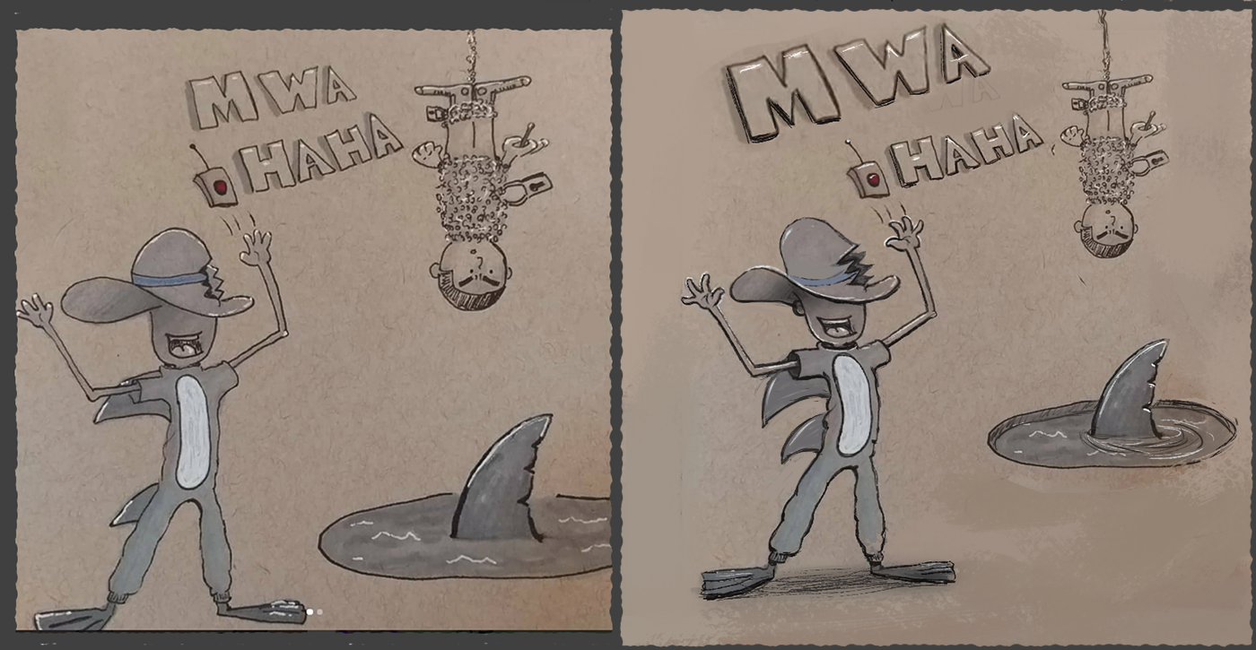
I've seen many of these toned paper illustrations that break technical lighting rules with the way they use white lines, but it works because they are designed with visual balance and emphasis in mind. Thinking about it a little more, I think it's the combination of how you've done your highlights along with your black line work that makes them feel a bit arbitrary. They feel arbitrary to me because you've emphasized certain areas, and in return placed less emphasis on other areas that I feel don't contribute to the design and balance of the villain character as a whole.
I could attempt a paint-over if you'd like. It would probably be rough, but would hopefully show what I mean about designing your highlights and black line-work a little more.
Website: www.tessawrathall.com
Instagram: www.instagram.com/tessawrathall_art/
-
@tessaw if you've got the time sure I'd appreciate the paint over. So is this a case of maybe leaving something out because it doesn't really enhance the illustration? Or did I not do enough highlights? I've heard people mention before"over rendering" and such. I think I get where you're coming from with the shark fin. I may be a little too gelly roll happy lol I just really like how it looks on the toned paper. But if using it everywhere I think light hits from up top is making it look....random then it guess I need to scale it back.
-
I think it's more about balancing those highlights out.
For example, because of the highlights, the shark fins on the villain are dominating over the arm and leg in front of them so the depth is a little out of wack. If you balance that out with stronger line work on the arms and sleeves, it would add more depth and keep the visual balance of that area in check.
Another example: The little white highlight on the elbow stands out and is pointing us away from the main action,. The highlights on the fins are also a bit strong and again lead us away from the focal point (the upper half of the villain).
Another example: Highlights could be added in strategic places to create more focus around the villain face and arms and also add more depth. Again,they might need to be balanced with black line work.
I've done a paint over and included some notes on top as well.
Anyway, just my opinion. Hopefully I'm making sense.
Website: www.tessawrathall.com
Instagram: www.instagram.com/tessawrathall_art/
-
@tessaw wow that is amazing. The new pic flows a lot better and is more pleasing to look at lol. I appreciate this feed back. I will try my best to incorporate this into future illustrations. Composition, focal points and proper highlights and shading using darker tones
