Society of Visual Storytelling

    SVSLearn Forums

    • Register
    • Login
    • Search
    • Recent
    • Tags
    • Popular
    • Users
    • Groups
    • Search

    Need Honest opinion

    Artwork
    7
    14
    1342
    Loading More Posts
    • Oldest to Newest
    • Newest to Oldest
    • Most Votes
    Reply
    • Reply as topic
    Log in to reply
    This topic has been deleted. Only users with topic management privileges can see it.
    • rcartwright
      rcartwright last edited by

      I like the second one. Maybe you should also adjust your text as it is almost vibrating the way it is now, just a thought.

      https://www.scbwi.org/members/richard-cartwright/
      https://www.instagram.com/richardwcartwright/
      https://www.pinterest.ca/richcartwright3/art-of-richard-cartwright/
      https://www.richardwcartwright.ca/

      1 Reply Last reply Reply Quote 1
      • Chip Valecek
        Chip Valecek SVS Team SVS OG @Cjones last edited by

        @cjones I like the second one. I would also suggest maybe playing with the colors a little. What if you made the chair green? I think your character would really pop off the image then.


        https://www.instagram.com/chipvalecek/
        https://www.facebook.com/cvalecek
        http://www.cshellmedia.com/

        1 Reply Last reply Reply Quote 1
        • TessaW
          TessaW last edited by

          I like the second one.

          I also suggest cropping of the right side a bit so the figure is more centered and extending the format so you can see his feet with a dramatic cast shadow extending toward the viewer. I'd also suggest making the text follow more of a rounded arch.

          Love the color palette! Best of luck as far as the contest goes.

          Website: www.tessawrathall.com

          Instagram: www.instagram.com/tessawrathall_art/

          Cjones 1 Reply Last reply Reply Quote 1
          • Cjones
            Cjones @TessaW last edited by

            @tessaw Thanks!. I forgot to mention i offset the image for text on the right. Ill Have to play around with the Text more.

            TessaW 1 Reply Last reply Reply Quote 1
            • TessaW
              TessaW @Cjones last edited by

              @cjones Ok, that makes more sense!

              Website: www.tessawrathall.com

              Instagram: www.instagram.com/tessawrathall_art/

              Cjones 1 Reply Last reply Reply Quote 0
              • Nyrryl  Cadiz
                Nyrryl Cadiz SVS OG last edited by

                Hi! I think your piece is wonderful. However, i think you can still push it more for a stronger statement. Here’s what i suggest:

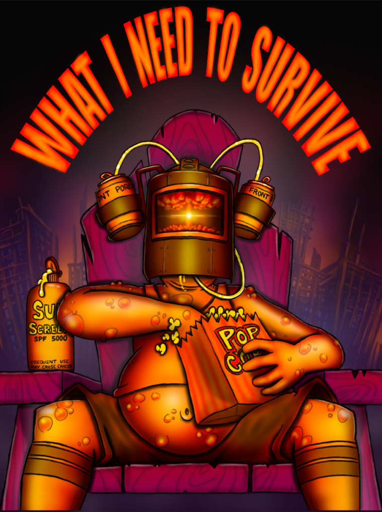
                1. Zoom in on the character. I like how you rendered your character. I like your color scheme, your lighting, however, it took me longer to get the gist of the illustration. Zoming in on the character, only did i realize that he has front a row seat to the end of the world. The mushroom cloud in his visor is a great touch but because of it’s size and how zoom out our character is, it’s a bit hard to notice at first glace.
                2. Use portrait layout for your illustration. Again, your illustration is already great but i think it would make it even better if you use a portrait layout for it. Perhaps, move your text higher and enlarge it. You know, like a movie poster.
                  Anyway, that’s what i think. I hope this helps.

                Portfolio: nyrrylcadiz.com
                Instagram: https://www.instagram.com/nyrryl_cadiz/
                YouTube: https://www.youtube.com/channel/UCbJCF1Im8ZO7hpGWTKOJMuA

                Cjones 3 Replies Last reply Reply Quote 1
                • Cjones
                  Cjones @TessaW last edited by Cjones

                  @tessaw LOL yeah, so the contest is for getting artwork onto a new Craft beer can. I designed the image around where the bar code, facts, name of brewing company would go.

                  1 Reply Last reply Reply Quote 1
                  • Cjones
                    Cjones @Nyrryl Cadiz last edited by

                    This post is deleted!
                    1 Reply Last reply Reply Quote 0
                    • Cjones
                      Cjones @Nyrryl Cadiz last edited by

                      This post is deleted!
                      1 Reply Last reply Reply Quote 0
                      • Cjones
                        Cjones @Nyrryl Cadiz last edited by

                        @nyrrylcadiz 0_1533759313551_WINTS-poster2.png

                        Nyrryl  Cadiz 1 Reply Last reply Reply Quote 4
                        • Nyrryl  Cadiz
                          Nyrryl Cadiz SVS OG @Cjones last edited by Nyrryl Cadiz

                          @cjones LOVE IT!!! This is amazing!

                          Portfolio: nyrrylcadiz.com
                          Instagram: https://www.instagram.com/nyrryl_cadiz/
                          YouTube: https://www.youtube.com/channel/UCbJCF1Im8ZO7hpGWTKOJMuA

                          1 Reply Last reply Reply Quote 1
                          • kaitlinmakes
                            kaitlinmakes last edited by

                            This seems to be the uncommon opinion - but I like the 1st one - I don't think the background takes at all from the main character - it's pushed back in space enough to really take a third seat. But what I do like about it is that it gives me more of the concept of your story - from a general "I just need a beer hat and some popcorn to be happy" to a "when the world ends I just need a beer hat and some popcorn to watch the world end."

                            https://www.instagram.com/kaitlin.kahn.art
                            Https://www.kaitlinkahn.com

                            1 Reply Last reply Reply Quote 1
                            • First post
                              Last post