Society of Visual Storytelling

    SVSLearn Forums

    • Register
    • Login
    • Search
    • Recent
    • Tags
    • Popular
    • Users
    • Groups
    • Search

    Music wip

    Artwork
    9
    26
    2897
    Loading More Posts
    • Oldest to Newest
    • Newest to Oldest
    • Most Votes
    Reply
    • Reply as topic
    Log in to reply
    This topic has been deleted. Only users with topic management privileges can see it.
    • kylebeaudette
      kylebeaudette last edited by

      I'm going to draw a Star Wars style Cantina with a little alien band since I have been whistling the cantina theme all summer. 0_1534394242737_IMG_20180816_002307_628.jpg

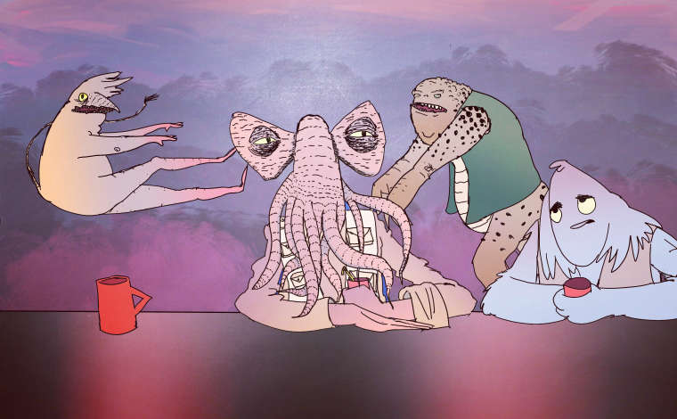
      So far I've drawn four aliens. I'm going for a lot more, but we'll see what I can churn out in the end. This image has been put through an instagram filter, I always love to see the effects they can have on the mood of a piece.
      *

      Instagram- www.instagram.com/kyle_beaudette/
      Www.twitter.com/kylebeautweet
      Www.etsy.com/shop/Artofkylebeaudette
      https://youtube.com/@kylebeaudette?si=ComtMDsVyK1HPn55

      1 Reply Last reply Reply Quote 3
      • kylebeaudette
        kylebeaudette last edited by

        Worked on it a bit more tonight. 0_1534475993981_IMG_20180816_231151_375.jpg

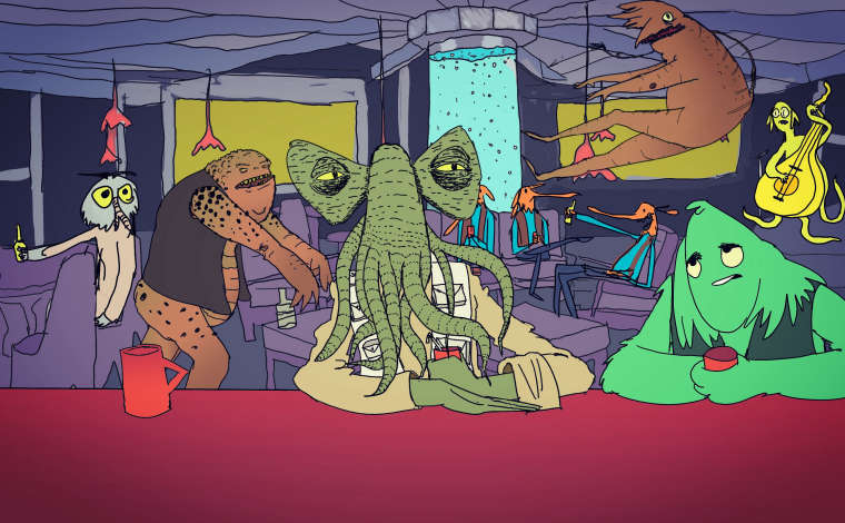
        Going to play with shadows and add more details. Please feel free to give critiques!

        Instagram- www.instagram.com/kyle_beaudette/
        Www.twitter.com/kylebeautweet
        Www.etsy.com/shop/Artofkylebeaudette
        https://youtube.com/@kylebeaudette?si=ComtMDsVyK1HPn55

        Heather Boyd 1 Reply Last reply Reply Quote 2
        • Heather Boyd
          Heather Boyd @kylebeaudette last edited by

          @kylebeaudette Perhaps add a little more mess or disorder of cups and such on the bar table it looks a bit empty in the foreground.

          🙂

          Instagram: www.instagram.com/heatherboyd.illustration/
          Website: https://heatherboydillustration.ca
          Shop: https://www.inprnt.com/search/products?q=HeatherBoydIllustration
          Ko-Fi: https://ko-fi.com/heatherboydillustration

          Be blessed,

          1 Reply Last reply Reply Quote 1
          • kylebeaudette
            kylebeaudette last edited by

            0_1534563102160_IMG_20180817_232526_421.jpg

            Yes, thank you! That bar totally needed some messy element. I added shadows and switched up the band.

            Instagram- www.instagram.com/kyle_beaudette/
            Www.twitter.com/kylebeautweet
            Www.etsy.com/shop/Artofkylebeaudette
            https://youtube.com/@kylebeaudette?si=ComtMDsVyK1HPn55

            1 Reply Last reply Reply Quote 1
            • TessaW
              TessaW last edited by TessaW

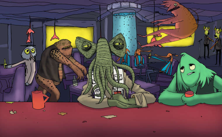
              I love the personality of all of your characters! A few suggestions:

              1. Fix the tangent created by the lamp and the middle figure's head.

              2. Compress the values a little in the background.

              3. Possibly add a bit more bleed light from the yellow windows.

              4. Add more texture to the green guy in the front so the rendering style feels more consistent.

              This is such a fun piece. Well done.

              Website: www.tessawrathall.com

              Instagram: www.instagram.com/tessawrathall_art/

              kylebeaudette 1 Reply Last reply Reply Quote 1
              • kylebeaudette
                kylebeaudette @TessaW last edited by

                @tessaw thank you!
                I understand what 3 and 4 mean, but not 1 and 2?
                Tangent? Compress the values?
                I'm a bit of a newbie.

                Instagram- www.instagram.com/kyle_beaudette/
                Www.twitter.com/kylebeautweet
                Www.etsy.com/shop/Artofkylebeaudette
                https://youtube.com/@kylebeaudette?si=ComtMDsVyK1HPn55

                1 Reply Last reply Reply Quote 0
                • TessaW
                  TessaW last edited by

                  Sorry @kylebeaudette

                  Tangents typically mean when the contours or edges of two elements meet up in close proximity to eachother and it creates awkwardness or unintended focus in that area. So that lamp hanging in the background by his head, just gives a weird emphasis to that area. It's sitting right in the center of his head and is a bit distracting. If you had raised it, so we could see more of the lamp shade, it could also potentially create another "tangent" where is looks like the lamp shade is his hat. So I would just move that pendant light behind the center character to the left and possible make it so we could see the lamp shade. It's hard to see what will work without trying it.

                  When I say compress the values, (I'm not sure I'm using that term correctly btw) I'm saying not to use as wide of a range of values. Values can go from white to black. So instead of using the full range from lightest to darkest, you would just bracket out a portion of them to use. It could be from very light to mid tones. Or just mid tones. Or dark midtones to black. Or whatever. It's about contrast. More of a value range will be more contrasted, less of a value range will be less contrasted.

                  So for this particular piece, it looks like you are using a very similar value structure throughout the whole thing. You've thought about how color, texture, and size will let the different elements stand out, but the values are all very similar. It could be that it's certain style you're going for, so feel free to ignore this advice, but I think you could play with value a bit more to lead our eye through the piece. Right now everything seems to have equal visual weight and so my eye keeps jumping around between everything without visual rest. That's not necessarily a bad thing I guess, but if you did want some difference, one solution might to keep a wide range of values on the two characters in the foreground and the bar, and less value contrast in the background. You could go lighter, darker, or keep it midrange.

                  Hope that all made sense! 😛

                  Website: www.tessawrathall.com

                  Instagram: www.instagram.com/tessawrathall_art/

                  kylebeaudette 1 Reply Last reply Reply Quote 1
                  • TessaW
                    TessaW last edited by TessaW

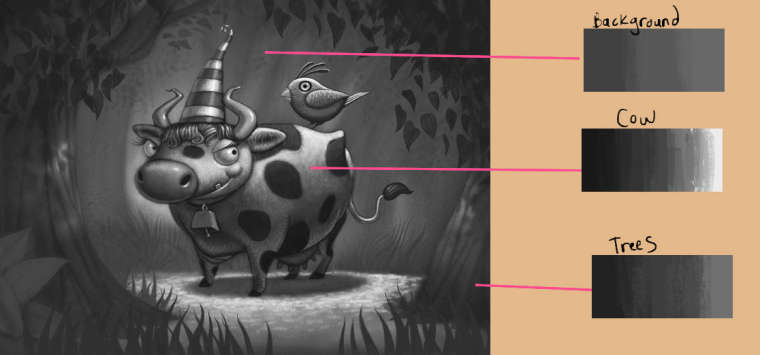
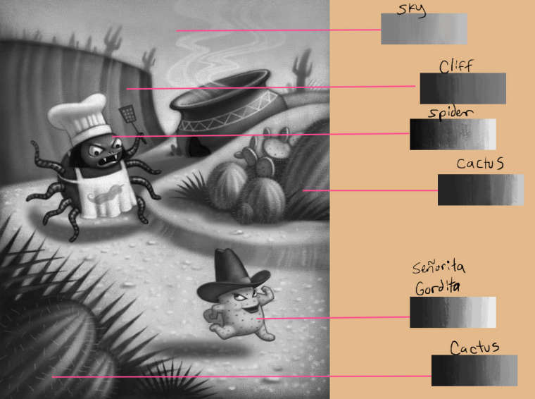
                    I did these value analysis studies a while back, but it kind of illustrates what I was trying to say. These are all studied from pieces by Will Terry. You can see how some elements use a very wide range of values, and some a lower range of values.

                    0_1534706993241_value2.jpg

                    0_1534707086932_value1.jpg

                    Website: www.tessawrathall.com

                    Instagram: www.instagram.com/tessawrathall_art/

                    1 Reply Last reply Reply Quote 1
                    • kylebeaudette
                      kylebeaudette @TessaW last edited by

                      @tessaw ahhhh yes, ok! I totally agree. I was trying to figure out how to add more depth to this. Thanks!!!

                      Instagram- www.instagram.com/kyle_beaudette/
                      Www.twitter.com/kylebeautweet
                      Www.etsy.com/shop/Artofkylebeaudette
                      https://youtube.com/@kylebeaudette?si=ComtMDsVyK1HPn55

                      1 Reply Last reply Reply Quote 0
                      • chrisaakins
                        chrisaakins last edited by

                        to piggy back on @TessaW's comment. You can also use tonal values. Add grey/blue to your colors to make them less intense if you want them to recede. To make them appear more important warm them up.

                        Chris Akins
                        www.chrisakinsart.com
                        www.instagram.com/chrisakinsart/

                        1 Reply Last reply Reply Quote 0
                        • kylebeaudette
                          kylebeaudette last edited by

                          Sooo I don't know how well I listened, but I worked on it more tonight. It's still kind of all over the place.
                          0_1534734678483_japigcantina.jpg

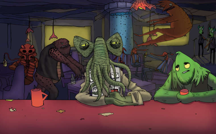
                          I tried to push the background back further with layers, some are very scratchy and sloppy. I edited out a character that just wasn't working, and added some light up front. I feel kind of like I'm just making a mess now🤗

                          Instagram- www.instagram.com/kyle_beaudette/
                          Www.twitter.com/kylebeautweet
                          Www.etsy.com/shop/Artofkylebeaudette
                          https://youtube.com/@kylebeaudette?si=ComtMDsVyK1HPn55

                          braden H 1 Reply Last reply Reply Quote 0
                          • braden H
                            braden H @kylebeaudette last edited by

                            @kylebeaudette

                            It always feels like a mess until it's finished. I often feel like I'm trying to make a gourmet meal out of hot garbage when I'm drawing. Keep polishing and it'll turn out fine.

                            It may be time to put it away for a day or two then come back to it if it's getting hard to work on.

                            1 Reply Last reply Reply Quote 1
                            • kylebeaudette
                              kylebeaudette last edited by kylebeaudette

                              Ugh, I did one more pass getting rid of confusing colours.
                              0_1534737565173_IMG_20180819_235719_683.jpg

                              Instagram- www.instagram.com/kyle_beaudette/
                              Www.twitter.com/kylebeautweet
                              Www.etsy.com/shop/Artofkylebeaudette
                              https://youtube.com/@kylebeaudette?si=ComtMDsVyK1HPn55

                              1 Reply Last reply Reply Quote 0
                              • TessaW
                                TessaW last edited by TessaW

                                I personally thinks it's shaping up nicely. I do think your previous version was working nicely as well, because it felt harmonized and the color was circulated well throughout.

                                I think you've done a nice job separating your foreground from your background. I do think that at this point, you could bring back some of the awesome lighting elements back into the scene. Don't be afraid to keep some nice low glows to your water tank, light bulbs, and windows. That might confuse you since I told you to compress your values, but you've tamed the objects and other characters so well that I think you can get away with it and it will add a really cool bar atmosphere.

                                You're doing a great job with this piece, so I hope you don't feel to overwhelmed.

                                Website: www.tessawrathall.com

                                Instagram: www.instagram.com/tessawrathall_art/

                                1 Reply Last reply Reply Quote 2
                                • ?
                                  A Former User last edited by

                                  I like how you've worked through this image, seems like you've learned a lot in a short time. While I agree with some of the other crits that have helped this piece I think what got lost was the Music element. The band is almost non existent at this point because the values are so dark. Maybe you could add a Jukebox in the foreground since the focus is on the 2 guys sitting at the bar if you want to keep the music idea. Or just focus on making a cool illustration of guys at a bar, its a fun scene, but I don't get Music from it.

                                  kylebeaudette 1 Reply Last reply Reply Quote 2
                                  • kylebeaudette
                                    kylebeaudette @Guest last edited by

                                    @shiggins180 yeah, I agree. I had originally wanted the creature flying across the room into a jukebox that was all lit up, casting light onto his behind. This last touch up last night was no good. I'll revert back to the save right before, and beef up that band from a two piece to another couple of musicians, and light them like their show required a cover price.

                                    On a seperate note, I had done a google image search for 'bar' to get some good layout ideas for a background. I found a great one, and traced it in a matter of like, 5 minutes. I went back and changed it a bit, but it's essentially a trace.
                                    Initially, I was thinking 'oh I can't keep an element I traced in here..' but now I dont care at all, and can see myself pasting various background scenes together and tracing them in the future. I usually just don't do a background. I hope I eventually learn the language of architecture through absolutely cheating my backgrounds for a while😅

                                    Instagram- www.instagram.com/kyle_beaudette/
                                    Www.twitter.com/kylebeautweet
                                    Www.etsy.com/shop/Artofkylebeaudette
                                    https://youtube.com/@kylebeaudette?si=ComtMDsVyK1HPn55

                                    1 Reply Last reply Reply Quote 0
                                    • kylebeaudette
                                      kylebeaudette last edited by

                                      0_1534822663768_musicjjj.jpg
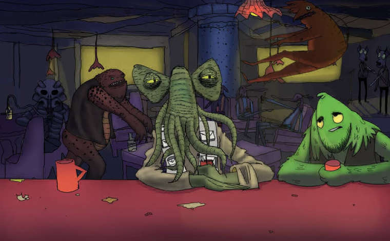
                                      Well, some more. Reverted some stuff, changed some others. There's so many layers now it's kind of a nightmare to work on...

                                      Instagram- www.instagram.com/kyle_beaudette/
                                      Www.twitter.com/kylebeautweet
                                      Www.etsy.com/shop/Artofkylebeaudette
                                      https://youtube.com/@kylebeaudette?si=ComtMDsVyK1HPn55

                                      chrisaakins 1 Reply Last reply Reply Quote 0
                                      • kylebeaudette
                                        kylebeaudette last edited by

                                        0_1534825633603_musicelephant.jpg
                                        Maybe this instead

                                        Instagram- www.instagram.com/kyle_beaudette/
                                        Www.twitter.com/kylebeautweet
                                        Www.etsy.com/shop/Artofkylebeaudette
                                        https://youtube.com/@kylebeaudette?si=ComtMDsVyK1HPn55

                                        1 Reply Last reply Reply Quote 4
                                        • kaitlinmakes
                                          kaitlinmakes last edited by

                                          Ive really been enjoying watching this build up - it also reminds me of a more fine art approach to making an image, and has a really wonderful grundgy feel to it.
                                          With all the activity, it also reads well, and I am having a lot of fun going through the image and discovering all of your creatures.
                                          My only thought is your flying guy - his toes are creating the most perfect tangent with the pole behind him.

                                          https://www.instagram.com/kaitlin.kahn.art
                                          Https://www.kaitlinkahn.com

                                          1 Reply Last reply Reply Quote 0
                                          • chrisaakins
                                            chrisaakins @kylebeaudette last edited by

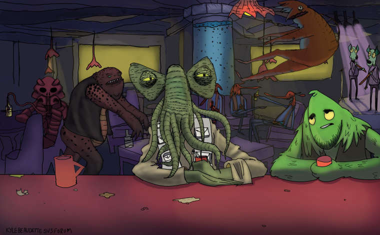
                                            @kylebeaudette wow this is looking great! I feel your pain, though. Layers! But don't give up. The picture is looking really good.

                                            Chris Akins
                                            www.chrisakinsart.com
                                            www.instagram.com/chrisakinsart/

                                            1 Reply Last reply Reply Quote 1
                                            • First post
                                              Last post