Music WIP
-
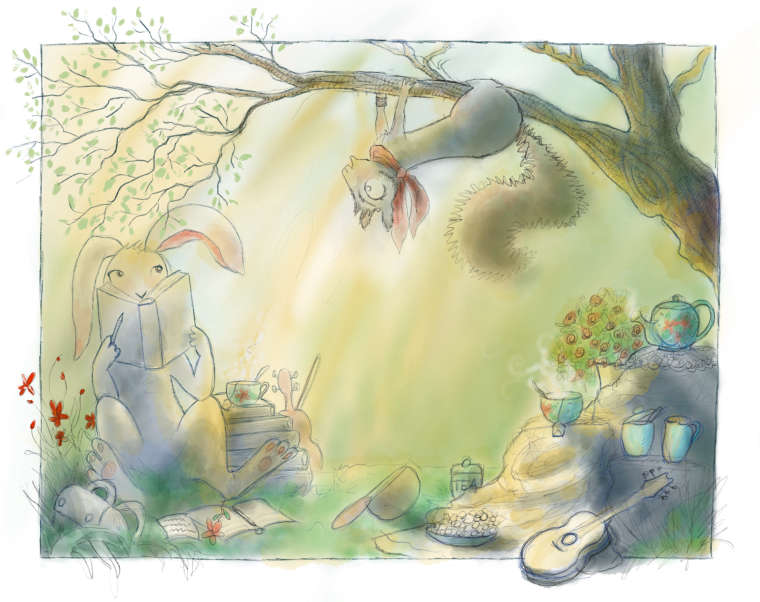
Hey Peeps, just joined yesterday! So pumped about all the talent! Anyway, decided to enter the Music Competion last minute. Would love to be critiqued on this one. What are you all’s thoughts? -
What particularly would you like suggestions about?
Something that comes to mind that might be helpful to you is that the first thing my eye goes to in your image is the patch of red flowers to the far left. Where would you like the viewer's focus to be?
Lovely details.
") Thanks for sharing.
Thanks for sharing. -
@squirrelsize I was just watching a documentary on the author and illustrator of Peter Rabbit, and your charming style reminds me of her work. I agree with @KathrynAdebayo the red flowers to the left are deep and vibrant for a background element where the rest is soft. But I like your playfulness, also reminds me of Alice in Wonderland. And I like when the picture elements come off the page or out of the frame. Your treatment of colour is light and soft but minus the red flowers everything just sits on the same level. Figure out what is most important in your image and strengthen those areas with definition. Also your squirrel hangs heavy on that thin branch, it may not hold up. Maybe show some the branch give way, arch/bend more. And try to resolve a bit more where the squirrel's back legs "hide" or "doesn't hide".
Heather BoydInstagram: www.instagram.com/heatherboyd.illustration/
Website: https://heatherboydillustration.ca
Shop: https://www.inprnt.com/search/products?q=HeatherBoydIllustration
Ko-Fi: https://ko-fi.com/heatherboydillustrationBe blessed,
-
@kathrynadebayo Wow! Thanks for the suggestion about the red flowers, now that you have mentioned them I see what you mean, they do draw more attention then I would like. I’ll have to fix that.
-
@heather-boyd Yes! I love Peter Rabbit and Beatrix Potter! I really appreciate the tips!! I’ve been out of art school for over a year and I really have been missing the crits and other arty minded peeps.
Also, love the suggestion about the tree branch. That would also add some tension to the drawing too!
I agree on the Squirrels hind legs, I redrew them several times and still not happy with them.Thanks again girl!!