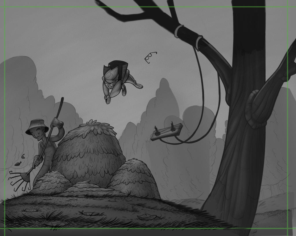
Society of Visual Storytelling

    SVSLearn Forums

    • Register
    • Login
    • Search
    • Recent
    • Tags
    • Popular
    • Users
    • Groups
    • Search

    Fall WIP (leafpile)

    Artwork
    21
    32
    3113
    Loading More Posts
    • Oldest to Newest
    • Newest to Oldest
    • Most Votes
    Reply
    • Reply as topic
    Log in to reply
    This topic has been deleted. Only users with topic management privileges can see it.
    • chrisaakins
      chrisaakins last edited by chrisaakins

      @Art-of-B Love this. And I read your Cato web comic from start to finish! I was hooked! You have a great style and a great story going. Now I have to stinking wait!

      Chris Akins
      www.chrisakinsart.com
      www.instagram.com/chrisakinsart/

      1 Reply Last reply Reply Quote 1
      • smceccarelli
        smceccarelli Pro SVS OG last edited by

        Lovely work - very nice, dynamic composition and wonderful line work. The only thing, which has been mentioned already, is that there doesn’t seem to be a clear connection between the kid and the swing. I honestly thought he had jumped from the tree until I read the comments and noticed the swing.
        If he had just jumped from it, the swing wouldn’t be so far back and also the kid´s pose would probably have a different shape - unless he jumped while standing, of course.
        One option is to just get rid of the swing and have him jump from the tree. Or you could try drawing the swing lines towards the direction of the boy, and the seat then overlapping the tree or clearing it on the other side.

        0_1536209824907_3E776304-ECE2-4027-A7B8-FCADCC9ECAB7.jpeg

        1 Reply Last reply Reply Quote 4
        • Nyrryl  Cadiz
          Nyrryl Cadiz SVS OG last edited by

          You never fail to amaze me! The gestures in your illustrations are amazing. I think you can work on the swing tho. Since our character is thrown forward, should the swing be also arched forward? This is just my thoughts though. However, what you did still works. It’s amazing.

          Portfolio: nyrrylcadiz.com
          Instagram: https://www.instagram.com/nyrryl_cadiz/
          YouTube: https://www.youtube.com/channel/UCbJCF1Im8ZO7hpGWTKOJMuA

          1 Reply Last reply Reply Quote 1
          • braden H
            braden H last edited by

            Thank you all for the great feedback! I never would have clued in that the swing and the boy are disconnected (I can trace the line of flight, but that's because I drew it) It does at the moment look like he's leaping from the tree and the swing is unrelated.

            I love how much feedback people give on this site 🙂

            @chrisaakins Oh cool! yeah, it updates slowly, but steadily. Most people tend to leave it for a month or two to have enough updates to bing XD

            I've taken some of the advice and kind of moved things about so that the tree is further to the right and the boy and swing are more related.

            I'd started to fiddle with values before I hacked it up XD

            New version:

            alt text

            Old version

            alt text

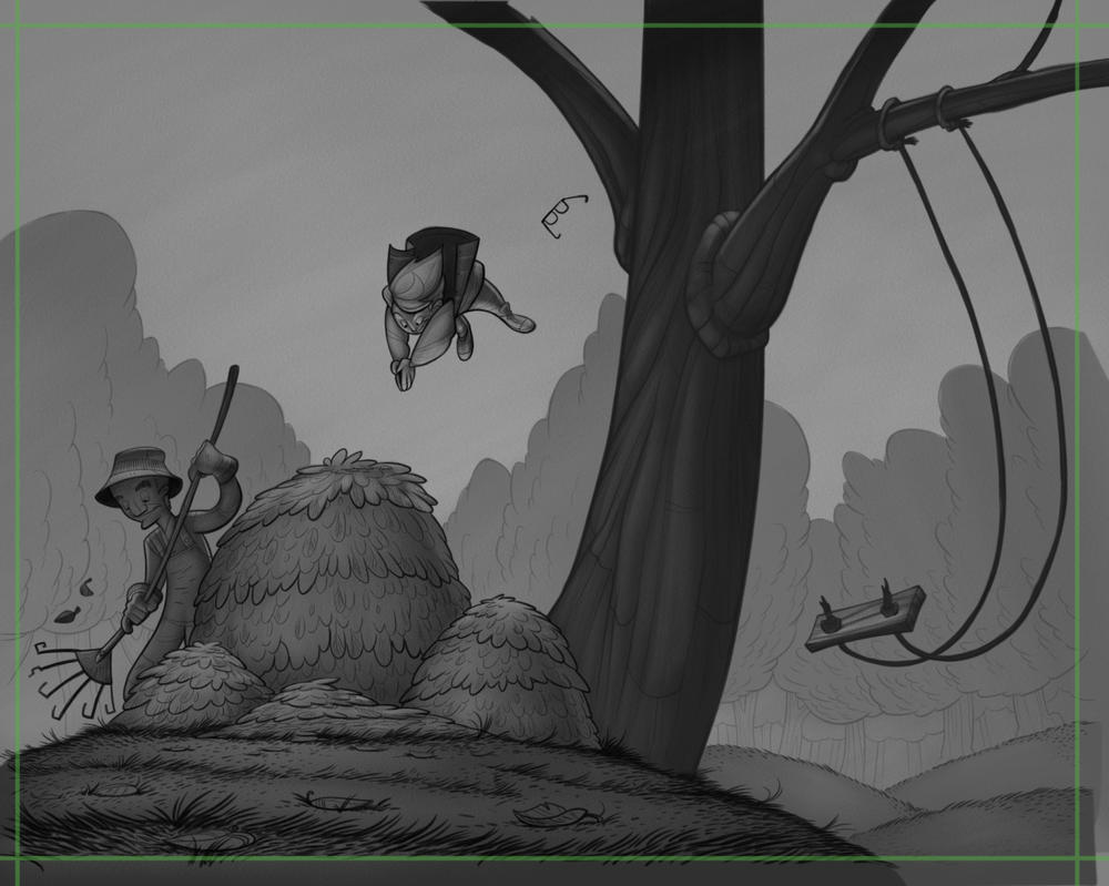
            I think the version with the tree further to the right is clearer, but I'd be interested in people's thoughts before I redraw 🙂

            I've got so much work ahead of me to really incorporate those composition classes into my golf swing.

            Thanks again!

            Chip Valecek rcartwright Elizabeth Rose 3 Replies Last reply Reply Quote 7
            • Chip Valecek
              Chip Valecek SVS Team SVS OG @braden H last edited by

              @art-of-b The new version reads much better. You are killing it wit all of these on top of your 100 drawings. Amazing work man.


              https://www.instagram.com/chipvalecek/
              https://www.facebook.com/cvalecek
              http://www.cshellmedia.com/

              braden H 1 Reply Last reply Reply Quote 1
              • Lee White
                Lee White SVS Team SVS Instructor Pro SVS OG last edited by

                Love seeing the process here! and very nice work of course!

                SVS Faculty Instructor
                www.leewhiteillustration.com

                1 Reply Last reply Reply Quote 2
                • rcartwright
                  rcartwright @braden H last edited by

                  @art-of-b I like the new one with the swing more central, thus making the tree a framing element that keeps the action more central

                  https://www.scbwi.org/members/richard-cartwright/
                  https://www.instagram.com/richardwcartwright/
                  https://www.pinterest.ca/richcartwright3/art-of-richard-cartwright/
                  https://www.richardwcartwright.ca/

                  1 Reply Last reply Reply Quote 1
                  • Elizabeth Rose
                    Elizabeth Rose @braden H last edited by Elizabeth Rose

                    @art-of-b Same here, the new one

                    https://elizabethrosehoffman.com/
                    https://www.instagram.com/elizabethrosehoffmanart/
                    https://linktr.ee/elizabethrosehoffman

                    1 Reply Last reply Reply Quote 1
                    • braden H
                      braden H @Chip Valecek last edited by

                      @chip-valecek

                      Thanks Chip! Investing ALL of my spare time right now 🙂

                      1 Reply Last reply Reply Quote 0
                      • chrisaakins
                        chrisaakins last edited by

                        The tree to the right totally works. I like the nice little detail of his glasses flinging off. Great stuff, man!

                        Chris Akins
                        www.chrisakinsart.com
                        www.instagram.com/chrisakinsart/

                        1 Reply Last reply Reply Quote 1
                        • adc
                          adc last edited by adc

                          Man, your gesture and comp work is inspiring. Something I know I need to work on. I love where this is going @Art-of-B.
                          The dynamic lines of the swing do a great job of directing the eye, but are even strong on the same side of the tree as the subject.

                          ~Andrew
                          My stuff: http://andrewdc.com/illustration/
                          Teh dribs: https://dribbble.com/adc

                          1 Reply Last reply Reply Quote 2
                          • lmrush
                            lmrush Pro SVS OG last edited by

                            Fabulous!

                            Lisa Rush
                            www.lisarushgallery.com
                            www.facebook.com/ArtbyLisaRush/
                            www.instagram.com/lisarush11/

                            1 Reply Last reply Reply Quote 1
                            • theemkat
                              theemkat last edited by

                              I'm absolutely loving the motion in this one! I agree with everyone else, the new version reads much better.

                              1 Reply Last reply Reply Quote 1
                              • Whitney Simms
                                Whitney Simms SVS OG last edited by

                                The tree to the right for sure. It makes the swing and the jumper more connected. You can see how he got in the air much easier. It flows. Can’t wait to see it all polished up. Want to see an after shot too. You’re telling quite the story with this little character with the music and now the leaves.

                                1 Reply Last reply Reply Quote 2
                                • ?
                                  A Former User last edited by

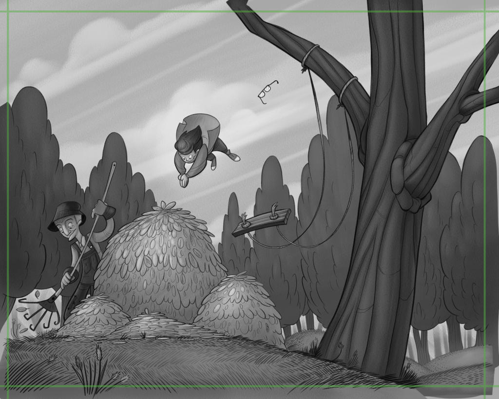
                                  Love the process here, tree to the right looks much better, only a few small things for me. The trees in the background seem really full for fall compared to the tree the kid is swinging on. The leaf piles almost look like Hay piles or a bush, maybe the shapes within the piles could be a little more varied. I'm really digging this illustration great job!

                                  1 Reply Last reply Reply Quote 1
                                  • braden H
                                    braden H last edited by

                                    Phew! Got distracted by other projects, but I'm back on track! Redrew and redid values (I think I've got a better idea of what values should look like before adding colour, now). I think it's lost a bit of the movement that the last version had, but I gotta move forward!

                                    Thanks again to everyone for the feedback so far 🙂

                                    alt text

                                    1 Reply Last reply Reply Quote 4
                                    • chrisaakins
                                      chrisaakins last edited by

                                      @Art-of-B Is there a way to remove the trees behind the swing? I think they rob the feeling of being up in the air. They are not as prominent in your earlier sketches.

                                      Chris Akins
                                      www.chrisakinsart.com
                                      www.instagram.com/chrisakinsart/

                                      braden H 1 Reply Last reply Reply Quote 2
                                      • braden H
                                        braden H @chrisaakins last edited by

                                        @chrisaakins That's definitely one of the areas I'm gonna be fiddling with before I move to colour, yeah. That swing (along with the grampa's overalls) kinda fade into the background at the moment.

                                        chrisaakins 1 Reply Last reply Reply Quote 0
                                        • chrisaakins
                                          chrisaakins @braden H last edited by

                                          @art-of-b The overalls can be solved with a color contrast. Blue with warm colors for example. I don't think the value would matter so much then. I really like your work and style. I like your clean lines and polished forms. You have the ability to tell so much with just a simple shape or line. I am impressed.

                                          Chris Akins
                                          www.chrisakinsart.com
                                          www.instagram.com/chrisakinsart/

                                          braden H 1 Reply Last reply Reply Quote 0
                                          • braden H
                                            braden H @chrisaakins last edited by

                                            @chrisaakins Thanks! And absolutely regarding the cool on warm colours. I'm thinkin' his overalls are gonna be a nice denim blue and the autumn leaves in the background will be something warmish. I still wanna try and make everything work with value first, though. Tile light on dark on light on dark and such.

                                            1 Reply Last reply Reply Quote 0
                                            • First post
                                              Last post