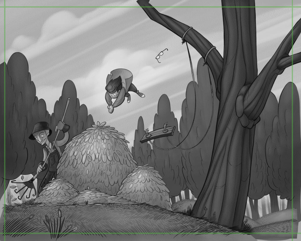
Fall WIP (leafpile)
-
Love seeing the process here! and very nice work of course!
-
@art-of-b I like the new one with the swing more central, thus making the tree a framing element that keeps the action more central
-
@art-of-b Same here, the new one
-
Thanks Chip! Investing ALL of my spare time right now
")
-
The tree to the right totally works. I like the nice little detail of his glasses flinging off. Great stuff, man!
-
Man, your gesture and comp work is inspiring. Something I know I need to work on. I love where this is going @Art-of-B.
The dynamic lines of the swing do a great job of directing the eye, but are even strong on the same side of the tree as the subject. -
Fabulous!
-
I'm absolutely loving the motion in this one! I agree with everyone else, the new version reads much better.
-
The tree to the right for sure. It makes the swing and the jumper more connected. You can see how he got in the air much easier. It flows. Can’t wait to see it all polished up. Want to see an after shot too. You’re telling quite the story with this little character with the music and now the leaves.
-
Love the process here, tree to the right looks much better, only a few small things for me. The trees in the background seem really full for fall compared to the tree the kid is swinging on. The leaf piles almost look like Hay piles or a bush, maybe the shapes within the piles could be a little more varied. I'm really digging this illustration great job!
-
Phew! Got distracted by other projects, but I'm back on track! Redrew and redid values (I think I've got a better idea of what values should look like before adding colour, now). I think it's lost a bit of the movement that the last version had, but I gotta move forward!
Thanks again to everyone for the feedback so far
-
@Art-of-B Is there a way to remove the trees behind the swing? I think they rob the feeling of being up in the air. They are not as prominent in your earlier sketches.
-
@chrisaakins That's definitely one of the areas I'm gonna be fiddling with before I move to colour, yeah. That swing (along with the grampa's overalls) kinda fade into the background at the moment.
-
@art-of-b The overalls can be solved with a color contrast. Blue with warm colors for example. I don't think the value would matter so much then. I really like your work and style. I like your clean lines and polished forms. You have the ability to tell so much with just a simple shape or line. I am impressed.
-
@chrisaakins Thanks! And absolutely regarding the cool on warm colours. I'm thinkin' his overalls are gonna be a nice denim blue and the autumn leaves in the background will be something warmish. I still wanna try and make everything work with value first, though. Tile light on dark on light on dark and such.
-
Almost done... I'm heading to a wedding for the weekend, so I'm gonna let this percolate until sunday night then make some small changes.
-
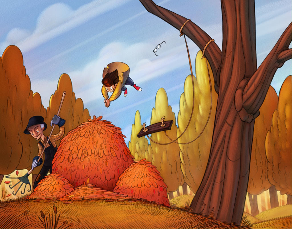
@art-of-b this is looking amazing! My one comment is the lighting of the trees in the distance. it’s as if the sun is directly hitting them even though the overall lighting does not suggest that. I don’t know if you’re still working on this though. But if you choose to have an afternoon lighting and bathe everything in a yellowish/orange light, that would be amazing. I hope this helps.