Fall WIP -critiques please
-
The top down view, portrait cropping is interesting with your man character at the bottom. I feel like all those things happening "above" your main character in the picture composed in a way that it can be a good paralel to show the character being overwhelmed and crushed by the competitors. It makes a good underdog
 . I'd just make sure to carefully lead the eye to the main character. Can't wait to see the end result.
-
@nasvikdraws thanks! i’ll try my best.
-
I like the representation of the crushing competition with t-rex and pretty much agree with nasvikdraws
 I am looking forward to seeing the final result!
 -
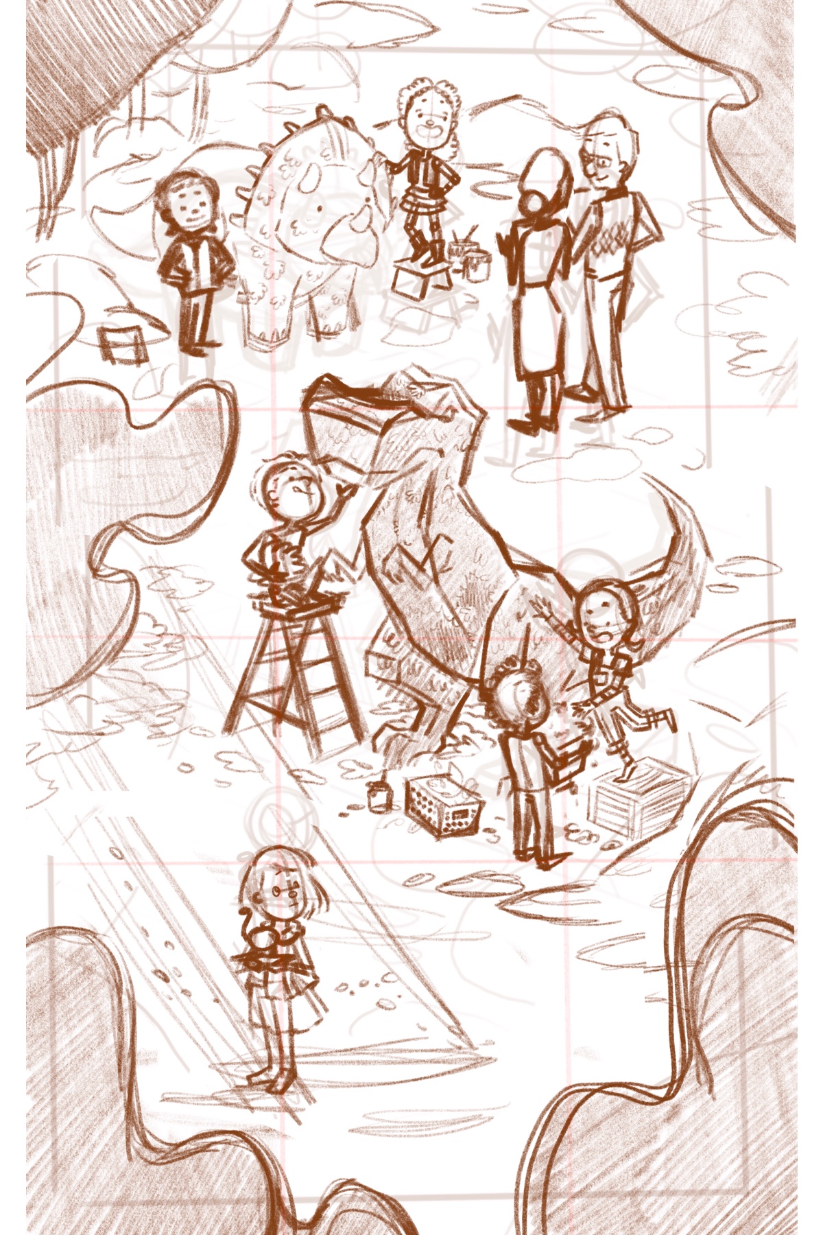
Hi everbody! It’s been a busy week but i managed to squeeze some time to flesh out this illustration a bit more. Please let me know what you guys think. I would love to hear your critiques. Thank you so much!
-
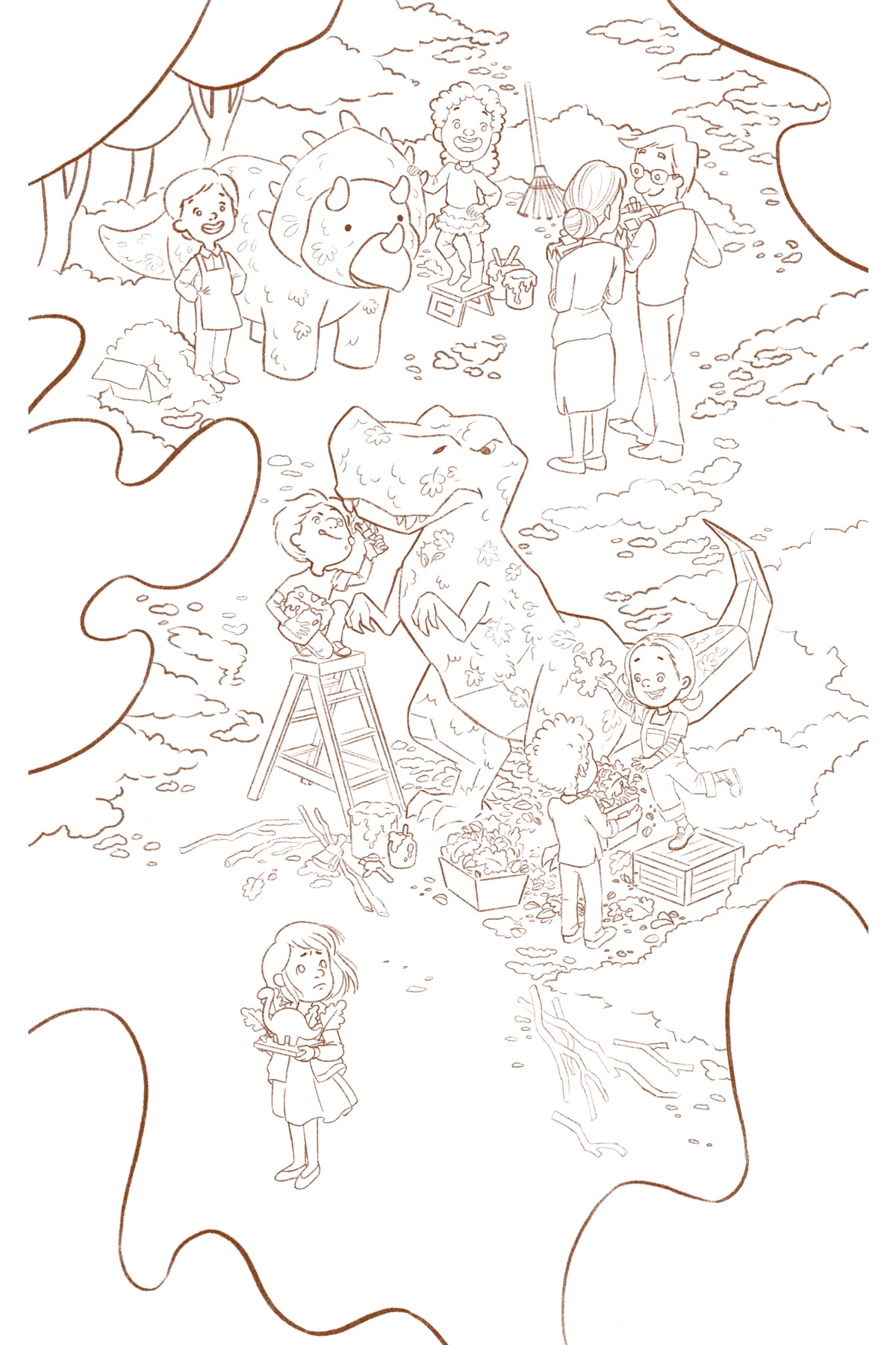
Here’s my final sketch. Please let me know if there are some issues. Sometimes, when I work long hours on a piece, i tend to not notice mistakes I made. Thank you so much everybody.
-
Hi! I really really love this, what a fun concept! Love your composition, the eye makes a natural journey zigzagging down the page until they arrive at the character down at the bottom, great job!
It's the first time I see it and the one thing that stood out to me was the treetops. At first I wasn't sure what they were, they looked like blobs to me... I think the problem is two-fold.
One, since the treetops are so much closer to us than the trees in the background, this close you'd expect to see a bit more detail and definition. It's a good way to differentiate different planes in your drawing to put more detail on what's up close and less on what's in the background. Here there is some inconsistency: there's more detail on the piles of leaves on the ground and on the dinosaurs we can even see individual leaves, but not on the treetop which are closer. Of course you don't want to attract too much attention to them, but a more detailed silhouette could make a diffference.
Two, looking at how big the characters are I'm not sure your point of view is high enough to be in the treetops/ above the treetops! Maybe that's why it feels so odd and out of place to me... There is also a lot of them, while maybe I'd keep the one in the corner to frame the image, the one in the middle next to the middle dinosaur isn't needed in my opinion..
I hope that helps even a little! Great job, this is so excellent! I love seeing all these illustrations for critique in the forum because all the feedback is so high-level, it's very interesting!
-
@NessIllustration Hi! I’m very happy that you love my work. That really means a lot to me. About the trees, yeah they do look very odd i must admit. However, i think i’ll stick with the initial design for now. I deliberately deprived the trees of details so that the eye would not linger on them for long but rather focus their attention to our characters, especially our main character. They may not be in the right proportion as to our characters but i guess that’s just me having some artistic freedom with it. I’m kinda bending reality to suit my needs... hehehe... Anyway thank you so much for the input. I’ll definitely consider them when doing future illustrations.
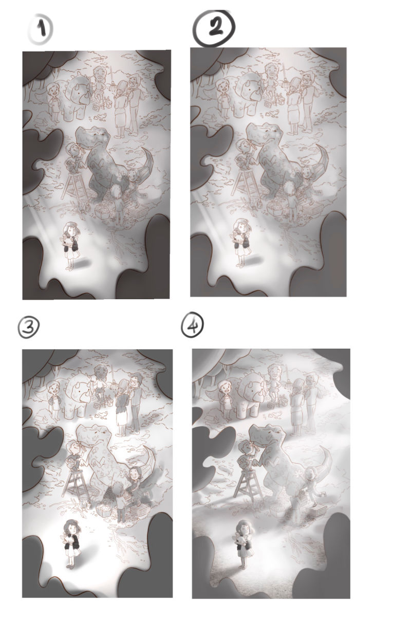
So I’ve made some value studies and these are what i end up with. the first 2 studies are practically the same study with the second one a but lighter. I wanted to see if it will look better with lighter values. The third one is supposed to be an overcast day where the shadows are diffused and such. I guess it will look great if i used muted colors with it, making the mood melancholic and what not. Now, the fourth one. That’s by far my favorite. You might notice it’s more detailed than the previous three which were just scribbled in a few minutes. When i reached the fourth study, i had the idea of having the light source coming from the back. I started painting it and i really like it so much so that i worked on it more. I really am leaning on four but please let me know what you guys think. Perhaps you some critiques or perhaps you guys have some suggestions to improve the piece.
Thank you so much!
-
4 all the way, definitely! Interesting light source!
Some of your characters are getting lost though, because they have the same values as the background. In 3 for instance, you have some darker values on your characters that really brought them out more. This is going to be an amazing piece, good luck!
-
Love where this goes! I'd chose 4 for the lighting. It is very atmospheric.
The only two comments I have for your previous sketch phase:
- the T-Rex's facial expression is a bit confusing. It seems to be angry at your main character. Not sure if that is intentional. I think it should have more inanimate eyes.
-the little diplodocus (?) in the main character's hand is a bit hard to read as it is enclosed in the girl's silhouette.
This is going to be great. Rooting for you

- the T-Rex's facial expression is a bit confusing. It seems to be angry at your main character. Not sure if that is intentional. I think it should have more inanimate eyes.
-
Another vote for 4!
-
@nasvikdraws Thanks! Yes, i wanted the t-rex to be glaring down on our character.
@Eli Thank you for the input
-
Personally not bothered at all by the glaring T-Rex. It's a statue, and it's fun to imagine that the kid wanted his t-rex to look fearsome and glare down and passersby!
-
Another vote for 4! I'd just bring back some of clarity to the trex grouping so they don't get too lost.
-
My vote's for #4. The dark sweater on the girl is more than enough to make her pop. I might reduce the effect of the ray of light a tad so we don't lose detail on the kids working on the t-rex, though.
This is looking super awesome so far.
-
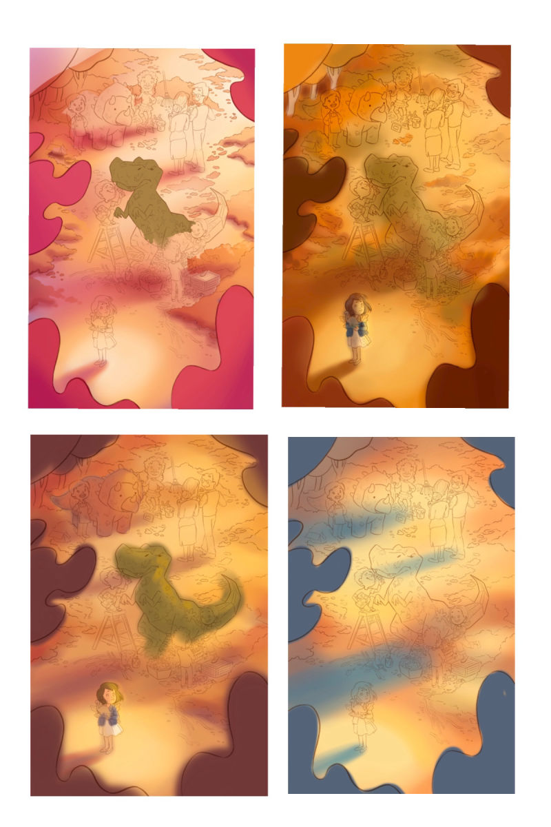
Bad news everybody. I won’t be going through with this piece for now. Just this month, i tried my best to color it but it was just too hard. Below are my failed color comps. I just could not decide on which one to use or if they were even good enough. There was just so much things going on. it was very overwhelming for me.
-
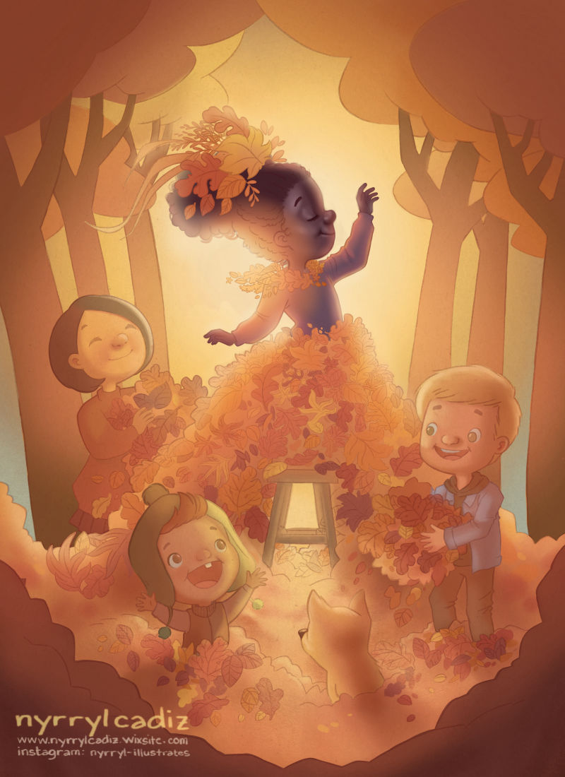
There’s actually something good coming from this ordeal though. Even though i won’t be entering this piece in this month’s contest, i was detemined to have an entry. That’s why i scraped whatever time i have and created the illustration below. It kinda looks like my previous piece with the colors and composition and all but i was pressed for time and i guess it was my go to formula. I’m afraid it looks too generic and boring though. I would really love to know your thoughts. Thank you so much everybody. Again, if there’s any fault in the illustration please let me know. I would really appreciate it. Thank you so much!
-
I think that's a lovely piece
 Good job!
I do hope that even if the contest is over, you will attempt to color your original piece again, at your own rhythm! It was a wonderful drawing (my personal favorite of the fall competition!), and I think all your color compositions looked very nice! I especially liked 1 and 3. I can see how it would feel overwhelming to color, especially with a tight deadline, but the fact that it was difficult means there's an opportunity here for you to level up! Whatever you decide, best of luck and your art is wonderful
-
@nessillustration hi! Thank you so much for the support. The experience was very eye opening. I really overestimated my capabilities. Yes, I am still planning on finishing it but this time i won’t rush it(even if it takes months lol). I really need to study how to make the piece work and how to focus the attention on the main character. There’s just so much going on. Too much characters. Too much lighting. It’s a nightmare! Lol. I will really need to level up my skills and art knowledge on this one. Again, thanks. I was really anxious on admitting defeat on the forum but your comment really puts me at ease. Thank you.
-
@nyrrylcadiz I don't think this looks "generic and boring" AT ALL! I really like it! I love pieces that capture the glowing, golden light of autumn, which you've done. The concept is charming! I guess I would like to see the colors pushed a bit more--(which maybe you're planning to do anyway). Anyway, I love this
-
@eli hi, Eli! I was really hoping to end it as such but just in case i change my mind, which colors would you suggest i tweak a little bit more? It’s at these stages that I really don’t know where to work on more. Thank you so much.