Society of Visual Storytelling

    SVSLearn Forums

    • Register
    • Login
    • Search
    • Recent
    • Tags
    • Popular
    • Users
    • Groups
    • Search

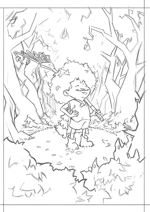
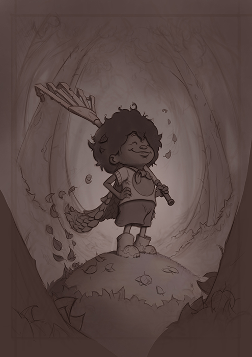
    Fall - WIP (The battle of leaves)

    Artwork
    16
    27
    3075
    Loading More Posts
    • Oldest to Newest
    • Newest to Oldest
    • Most Votes
    Reply
    • Reply as topic
    Log in to reply
    This topic has been deleted. Only users with topic management privileges can see it.
    • Davidingalls
      Davidingalls last edited by

      Gary, great character sketch. I love the pile of leaves as her cape. I’m not sure which composition I would drop her in but I like the idea of #3. Every superhero need to have a nemesis or two.

      1 Reply Last reply Reply Quote 0
      • Jon Anderson
        Jon Anderson SVS OG last edited by

        I like 2, 3, and 6. The values and composition feel better in those. I also like @Davidingalls suggestion about the nemesis.

        instagram.com/jonandersonillu

        1 Reply Last reply Reply Quote 1
        • Chip Valecek
          Chip Valecek SVS Team SVS OG last edited by

          Looks like the votes are all over, I like number 2 the most. It frames the character nicely.


          https://www.instagram.com/chipvalecek/
          https://www.facebook.com/cvalecek
          http://www.cshellmedia.com/

          1 Reply Last reply Reply Quote 0
          • Johanna Kim
            Johanna Kim SVS OG @Gary Wilkinson last edited by

            @gary-wilkinson Like this idea and 2 and 3 are my favorites. Really like the character sketch and 3/4 view. #2 is nice and simple, feels like a cover illustration, and you could even do it as cover, with a hand-lettered title. #3 brings in other characters, and feels more fun and active.

            http://www.johannakim.com
            http://instagram.com/johannahkim/

            1 Reply Last reply Reply Quote 0
            • Kevin Longueil
              Kevin Longueil SVS OG @Gary Wilkinson last edited by Kevin Longueil

              @gary-wilkinson 2,3, and 6 for me too - 3 with a bit of the gesture of 2 would be a great way to go - be a really nice book cover design with the space at the top. Looking forward to seeing where you go with this!

              Portfolio: kevinlongueil.com
              https://www.instagram.com/kevinlongueil/

              1 Reply Last reply Reply Quote 0
              • Gary Wilkinson
                Gary Wilkinson last edited by

                Thanks again for everyone's advice. I've decided to go with 2 (although I might look again at 3 someday in a different style)

                I've now got my linework down and have been playing around with a few color schemes. I quite like the idea of having the leaves around the mound of grass she is on and having somewhat of a dynamic light over her face with the background receeding into blue.

                1_1536657016876_thesweeperlsm.jpg 0_1536657016876_thesweeper5sm.jpg

                www.garywilkinsonart.com
                www.instagram.com/gwillustration/
                www.twitter.com/GWillustration

                1 Reply Last reply Reply Quote 5
                • ?
                  A Former User last edited by

                  Nice work, love the characters expression, she looks so proud! I think the blue background with the shapes of those trees looks a little scary or ominous and it conflicts with how happy she looks. Although from your description she was battling them so it could have been a pretty dramatic battle haha! Great job, can't wait to see it finished!

                  Gary Wilkinson 1 Reply Last reply Reply Quote 0
                  • Gary Wilkinson
                    Gary Wilkinson @Guest last edited by

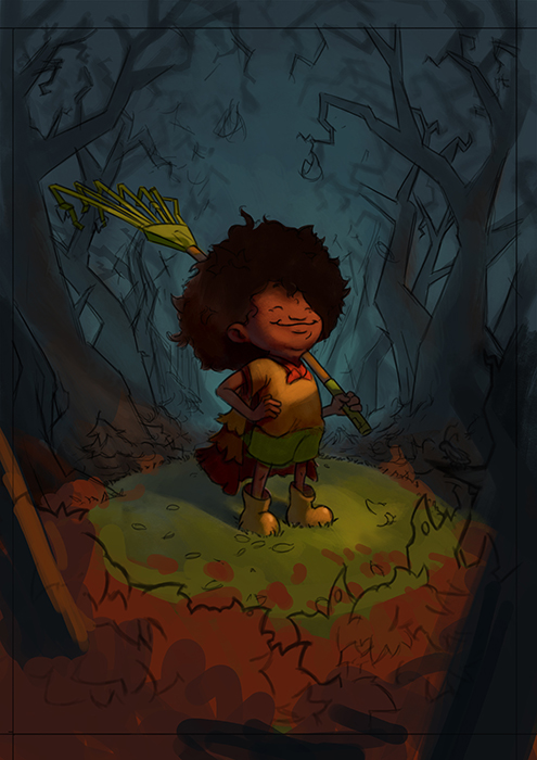
                    @shiggins180 you're right about it being too ominous and think it would fit the right scene but maybe not this one. I was rewatching Will Terry's 10 step video again recently (along with creative composition) and he really pushed the idea of getting a good sketch if things aren't working out right. I think I will go back to the sketch phase again to fix a few things

                    www.garywilkinsonart.com
                    www.instagram.com/gwillustration/
                    www.twitter.com/GWillustration

                    1 Reply Last reply Reply Quote 0
                    • Gary Wilkinson
                      Gary Wilkinson last edited by

                      I think I really want to push the superhero angle of this piece and feel it needs more heroic impact and less eeriness. Take 2:

                      0_1536736102638_Hero Sweeper1sm.jpg

                      www.garywilkinsonart.com
                      www.instagram.com/gwillustration/
                      www.twitter.com/GWillustration

                      ArtofJoseGalue 1 Reply Last reply Reply Quote 1
                      • LauraA
                        LauraA SVS OG last edited by

                        Nice improvements, and I do like your warm/cool color scheme! As I see it on my monitor, maybe push the lights a bit? The whole thing is keyed way down. But the glow looks really nice.

                        Instagram: https://www.instagram.com/lauraintorino/
                        http://lauraaldersonart.com/

                        1 Reply Last reply Reply Quote 0
                        • ArtofJoseGalue
                          ArtofJoseGalue @Gary Wilkinson last edited by

                          @gary-wilkinson The line looks pretty good. He definitely seems accomplish

                          1 Reply Last reply Reply Quote 0
                          • Eli
                            Eli last edited by

                            @Gary-Wilkinson the FACE on that kid! Adorable and proud!! Awesome.

                            1 Reply Last reply Reply Quote 0
                            • Gary Wilkinson
                              Gary Wilkinson last edited by

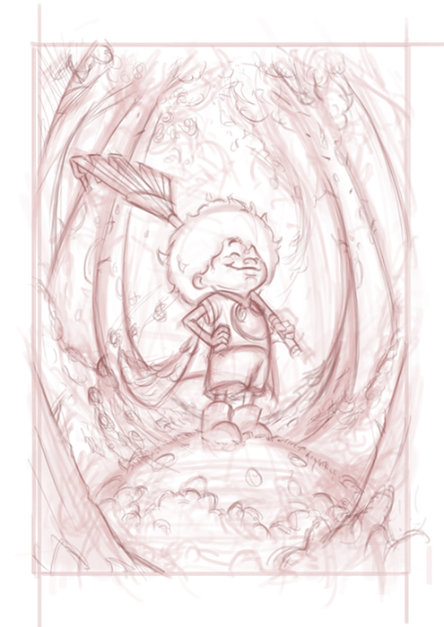
                              A few updates to the painting. I thought I would try and follow Will's process as he outlines it in the 10 steps to digital painting to see if I can get a process that is a bit more streamlined, my own process is very similar, but I feel like I jump around too much or correct issues that could have been resolved earlier.

                              Refined the linework
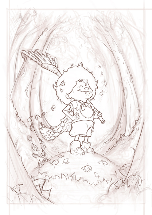
                              0_1536806959347_Hero Sweeper3sm.jpg

                              Added tone

                              0_1536806964357_Hero Sweeper3tonesm.jpg

                              Color Studies

                              0_1536806971257_Untitled-2.jpg

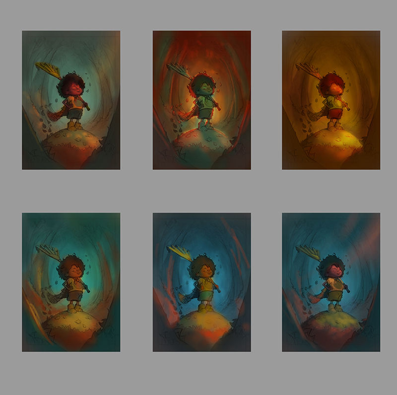
                              I think I like the middle top one with the back lighting as it's a style I haven't done much and seems to add to the heroic-ness of the character. What are your thoughts?

                              www.garywilkinsonart.com
                              www.instagram.com/gwillustration/
                              www.twitter.com/GWillustration

                              braden H ArtofJoseGalue Jon Anderson 3 Replies Last reply Reply Quote 1
                              • braden H
                                braden H @Gary Wilkinson last edited by

                                @gary-wilkinson Very nice! I think the top middle one feels very 'autumn'. It's a good choice.

                                Nyrryl  Cadiz 1 Reply Last reply Reply Quote 2
                                • Nyrryl  Cadiz
                                  Nyrryl Cadiz SVS OG @braden H last edited by

                                  @art-of-b i totally agree. That soft warm backlighting really gives off that autom vibe.

                                  Portfolio: nyrrylcadiz.com
                                  Instagram: https://www.instagram.com/nyrryl_cadiz/
                                  YouTube: https://www.youtube.com/channel/UCbJCF1Im8ZO7hpGWTKOJMuA

                                  1 Reply Last reply Reply Quote 1
                                  • Gary Wilkinson
                                    Gary Wilkinson last edited by

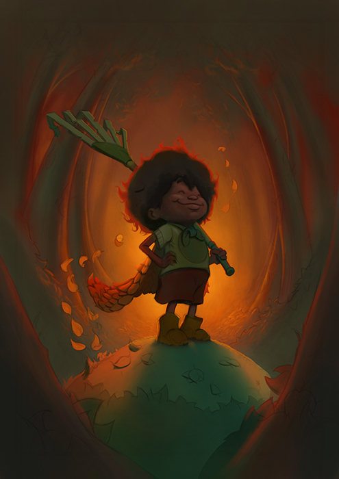
                                    Slowly getting there, trying to decide on the best way to lighten up the front face of the character, along with a few other bits and pieces. I want the character to be of a dark skin, but finding it tough to balance the colors hitting her from the front as she ends up looking too green. Any advice is appreciated

                                    0_1536825197874_Hero Sweeper6sm.jpg

                                    www.garywilkinsonart.com
                                    www.instagram.com/gwillustration/
                                    www.twitter.com/GWillustration

                                    PoppyK 2 Replies Last reply Reply Quote 4
                                    • ArtofJoseGalue
                                      ArtofJoseGalue @Gary Wilkinson last edited by

                                      This post is deleted!
                                      1 Reply Last reply Reply Quote 0
                                      • PoppyK
                                        PoppyK @Gary Wilkinson last edited by

                                        @gary-wilkinson yesss I love the latest version! You’re really sending big fall vibes! The lighting is gorgeous. I only have one tiny suggestion- maybe a little weight underfoot, on the pile of leaves, to stop it looking like a hill and more of a pile of leaves. Does that make sense? Can’t wait to see it all finished!

                                        www.instagram.com/poppytshayakay
                                        www.facebook.com/inkypops

                                        1 Reply Last reply Reply Quote 0
                                        • PoppyK
                                          PoppyK @Gary Wilkinson last edited by

                                          @gary-wilkinson argh ignore me! I just realised it IS a hill not a pile of leaves 🤦‍♀️ Sorry! 😁

                                          www.instagram.com/poppytshayakay
                                          www.facebook.com/inkypops

                                          1 Reply Last reply Reply Quote 0
                                          • Jon Anderson
                                            Jon Anderson SVS OG @Gary Wilkinson last edited by

                                            @gary-wilkinson Awesome! I also like the middle top best.

                                            instagram.com/jonandersonillu

                                            1 Reply Last reply Reply Quote 0
                                            • First post
                                              Last post