Portfolio Critique - World Traveler
-
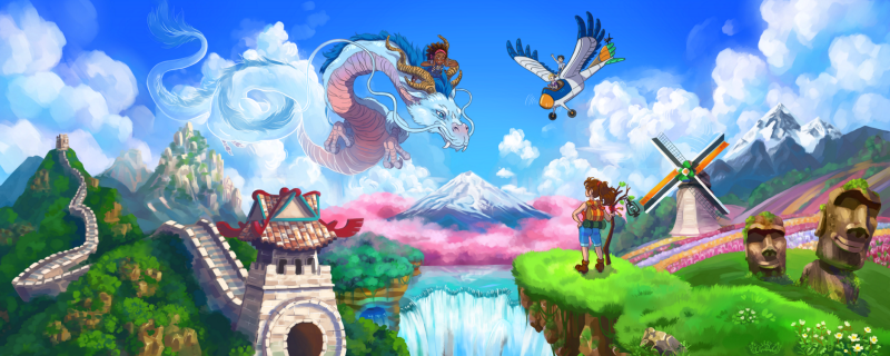
Hey everyone! Remember the April Contest? - yeah... so around 50 hours later here it is! lol. I would love to hear critiques on this, if you're so kind. I focused mainly on composition, so I'm curious how that aspect is perceived. The major issues I can see are perspective (especially scale) and lighting (oh man it's all over the place), but I really did try hard on the composition.
I'm so sick of looking at this one- I'm glad I can now move on to something simpler lol.
This is such a helpful community, I do hope I can hear your thoughts on this one!
") Feel free to shred it to pieces- I can take it!
Feel free to shred it to pieces- I can take it! 
-
@lady-chamomile Great colors. The only thing that sticks out to me is the plane/bird thing on the top right. It seems to be out of place. The painting has more of a painterly feel to it, but this element does not. It could be the yellow of the nose I am drawn to, but my eyes want to keep going back to it. I hope that helps.
-
I agree with Chip. Everything works great for me. I think your perspective, scale, and lighting are spot on. But as Chip pointed out the little bird plane although rendered well just dose not fit for me. I think the painting would be better served without it. Then you would have a spot for your eye to breath and also allow the dragon to make the connection between the cultures.
-
First, this is a super fun illustration. Vivid colors. Fun characters. And a cool idea.
I can understand what @Chip-Valecek and @Davidingalls are mentioning. I like the winged plane, but I think the stroke or outline is causing the problem.
The character on the hill is standing on the grass, really connecting her to the environment. The other characters riding the dragon, which is blending and becoming part of that painterly background. Perhaps there is some way to connect the winged plane with that environment/background.
Just my thoughts. Anyway, great piece!
-
I really like it! Your colors look great and the foreground and background work well. The two things that stand out to me is the whole image is very centered, everything meets right in the middle. The other thing is the heads on the right for some reason stand out to me first. I think it is the contrast of them or the more painterly style than the windmill right behind it?
I am currently working on a large image too. I know it is hard and a lot of work. Your's is inspiring.
-
I think you have done a great job on this piece, but I think it could benefit from a bit more consistency and a less clutter. There is so much going on in the painting and it feels like you have tried to add too much at the expense of the story telling and the consistency. I second what others mentioned about removing the plane as this will help the composition and the story telling element of east meets west (?)..
One thing I am a little concerned about if you considering this image fan art or not. To me it feels like Ghibli fan art, which is fine if that is the intent, but the slight changes to the plane in "The Wind Rises" and the Dragon in "Spirited Away" make it seem as though you are making them as your own design. The characters also look very familiar, but i'm not sure where I remember them from.
I think the portrait you painted before had a great distinctive style to it, however the anime work feel a lot less part of your own style. Have you thought about mixing the two together?
-
Really pretty piece! The thing that stands out right away to me, though, is that my eye doesn't know where to rest (there's not a clear focal point/hierarchy). The three characters are all about the same size, brightness, color, etc- would it make sense to make the dragon & rider either larger or brighter than the rest of the piece? That's the part that's the most interesting (to me). But well done in general!
-
This piece has so many lovely elements. I just love the dragon how you use transparency and the line work shifts from dark colors to light its really cool. There is great connection between the girl with the backpack and the dragon too however I agree that the winged plane feels off. it seems like a bit more of a distraction. I think the way you treated the line work on the dragon is so different than the plane, it could work to remove the plane but you could also play around with different line work and that might help the plane make more sense with its surroundings. but yeah I'm obsessed with the dragon
so awesome!! -
This is really, really pretty!
I think what stands out the most to me is that.. everything stands out! With your colors, lighting and composition, you're bringing attention to almost everything on this picture instead of focusing on one or two... I would suggest deciding beforehand what is important for the story, and make the rest less "appealing" so to speak, with less contrast, less flashy colors on those elements, etc. In this piece for example, maybe I'd remove plane bird altogether and use softer colors with less contrasts on the little temple, windmill, pink flowers and the Easter island statues.But in terms of style and rendering, this looks so good! That dragon, dang! You got some skill there lady!
-
@lady-chamomile
Your art is fantastic.If it were mine, I'm a little bother by the size of the plane and the composition is too center for my taste in this case. I love center compositions but in this case, if the art were mine, the direction I'll take from here would be something like this:
But these are things that can be a matter of taste, you know? Your work is great. I love it!
-
I'm not sure if this is a Ghibli inspired fan art type piece? If your intent was to make fan art than I think it is really good. Otherwise, honestly, I'm really bothered by how much is derived from Studio Ghibli. Anyone familiar with the films will know; down to Ursula the artist from Kiki's Delivery Service, to Haku from Spirited Away. The skill and painting itself is really nice and reminds me of old school 8-bit games with the saturated colors. I guess for me, it comes down to whether fan art should be put in a portfolio, because I wouldn't say that this is original. Your landscape painting is really beautiful though.
-
Thank you everyone for your very helpful input! This is such a great community. I'll be working on some changes soon I hope.
@Gary-Wilkinson @Sarahmaeliz Oh! I'm sorry, when I posted this image on instagram I labeled it as Studio Ghibli fanart; I forgot to do so here too. I originally wanted it just to be Studio Ghibli styled but I left the characters to the end and honestly ran out of steam (I think this took me about 50 hrs or more and I'm not used to that long of a workload lol). I should have spent time doing some character designs separately; working on character designs on the fly didn't produce good results. I ended up just modifying existing characters. The obvious ones are Ursula, the Haku-like dragon, and imaginary plane. Jiji is there too lol, but very small. The other characters are mine. At the very least this has taught me about better workflow. If I place this in a portfolio I'd label it as fanart and as a demonstration of my painting style, not my character design. Thanks for pointing that out! And for the feedback
@Chip-Valecek @Davidingalls @Justin-Moss @CaroStoltz @kerilynnwilson Okay I think I see what you mean... I guess it is a bit cluttered huh? Maybe I'll try a plane less version and then one with a modified plane
@Mandy-Forte OMG I feel for you! I didn't know how hard it is to make a piece with so many parts! Can't wait to see yours, please tag me!! And thanks for the feedback, I'll work it out and see
@NessIllustration I need a composition class... and a value class... and many more things lol. Yeah I see what you mean... I'm not sure how to fix it but I'll try a few things. Thanks for the feedback! As for the style it's heavily inspired by Studio Ghibli (see my first paragraph lol), as for the rendering, have you tried GDQuest's brushes? I mostly used his painterly brush- I love that one! (oh, I just looked it up and they are Krita brushes, I don't know if they work with Photoshop)
@Zombie-Rhythm oh cool! Those are interesting changes, I'll have to try them out! Thanks again
Yeah I need a composition class lol