Harry Potter - WIP
-
@nessillustration Just chiming in on the comment from @CaroStoltz . What if you make the kids in the background in one flat plane instead of scattering their tables in perspective? That would flatten your design I think and you can leave the foreground characters (including Flitwick) in one plane.
-
@nasvikdraws That's an interesting idea I hadn't thought of! Before you commented, I went for making Flitwick just a bit smaller. I'd like to see what you guys think of it now, before I consider other options...
I also redrew Flitwick's face and made my color test! Thoughts?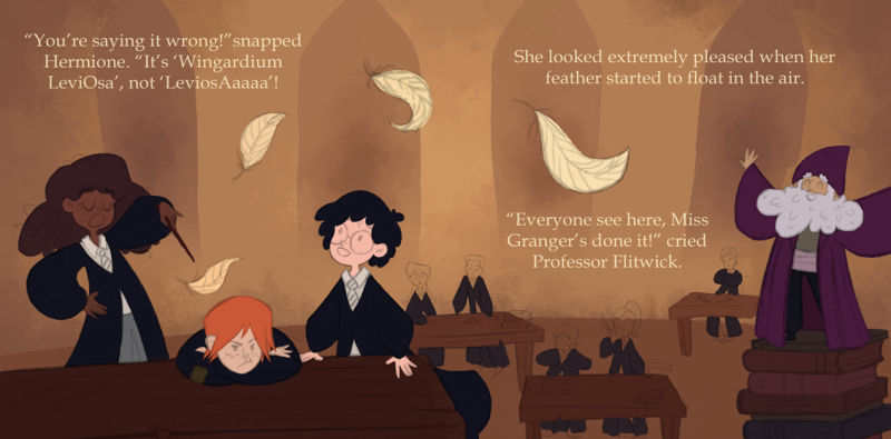
-
@nessillustration Color choices & treatment are really nice- it still feels like the placement of the table is off (to me). It's not on the same plane as the back tables, it reads like it's up on a platform or something. But, that's pretty nit-picky! It's a very nice piece.
-
@CaroStoltz I see what you mean, but in this instance, oddly, I kind of like that! I come from traditional animation and mobile games, I had very technical and strict perspective classes - multiple - where I learned to draw realistic environments, and while that was irreplaceable knowledge it made my backgrounds a little stiff to my taste, because what I admire is the children's book style where things are a little wacky, and I'm only just starting to be able to break the rules and prioritize design over perspective. I like that the trio is made more prominent by the placement of the table even if my brain is still trying to tell me that's not right!
-
Just chiming in here, but I personally think the perspective works. It suits the playfulness of your style. It does look like they are on a platform, but I think that's ok. It definitely adds interest to the composition and it helps that it's a magical school set in a castle, and my mind jumps to the conclusion that there might be different levels in the same room.
Website: www.tessawrathall.com
Instagram: www.instagram.com/tessawrathall_art/
-
@tessaw
....or floating tables")
-
@nasvikdraws Lol, True true.
-
Very nice!
Sorry I'm chiming in late. This isn't a problem that NEEDS fixing it's more of a personal preference thing.
To me Professor Flitwick looks very tall. Minus the hat and beard he seems about 5 heads high or so. To make him look tiny I might redesign him so that his proportions are closer to 3-4 heads in height.
-
@art-of-b That's a good point... I'm well into coloring now, but I'll give some thought to if I should change that or not. Thanks!
-
Pheeeew, I finished rendering!
I really want to thank everyone that gave me feedback and helped me with this piece! If you see anything else that could be improved I'd love to know For now it looks like this: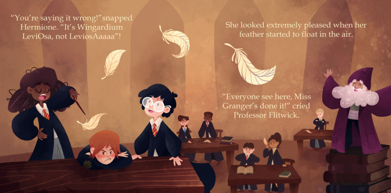
vanessastoilova.com
instagram.com/vanessa.stoilova/Check out my Youtube channel for tips on how to start your career in illustration! www.youtube.com/c/ArtBusinesswithNess
-
@nessillustration I love this! My oldest child has read all the Harry Potter books and his little brother wants me to start reading them to him and this would be a great option. I'd hope that a publisher would pick this up
The only thing I noticed that may need to be adjusted is that if you are designing for a book layout then the two characters at the table in the center are going to end up in the gutter of the book and they may end up too close to one another in a finished book.
-
@jennywilburn Thank you so much, Jenny! This would definitely be my dream project, although with all the copyrights and such it's a tremendously long shot haha...
I actually designed this page so the gutter end up exactly in the middle of the 2 students in the back (sketch in post 1 has the gutter in) but I don't know exactly how much space a gutter ends up eating up. You think this isn't enough? -
Beautiful! It's great to have you around here. Your work is so strong.
As for the gutter issue, it depends on the book. If it's a board book, it probably wouldn't be a problem at all. For some books it might look like they are pretty close together.
Website: www.tessawrathall.com
Instagram: www.instagram.com/tessawrathall_art/
-
@tessaw That's so nice of you to say, Tessa! I'm actually the one that feels like all of YOU around here have such strong work
 The discussions and feedback are very high level which is really nice and more interesting than most other forums out there!
It's really something to think about the gutter! Thank you two for bringing this up, I will keep it in mind when I finally work on my first book!
-
@nessillustration Like TessaW said, it really does depend on the book layout and binding. They can vary. I'm just super cautious about layout and would try not to have things split in the gutter, if possible. You just never know what could happen with the printer and binding. I'm still learning so much, so I am no expert in this area at all
-
@nessillustration Great. Love the finished piece.