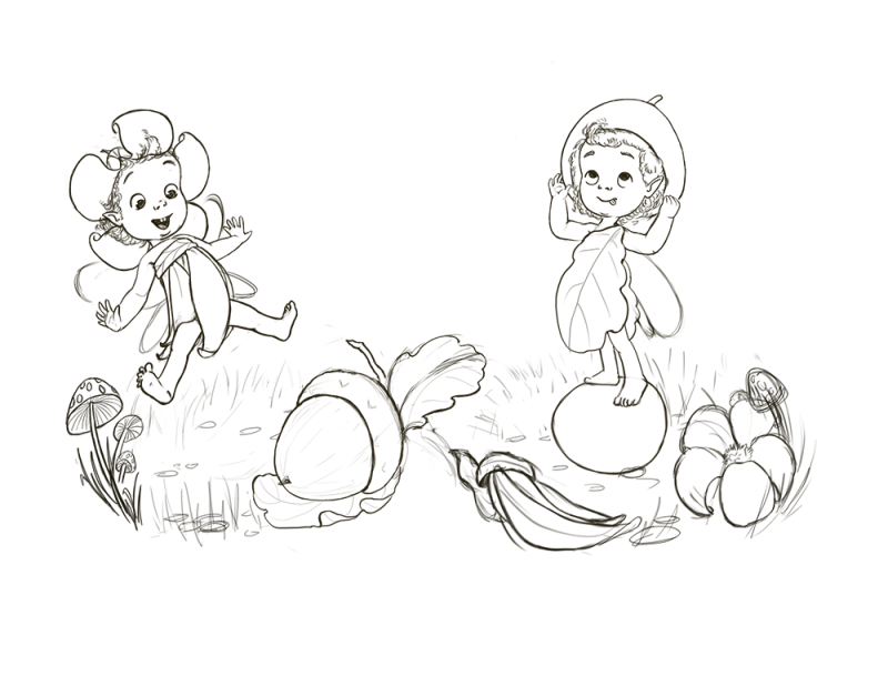
Society of Visual Storytelling

    SVSLearn Forums

    • Register
    • Login
    • Search
    • Recent
    • Tags
    • Popular
    • Users
    • Groups
    • Search

    Fall WIP

    Artwork
    17
    32
    2722
    Loading More Posts
    • Oldest to Newest
    • Newest to Oldest
    • Most Votes
    Reply
    • Reply as topic
    Log in to reply
    This topic has been deleted. Only users with topic management privileges can see it.
    • braden H
      braden H last edited by

      Very cute! I love the over-the-shoulder leaf dress.

      1 Reply Last reply Reply Quote 1
      • TessaW
        TessaW last edited by

        @LauraA Thank you! I was actually envisioning the fairy flying upward in surprise as she's seeing the acorn, instead of her landing. I tried to fix the leg. Hopefully it looks better.

        @MissMushy Thanks!

        @Art-of-B Thank you!

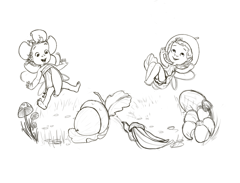
        I'm still working through the line work and have to tweak things, But I came up with a variation. . . cause, why not? Anyone have an opinion on which pose is better?

        0_1537330666923_Fashion Fairy 2.png

        0_1537330695812_Fashion Fairy 1.png

        Website: www.tessawrathall.com

        Instagram: www.instagram.com/tessawrathall_art/

        Jade V Nyrryl  Cadiz 2 Replies Last reply Reply Quote 9
        • Jade V
          Jade V @TessaW last edited by

          @tessaw So cute! I like the top one, if both are up in the air there's a matching gap on the floor. With one in the air and one on the acorn it gives it a variation

          1 Reply Last reply Reply Quote 2
          • Nyrryl  Cadiz
            Nyrryl Cadiz SVS OG last edited by

            Oh, wow! I love the wardrobe change! Very,very cute!

            Portfolio: nyrrylcadiz.com
            Instagram: https://www.instagram.com/nyrryl_cadiz/
            YouTube: https://www.youtube.com/channel/UCbJCF1Im8ZO7hpGWTKOJMuA

            1 Reply Last reply Reply Quote 1
            • Nyrryl  Cadiz
              Nyrryl Cadiz SVS OG @TessaW last edited by

              @tessaw i love the second illustration. The little fairy’s pose all curled up like that is really cute and nice to look at. However, i think you can tweak the fairy’s first, surprised pose. For me at least, i think her torso is too long. Perhaps just move her legs a bit higher to her body. Overall, i’m loving your work. I hope this helps.

              Portfolio: nyrrylcadiz.com
              Instagram: https://www.instagram.com/nyrryl_cadiz/
              YouTube: https://www.youtube.com/channel/UCbJCF1Im8ZO7hpGWTKOJMuA

              1 Reply Last reply Reply Quote 1
              • Jonas Zavacky
                Jonas Zavacky last edited by

                This is lovely! 😃 I am a huge fan of the concept of small creatures in the normal world 😃 Can't wait to see the process and result!

                1 Reply Last reply Reply Quote 1
                • chrisaakins
                  chrisaakins last edited by

                  I like the 2nd one. I like how it creates a nice curly line out of all the elements.

                  Chris Akins
                  www.chrisakinsart.com
                  www.instagram.com/chrisakinsart/

                  1 Reply Last reply Reply Quote 1
                  • ArtofAleksey
                    ArtofAleksey last edited by

                    This is like autumn fairies? I love it, discovering the acorn hat idea is super cute.

                    instagram and twitter: @artofaleksey
                    alekseyillustration.com

                    1 Reply Last reply Reply Quote 1
                    • Chip Valecek
                      Chip Valecek SVS Team SVS OG last edited by

                      I like the 2nd one as well.


                      https://www.instagram.com/chipvalecek/
                      https://www.facebook.com/cvalecek
                      http://www.cshellmedia.com/

                      1 Reply Last reply Reply Quote 1
                      • Elizabeth Rose
                        Elizabeth Rose last edited by

                        So So Cute! Can't wait to see the color version! I love the energy of the second sketch

                        https://elizabethrosehoffman.com/
                        https://www.instagram.com/elizabethrosehoffmanart/
                        https://linktr.ee/elizabethrosehoffman

                        1 Reply Last reply Reply Quote 1
                        • TessaW
                          TessaW last edited by

                          @Jade-V Good point. I decided to explore the composition a bit more after seeing your comment.

                          @nyrrylcadiz - Oof. You caught me. I have the bad habit of making torsos too long. I was consciously trying to keep it shorter for this piece, but I didn't shorten it enough! Thanks for letting me know. I tried to shorten the torso even more. Hope it's enough this time.

                          @Jonas-Zavacky Thank you Jonas. You must like The Borrowers then?!?

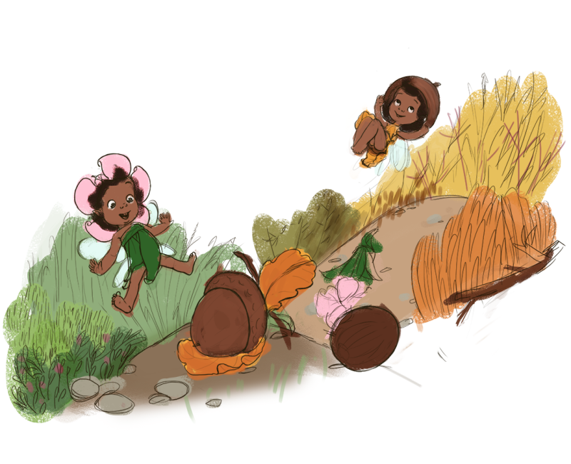
                          @chrisaakins Thank you. I was attempting to imply an infinity symbol with the foliage.

                          @swordofodin It's supposed to be a fairy in her summer wardrobe switching to her fall wardrobe and being excited about it. Fall is my favorite time as far as fashion goes. 🙂

                          @Chip-Valecek Thanks!

                          @Squirrelsize - Thank you!

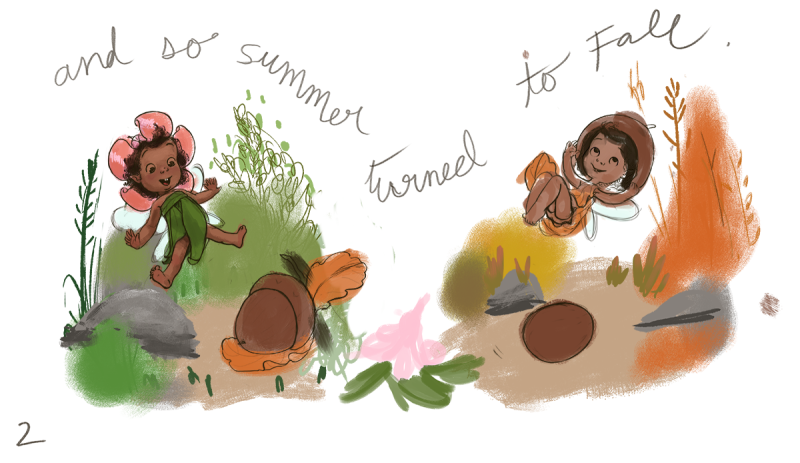
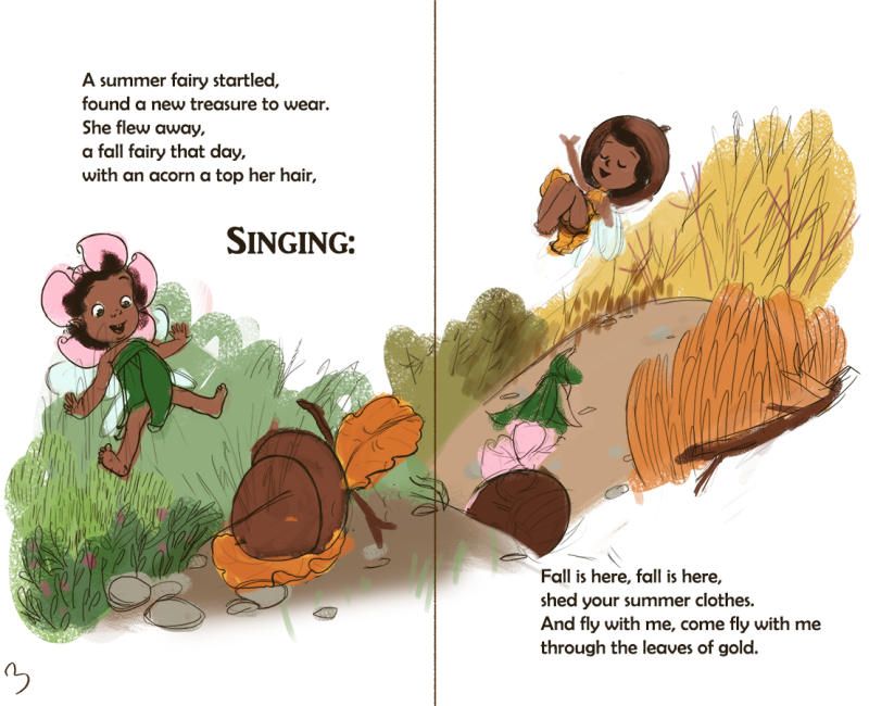
                          Welp, I'm forever changing things around mid-process. I'm still not very secure when it comes to composition or the thumbnailing process, but I'm at least getting better at them than I was before. I decided to change the composition to imply a little more action and I wanted to show that the foliage was changing from summer to fall, and this new comp gives me more room to do that. The colors are just rough flats and don't quite convey the final values. I'm pretty happy with it. Just need a couple of tweaks and I think I'll go ahead and start rendering it out. Thinking of adding a magic fairy trail to show how she's been flying.

                          0_1537486293653_Fashion Fairy copy 2.png

                          Website: www.tessawrathall.com

                          Instagram: www.instagram.com/tessawrathall_art/

                          ArtofAleksey Jonas Zavacky 2 Replies Last reply Reply Quote 1
                          • Gary Wilkinson
                            Gary Wilkinson last edited by

                            I love the concept, but I think the story reads better as 2 separate images as you originally had. Currently it feels like 2 fairies rather than a continuing story of 1.

                            How about if you have both images apart from each other but framed with spring/autumn foliage or seasonal items around edges to show the transitioning through the 2 seasons.

                            www.garywilkinsonart.com
                            www.instagram.com/gwillustration/
                            www.twitter.com/GWillustration

                            TessaW 1 Reply Last reply Reply Quote 2
                            • TessaW
                              TessaW @Gary Wilkinson last edited by

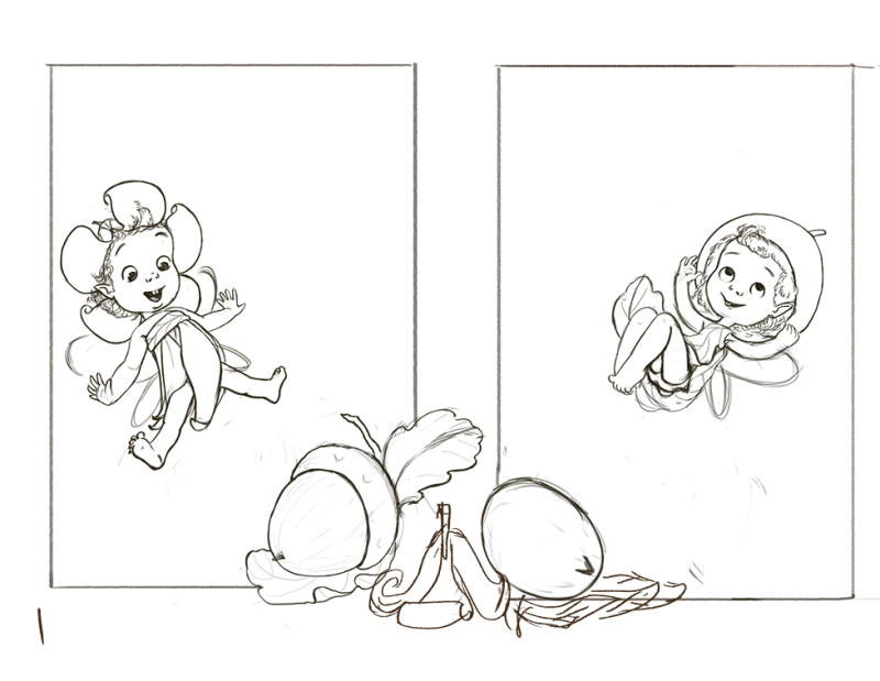
                              @gary-wilkinson Aw dang it! And I thought I had it. Lol. I'll play around with the framing of the earlier comps. Thanks for your input.

                              Website: www.tessawrathall.com

                              Instagram: www.instagram.com/tessawrathall_art/

                              Gary Wilkinson 1 Reply Last reply Reply Quote 0
                              • Gary Wilkinson
                                Gary Wilkinson @TessaW last edited by

                                @tessaw It's just my opinion and others might read it differently, if you are happy with what you have then keep with it. If text was added later to explain the story it would be a much easier read of the illustration

                                www.garywilkinsonart.com
                                www.instagram.com/gwillustration/
                                www.twitter.com/GWillustration

                                1 Reply Last reply Reply Quote 2
                                • ArtofAleksey
                                  ArtofAleksey @TessaW last edited by

                                  @tessaw Ohh i see. Sorry I didnt look close enough I distracted myself with the sequential art, and the acorn is what stood out to me.

                                  instagram and twitter: @artofaleksey
                                  alekseyillustration.com

                                  1 Reply Last reply Reply Quote 1
                                  • Jonas Zavacky
                                    Jonas Zavacky @TessaW last edited by Jonas Zavacky

                                    @tessaw Ooooh the memories! Yes! I loved the movie when I was young 😃 Oh well 😃 but i guess you talked about the book?

                                    1 Reply Last reply Reply Quote 1
                                    • TessaW
                                      TessaW last edited by

                                      @Gary-Wilkinson While I am happy with the overall look of the new comp, I want the concept to read, so I really appreciate your feedback. This forum has held my hand quite a bit as I've navigated through trying to make my own compositions, and it's always shaped up my pieces way better than I could have done on my own. So I hope my reply didn't come off as too negative, as your critique was very valuable.

                                      @swordofodin Hey, no problem. If the concept doesn't read, then I know I have more work to do. 🙂

                                      @Jonas-Zavacky No, I actually haven't read the book. I didn't know there was a book! But I guess it makes sense that it started out that way. I remember loving an old made-for-tv version of the Borrowers when I was growing up in the 80s, though I don't remember a lot about it. Then I saw the 90s version of it with my daughter about a year ago! I think studio Ghibli made a version of it, that I've been meaning to see. Which movie of the borrowers did you watch?

                                      Website: www.tessawrathall.com

                                      Instagram: www.instagram.com/tessawrathall_art/

                                      1 Reply Last reply Reply Quote 0
                                      • TessaW
                                        TessaW last edited by

                                        Forever playing around.

                                        0_1537555698474_1.png

                                        0_1537555704229_2.png

                                        0_1537555708970_3.png

                                        Website: www.tessawrathall.com

                                        Instagram: www.instagram.com/tessawrathall_art/

                                        Gary Wilkinson 1 Reply Last reply Reply Quote 3
                                        • Gary Wilkinson
                                          Gary Wilkinson @TessaW last edited by

                                          @tessaw I didn't take it negatively at all. Reading my reply in a different tone makes it seems almost defensive, but I was more concerned of pushing your piece to something you might not be happy with 🙂

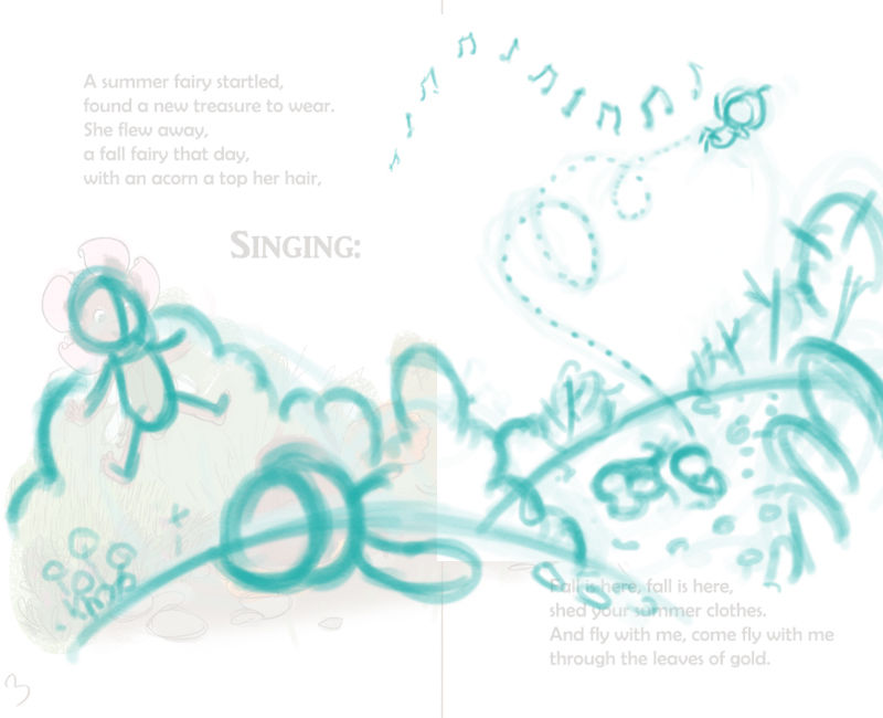
                                          I think the new version with the text fits in so much better. One thing I would suggest is to adjust the position of the flower hat on the floor and the left over acorn as they are almost at a tangent and it's feeling as though they are stacked on top of each other. Their position also creates (at least for me) an issue with the composition for that page with it being quite vertically weighted on the left side.

                                          I hope you don't mind but I did a quick draw over with how I would probably frame the scene. I minimized the size of the scene on the 2nd page to create more depth, and to try separate the character as she transitions from each season. I also tried to emphasize her ability to fly, which also gives room to hopefully give a better flow to the composition (the music notes might have been a bad idea though..)

                                          0_1537576720115_Untitled-1.jpg

                                          www.garywilkinsonart.com
                                          www.instagram.com/gwillustration/
                                          www.twitter.com/GWillustration

                                          TessaW 1 Reply Last reply Reply Quote 1
                                          • TessaW
                                            TessaW @Gary Wilkinson last edited by TessaW

                                            @gary-wilkinson said in Fall WIP:

                                            @tessaw I didn't take it negatively at all. Reading my reply in a different tone makes it seems almost defensive, but I was more concerned of pushing your piece to something you might not be happy with

                                            Ok cool ☺ Just making sure.

                                            And wow! Thanks so much for taking the time to do the draw-over. It really has improved the composition a lot!

                                            Website: www.tessawrathall.com

                                            Instagram: www.instagram.com/tessawrathall_art/

                                            1 Reply Last reply Reply Quote 0
                                            • First post
                                              Last post