Hand Drawings Critique Requested Part 5
-
Like others have said I would forget shading right now and focus on shapes. I would also use pictures to start instead of your own hands as it's a more stable image and easier to translate onto paper to start. I'd also suggest starting with simple hand poses and nail the anatomy - in your sketches I see complicated hand poses that would be difficult to get even for a seasoned pro, but you're still learning basic proportions. There's nothing wrong with starting simple and moving your way up
") Drawing a single finger was a great idea to narrow your focus, for instance! As for the drawing themselves, I see you tend to over exaggerate the "bulbousness" of each phalange, which can very easily make fingers look like sausages. You also over exaggerate lines on the hand and fingers. That tends to make hands easily look old or over rendered. A good trick for that is I would suggest drawing hand silhouettes! Just the silhouette, you can even draw directly over a photo in a digital program and black out the silhouette. Notice which parts blend into each other, and it can teach you not to draw every singly part of the hand as separate. It is after all, coming all together to form one hand, a total.
Drawing a single finger was a great idea to narrow your focus, for instance! As for the drawing themselves, I see you tend to over exaggerate the "bulbousness" of each phalange, which can very easily make fingers look like sausages. You also over exaggerate lines on the hand and fingers. That tends to make hands easily look old or over rendered. A good trick for that is I would suggest drawing hand silhouettes! Just the silhouette, you can even draw directly over a photo in a digital program and black out the silhouette. Notice which parts blend into each other, and it can teach you not to draw every singly part of the hand as separate. It is after all, coming all together to form one hand, a total. -
@jonas-zavacky Thanks so much for linking the videos! I'll be sure to check them out and work on my anatomy and perspective. Thank you!
-
@kaitlinmakes I'll be sure to check out Proko and work hard at anatomy. Thank you for your support!
-
@nessillustration Haha, I really need to work on my anatomy and simplifying things. What do you mean by I over exaggerate lines? Disproportionate or anatomically incorrect, perhaps? I'll definitely try out drawing the silhouette first. Thanks a lot!
-
@orion-tian I meant mostly that the lines are very thick and dark! When it comes to drawing lines on faces or hands, less is more because it looks very wrinkly very fast!
-
@nessillustration Ok, got it! Thanks for telling me!
-
People have already given great critiques and I will just jump in and reiterate a couple of points already mentioned to point out a specific issue.
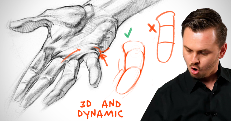
You seem to be trying to visualize the fingers as cubes and cylinders. That's great! But in most cases you are drawing you finger creases at the joints very straight and very dark. That flattens out any under-structure you are learning. The finger joints in 41 are fairly successful in using line to help describe the fingers as 3d forms, but then you lose that quality in 42 and 48.
Here's a visual from Proko to think about.
-
@tessaw I see what you mean, I'll be sure to work on that! Sorry I didn't see this sooner. :face_with_cold_sweat:
-
 Oh one more thing- you seem to be depicting fingers (44, 49) with hyper mobility:
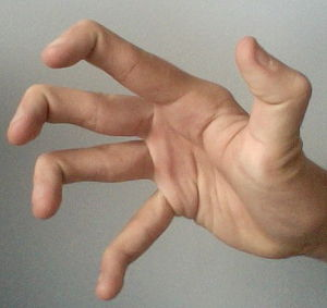
Is this your intention? For the average person, bending the joint closest to the fingertips, while keeping the rest straight is pretty impossible. Not that there's anything wrong with depicting them this way, as long as you are aware that it's not exactly an average natural pose. Are you using reference?
-
@tessaw I am aware that that is something an average person can't do. Since I'm not using reference and working on simplifying the hand, I thought it would be fun to draw it this way but also simpler since you only adjust one part of the finger. Thanks for pointing it out!