Society of Visual Storytelling

    SVSLearn Forums

    • Register
    • Login
    • Search
    • Recent
    • Tags
    • Popular
    • Users
    • Groups
    • Search

    October Prompt WIP

    Artwork
    8
    20
    1570
    Loading More Posts
    • Oldest to Newest
    • Newest to Oldest
    • Most Votes
    Reply
    • Reply as topic
    Log in to reply
    This topic has been deleted. Only users with topic management privileges can see it.
    • TwiggyT
      TwiggyT last edited by

      Hi all,

      I've done some sketches for this month's prompt "Misunderstood Monsters." Which do you think is strongest? And what do you think needs improved?

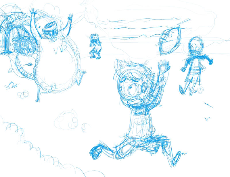
      Here's the first one:
      0_1539201233077_sheepsquatch catch .jpg

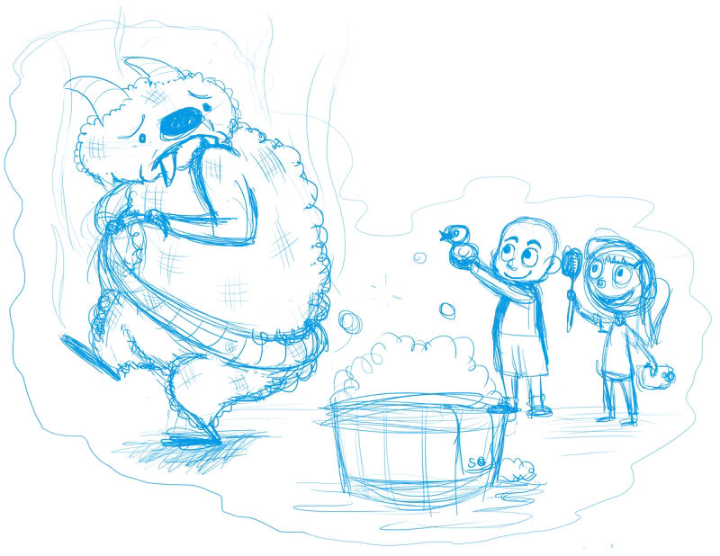
      And here's the second one:
      0_1539201265355_sheepsquatch bath1.jpg

      http://twiggyt.com
      Instagram: www.instagram.com/twiggyt_art/
      Twitter: @twiggyt_art

      Chip Valecek 1 Reply Last reply Reply Quote 0
      • rcartwright
        rcartwright last edited by

        I like 1 mostly because the concept seems reversed in 2 but I also think one has some good action

        https://www.scbwi.org/members/richard-cartwright/
        https://www.instagram.com/richardwcartwright/
        https://www.pinterest.ca/richcartwright3/art-of-richard-cartwright/
        https://www.richardwcartwright.ca/

        1 Reply Last reply Reply Quote 1
        • Chip Valecek
          Chip Valecek SVS Team SVS OG @TwiggyT last edited by

          @twiggyt I have to agree with @rcartwright with the first one. The message is more clear that he is misunderstood.


          https://www.instagram.com/chipvalecek/
          https://www.facebook.com/cvalecek
          http://www.cshellmedia.com/

          1 Reply Last reply Reply Quote 1
          • Ailantan
            Ailantan last edited by

            Yeah, nr#1 I also understand right away.

            https://www.instagram.com/ailantanart/

            1 Reply Last reply Reply Quote 1
            • TwiggyT
              TwiggyT last edited by

              Thanks @Chip-Valecek @Ailantan @rcartwright That's what I was thinking, but it's good to hear it from other people.

              http://twiggyt.com
              Instagram: www.instagram.com/twiggyt_art/
              Twitter: @twiggyt_art

              1 Reply Last reply Reply Quote 0
              • TwiggyT
                TwiggyT last edited by TwiggyT

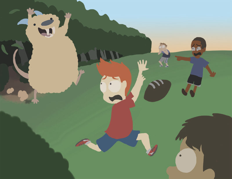
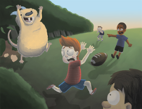
                Playing with some color. I did have it as daylight, but I decided to change it to sunset to up the spooky factor a little. I need to dim the kid in red down some and add shadows so that the monster is the focal point. I tweaked the composition some, too.

                0_1539297573111_sheepsquatch-catch2.jpg

                http://twiggyt.com
                Instagram: www.instagram.com/twiggyt_art/
                Twitter: @twiggyt_art

                1 Reply Last reply Reply Quote 0
                • KathrynAdebayo
                  KathrynAdebayo last edited by

                  I think your concept is excellent. The monster looks so pure-hearted! I know you're just blocking in colors right now, but it might help the readability of your piece to separate the arms of the boy in red and give each a clear silhouette. Looking forward to seeing the progression of this illustration!

                  1 Reply Last reply Reply Quote 0
                  • TwiggyT
                    TwiggyT last edited by

                    Great idea, @KathrynAdebayo ! Thank you!

                    http://twiggyt.com
                    Instagram: www.instagram.com/twiggyt_art/
                    Twitter: @twiggyt_art

                    1 Reply Last reply Reply Quote 0
                    • TwiggyT
                      TwiggyT last edited by

                      It's gettin' a little woolly here.

                      0_1539380765267_sheepsquatch-catch2.jpg

                      http://twiggyt.com
                      Instagram: www.instagram.com/twiggyt_art/
                      Twitter: @twiggyt_art

                      1 Reply Last reply Reply Quote 4
                      • braden H
                        braden H last edited by

                        That expression on the monster is just perfect. Kinda reminds of of a monstrous hamster 🙂

                        TwiggyT 1 Reply Last reply Reply Quote 2
                        • TwiggyT
                          TwiggyT @braden H last edited by

                          @art-of-b Thank you! I kind of like the idea of monstrous hamster, ha ha.

                          http://twiggyt.com
                          Instagram: www.instagram.com/twiggyt_art/
                          Twitter: @twiggyt_art

                          1 Reply Last reply Reply Quote 0
                          • ?
                            A Former User last edited by

                            I love your monster, especially his teeth hehe! Plus I like how you've made him look more fuzzy & fluffy rather than slimy etc, I can definitely see how he can be portrayed as 'misunderstood' 🙂
                            Are you going to add any shadows for the monster & kids? 🙂
                            Look forward to seeing how it progresses!

                            TwiggyT 1 Reply Last reply Reply Quote 0
                            • TwiggyT
                              TwiggyT @Guest last edited by

                              @hannahmccaffery Yes! I just have to figure out how to do it properly. I took it into Photoshop the other day to add rudimentary shadows, but it did weird things when I re-opened the file in ClipStudio Paint, so I deleted the layers. After I did that I realized I could've locked layer opacity and painted over the 'shadows' and gotten the same effect that I had in Photoshop. Oh well. I'll re-add them at some point, though.

                              http://twiggyt.com
                              Instagram: www.instagram.com/twiggyt_art/
                              Twitter: @twiggyt_art

                              1 Reply Last reply Reply Quote 0
                              • TwiggyT
                                TwiggyT last edited by

                                Adding some more detail. I am not sure about the shadows.

                                0_1539725672032_sheepsquatch-catch3.jpg

                                http://twiggyt.com
                                Instagram: www.instagram.com/twiggyt_art/
                                Twitter: @twiggyt_art

                                1 Reply Last reply Reply Quote 1
                                • TwiggyT
                                  TwiggyT last edited by TwiggyT

                                  It's getting closer to finished. I'm trying to make the monster the focal point, but I don't know if I've watered down the kids too much or not.

                                  0_1540244101015_sheepsquatch-catch4.jpg

                                  http://twiggyt.com
                                  Instagram: www.instagram.com/twiggyt_art/
                                  Twitter: @twiggyt_art

                                  1 Reply Last reply Reply Quote 0
                                  • TwiggyT
                                    TwiggyT last edited by

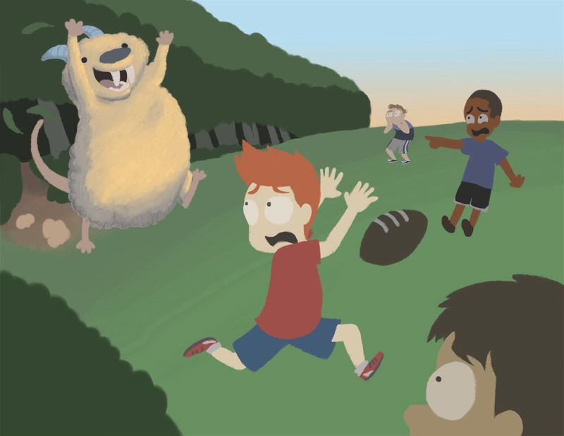
                                    I changed the composition slightly. Are the colors getting too muddy? Is the monster too bright?

                                    0_1540325325083_sheepsquatch-catch5.jpg

                                    http://twiggyt.com
                                    Instagram: www.instagram.com/twiggyt_art/
                                    Twitter: @twiggyt_art

                                    Art Dud 1 Reply Last reply Reply Quote 0
                                    • KathrynAdebayo
                                      KathrynAdebayo last edited by

                                      I love the expressions on all of your characters and the way that the colors are playing out. The monster is awesome. Also, I think the more defined plant in the most recent draft in the foreground is an improvement.

                                      I'm not an expert on this myself, but I think something that could improve your piece even more is the placement of shadows. I'd double check the monster's shadow, since it seems it is at a different angle than the shadows of the children. I'd also look at the shadow of the boy in the foreground since it looks like his knee is very near to the ground as he's running. I'd consider how the shape of the leg's shadow could stretch further out beside him to change that illusion. Finally, I'd consider the shadow of the football. One way to estimate where it would be placed is to consider how it's about "head-height" when compared to the boys. Where would the shadow of the football fall if it was the head of a body that touched the ground? Perhaps it would even be off the page. I find shadows challenging, and I am grateful for the opportunity to learn from analyzing your piece. Thanks for sharing its progression with us. I like it better each time. 🙂

                                      1 Reply Last reply Reply Quote 0
                                      • Art Dud
                                        Art Dud @TwiggyT last edited by

                                        @twiggyt

                                        I like the overall composition. As was stated the shadows/lighting could be adjusted to make it more believable. The shadow would be tightest/darkest as it emanates from the source. There is also a tangent with the monsters foot and hair. Based on the positioning, the boy running in the foreground doesn’t appear to be looking at the monster. If you place all the monster on a horizontal sliders, it’s placement would pass between the football and the boy pointing. The partial face in the foreground could add event more to the composition by showing a gasp expression (show the mouth). In addition to the shadows, the light source doesn’t seem to be believably applies to everything. Light source, top right. There perhaps needs to be more contrast on the monster and running boy to better reflect the lighting scenario. I can’t wait to see the final.

                                        www.chrisdudleyart.com
                                        @artdud
                                        Instagram: @chrisdudleyart

                                        1 Reply Last reply Reply Quote 0
                                        • TwiggyT
                                          TwiggyT last edited by

                                          @Art-Dud @KathrynAdebayo Thank you both for your input! I felt stuck and didn't know where to go. My husband suggested changing the light source to the top left, making the shadows trail the other direction, which is also something I'm considering.

                                          I find it difficult to work out perspective on the computer... no matter what program I use, I find the rulers and guides difficult, and I don't know of a single program that lets you set a focal point off the page. If anyone has any tips or has found any art programs or add-ons that help them, I'm all ears. I have Clip Studio Paint, Photoshop CS 5.5, and Autodesk Sketchbook. There's got to be a solution somewhere. 😕

                                          http://twiggyt.com
                                          Instagram: www.instagram.com/twiggyt_art/
                                          Twitter: @twiggyt_art

                                          Art Dud 1 Reply Last reply Reply Quote 0
                                          • Art Dud
                                            Art Dud @TwiggyT last edited by

                                            @twiggyt

                                            Trust me, I know the feeling. I am “newer” to illustration....we to the extent I am doing so now. I have found it helpful to workout as much as I can in advance. On projects with complex lighting scenerios, I try to work out the shadows in the 2nd or 3rd pass on my presketch. It saves me the headache of when color starts to confuse me. Ha I have done the same...acquiesce to simpler light source. 😂

                                            www.chrisdudleyart.com
                                            @artdud
                                            Instagram: @chrisdudleyart

                                            1 Reply Last reply Reply Quote 1
                                            • First post
                                              Last post