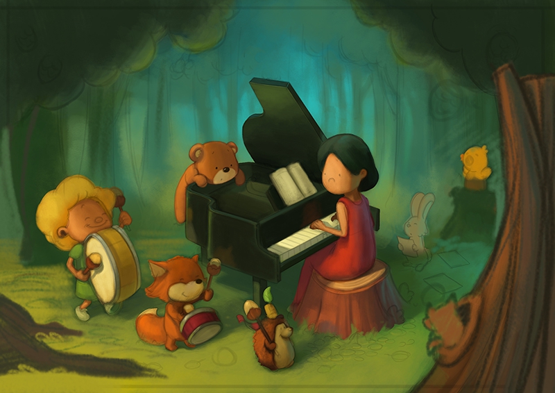
Piano WIP
-
@gary-wilkinson your character designs are really cute! The thing that stuck out to me is the piano is dab smack in the middle both vertically and horizontally. My eye get's stuck on it.
-
Did a quick paintover. Hope that wasn't presumptuous
")
The reason I painted out the branch with the little birdy was because if the tree on the right is in the foreground, then the bird would be facing away from the piano (away from action, I suppose?).
-
This is a great beginning, but I agree with @smceccarelli about the trees in the front. It feels to me like they are blocking my eyepath and trapping me in. I understand the use of them as a framing device, but it feels like a fence, not a frame right now. It kind of has a somber feeling to me for some reason and is not as light/elated feeling as some as your other work. Excited to see where this goes!
-
I wonder if you can try in inverse the light - make the ground on the front darker and the ground on the back lighter. The light at the back would contrast against the piano creating a focus spot.. Maybe, I'm not sure if it would help or not...
-
Quickie observation: I initially read the nose of the pianist as a frown, which has an entirely new meaning, but prooobably not one you're looking for. I know you mentioned that the pianist will have a full face soon, but I couldn't help pointing that one out
-
I didn't reply to this yesterday because I couldn't think of an intelligent enough critique! I love the color and light in this, but then I love the color and light in all your pieces, so you obviously know what you're doing in that regard!
Re the trees, I was thinking you could perhaps put in a bit foliage in the foreground rather than trunks? (Like the shapes of a few individual leaves.) Or it could be combined with the trunks. But it might just give you a way to add some interest and perhaps give another depth clue in addition to what you already have. Take that for what it's worth, since I still haven't analyzed it thoroughly!
-
I would like to see this without the back ground and just some of the ground around the piano to keep the characters grouped together. The small yellow bird on the edge is a bit of a distraction
-
Looks lovely but a quick note: You might have to inverse the whole picture. A grand piano is long on the left side because the low notes have longer strings.
-
@Gary-Wilkinson stunning piece! The characters and rendering of them is spot on. They are beautiful and make me want to send my kids to that studio!
If you cover those foreground trees I don’t get anything that really sticks out is incomplete or uneasy about the piece. I looked on Pinterest and found some things that may help. In the forest images the light sorce was more defined. It is clear on your figures, but it was over exaggerated light beams. Some were more suddle than others. It could help with where the figures are? Also, the upper trees could have some light breaking through the leaf clusters and maybe a branch or two separate from the leaves to allow a little light to show through. Or completely loose those and just do brush and weeds on the bottom.
I would see what other people have done to solve the forest concept. That may help.
But you are so stinking close. And if you hadn’t asked I would have said, “hit print and frame it up!” Really strong work!
-
Wow thank you for so many people taking the time to comment and give advice, it's been really helpful.
@smceccarelli - great advice and I think you picked up on all the things I was feeling uncomfortable about. The foreground trees are definitely something that I need to scrap and readjust and i'm playing with a few different ideas to achieve that now. Thank you for your help.
@hannahmccaffery - mixing in more green and blues sounds like that would definitely help. I originally had the bird on the top of the piano but I felt that it drew too much attention. I think i'm going to scrap that bird anyhow and maybe have it flying around instead.
@demotlj - yeah the symmetry isn't working so well. Sometimes things that looked good in the sketch don't seem to work when you start painting

@Art-of-B - I'll get out my axe and start chopping down some trees
 Also thank you for taking the time to do the paintover. Although the way I am going with the image doesn't follow that exactly it really helped me move forward with it!
@Kevin-Longueil - You're right the boy/girl (i'm never sure which) is too close to the edge. I'll try re position the characters to balance it out a bit better.
@juliepeelart I understand what you mean about the piano's position, but the client wanted it to be in the center of the image, so I tried to accommodate that as best as I could.
@Teju-Abiola I think the blue light is probably one of the reasons for the more sombre mood, but I hope by the end it will evoke a more happier feeling even if it isn't as light as my other pieces.
@NessIllustration the foreground and background light are a bit too even and definitely need better re balancing. I did want to add objects to that foreground plane, but it didn't work as well as I thought
@LauraA thank you for the comments Laura, and I'm pleased you like the colors
Foliage is probably a better choice than trunks. As others mentioned they are too heavy and making the image too tight in it's composition and they will be trimmed back as I try resolve the image.@rcartwright my original idea was to have it just as a simple ground plane without a background but the client wanted a surrounded by the forest type of setting. I might tone down the background a bit more before it's finished though.
@holleywilliamson great catch I didn't even think about the anatomy of the piano! Actually a lot of the time I flip an image so much I forgot which way it was originally suppose to be

@Whitney-Simms thank you Whitney. I think having some light showing through from that upper canopy is a great idea and I will explore that to see how it looks
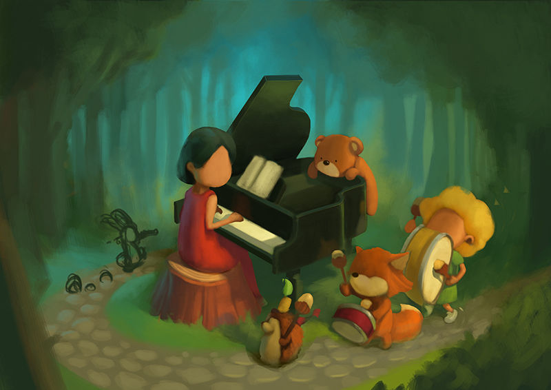
Here is where I am at the moment. I took away the foreground trees and added a path to break up the empty foreground space and will added a couple more characters (a bunny leading some bugs with his flute) as well as some fallen leaves and acorns in later stages. I feel a bit more comfortable with the painting and although it's not there yet, all of your help is helping guide it to completion
-
This looks fantastic! I absolutely love the addition of the path, it all flows so much nicer now and makes your eyes travel down the path with the characters. Also, losing the trees in the foreground really does open it all up like you say!
Love the lighting in the background, that has already added some depth to it!
Look forward to seeing the finished piece, lovely stuff -
I feel like I have gona almost as far as I can with this design and the client is happy with it, so I am calling it done
thank you for everyone's help with it!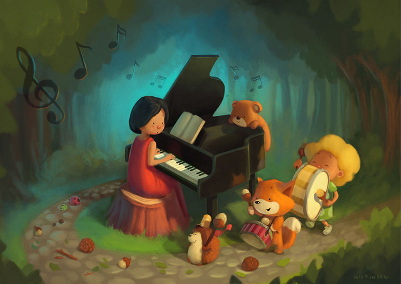
-
Hi, Gary. I believe your piano needs a stand for it’s flap. I don’t know if you’re planning to add it later but just saying. Plus with the piano open like that you will also need to show its strings. I love this piece.
-
I agree with @nyrrylcadiz about the strings especially since it’s for a piano studio but other than that it’s a lovely painting and I very much like this version over the last.
-
@gary-wilkinson it’s just perfect! Love the music notes that carry the melody around the page. I hope you can sell it as a print too! If not, that’s okay. It’s beautiful. I’m sure they are super happy to have this beauty in their studio. Totally inspiring to little musicians.
-
Hi Gary, this is another tremendous piece. Your art is really inspirational to me. I really vascilated about adding a suggestion to your thread or not because you said you were finished, but I decided to write it here with the added note, "please totally disregard if not appropriate!" It seems that your piano lid could benefit from mimicking the curved shape of the piano so that it would close properly. I find it's hard to paint simple versions of technical objects because those familiar with them notice minute details.
Thanks, as always, for sharing your process.