Working in color - grayscale with color layer?
-
Thank you @Chip-Valecek - it is always good to hear your take on things!
@Art-of-B Thank you for the feedback - it is Very good to know this is part of your process - your work is really great!
@rcartwright Thank you for the the feedback! - i will check out the resources you mention - i recall Sycra has a great video about color value too.@darian Thank you for the feedback and the question that made me think
") I have gotten out of the habit of checking my values with the cutout filter! But that was my main method Lee White mentioned it a long time ago and it seems pretty useful - i ran the image through the cutout filter with and without the color to see how it was reading - i will get back into this habit now that i am making an attempt at color
I have gotten out of the habit of checking my values with the cutout filter! But that was my main method Lee White mentioned it a long time ago and it seems pretty useful - i ran the image through the cutout filter with and without the color to see how it was reading - i will get back into this habit now that i am making an attempt at color 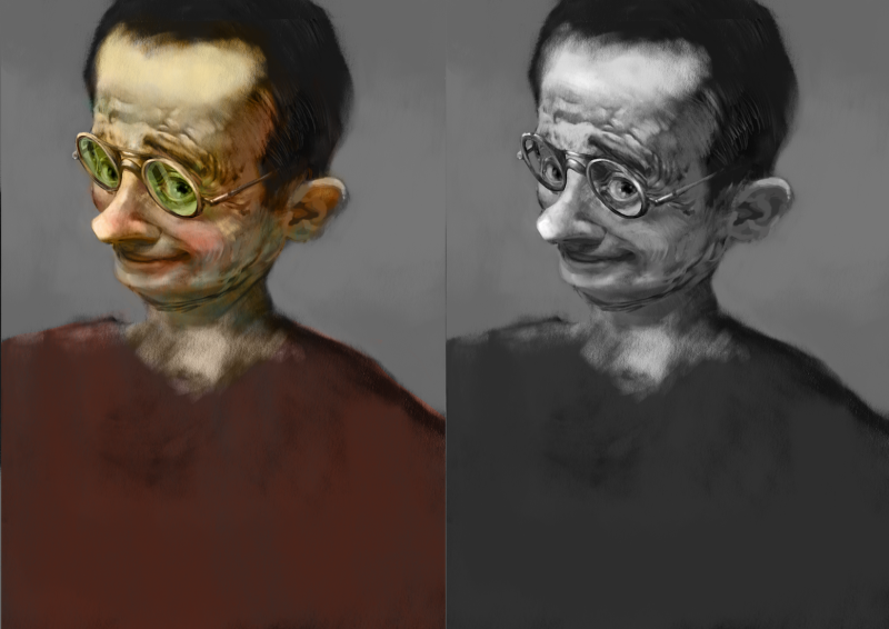
@smceccarelli Thank you for the feedback Simona! - it does look pale and chalky for sure - i think using this method as a first pass, as you say, will be the way to go. I think i will finish this piece and see where it ends up
-
Looking great!
Portfolio: nyrrylcadiz.com
Instagram: https://www.instagram.com/nyrryl_cadiz/
YouTube: https://www.youtube.com/channel/UCbJCF1Im8ZO7hpGWTKOJMuA -
@nyrrylcadiz Thank you Nyrryl!
-
Love the cutout filter method! Thank you for sharing @Kevin-Longueil
The reason I asked, is because like @smceccarelli mentioned, you can always paint over with saturated colors on top..but you might have to re-check it's grayscale again ( i tend to mess up the value structure at the paintover stage..haha).
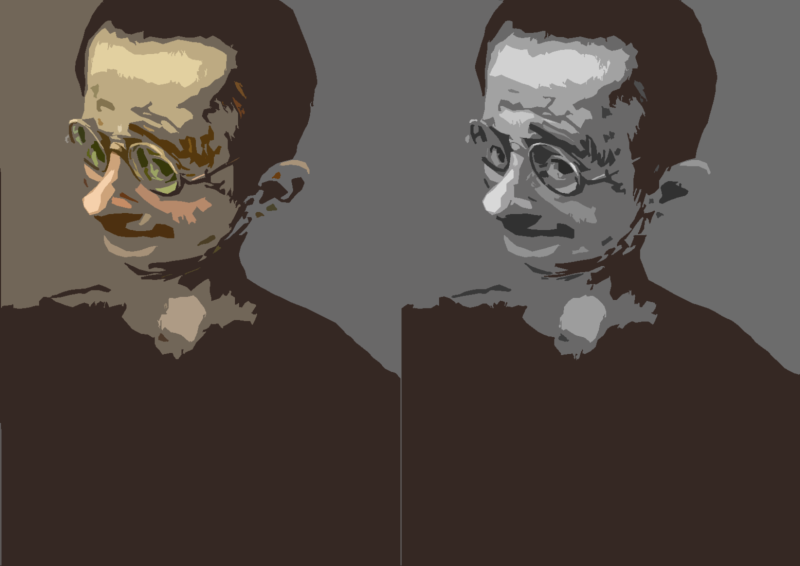
To check for values, I just save a copy of the image & convert it to grayscale mode.
-
@kevin-longueil I think it looks great! Looks like an oil painting.
-
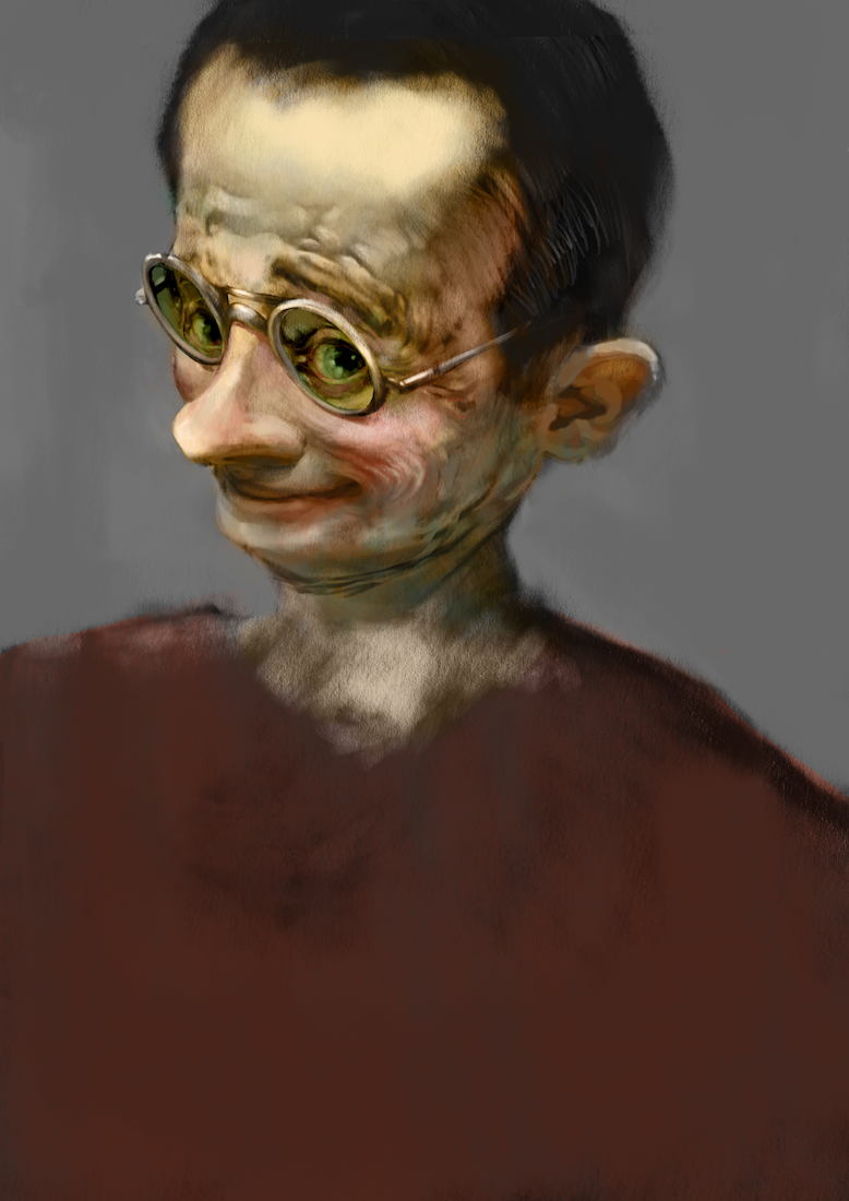
@kevin-longueil I think it looks good, the top of the head looks a bit washed out to me though it's void of any detail? I think what @smceccarelli said about using extra layers will improve this method because even oil painters don't finish with colour glazes over there grisaille under paintings... they would come along and add there thicker paint where needed to finish it off. I'm glad you've started to add colour to your work it will be exciting to see what you do.
-
I think that looks pretty good! The one part where it really looks like you used this greyscale method is the hair I think! It ends up looking very dark and black. On the forehead where it's thinning, it would look more brownish.
I think you're doing a good job with this method though! I never could use this method very well, it kind of bugs me not to have total control over the tones and I have to keep switching to get the right colors. It always ends up looking a bit grey and muddy to me in the end, I think you did a great job of avoiding that! -
@chrisaakins Thank you for the feedback Chris!
@Jason-Bowen Thank you for the feedback Jason! Very much appreciated - i'm starting to a "normal" layer as we speak - it is improving i think...i will post the minor progress below - thanks again
@NessIllustration Thank you for the feedback Vanessa!still working on it but the "normal" layer is helping for sure - thank you for your help everyone!
-
@kevin-longueil I don't feel qualified to offer much critique on this but it is looking good. I am a huge fan of greyscale images (making them AND seeing them) but I am liking your transition into color. I really like his eyes behind the green glasses--they are so lively and, like some of your other Oz characters, they have that knowing look, like the character knows a secret that you don't.
-
@eli Thank you for your feedback Eli!