Any bikers (or tattoo or decal artists)? Please tune in!
-
My wonderful husband is a biker and the name of his machine is "Black Dog". This year for his birthday I decided to design a custom decal for him and have it printed on a T-shirt...maybe other stuff, not sure yet.
This is a big change of register for me, so if anybody here on the forum is either a biker him/herself or has experience with similar types of design (T-shirts, tattoos or auto decals), please tune in!
This is the first sketch - I used a lot of Harley imagery: the only really original part is the dog skull. I plan to do some refined hatching in the line and shading work and then add some flat color...maybe, maybe leave it B&W? Would you introduce the Harley logo anywhere or better leave it out? What should I pay attention to in terms of having this printed on textile and what is the best technique to do that on a black T-shirt?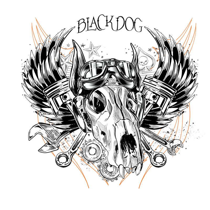
-
@smceccarelli I think it looks great. I would remove the two cogs to allow the jaws silhouette to be clearer though. I'm not a biker but I did use to have a bmx lol

-
@smceccarelli I can't offer much critique, but just wanted to tell you that I think this is awesome. He'll love it. Personally I like it in black and white, but color could be really cool also. I'd leave off the Harley logo. It doesn't need it.
-
I had to make something symilar for one TV comercial, but with a bit of humor in it, because it was for moto club "Grannies angels"
 ..... I'll try to find it to show you. Basicly - keep it as clean as it can be, especially if it's going to be printed on textile. For me, it will look better if you remove the orange tribal shapes from the back and allso the stars and the spade with the little scul on it - they are just making it too fragmented. I would add a nice shaped ribbon and to put the text on it - it would read much easyer and clearer. Maybe it can be situated well under the dog scul and the scul to overlap the ribbon and the text to be separated by the scull like BLACK .....scull ....DOG , and all the gadjets to show under the ribbon . The scull looks amazing , so you must find a way to pop it more ....So these are my suggestions to try
-
@smceccarelli No logo needed, it looks great as is. I agree with @mariana_0101 with the removal of the tribal. I would also remove the ghosted elements in the back. You don't want it to become to busy. As for printing on a black shirt, if you are going to keep it black and white, I would put a white border around the image so it stands out on the black shirt.
I have done shirts for my kids schools and when they want that worn look to them, i will add a mask on top and use a splatter brush. It will remove parts of the image so when you print it on the shirt it will give it that worn look.
-
Very nice!
I really like the linework and feathering, particularly on the wings, goggles and metallic objects behind the skull.
I agree with others that the pupper skull needs to stand out a bit more. An easy way to do this may be to reinforce the contour lines. The white border around the left edge of the skull works, and you may want to run it all the way around the skull object. Either that, or slightly thicken the black lines around the skull.
But really, it looks pretty cool. Very biker patch. I don't think it would look out of place on a leather jacket

-
@smceccarelli Wow, this is very sweet! Love it. IMHO, I think 100% black and white would be perfect. I'm not sure it really calls for color, if that makes sense.
-
You have a “sick” silhouette...don’t hid it. That will make this piece “pop” more.
Something with the text, as mentioned a ribbon or banner. Or if it could be incorporated on a design element.
Also perhaps swap out one of the wrenches so it doesn’t repeat in both sides. Perhaps a screwdriver where you can see part of the handle eminating from behind the skull.
Awesome design...and idea!
-
@smceccarelli You are amazing! What a thoughtful gift. I have no biker experience, but just from looking there is a little bit of a perspective that is off. I think it is because the googles are not centered on the skull, and the item that is in the socket on my right is lighter than the left, that is bringing the wrong one to the foreground. Maybe reverse the image and see if you can see it too?
-
@juliepeelart Spot on! I have noticed and corrected!
-
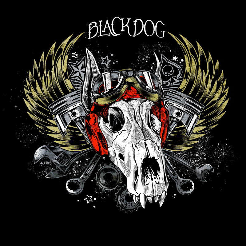
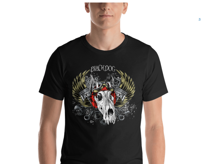
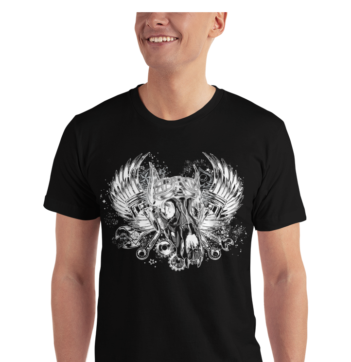
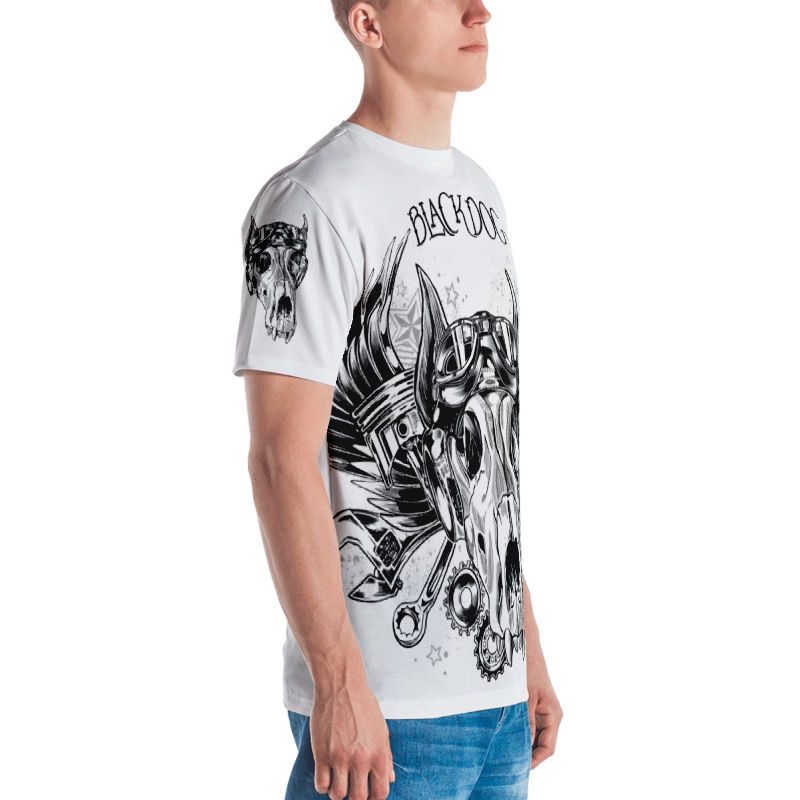
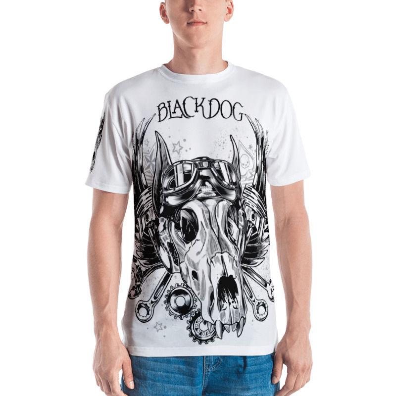
So, here is what I ended up with....I darkened all the BG elements, so that they don't interfere with the skull. I've tried to move around the text, but everywhere else seems less elegant. And I've added color. But now, which version to order? I really like the all-over print, but it seems it's only possible on white.
-
@smceccarelli The all-over print looks extra cool I think - can you do the same on a black tee with the values inverted? They are all really nice though!
-
Fun! I'm a big fan of the reversed image on the black shirt, but the larger image on the white shirt is quite striking, too. Really nice work! Looks great on the T-shirt.