WIP; feedback welcome and encouraged!
-
@nessillustration Ooh, that's a great idea about sight lines. I'll definitely adjust that.
[replying to @Eli here too] I think with anatomy, I'm of two minds. On the one hand, I completely understand what you're both saying with regard to faces/bodies reading at least low-grade masculine, and the pitch/brief was initially two women, BUT......I'm actually very comfortable with it being read as genderqueer, if the lens feels appropriate to the viewer, especially since within the illustration's narrative they should be able to pass as men. [And of course, if these two have been on ships long enough to accumulate scars, I think it also stands to reason that they should also build up some significant shoulder muscle.] I really appreciate you both bringing it up, though, because that's definitely something that should get deliberate consideration. Thank you!
All in all, I think I'm gonna do a bit of a rough pass at pushing the poses a bit more, which would incorporate more of a curved line to their stances, so that might also help knock off the very masculine straight edges. And looking this over again, I think Mx. Left there actually does have a bit more of an anvil-jaw than I meant to draw.

-
Welcome! This is very cool and I look forward to seeing more from you. You are obviously a great draftsman. I love the way you have them posed, but one thing I’m not so sure about is the right character’s hand behind the other character’s head. It’s kind of tangenty ... and a little bit distracting to me. I’m not sure if there is a better place to put it because I really like the interplay you have going between them where they have gotten crossed up in the rigging, but maybe see if there is a better option. Great work so far!
-
Hello all! I've been working on this and refining based on everyone's feedback, and I'm feeling much better about how it feels now.
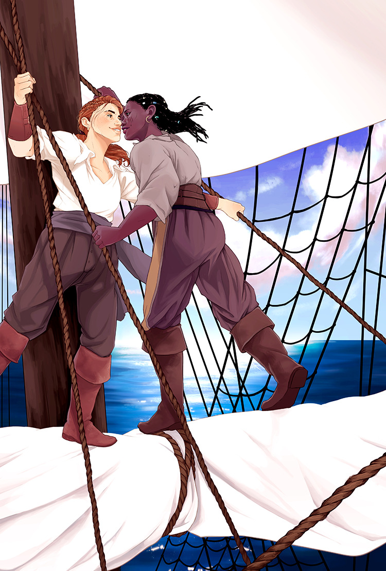
The lines are currently like so:
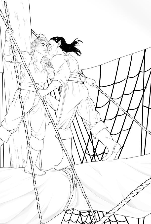
....which, in contrast to the original I posted here, changed like this:
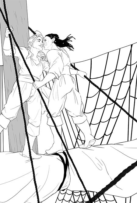
I backed off the ropes to no longer be flat and, just for work purposes here, just took out the mast shading. You can see that I mostly just shifted the posing of Mx. Right, but dang that made a big difference. I also worked on their faces to refine expression, and I think it feels a lot more....approachable now??
I've been working on both value and some color and I feel really good about how they're both playing. I would have posted the values here before I dove into color, but I did a lot of going back and forth to tweak both sides, so it really was a simultaneous development, haha.
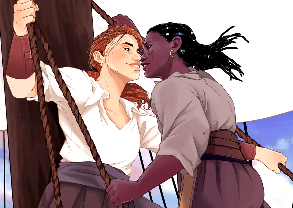
You can see the work I've done here:
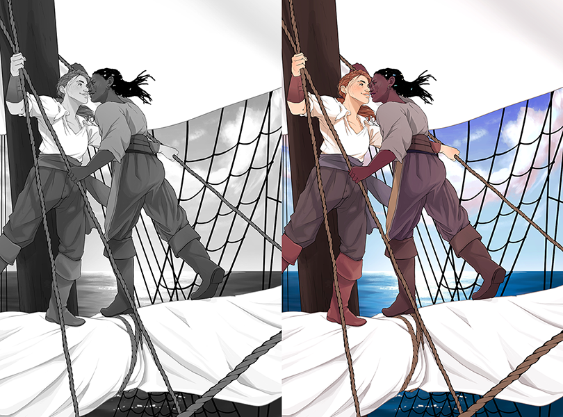
aaand here's a closer look at my color WIP:
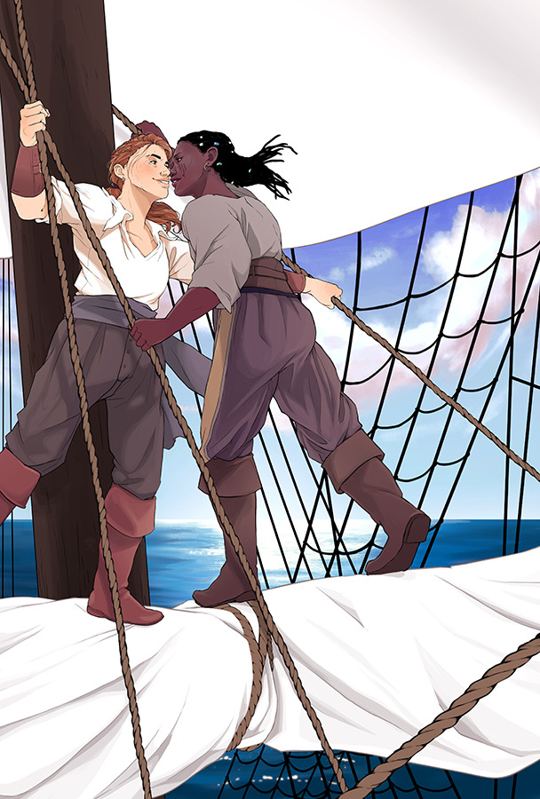
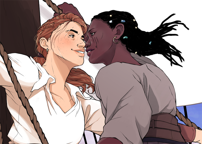
My values aren't quite there yet, and I'm working to find a middle ground between a faithful rendering of dark skin while keeping the visual literacy of the image intact. The mast is a bit of a struggle as well; I like how it's visually very heavy, since it's a bit of an anchor for all the other hard lines in the image, while my figures are very organic and curvilinear in contrast. I might bump up its values to keep it from being such a punch in the face, though. I'm also still mulling over @Kristin-Wauson's comment about Right's tangenty hand....I might shift it down (or up??) a bit, but that might make it even less readable as a detail; I think it makes for a good anchor for the physics of the pose, and the rope is there anyway, so the tangent might exist whether the hand is there or not. :|a I'm open to suggestions, though.
And of course, my colors are still in development, so that'll be deepening as I go. I am really liking the balance of vivid blues and kind of worn warm tones of my figures, so I'm hoping to keep that as well as keeping a bit of a nod to the types of colors that can survive out on the seas. (Cue me studying color keys from Pirates of the Caribbean and Black Sails.)
Thoughts still welcome! I really appreciate everyone's feedback and time.

-
@thousandwrecks this is looking great and I think now that you’ve added color, the hand looks less tangenty to me because of the dark skin color of the hand. When it was lines it looked more like an extension of the lighter skinned character’s head, but now with the value difference there is a clear delineation. Sorry if I made you focus on it too much.
 I love the color palette!
 -
This is looking awesome! I am excited to see the final.
-
@kristin-wauson oh, good!!! I'm really glad that sort of faded in priority and isn't quite as much of a snag. Thank you for bringing it up, though, because it's really important to keep it in mind!
-
@sarah-luann thank you so much! I think I'm starting to be able see the final piece taking shape!
")
-
Hello all! I'm rounding the bend on this piece and am feeling really good about it. Thank you to everyone for your feedback over the course of this loooong patient process. Any last comments totally welcome, too.
-
I love how this illustration feels transformed once you add the colors and values. Don't have any substantial critique for you sadly- this looks great to me!
-
@thousandwrecks Wow! This turned out fantastic!
-
@thousandwrecks This is looking great! It's so fun to see it from the original sketches and line drawings to the finished (near finished?) piece.
One tiny thing that jumped out at me is the clouds in the background, they feel a bit like they're being distorted by a fisheye lens in the way that they angle down along the right edge. I'm not sure if you were trying to use it as a compositional element, it just looks a little unnatural. It's really nitpicky, but that's the thing that jumps out the most.
Awesome job!