Hi! New here. Would love some critiques and to meet some of you!
-
Hi Elisabeth! Welcome to the forums
")
You have a really nice style, very cute and modern and relevant to today's industry, I think! It looks like you have a strong foundation of anatomy and perspective as well! I think you're at a point where you can start focusing less on how well you can draw things, and more about what you draw. Meaning, you can start focusing on storytelling, composition, lighting and colors to best express what you're trying to express.
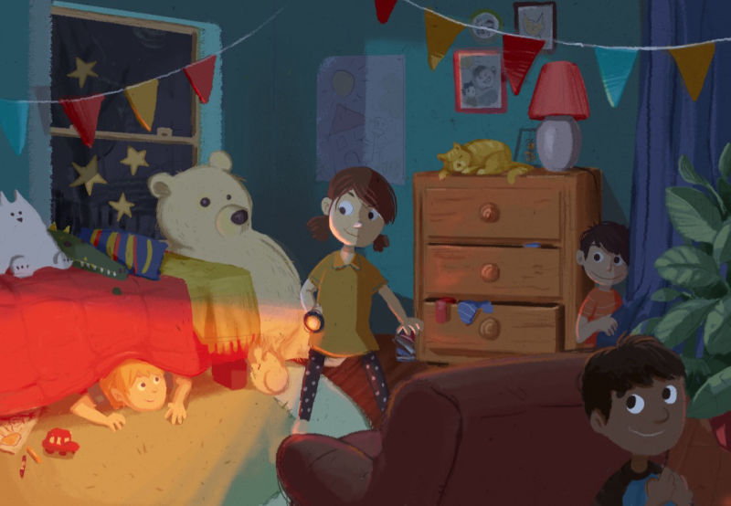
In this illustration for instance, it is very busy and there is no clear focal point. The eye kind of wanders in and out of the picture without a clear path that you decided. I'd suggest to decide what is the focal point of your picture (for instance, it could be the girl in the middle who is counting) and tweak the lighting, values and colors around that area to really put more contrast and emphasis there and make her pop. Then, reduce contrasts and popping colors in other areas of the illustration that are less important so that they don't steal the spotlight. For instance, that white stuffed toy on the bed, the stars out the window and the colorful triangles hanging from the ceiling are really eye-catching, but I'm not sure they should be! This really is a very busy image, don't be afraid to have places in your image that have less detail and that can counter-balance the areas that do have a lot of detail. Maybe put a bit more shadows on the hidden kids to blend them in a little bit more? These are some of the little things you can do to tell your story more clearly and effectively
But as I said, this is a very beautiful and attractive illustration altogether and I think you're really on to something! I wish you good continuation on your journey 
vanessastoilova.com
instagram.com/vanessa.stoilova/Check out my Youtube channel for tips on how to start your career in illustration! www.youtube.com/c/ArtBusinesswithNess
-
@nessillustration wow thank you so much! Such a good constructive critique! You’re so right about the focal point. I got too excited about drawing anfun kids room and didn’t think about my composition enough. Ugh! Now I feel like I want to re-do... but maybe I don’t have to. I should definitely change some things though. Thanks so much for getting this to my attention. And nice to meet you!
-
@elisabeth Welcome!
I won't say a bunch more because I think @NessIllustration said it nicely!
I don't think it's a matter of a redo. While composition stuff is harder to rework after your done or later in the painting, it's definitely still possible. One thing you can try is just to play around with a layer on top of everything and just make rough adjustments to values. One quick win would be to just darken everything that's in the shadow areas already. That won't do it all, but it will help, because you already have this nice triangular shape in the middle where the light is that could help focus things on the girl, who, I'm guessing is the focal point (I get this from the fact that she's in the center of the composition, and all the boys are looking at her)
Nice work though! I look forward to seeing more of your paintings!
-
@elisabeth welcome to the forums. You are only as old as you feel. So I am like a 20 something year old but really 41 LOL
-
@nessillustration Hi again! I'v changed the art some.... Would love to know what you think. Do you think this works better? I didn't start over or anything but tried to give it more of a focal point. Thoughts?
-
@elisabeth This is a really interesting direction! Your new focal point seems to be boy under the bed, who has the more light and saturation of the whole image, and it's an original focal point for this illustration rather than the central girl
My concern is that the image got so dark now! Not necessarily a bad thing, but children books are usually a bit lighter, even during night scenes.vanessastoilova.com
instagram.com/vanessa.stoilova/Check out my Youtube channel for tips on how to start your career in illustration! www.youtube.com/c/ArtBusinesswithNess
-
@nessillustration thank you for the feedback! I’ll
lighten things up! -
Welcome to SVS! I like the new direction as it seems more dynamic and as @NessIllustration said it narrows down on the focal point. I like the suggestion of lightening the image a bit. I also like how you filled the room. Nice image!
-
Ohh I like the new one, the composition works really well in this one
-
Thanks everyone!!! This forum is amazing. So useful! Learning so much already! So... following @NessIllustration 's great advice still, I brightened things up a bit and added a little more kid friendly saturation in the "dark" areas. Do you guys think this works better?