What is the one thing I can work on to improve this piece (Slow WIP)?
-
I am working on “slow” for the November art challenge. I did not manage to finish on time.
Still working-in progress. At this moment I am a bit blind to this piece.
Does the overall composition and value works?
What is the one thing I can work on to make the biggest improvement for this piece?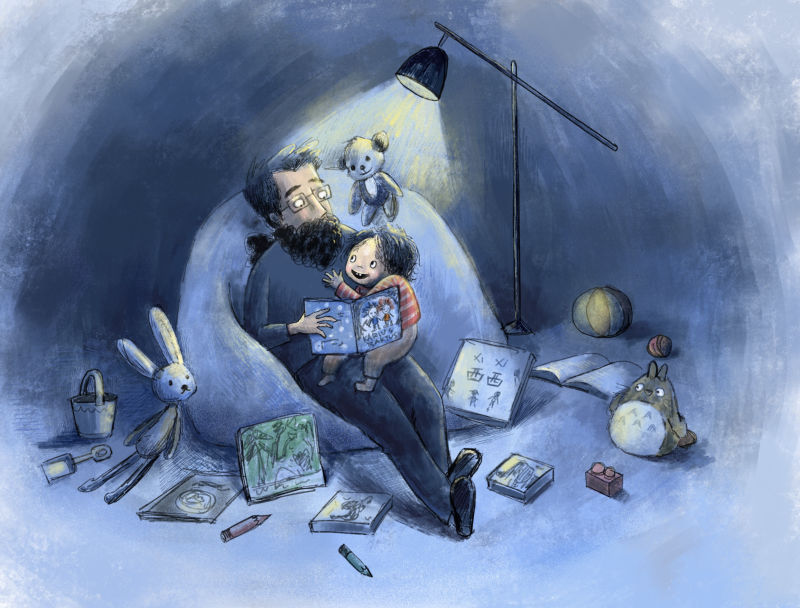
-
@xin-li To me there are too many objects on the ground so they create these small distracting islands of value. I'm also not sure what the focus is because while I assume it is the girl and man the stuffed animals see to have poses and facial expressions as if they are alive and that seems more interesting to me.
-
@xin-li
I do a lot of student critiques. And I've watched them either be super bland and politely generic or go weirdly off the rails too many times to not try and make the critique process more effective.In my experience, getting genuinely useful feedback requires more from the illustrator than "What do you think of this?" (BTW, I recognize that your original post does ask fairly specific questions). I've found that if I ask the person requesting a crit a series of probing questions I can then offer feedback that responds to the illustrator's intent, and intelligently build on what is already happening in the piece.
So I'm going to try on these boards (and your post) what I've found to be incredibly successful in my college classes. Hopefully it makes any future discussion about your piece above more productive for everyone. (And if it's just annoying that's fine too)
-
Who is this piece for? (personal project, specific client, addressing a genre, exploring a technique, developing a technical skill)
-
What is the topic/theme? (illustrating an article, a story, current event issue)
-
What are your keywords? How do you feel about the source material (The topic/theme) and/or how do you want the viewer to feel? Ideally this is limited to 2-3 words, and no longer than a single sentence.
-
What compositional choices did you make to reinforce those keywords? (and not just what is placed where, but how the vales are arranged on the page)
-
What color choices did you make to reinforce those keywords?
-
What medium choices did you make to reinforce those keywords?
-
-
@davidhohn I love these questions, I've saved them to ask myself when I work on a piece. One question about your question 3... regarding the keywords... is that something like, distilling your intent of the illustration down to a few simple words? Are these supposed to be emotional words, or ideas / themes or some combination?
Rob Gale
instagram: www.instagram.com/robgalestudio/
website: www.robgaleillustration.com -
If there’s only one thing I think you should work on more on this piece, I believe it would be you lighting. You need a stronger light source coming from your lamp. I suggest ussing a warm color to compliment your cool surroundings. Having said that bit, i also think that you should work on the shadows too given your new lighting. This are my thoughts. I hope they’re helpful.
-
@robgale Glad that you find these questions useful! I have found that the best keywords are ones that have an emotional connection, and are most often adjectives and verbs.
For example if you do a painting of a rock.
No one really cares about a rock in and of itself, it's what they associate with that rock that matters. So a painting of rock that is "steadfast" and "stable" is something a viewer can connect to. By contrast a rock that is painted to be "oppressive" and "looming" can evoke a completely different emotional connection and would therefore require entirely different choices regarding composition, color and even medium.
-
@davidhohn
Thanks for such a useful and clear list.This piece is a personal project. I try to document moments from everyday life while learning digital painting.
The mood I want to capture was dad and child enjoying a good book, treasure the time of being together, and captivated by a good story.
Composition & colour: I try to keep the viewer's attention to the child and dad by putting them under a spot light, and apply a distinct warm colour on the child. I also arrange all the toy animals looking back to the story-teller as if they are also captivated by the story.
Medium: I was not very conscious on the choice of medium to enhance the piece. The choice of working digitally, and the choice of brushes were more about trying out a style rather than enhance the subject matter.
As I wrote out my intent, I realised that this piece is not working from the sketch level. The facial expression of dad and the child is not telling the same story as I intended, and the arrange of toys seems unnatural and a bit creepy. I think I need to restart from sketching level.
-
I love David's list. It addresses most fundamental, the very first things that need to be done, which makes it more basic (in a good sense) than the usual advice.
That said, while you're re-sketching, I would eliminate some of the empty space around the main figures, because it looks like they are in a big, empty room and that feels slightly disconcerting. Also, I'd vary the size of the toys more and group some of them together.
And yes, I'd consider upping the light a bit and considering how "alive" you want the stuffed animals to look. Totoru definitely looks sentient. In fact, after the initial glance, my attention goes straight to him and wondering what on earth he's thinking about! I get your point about pointing attention to the main characters, but you also have to consider what part the toys are supposed to play in the scene.
I guess my other question would be, how is the dad able to hold that book open and where is his other hand? There's something a little ambiguous anatomically there, but I'd get the composition worked out first because everything could change.
I like the mark making (the medium) and the overall feeling of coziness that you are going for. I might go back to David's question #5 on this topic. Maybe upping the lighting would address that.
I get how hard this is! Sometimes it's hard to know how to take critique information and make useful changes without getting off track. Only you know what inspired you to start this piece the way you did in the first place. That's why I like David's advice so much. Please post updates! I like to see how the process works for other people.
-
@davidhohn Nice! thank you for the clarification, that makes total sense.