New work, looking for feedback
-
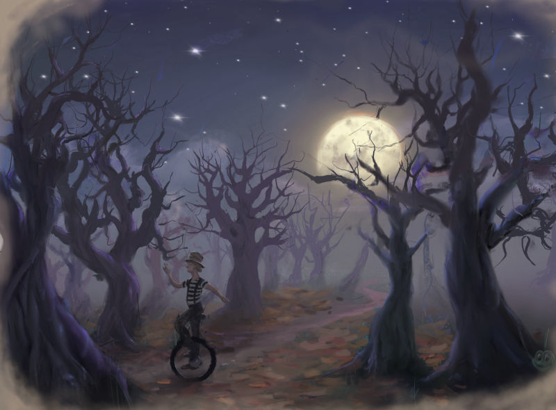
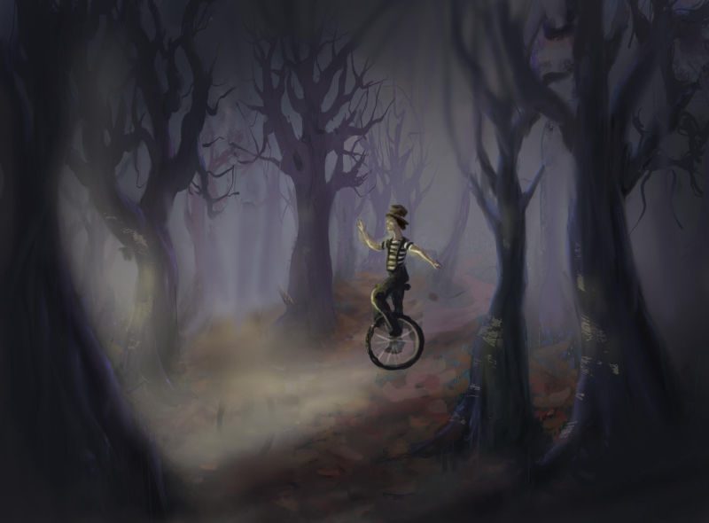
Hello, I am new to SVS and the forum. I have been listening and looking though for a few weeks. I come from a fine art background but am new to illustration. I would greatly appreciate any feedback anyone might have. This is a piece I did not too long ago depicting a Mad Hatter riding through a forrest. I’m using an iPad Pro with procreate. I typically work in oil but am wanting to learn a digital medium. After listening to podcasts and such on SVS and some elsewhere I came to the conclusion that perhaps I should work on adapting my style to be more illustrative without completely changing and trying to be something I am not. Thoughts on that and my work would be awesome. Thank you!
-
@hugowee welcome to the forums. As far as crit on the piece. My eye is drawn to the moon and wants to keep going back to it. Maybe if the moon was lower and the mad hatter was in front of it, almost like a silhouette? I do like what you have going on with the trees and environment. Its just your focal point is in the wrong spot now.
-
Thank you @Chip-Valecek that is great advice. I see how he disappears into the forest.
-
Nice work so far! I like the composition
")
I agree with chip. Right now the picture is all about the moon. I suppose it depends on what you want your focal point to be. If you want the hatter to read clearer (or first?) he needs to pop a little more.
-
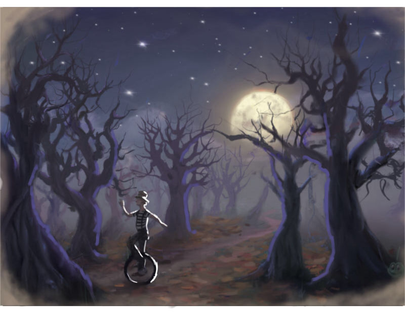
Welcome welcome @hugowee. Very nice mood driven piece. I like the overall composition you have going on here. I also agree that the moon is the focal point. I’d suggest you may try adding some highlights. A contrast of moon light on the characters back against the trees may help. Just as an example I’ve added additional low level light on the trees in addition to the character.
-
Hi and welcome. Nice piece. I think the others are right and i think what matters a lot is the readability and the storytelling, character, emotion etc
But in my opinion i think there are very many illustrators with very many styles today and in the past so i don.t think a painterly style is bad. There are styles influenced by abstract minimal graphic design to styles lush with paint. Shaun Tan has a very painterly style, ezra jack keats looks fabulously painterly to me, Salvador Dali illustrated Alice in Wonderland by being himself etc etc
What are your favorite ilustrators and what about them drew you in and made you want to be an illustrator? I think in thatanswer also lies how to be yourself, with your own strengths and sensibilities. Fine art brings expression, color, a lot of stuff i think
Just my 2 cents
-
Here is a quick paintover that might help. everything is taller and the man is moved back a bit and lit from the other way. I like your colour palette and mood of the piece. Hope this helps
-
@irina Thanks. I will check out the artists you suggested. I definitely admire Shaun Tan's work. I also like Paul O Zelinsky. My work until now tends to be more representational, naturalistic but I find my figures especially tend to take on another personality. This is why I would like to try some illustration work to see how far I can go. Where as before I felt like I had to hold that part of me back. So much to learn and explore. Thank you for you comments.
-
@hugowee also, i actually like your original image very much but as the other said the focus is the moon. Which is not bad per se if it's in a book for example or a graphic novel, it could just be one image in a series of images and in that particular image the focus is on the moon or the text says something about the moon or so. The way i read the image, the "message" i get is moon, night, quiet. The monocyclist and the path and the fact that he's going towards the left of the page while the moon is on the right (keep in mind in a book for the western market reading is from left to right so it's like we had some pages before where we were shown the monocyclist doing stuff and now as our eyes move over the spread towards the next page we have a moment of pause and and the moon is slowly rising. That's how i read it. So for me this image as it is, is fine as it is in a context of a book, or a sequence. It has dynamism. I could see the writing underneath or on another page. Actually if it were a spread one thing to consider is also leaving enough "white space" to later on insert text (if it were a book that had text). If it were a "mute" book, like Raymond Briggs Snowman or Shaun Tan's The Arrival, the image could still exist like this but having other images inform this scene. Shaun Tan has these big lyrical spreads from time to time to break the narrative progression and page to let the eye wander across the page/spread while also slowing down and thinking about what we found out
If you put this piece into a portfolio to send to agents and so on i would definitely make a few more images to go with it before it. So it looks like a tiny sequence/story
Also, your work reminds me of some cards in the Dixit board game
To me Jason Bowen's suggestion changes the "story". Now there is something interesting on the left of the page, it illuminates the monocyclist and he's going there but the intrigue is in "what is in the left corner and where is the monocyclist going?"
So as far as i am concerned, i think the most important thing to think about is what is the story, what does it tell?
You can have the focus on landscape rather than character as for example you have a focus on the big emerald city in the raymond briggs snowman book, but the message is in context, it's a about the journey. Their presence is just hinted enough to say they are doing it but the focus is on the wow big city taking the space of a huge spread. You can see them clear enough and recognise it's them and they are treated differently than the person on the ground because they are the subject of the story

https://thepreschooltoolboxblog.com/activities-for-use-with-the-snowman-storybook-by-raymond-briggs/
-
@irina These are great questions to consider, some of which I should have thought of and didn’t. Like the idea that the picture reads from right to left rather than left to right. I might try and reverse the image to see what it looks like then. There is much to be worked on and I can see how leaving room for text would be important. Thank you for comments.