How to improve this piece?
-
Hi guys! I am so glad to be part of this community.
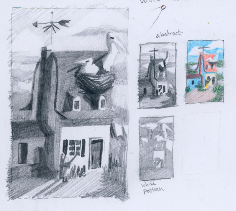
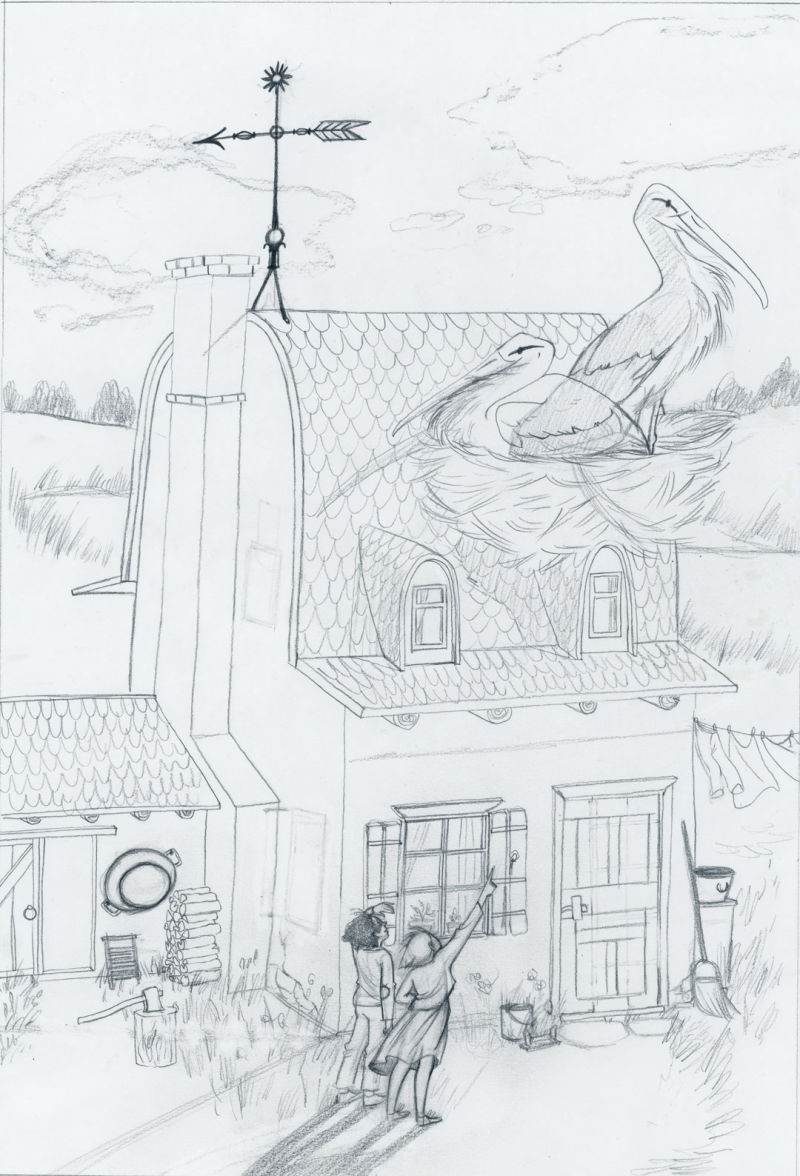
I just finished this piece that was inspired by a scene in The Star of Kazan by Eva Ibboston. It is a beautiful book. I wanted to work on lighting and color and I was hoping to get some feedback as to how I might make it better.!
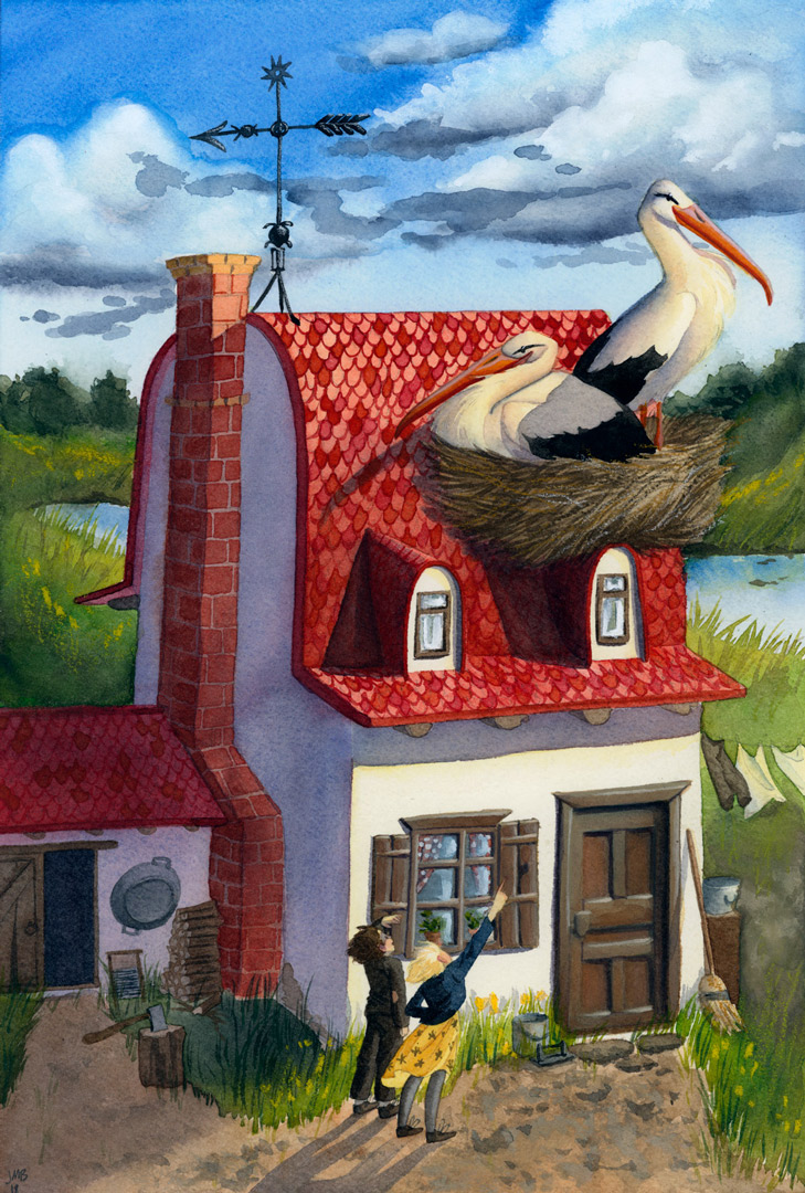
I feel like if I put in another 20% of effort it could be all the better, but I don't actually know what to do to push it that next little bit.
If you would like to do a paint over, that is totally cool or you could repaint the whole piece- you can just use the lineart above to do it, if you would like. Just please DO NOT repost this piece anywhere else without my permission.
I cannot wait to get some feedback and constructive criticism! Specifically I am looking for things I might have done wrong, things that I could do better, and any tips on what to add, or take away or beef up. This was painted in watercolor on cold press, just so you know.
-
@jeanebean Oh wow! This is beautiful!
When I look at this piece, a few shapes read nicely. The house is a great shape. It's got a nice silhouette. The people read pretty well. They're nice dark shapes on that white wall (though the blonde hair and the yellow skirt are blending with the house and the grass.)
However, the big things that should be reading nice and strong (the birds!) aren't. Right now I kind of need to hunt for them. Whereas gargantuan car-sized birds should be pretty obvious, right?
")
Desaturate the image so it's greyscale and you'll be able to see objects that are of similar value are overlapping (the nest with the trees and hillside, the nest with the shadowed portion of the roof, the chest of the right bird with the sky, the left bird's beak with the roof, etc)
I order to make those birds pop a bit more you could push and pull the values so that those birds are darker shapes over a lighter background.
Assuming of course that you're using photoshop to tweak the image
However, I guess it all depends on what areas of the picture you want reading first. If you want the birds to be hidden compared to the people (and the upstairs windows, thassa lotta contrast
) you could leave as is.Really cool work! I'll be interested to watch it change and develop.
-
@art-of-b Thank you! Great points. I can see what you mean! I shall see what I can do to fix it. Thanks again!
-
@jeanebean I may try and do a drawover at some point. Depends on what else happens to get in the way today
-
@art-of-b That would be lovely, if you wanted to. No pressure, mind! Now that I am seeing the problem I am thinking about redrawing the piece altogether to make sure that the storks are the absolute focal point. I think with the house shape and colors, I am losing the battle here with the white windows against the red and the storks too close to the sky and the back. I thought in my thumbnail that it would work out to plan, but I can see now that the small value study either wasn't right or I strayed from it too much. (I am not actually sure where my problems lies in the construction of this piece- I mean at what point I lost the grasp on it)
-
I would keep working on it. I really think it's at that 85% phase where everything slows down and it never EVER feels like your making any difference and you really wanna restart but you should PRESS ON! The last 20% takes 80% of the time, right?
-
@jeanebean
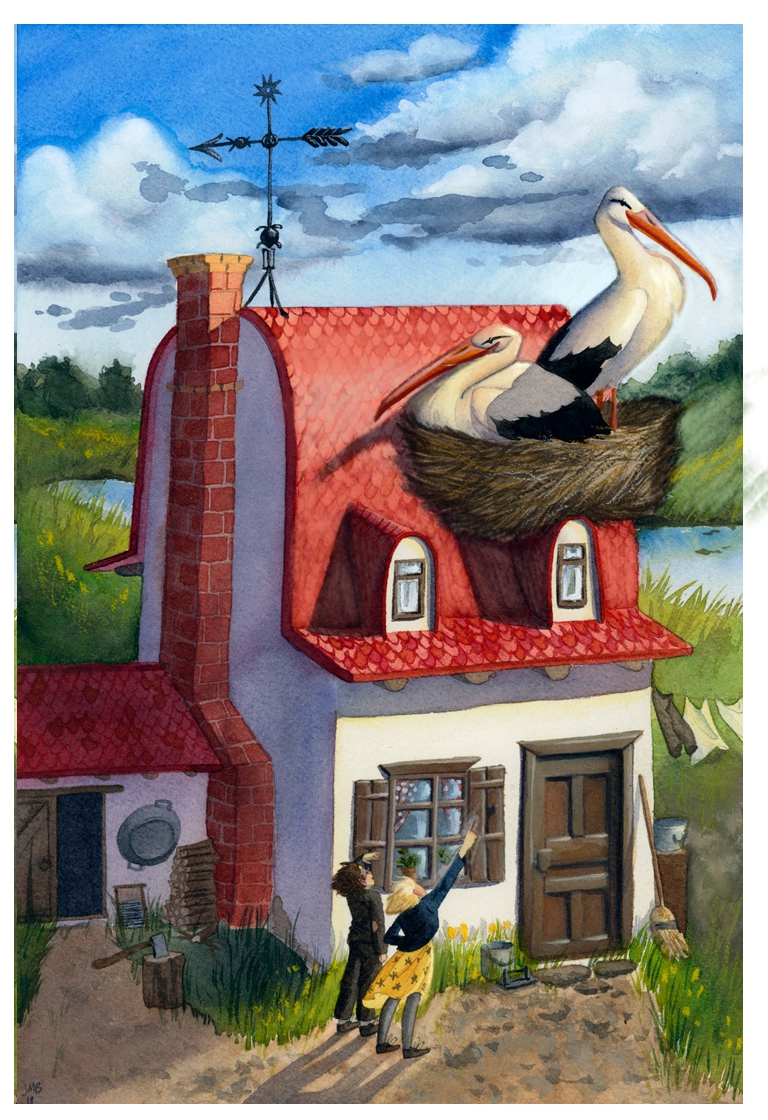
Drawover!
I tried to just kind push and pull the darks and lights so that things contrasted a little more, sometimes giving an object a bit of an outline or halo.
Removing some details of the tiles (great detail, by the way) seemed to help the birds pop a bit more.
Dunno if everything I posted has been 'GOOD' advice, but this is how'd I try and tweak the image
-
Oh! it is subtle, but it seriously helps! Thank you so much for doing it! I'll try it next.
-
Wow!! So lovely. The advice given so far seems really helpful. Cooling down the bright white of the house a bit might help as well. My eye tends to settle on the line created by the shadow from the roof on the front of the building, even though that isn't the most important place to look. Thanks so much for sharing this piece and its process!
-
@JeaneBean you watercolor skills is awesome. I especially love what you did on the roof and the storks. Given @Art of B’s critique, I think you can work on more on the gir’ls clothes. Her skirt flutters in an odd angle. I don’t know if this is deliberate tho. If it is, then just forget what i said. I really like this piece.
Portfolio: nyrrylcadiz.com
Instagram: https://www.instagram.com/nyrryl_cadiz/
YouTube: https://www.youtube.com/channel/UCbJCF1Im8ZO7hpGWTKOJMuA -
@kathrynadebayo Thank you! I think I will give it a grey wash and maybe try to give it a little texture, too to make it recede a little.
-
@nyrrylcadiz Thank you! I am not seeing which angle of it is odd. Could you please clarify? I wanted the wind to be blowing from the right to the left to give it a little movement but I'm not great at drapery and skirts always confuse me. Any more feedback would be greatly appreciated!