In the forest, looking for feedback
-
Hello!
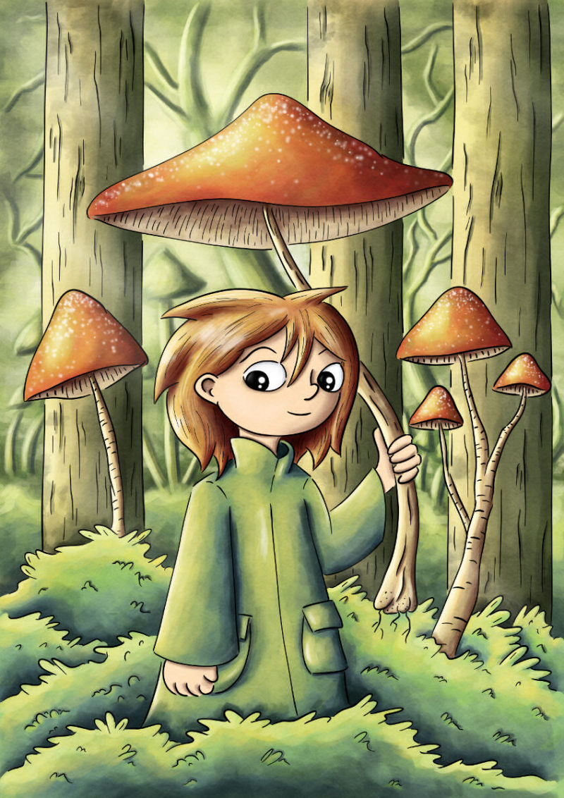
I finished this digital painting a few weeks back and would love to hear your thoughts about it. Mostly, I'd be interested in improving the way I work with colors and line art - I often feel like the colors and lines don't fit together that well. It's almost like I have two illustrations in different styles on top of each other (if that makes any sense).
I wanted to try a more "simple" style for this when I first drew it as a pencil sketch. I also decided to experiment with the palette a bit more, in an effort to make the colors look more uniform, and give the illustration an overarching color scheme, something I think I often miss when I draw. I also like to give my digital art a more hand-painted feel, with a bit more visible brush strokes and the texture of watercolor paper for example. Not sure if it's working though.
I've also tried a bit with coloring the line-art. I ended up skipping it here, since I felt that it only looked good in some places and not everywhere. How do you do when you pick colors for the lineart?
-
This is a lovely illustration and very cute! My boyfriend saw it and exclaimed "that's so cute!!"
But I do see a bit what you mean about your lighting and colors! I think because your drawing style and lineart are very stylized and have this cool flat look, whereas you use very dark shadows and very light lights in your coloring, which gives a very 3D, almost modeled look. I personally think there's too much contrast in your shading for a normal daytime illustration without any dramatic lighting, and that you tend to go too dark with your shadows.
You also have to think, every line you draw for the lineart isn't just random, it defines a volume. And shading also defines a volume, so you have to make sure that both are conveying the volume the same way. In some places in your illustration, they contradict each other. For instance, the leaves in your bushes. This is something that's quite difficult to do though and probably won't happen in just a few days, because you have to get a deeper understanding of volumes and light. This will take some practice, observation and studying. Best of luck to you! You already have a very cute style and it can only get better as you keep learning
")
-
I love the concept here, the mushroom forest idea. It's a lot of fun, and the character is great. Gives me a bit of a throw back to "Hey, Arnold" for some reason

What strikes me is your palette. I think that's what's doing you the most disservice in your painting. A lot of people get really afraid of contrast, and I think that's what you've got going on here. Everything is in the same green/yellow/red thread, and it's causing it to flatten out and you're losing some of your depth. If you take this picture and desaturate it in Photoshop (or your tool of choice) I think you'll see that you've got a lot of the same grey tone through out. Adding in some tertiary colors and letting your background get darker would allow the character to pop more, and make the painting more visually striking.
Also, looking over it, there's very little variation in line width throughout the picture, and your shading stays fairly consistent, even going back further away. I see that you're using heavier lines on the character than on the background mushrooms and trees, but I think you could push that a bit more, and add either more or less shading to the trees in the background and get more of what you're looking for.
I think you're off to a great start though, and @NessIllustration said it great it's exceptionally cute. Tons of potential here, just a few technical tweaks to make it great
-Aaron
-
@Aaron-Pierce makes a good point. I think you may be confused to hear me say you have too much contrast and him say you don't have enough. But to clarify we are talking about different thing: I think you go too dark in your shadows on each individual element, and Aaron is saying (very accurately) that all the different elements carry the same values.
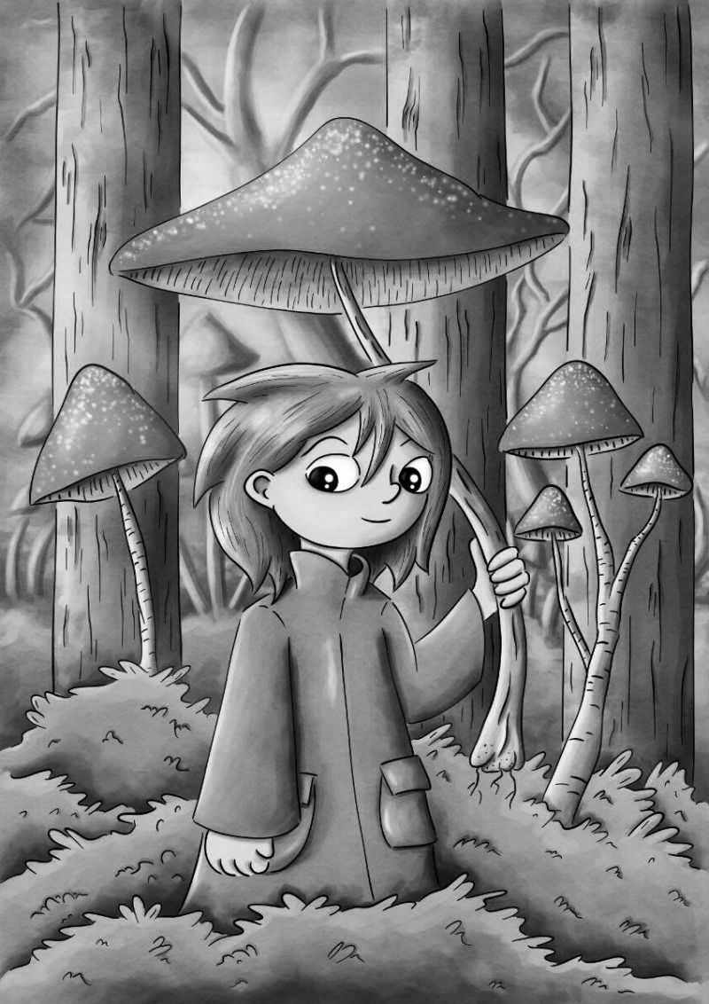
If you desaturate the picture you get this, and you can see that the background, trees, character, bushes, etc. all have the same base tone, shadow tone and light tone. In fact, if you were to remove your lineart and shading, you'd be left with a sea of middle tone grays almost indistinguishable from each other. Aaron makes a good point, and it's very possible that you're letting the shading distract you from making your basic underlayout have a strong foundation of different values that attracts the eye to your character. You may also be overshading your volumes in an attempt to create contrast between shapes that all have such similar values.
-
@NessIllustration good catch, I should have clarified what I meant by that
You're spot on with your clarification, and I think popping up the grayscale does a great job of illustrating it! Thanks for that -
Thanks a lot @NessIllustration and @Aaron-Pierce ! That is all really helpful!
I think I often forget completely about color value in the overarching composition when I work with color. I've never really liked the "flat" look of many of my drawings, and maybe the extreme shading on specific objects is an attempt to work around that. But I see what you mean that it can actually have an opposite effect, while also contradicting the lineart.
I'll have to think about good ways to start improving on these things. Thanks again!