Snow Fall Watercolor Painting Critique
-
@Rob-Smith again great work…your skills are so good
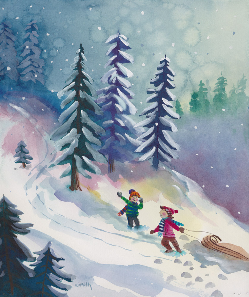
") The children are so much better, seeing their faces is much more engaging. I like the colour drift from pink into yellow from the trees, leads your eye down to the children. I also like on this one, the light white highlight on the snow trail in the top corner, small detail but I like it. The one thing that bugs me a bit, not meant to be criticism just a thought…but I did like the way you painted the trees on the second piece…the way you could see the trunk, a few branches, and the snow highlights so precisely painted. I wonder if maybe the middle blue tree on this last piece could use just a couple more snow highlights, a bit like the second piece…might also help to emphasise the light from the right hand side…but it is beautiful work…I think this last piece is the best overall especially in terms of the values and composition…. (zooming out it has good impact at small size)…. and the way it leads your eye across the page
The children are so much better, seeing their faces is much more engaging. I like the colour drift from pink into yellow from the trees, leads your eye down to the children. I also like on this one, the light white highlight on the snow trail in the top corner, small detail but I like it. The one thing that bugs me a bit, not meant to be criticism just a thought…but I did like the way you painted the trees on the second piece…the way you could see the trunk, a few branches, and the snow highlights so precisely painted. I wonder if maybe the middle blue tree on this last piece could use just a couple more snow highlights, a bit like the second piece…might also help to emphasise the light from the right hand side…but it is beautiful work…I think this last piece is the best overall especially in terms of the values and composition…. (zooming out it has good impact at small size)…. and the way it leads your eye across the page -
I took everything that you guys pointed out and made some corrections. Thank you!!! Here is the updated painting.
-
It looks more lively and a bit lighter-or brighter. I thought your first one was great-loved the colors but this one does feel more light and active.
-
now that is very lovely!