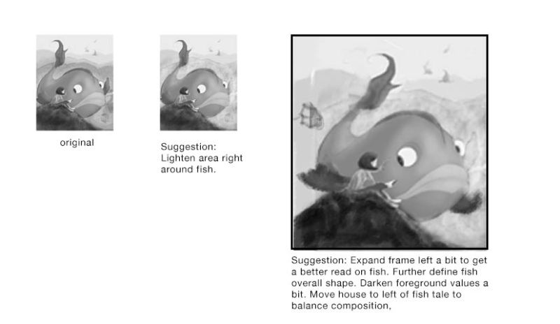
BIG - WIP (need help with values)
-
@laurel-aylesworth Hi Laurel. I really love your idea and drawing. I hope you don't mind that I did a bit of a draw-over to show my suggestions. It's easier for me to think through my response. When I consider the values for my illos, I find it's helpful to shrink it way down, then adjust values at this scale. I know you didn't ask for additional assistance, but after I adjusted the values, I couldn't help but make some small tweaks here and there. I've noted all the changes I've made, which I think still honors your original idea and drawing, but makes it hopefully easier to read. Let me know what you think:)
-
@johanna-kim Thanks so much! I hadn't thought of moving the house to the left in the midground. That's an interesting idea I'll play around with. And I like the idea of more breathing room near the fish's side.
-
@laurel-aylesworth I agree that the girl's pants need to be darkened, and I also think lightening the tail fin value would eliminate that as a focal point, so it's not competing with your main focal point.
-
@wendyinca I love the image! I'm not much use in advising on values, as I'm just starting out and struggling with everything myself. I do however feel there's a tangent (if that is the correct word?) where the girl's left foot is aligned with the corner of the fish's mouth. I would either move the foot down a little or the mouth up a little I think. Although I do love the expression on the face of the fish.
-
I like your idea / composition. I like the feeling of the girl & the fish wondering about one another.
I agree with the comments about adding a little space on the left & adjusting the foot / fishes mouth. I like the house and background in the original & agree with other comments that a higher contrast between the fish & the background would be helpful. I really like the girl's pose and the curve of her hair, and how the hair & angles of the girl lead toward the fish's eye. The higher contrast areas of the fish eye, girl's face, & book really draw the focus into that area.
-
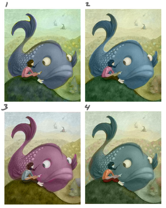
Hello folks. I'm wrestling with color options. I'm almost tempted to keep it grayscale. I dunno. Or use super muted colors. Any comments/suggestions are welcome. Thanks again!
-
I'm a fan of number 2
")
-
Wow! This is really good! I really loke you purple fish. My bet is on 3.
-
I like 4 but i think only because if you made her hair a different color instead of green. Maybe a warmer color so she separates better from the fish. The reason I chose 4 is in all the other ones the color for the hill shes on is the same as her pants.
-
I just love 2 - but either way you go these palettes are all so lovely and dreamy - definitely go with color!