Children's Card Design
-
In school, I'm going for the Graphic Design major. So, compared to many of my classmates, I have a...different angle of things. Seemingly the only one without a fine art/contemporary art/minimalist angle to design.
Anyway, this is one of my ideas for a portfolio piece.
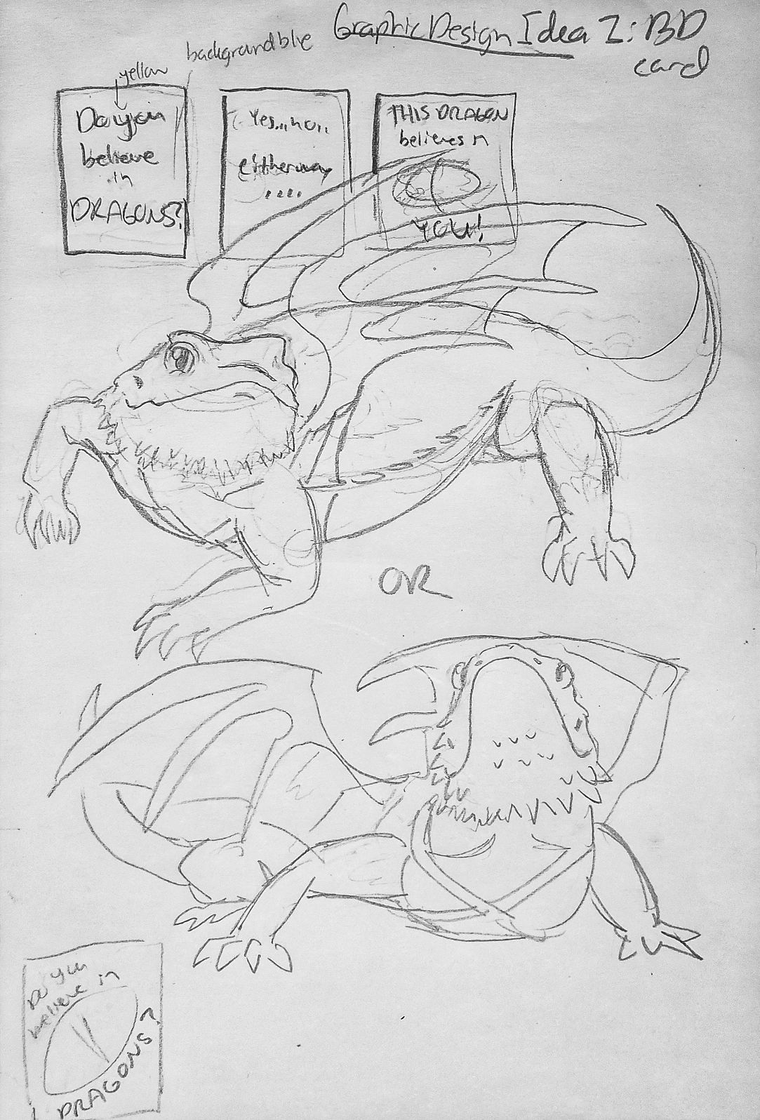
Of course, it's going to be done digitally with type and color. But so far, I'm getting the rough ideas down.
So. First idea for the front cover is light blue background, yellow words. The other idea is instead of blue, the background would be a close up of the bearded dragon's eye. Which one seems better?
Also! The second question I have is the design of the bearded dragon. This would go in the third page of the card, below the word BELIEVES and over the word YOU. Does the top pose or the second pose look better?
-
I like the second pose more - feels more open. Maybe if the second was looking at us but still like how he is looking up to fly!
")