Luv WIP
-
UGG this is so good. I was going to say the color scheme of warm and parents cool is the best one, but you already said it. Great work @Braden-Hallett
-
@Braden-Hallett So much fun... so much my house!
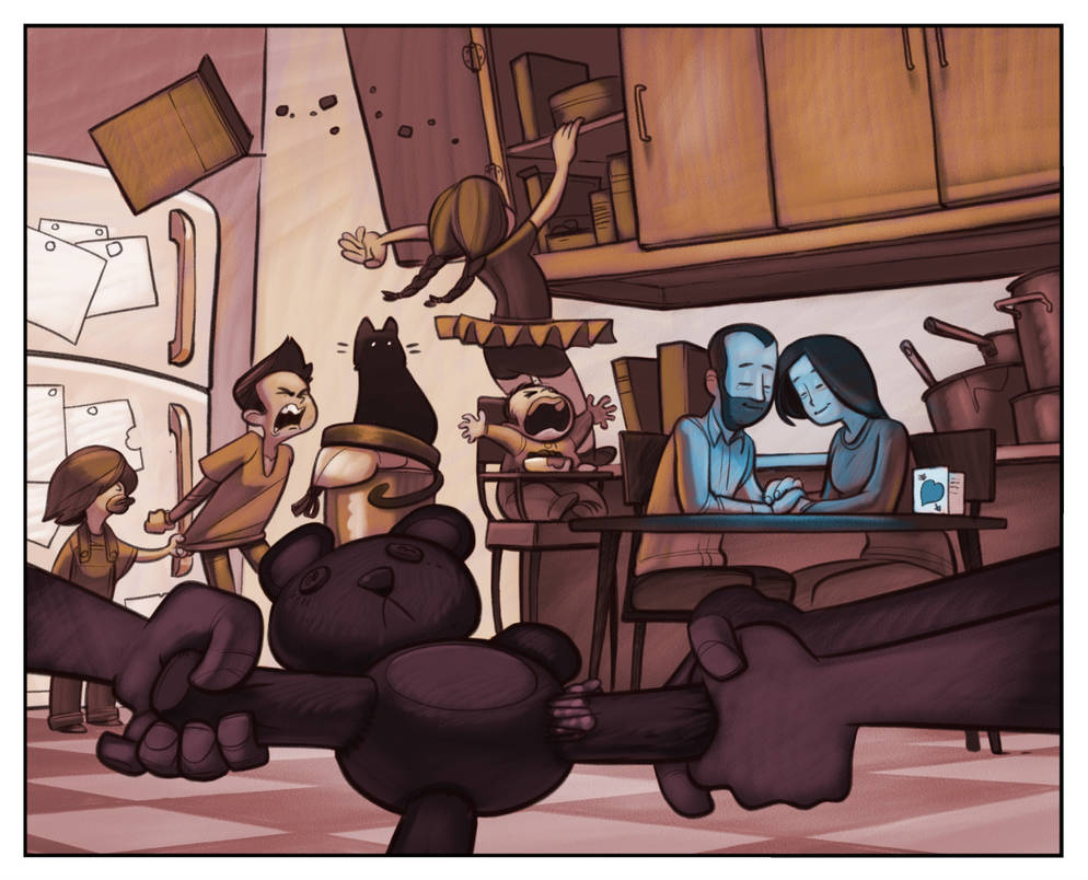
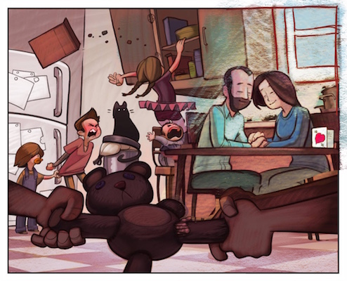
I love the color study with the cool colors on the parents and warm colors everywhere else. I think it really reinforces what you are going for.
-
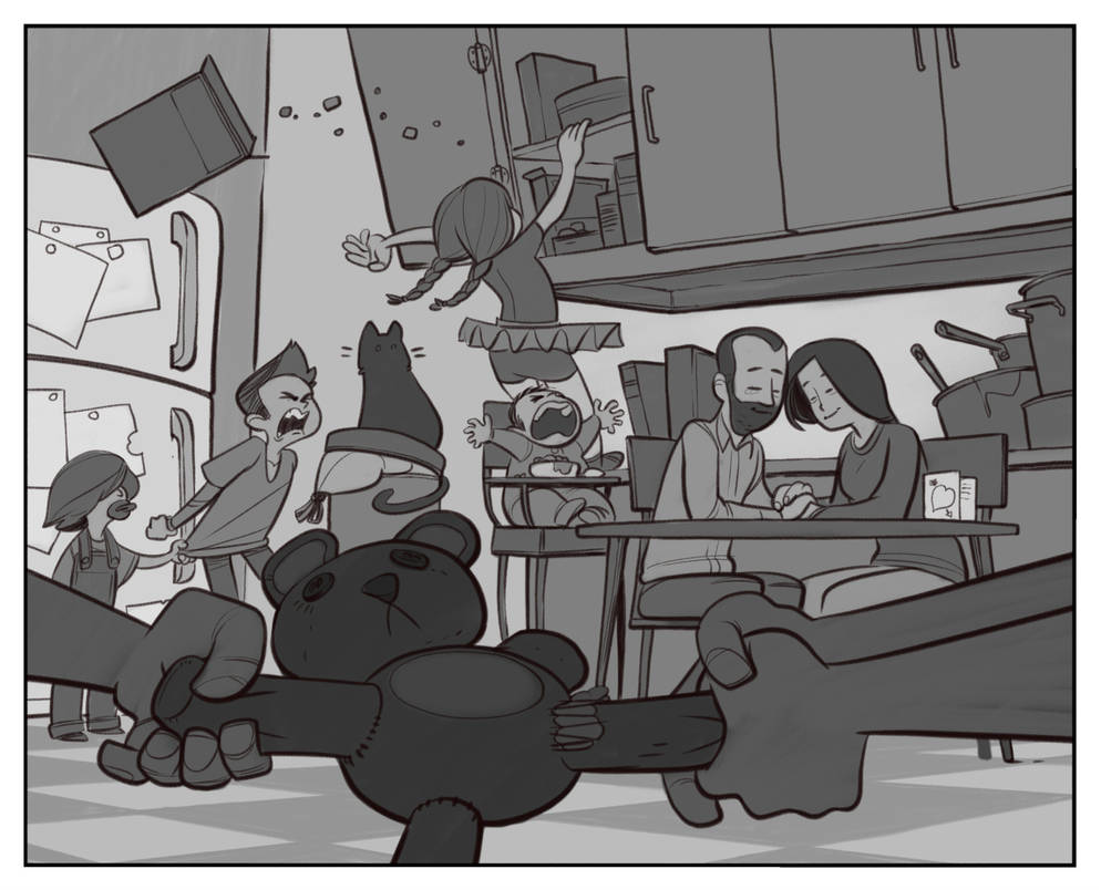
@Braden-Hallett I like the tension of the red overlay colour -red being the obvious love colour and also angry colour at least for me. So in one way the environment is going off the walls madness but the parents don't let this consume their love for their family -two different points of view wrapped up or should I say exploding at the same time! And the parents are successfully staying cool.
")
-
@CukiArtist No text, but in general I like them happily sitting on the right third of the drawing. If i redo the piece (maaaaaaaaaybe?) I'll play with them being a literal eye a storm closer to centre
-
Hokeedokee!
local value:
Rendered value
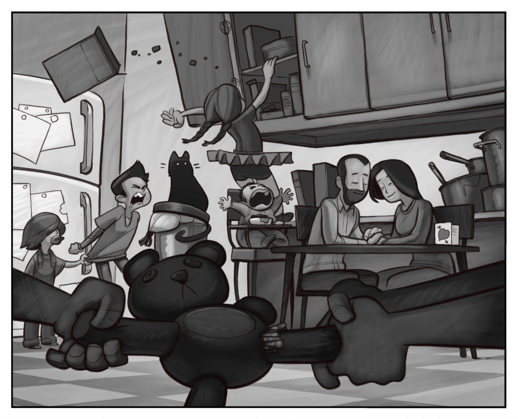
Basic light map (warms and cools the local colour layer)
Basic local colour layer
And from here I'm gonna paint! Push and pull, saturate and desaturate. Reintroduce more of the light colour. Kinda fiddle with it until I'm happier with it. This process gets me to a point where I have ALMOST all the puzzle pieces. Now I just need to assemble it.
I have a really hard time with colour. I feel a little like a tone deaf person who's trying to learn scales solely on where to place my fingers. I'm sure someday something'll just click. Just gonna take yet more friggin' practice.
-
@Braden-Hallett i dig the use of cool colors as a way to focus on the parents
instagram and twitter: @artofaleksey
alekseyillustration.com -
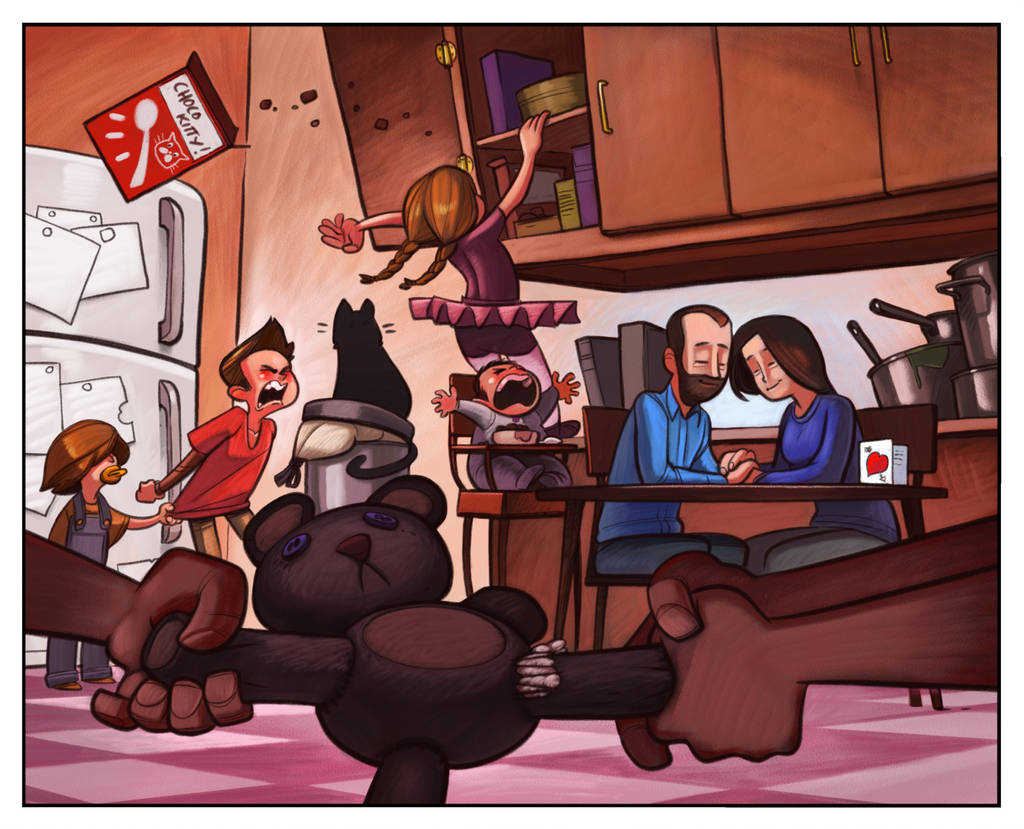
@Braden-Hallett This is looking awesome! I did a quick and hopefully not too annoying cut and paste of my thinking - i do still feel like the parents are possibly too far in the background and may be a different scale than the children? Was thinking a window over the sink might really free you up and allow you to do more things with the lighting in the room - but maybe would change the mood too much? - just a thought though
-
@Aleksey Thanks! I'm hoping to reinforce that as i paint
-
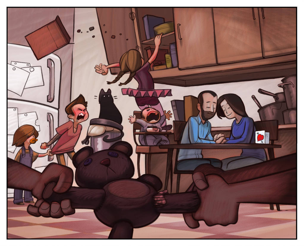
@Kevin-Longueil Oh wow! I really like the window idea. That would really let me cast a different light on the parents. If I go back and repaint (I think I almost always do
 ) I'll totally do that.
As for the scale, I think if I put a shadow under the table and put the mum's feet where they should be it'll reinforce where they are in space. We'll see
Thanks for the paint over :smiling_face_with_open_mouth:
-
@Braden-Hallett: -Really lovely concept, and very challenging composition to pull off. So well done. @Kevin-Longueil Love the window idea. It really adds so much to the mood.
-
@xin-li Thanks! I may, instead of doing a LOT of surgery to add the window, play with some kind of hanging kitchen light. Benefit of the light without having to renovate the kitchen :smiling_face_with_open_mouth_smiling_eyes:
-
This is looking great! I've learned a lot by seeing your process to get to this point!
-
@cbrocke I agree, really helpful as a newbie!
-
This thread is great, wonderful to see the work in progress and people helping to bring the illustration along.
-
Push and pull. Saturate and desaturate. Cool down and warm up.
Next step is flatten linework and paint allllll on one layer.
-
@Braden-Hallett really terrific concept and line work
-
@mzmolly Thanks
-
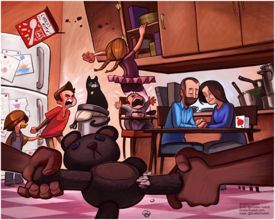
Callin' it dooooone. I gotta move on to other stuff.
-
It looks so good and love seeing the whole process!
-
Great work and thanks for talking so much about your process along the way. It's really interesting to see how different people reach their final illustration.