Critique on last 20%
-
Hi All!
I feel that I'm nearing the end on this piece, and I like the direction of it. But as Lee says, he often sees beginning illustrators leave a piece without finishing that last 20%. I'm posting my original sketch, a process shot of about half way done, and where I am now.
I have questions about the boy and the dog. Something seems wrong about them. Is it the shadows? Do they look too stiff? I'm also wondering about the windows and doorways in the closest building. They seem wonky. Why? Is it not shadowed enough, or is the perspective off? I'd also love any general suggestions on what you think might help this piece feel nice and polished. Thanks!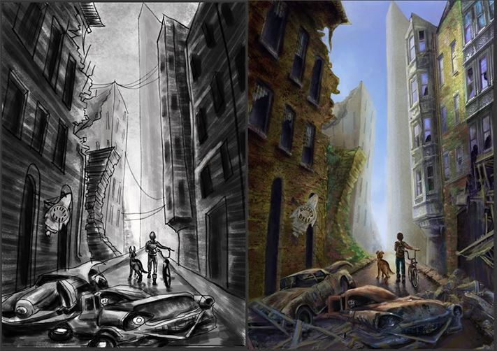
-
@jennymwine First, this looks incredible, really great feel. I think the boy and dog could use much stronger highlights. The light source seems to be directed straight at them, so it would be nice if there were a slight glow around them. The windows in the closest building on the right seem a little wonky (not sure if that’s what you meant), and I think it’s because of the way the windows are broken - large breaks one next to the other that almost look like eyes.
-
@inkandspatter Those are some really good ideas! I definately see what you mean about the light. Thanks! By the way, I can't wait to see how your seagulls piece turns out!
-
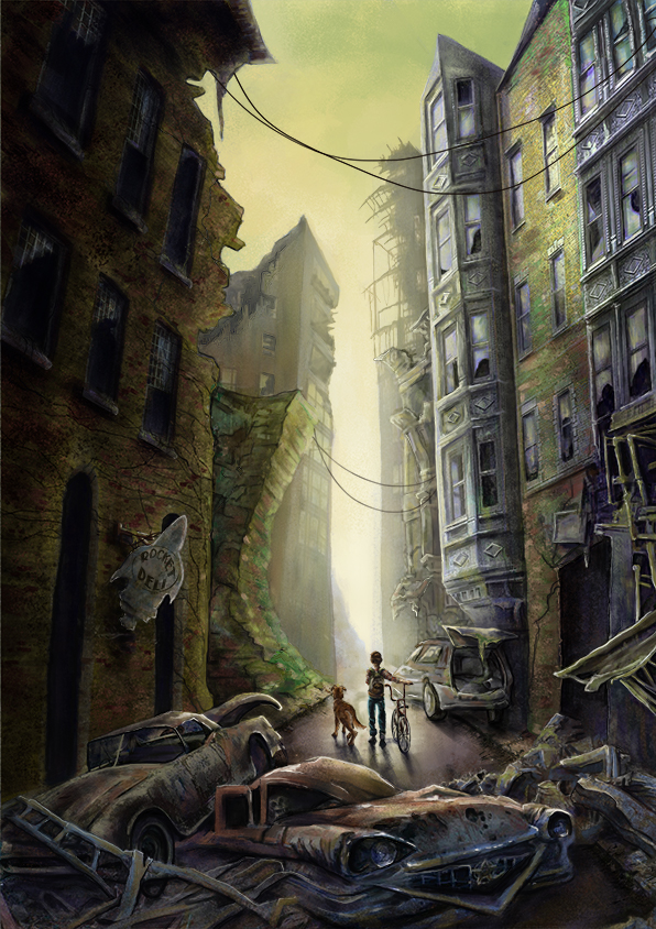
@jennymwine This looks really cool! I love the atmosphere and that orbital perspective you have makes it look like the alley is really looming in on them from both sides. Great stuff!
On the topic of the closest building, I think the perspective is off on the door to the right? Correct me if I'm wrong but I think its the lintel angle above that primary patch of darkness that's not conforming to the correct vanishing point and making the windows look out. Mainly the corner with all the cracks running out of it because it draws the eye. I think maybe straightening that up will make the windows feel more conformed since you've got that really dramatic lens distortion happening towards the edge of the frame. If it's too tricky to move at this point you could probably make it look like the actual lintel block has fallen down at an angle?
This is a really cool piece of art
-
This is looking really, really cool. I love all the little details and textures you have going on. There is a very clear focal point, with little rewards for viewers who decide to look longer. A+. Since you're looking for final nitpicks, I'll say a couple little things that you may or may not want to look at.
I feel like the atmospheric perspective is silhouetting the boy really well, but the dogs head is at a bit of a tangent. I see in your original sketch it wasn't, but somehow during painting the building moved over a bit. A little more fog there could be all you need, or you may want to try nudging the building edges back to where they were in the sketch.
I agree that the lighting on the boy and dog doesn't quite seem right, and you really want to nail that since the eye goes straight there.
Overall, I feel like what you really need to think about is hard vs. soft edges. You have a nice variation of hard and soft in this, but while in some places it seems very deliberate and in intentional, in other places it doesn't. Maybe just look around the whole composition and ask, do I want this edge to be hard or soft? Why? And make deliberate decisions about that all around.
Overall, this piece is amazing. I hope some of these thoughts can help.
")
-
Looks great. You could try flipping your dog to get a clearer siloutte. Also you could do with some extra life in the picture like flies or dust or even the odd spider web etc. Good luck
-
@Jason-Bowen That's a good idea! I didn't think of that! Thanks!
-
@Sarah-LuAnn Thank you so much! That's really helpful! I appreciate you taking the time to give me such great and honest feedback.
-
@Kris Thanks so much! I didn't know where to start on how to fix that building. Thanks for the feedback and setting me in a stronger direction. I really appreciate it!