WIM Book Cover "The Wind in the Willows"
-
Okay, So this is what I have so far. I'm building this piece in Adobe Illustrator, So all the elements can be moved around to better the composition as it progresses. I'm playing around with color a little, but thats not my focus.
Building all the elements and arranging them around is what i'm working on currently.
So far I got Ratty and Mole in the rowboat. Badger and Mr. Toad in his Automobile. I still need to make Otter and Baby Otter. That will be next.
Then I will be building the fore, mid, and background.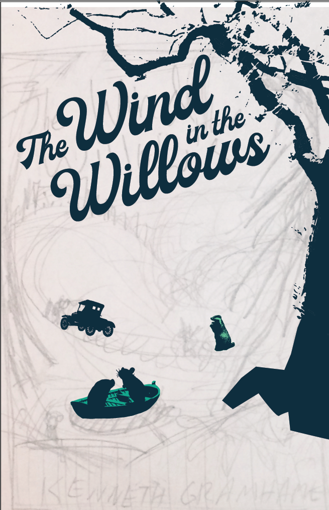
-
@Squirrelsize - I wasn't familiar with Olly Moss but now a definite fan. I also think you are making some strides with the thumbnail you posted to emulate that style!
The tree is serving as a nice frame for the composition. It is a bit difficult to see in the thumbnail but I think continuing that sort of frame around the entire composition would be nice.
It is a bit difficult to read right now what sort of animals you have in the boat. Perhaps when you are rendering it will be easier to read but perhaps making the silhouettes a bit more readable at this point in the game would be a good starting point.
I can't wait to see more and where you head with this!
-
@djly Awe! Thanks girl! You have some really good pointers! I'll try to incorporate some of those suggestions. I am a bit worried about Mole in the rowboat. He looks a bit like a blob. I may have to re-render him.
Thanks again!
-
Still gotta add Otter and baby Otter and I have a lot of detail to add in too. But its only half way through the month. I got this (Self encouragement). Even though I've not done any color studies, I'm really happy with the color it is now. Though if I have time, I would like to play around with a few color families.
How is the composition and flow so far? any suggestions on trying to move something or value changes?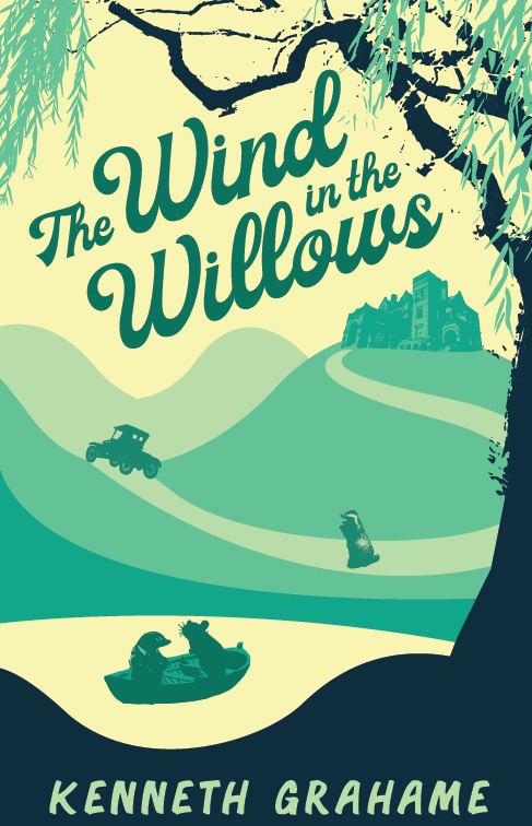
-
@Squirrelsize I really like the framing of the tree moving into the burrows of the land in the front -it echos the movement of a wave. And I love the scattered texture of the tree in those colours.
The character on the middle right -looks like he's floating more than the others -and yes I understand it's not done. lols
I have the book in my closet, I have never read through it all. So I cannot be objective in terms of cover vs. story compatibility, sorry. I still recall the look of the cover though lols.
")
Instagram: www.instagram.com/heatherboyd.illustration/
Website: https://heatherboydillustration.ca
Shop: https://www.inprnt.com/search/products?q=HeatherBoydIllustration
Ko-Fi: https://ko-fi.com/heatherboydillustrationBe blessed,
-
@Heather-Boyd Thanks! Hahaha! He does look like he's floating! Hopefully he will look better after he gets his shadow.
You should finish reading the book, Its so good. I love drinking a hot cup of tea during the Winter scenes -
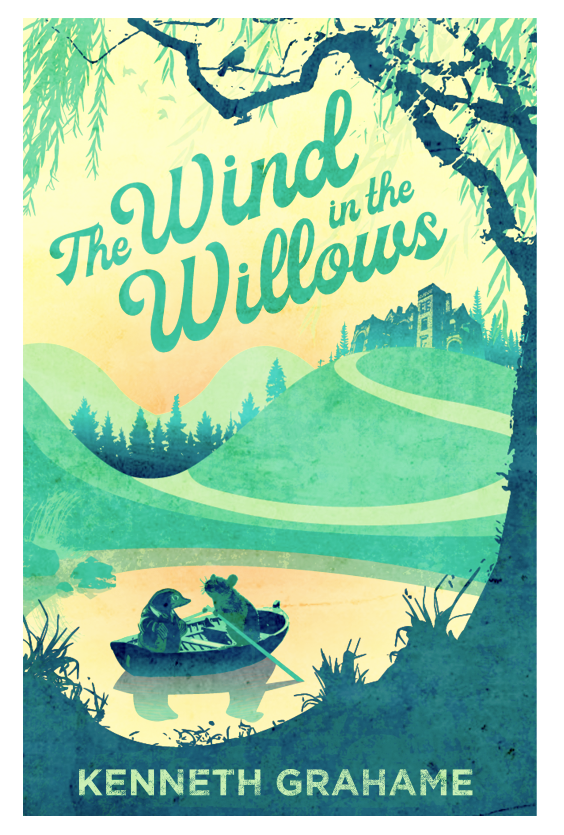
Otters are finally made! Yey! Also added some trees too. What do you all think about the gradient blue in the pine tress and the big willow tree? If I go with the gradient, I will be adding more gradients so that they don't seem odd and left out.
-
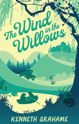
@Squirrelsize Yo! this is coming along great. Here are my thoughts:
I like the color palette it's cool and very relaxing which is really nice. I love the willow framing everything and how it feels like the willow is holding all the characters under its boughs.
I feel that you need to play with your Unity a little more. You have all the characters, car, and manor in high detail. But the environment is too flat in comparison, it does not feel cohesive as a whole.
The figures and tree especially look like you dragged a jpeg into illustrator and just applied a trace filter, and so you ended up with the very blotchy rendering on the tree. I actually really like this rendering, but since the whole piece doesn't follow that element it looks pasted together. Especially the otter in the lower left right now, it looks like a sticker added to the composition after the fact.
I would actually suggest cutting out some of the figures. I know you have spent a lot of time on them and it would suck to throw out work, But, I would simplify it down to just mole and rat in the boat and keep the manor on the hill, but cut out the car, badger, and otters. I know you wanted to show all the main characters in the cover, it's getting overcrowded and the other elements don't mesh as well. Simplifying it to mole and rat in the boat would really help this design.
I love the lettering, and the angle that it is at!
Keep up the great work! this is gonna rock and I can't wait to see you continue along.
Cheers,
Anderson Carmanhttps://www.andersoncarman.com/
https://www.instagram.com/andersoncarman/ -
@andersoncarman Haha! You know, I totally agree with it looking over crowded. I have been thinking about the idea of taking things out. I think that would be a good direction to go for. I also agree about it not looking cohesive. I think taking out some of the characters and elements will help. I'll mess around with that and see how it looks. Thanks for the input man! Someone with fresh eyes can really make nagging thoughts real. lol
What are your thoughts on the gradients?
-
Yep! I like it Better
I think I need to do something about that texture on the tree now. I reckon either add more texture to the rest of the scape or take it out all together.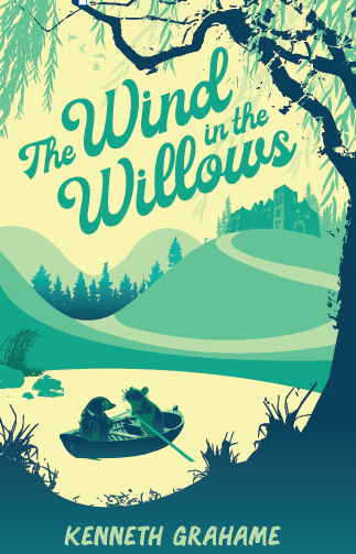
-
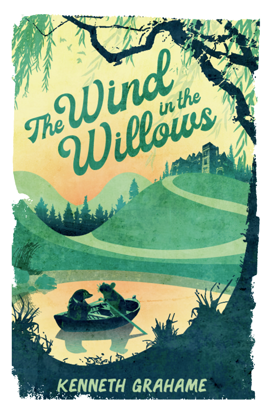
Textures Galore!
I added a wee bit of orange in the sunrise. Should I leave it? Yea or nay?I'm still working on the gradients and I need to tweak the mansion and surrounding trees.
Anything else that pops out to you all that I should change or move around?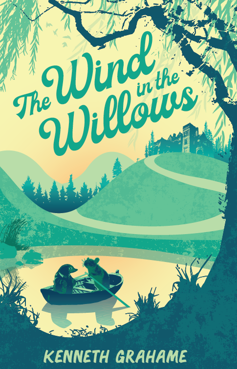
-
@Squirrelsize hey that looks really good already ! excited to see the final - and I am for the orange light
-
I like the texture and the color change, makes it warmer.
-
I also can't wait to see the final! Always really impressed with your art style @Squirrelsize . Great job!
-
@Squirrelsize I love this! I love the texture and the trees and I like the orange you added too. It makes the characters pop I think since it’s refleced in the water as well.
-
I'm late to the party but I vote for orange too. Really nice cover.
-
I'm having more fun with textures and effects. I tweaked around with the title typography. I'm liking how the title looks, but I'm thinking I might try a few different fonts for the author's name at the bottom of the cover. Not sure if I like it or not. What do you all think? Maybe something that will compliment the font title a bit more. Do you all have any good fonts that could work?
You all liked the orange so much I added a bit more!
-
It is much better, more orange is also good idea. Like the texture on the sea and the background. I do like more the sharp edge of the cover, like the version before, not the texture edge of the cover as now.
-
Here is another one with a few different effects. I also did the hard edge too
How do you all feel about the new Author's name font?
-
This post is deleted!