Society of Visual Storytelling

    SVSLearn Forums

    • Register
    • Login
    • Search
    • Recent
    • Tags
    • Popular
    • Users
    • Groups
    • Search

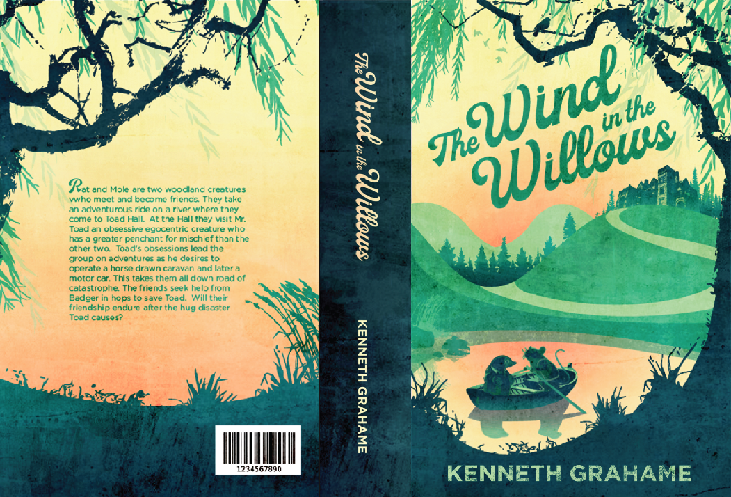
    WIM Book Cover "The Wind in the Willows"

    Artwork
    13
    44
    3268
    Loading More Posts
    • Oldest to Newest
    • Newest to Oldest
    • Most Votes
    Reply
    • Reply as topic
    Log in to reply
    This topic has been deleted. Only users with topic management privileges can see it.
    • Elizabeth Rose
      Elizabeth Rose last edited by

      I'm having more fun with textures and effects. I tweaked around with the title typography. I'm liking how the title looks, but I'm thinking I might try a few different fonts for the author's name at the bottom of the cover. Not sure if I like it or not. What do you all think? Maybe something that will compliment the font title a bit more. Do you all have any good fonts that could work?

      You all liked the orange so much I added a bit more!

      Screen Shot 2019-03-18 at 7.52.28 AM.png

      1 Reply Last reply Reply Quote 3
      • MichaelaH
        MichaelaH last edited by

        It is much better, more orange is also good idea. Like the texture on the sea and the background. I do like more the sharp edge of the cover, like the version before, not the texture edge of the cover as now.

        https://www.instagram.com/michaelaheimlich/
        https://www.heimlich-illustration.de/

        1 Reply Last reply Reply Quote 1
        • Elizabeth Rose
          Elizabeth Rose last edited by

          Here is another one with a few different effects. I also did the hard edge too 🙂

          How do you all feel about the new Author's name font?

          Screen Shot 2019-03-18 at 8.57.10 AM.png

          1 Reply Last reply Reply Quote 1
          • Elizabeth Rose
            Elizabeth Rose last edited by

            This post is deleted!
            1 Reply Last reply Reply Quote 0
            • Elizabeth Rose
              Elizabeth Rose last edited by

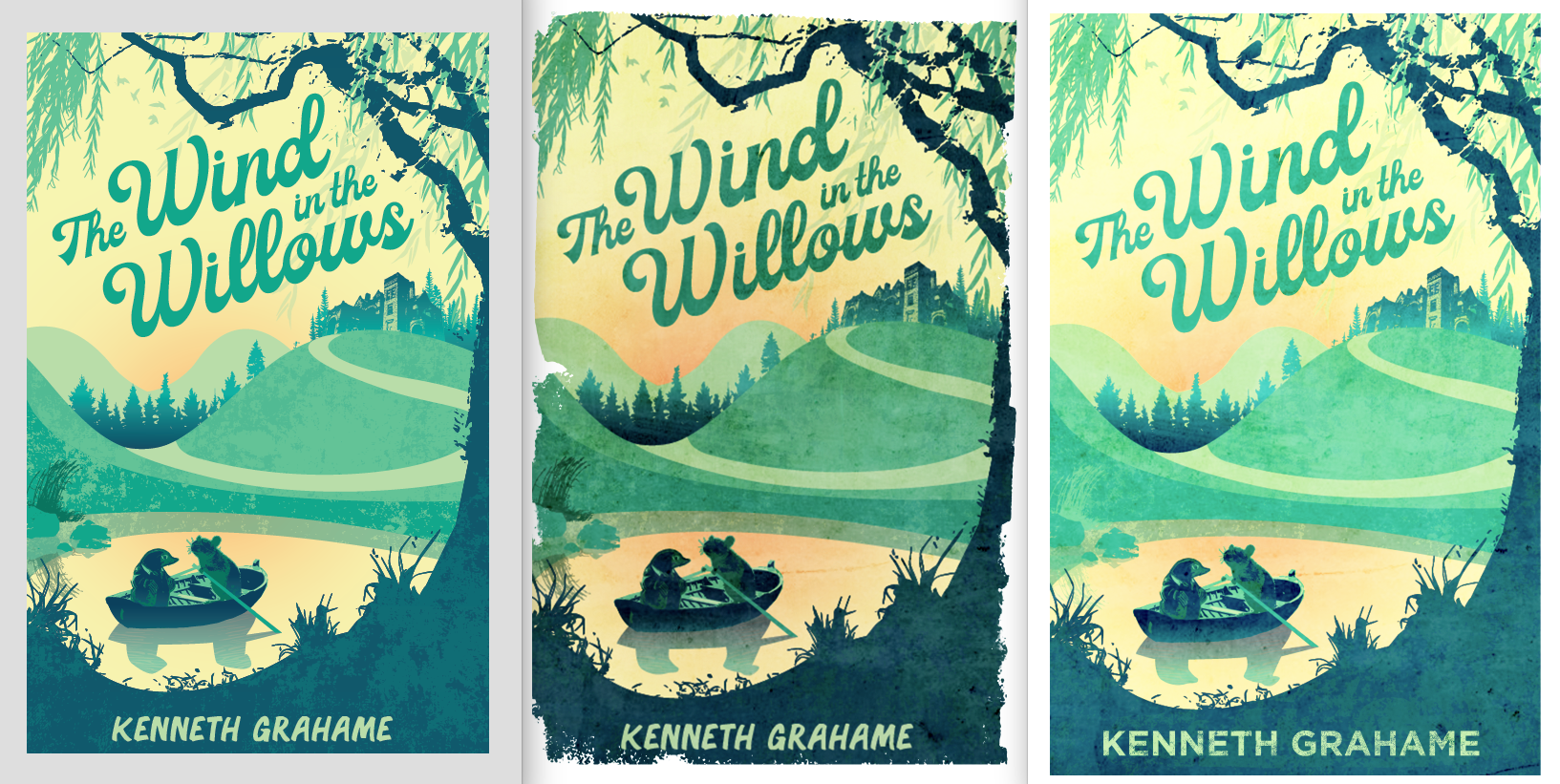
              Here are the last three for comparison:

              Screen Shot 2019-03-18 at 9.04.38 AM.png

              Chip Valecek Heather Boyd 2 Replies Last reply Reply Quote 0
              • Chip Valecek
                Chip Valecek SVS Team SVS OG @Elizabeth Rose last edited by

                @Squirrelsize this really came together great. I prefer the middle on but with a hard edge. As far as the author font, I tend to like something very basic and in the sans serif family. But that is just my opinion on that.


                https://www.instagram.com/chipvalecek/
                https://www.facebook.com/cvalecek
                http://www.cshellmedia.com/

                1 Reply Last reply Reply Quote 1
                • MichaelaH
                  MichaelaH last edited by

                  I also prefer the middle one and with hard edge.

                  https://www.instagram.com/michaelaheimlich/
                  https://www.heimlich-illustration.de/

                  1 Reply Last reply Reply Quote 2
                  • Heather Boyd
                    Heather Boyd @Elizabeth Rose last edited by

                    @Squirrelsize I like the first two. The last one I find too light ad the characters in the boat to sharp a contrast -I feel it gets lost/messy. 🙂 Which now looking at the second one I find the character and boat area similar to my issue with the third one but like it better.

                    Instagram: www.instagram.com/heatherboyd.illustration/
                    Website: https://heatherboydillustration.ca
                    Shop: https://www.inprnt.com/search/products?q=HeatherBoydIllustration
                    Ko-Fi: https://ko-fi.com/heatherboydillustration

                    Be blessed,

                    1 Reply Last reply Reply Quote 1
                    • Elizabeth Rose
                      Elizabeth Rose last edited by

                      Wow! Thanks you all! Some really good tips and suggestions 🙂

                      1 Reply Last reply Reply Quote 0
                      • Elizabeth Rose
                        Elizabeth Rose last edited by

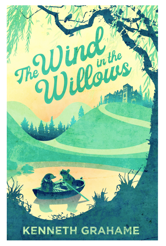
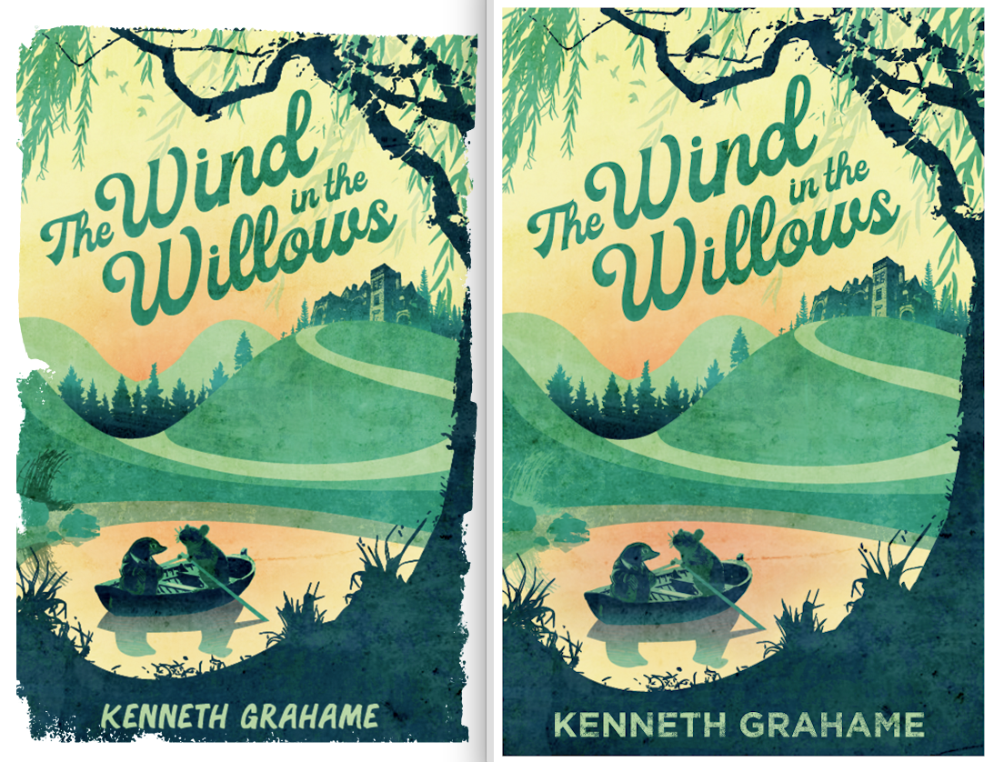
                        Left is the old dark one. Right is the new with straight edges.

                        Screen Shot 2019-03-18 at 10.02.11 AM.png

                        Jon Anderson 1 Reply Last reply Reply Quote 5
                        • andersoncarman
                          andersoncarman last edited by

                          @Squirrelsize I like straight edges

                          Nice work! this is looking great!

                          Cheers,
                          Anderson Carman

                          https://www.andersoncarman.com/
                          https://www.instagram.com/andersoncarman/

                          1 Reply Last reply Reply Quote 3
                          • Jon Anderson
                            Jon Anderson SVS OG @Elizabeth Rose last edited by

                            @Squirrelsize The straight edges look nicer to me as the jagged edge is a bit distracting. Good work!

                            instagram.com/jonandersonillu

                            1 Reply Last reply Reply Quote 1
                            • Elizabeth Rose
                              Elizabeth Rose last edited by

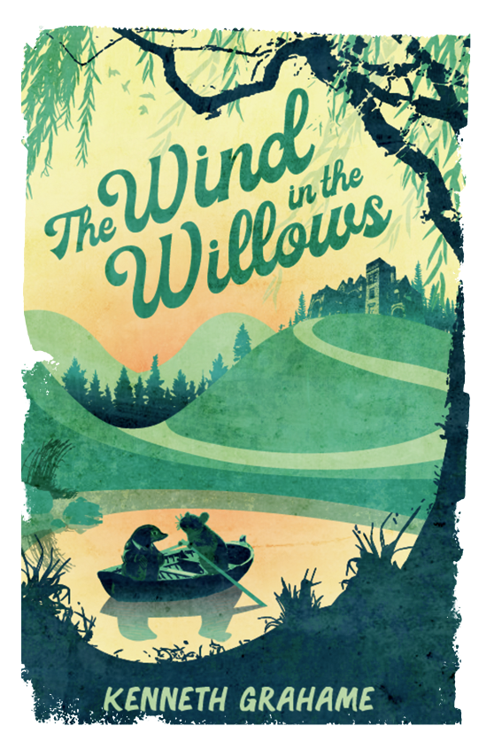
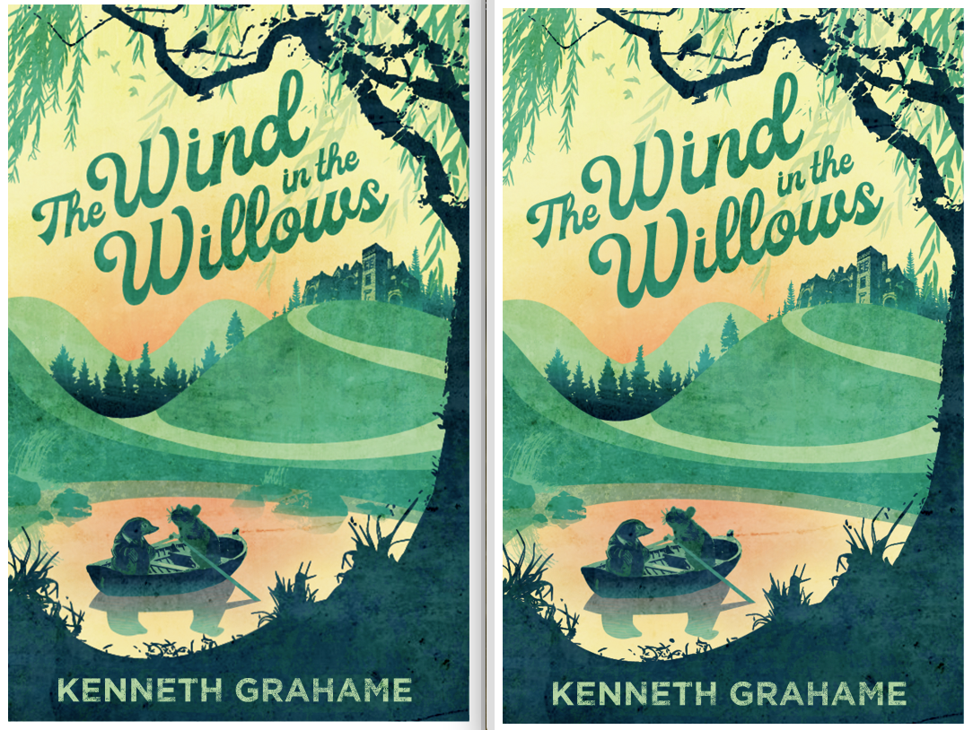
                              Added some river rocks! Should I add more?

                              Screen Shot 2019-03-19 at 7.18.25 AM.png

                              1 Reply Last reply Reply Quote 2
                              • Erin.Cortese
                                Erin.Cortese Moderator last edited by

                                I think the composition on the right (with less rocks) is more effective. It leaves a nice amount of negative space for the eye to rest and move a little more freely. For some reason the composition with more rocks diverts my gaze to the top of the hill very quickly. This is really beautiful, I love the colours, and textures.

                                Elizabeth Rose 1 Reply Last reply Reply Quote 1
                                • Elizabeth Rose
                                  Elizabeth Rose @Erin.Cortese last edited by

                                  @inkandspatter Okay! Cool! I totally see that now. Good advice!

                                  1 Reply Last reply Reply Quote 0
                                  • KathrynAdebayo
                                    KathrynAdebayo last edited by KathrynAdebayo

                                    Your version with less rocks looks like a finished work to me. So nice. 🙂 Though maybe the value of the bottom of the background trees is a bit strong? This is really looking amazing.

                                    Elizabeth Rose 1 Reply Last reply Reply Quote 1
                                    • Elizabeth Rose
                                      Elizabeth Rose @KathrynAdebayo last edited by

                                      @KathrynAdebayo Cool, I'll try lighting up the background trees and see how it looks 🙂

                                      1 Reply Last reply Reply Quote 0
                                      • Elizabeth Rose
                                        Elizabeth Rose last edited by

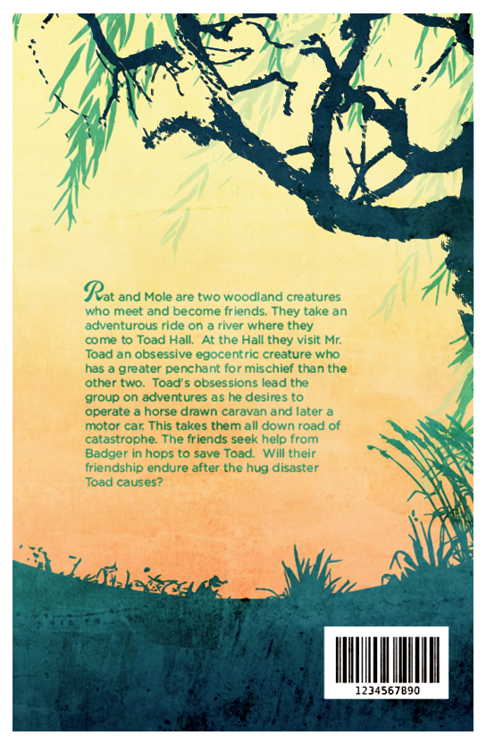
                                        Okay! Working on back now. What you all think? I was thinking about putting in some more elements, but I've been finding this piece likes to be simple. Maybe add a bird or two in the branches?

                                        Screen Shot 2019-03-19 at 3.38.08 PM.png

                                        Erin.Cortese 1 Reply Last reply Reply Quote 2
                                        • Erin.Cortese
                                          Erin.Cortese Moderator @Elizabeth Rose last edited by Erin.Cortese

                                          @Squirrelsize Beautiful! Your design is very well thought out and very nicely balanced.

                                          1 Reply Last reply Reply Quote 1
                                          • Elizabeth Rose
                                            Elizabeth Rose last edited by

                                            Yey! I'm getting really excited! This has been a fun piece! Still open to changes however. You all see anything that bothers you that I should change up?

                                            These are my edits from the last several post:

                                            I lighted up the background trees on the front cover.
                                            Switch the willow tree on the back to the right side of the page.
                                            Put clothes and a tail on Ratty

                                            Screen Shot 2019-03-20 at 8.02.24 AM.png

                                            1 Reply Last reply Reply Quote 5
                                            • First post
                                              Last post