Entry for Tuesdays critique
-
I really like this piece and I think your character design is fantastic.
-
Ooh interesting points @Rich-Green, yes I see what you mean. In the first one hedgehog looks like he's staring forlornly at his only present...that connection gave you a clue about his thoughts. I agree maybe rearranging the furniture, eg swapping the bed with the tree/present, might help.
-
@Rich-Green I agree with you and try and place the tree on the other side. maybe place the bed somewhere else as well. During the weekend, Ill work on it!
-
@Dulcie Thank you, I agree and play around with it.
-
I agree with Rich about moving some of the elements around. Moving the hedgehog over there was a composition fix. When you move a main character other things will definitely need to be adjusted around them.
Really cool piece. Can't wait to see where you go with it! : )
-
@Lee-White @Rich-Green Thank you again for your help. Now with all nice comments I can take it further!
-

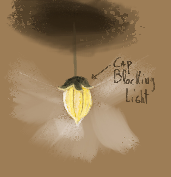
sorry for my crappy sketch but it should make my point clear !this is what i see, because the cap is over the lightbal, its sort of blocking the light so the cap and the ceiling on top of the lamp should be darker, i know you have bouncing light , but thats less stronger, and you should change the moon or redo it because that looks to digital and not rendered enough!
overall, i realy like your piece,love the details composition, the carcters looking adorable , your a great artist! but understanding light is hard, i also struggle with it, but where learning everyday!!
-
@Nancy-Gormezano thank youuuu!
-
@johntatulliart Thank you John!
-
@smoke Thank you! Yes, there's still a lot of work on this one!