Children in the neighborhood series WIP
-
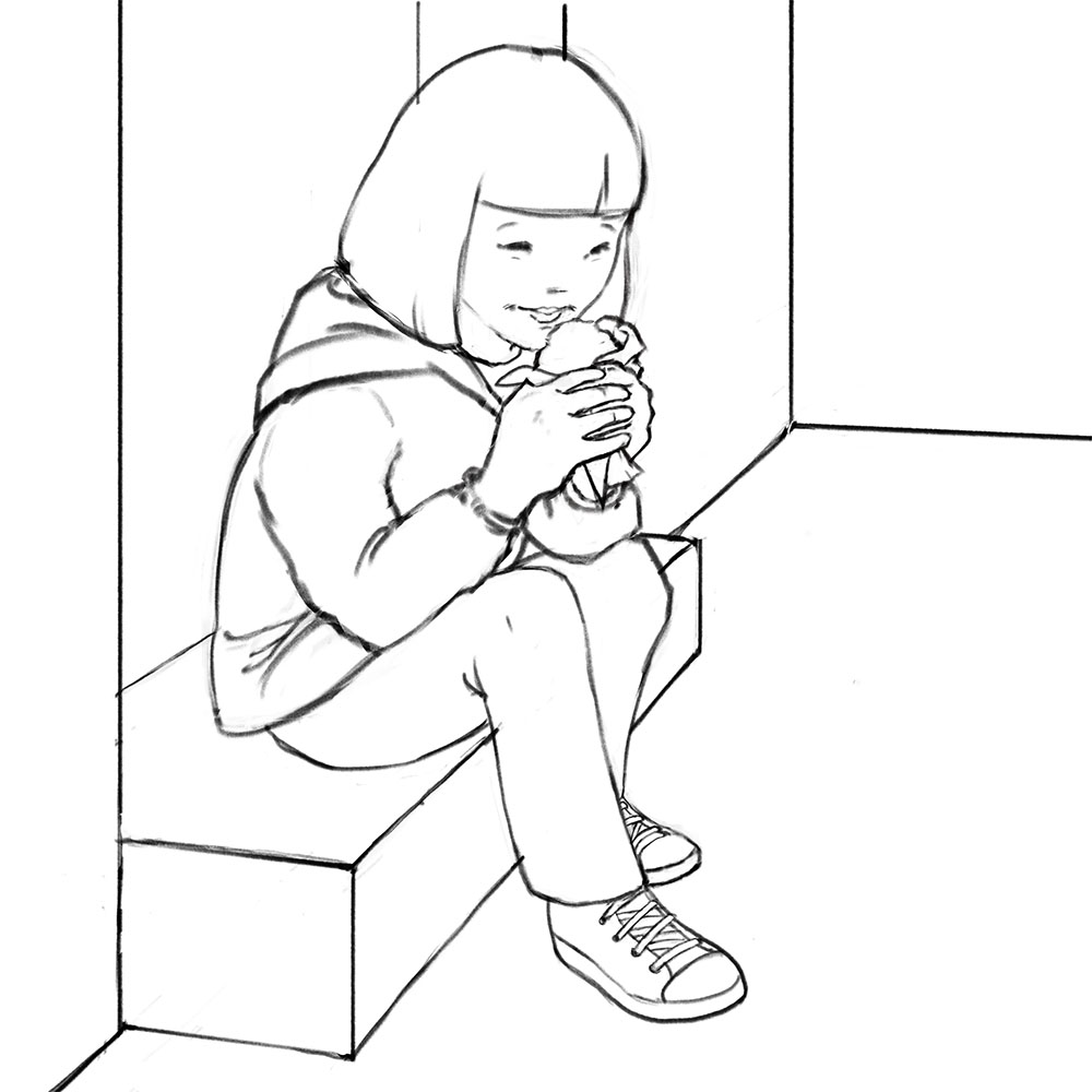
Continuing with the series of children in my neighborhood, I've drawn out a little girl sitting down outside a gelateria with her first ice cream of the season. Eventually I'm going to emphasize the sunlight, because to me this piece is all about early spring, but first I want to make sure the drawing is on target. I want to show that she's cradling this ice cream carefully, as though it's a great treasure (or maybe she's afraid of spilling it) Does that come across in how I've drawn the pose, especially the hands?
Also, do you think I should add something on the right, or is it ok as it is? There will, of course, be shadows, more architectural details, and such. The sunlight will be coming from the square in the upper right hand corner. But I'm thinking of adding something. Could be a shadow of someone off stage, or a pleading dog, but I want the focus to be on the girl, who is in her own world enjoying the ice cream. So I kind of don't want to add the dog.
Thank you for any feedback you provide!
-
I definitely get that First ice cream of the season-vibe from it, maybe emphasized because I haven't had mine yet
 And she has a very natural pose, something I always struggle with.
Spontaneously, I'd say that you don't need more on the right. The lighting and added details to the architecture should be enough to give a greater sense of context and surrounding world, while keeping the focus on her.
-
@Joen-Söderholm Thanks for your comments!
-
Beautiful.
") I think the pose and expression are very seeet. I would agree that nothing more is needed to the right. Anatomy wise, her shoulder looks a bit wide to me. Looking forward to seeing the progression of this piece very much.
I think the pose and expression are very seeet. I would agree that nothing more is needed to the right. Anatomy wise, her shoulder looks a bit wide to me. Looking forward to seeing the progression of this piece very much.