Society of Visual Storytelling

    SVSLearn Forums

    • Register
    • Login
    • Search
    • Recent
    • Tags
    • Popular
    • Users
    • Groups
    • Search

    Brighter colors or muted colors ? Need your opinion 🎨

    Artwork
    7
    15
    790
    Loading More Posts
    • Oldest to Newest
    • Newest to Oldest
    • Most Votes
    Reply
    • Reply as topic
    Log in to reply
    This topic has been deleted. Only users with topic management privileges can see it.
    • Darian
      Darian SVS OG last edited by

      Hi Awesome Fellow Illustrators,

      Its been a while, so a warm hello to you!

      I have been a having a ball of a time designing & painting illustrations and I find I am spending a lot of time deciding the final color vibrance of my images..especially with the light backgrounds of social media that can darken or lighten your illustration visually.

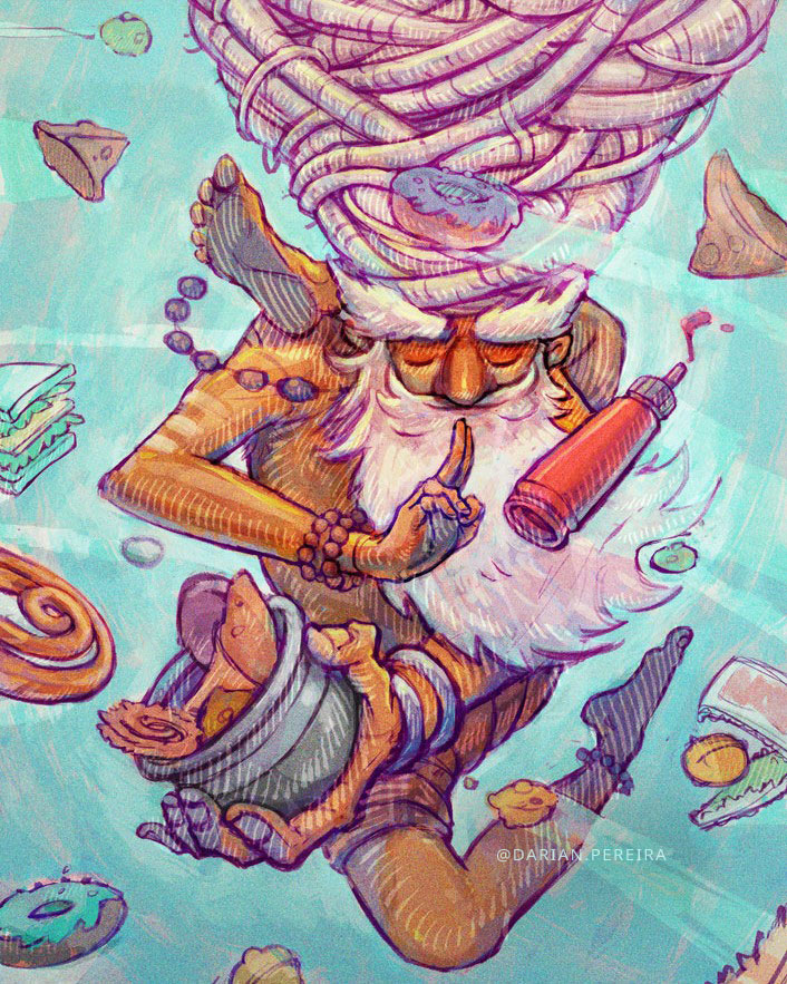
      So, here's a final image of an illustration I recently completed.Frightened-creature-color-light @darian.pereira.jpg

      I honestly loved the final look of it, also keeping in mind how it would look in a square as seen here.Frightened-creature-color-light sq @darian.pereira.jpg

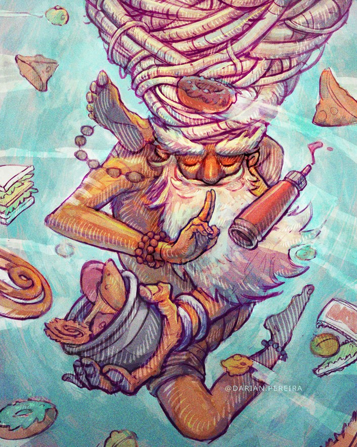
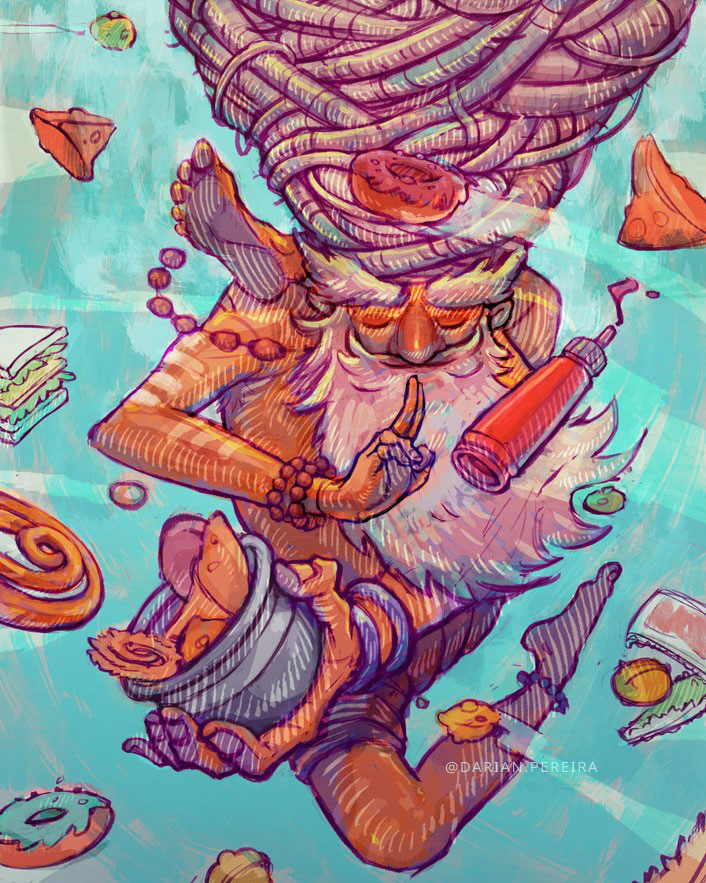
      I have a previous version of the same in its development stage, that is more vibrant:
      Frightened-creature-vibrant @darian.pereira.jpg

      and it's square version:
      Frightened-creature-vibrant sq @darian.pereira.jpg

      I seem to like it more for its appeal, but i find it edging towards being a bit garish.

      So I need to know what you think, as I find myself switching between these two (one being vibrant but maybe garish & the other, less vibrant but a bit duller in comparison) time & again wondering which is the best option for an interesting illustration as a whole.

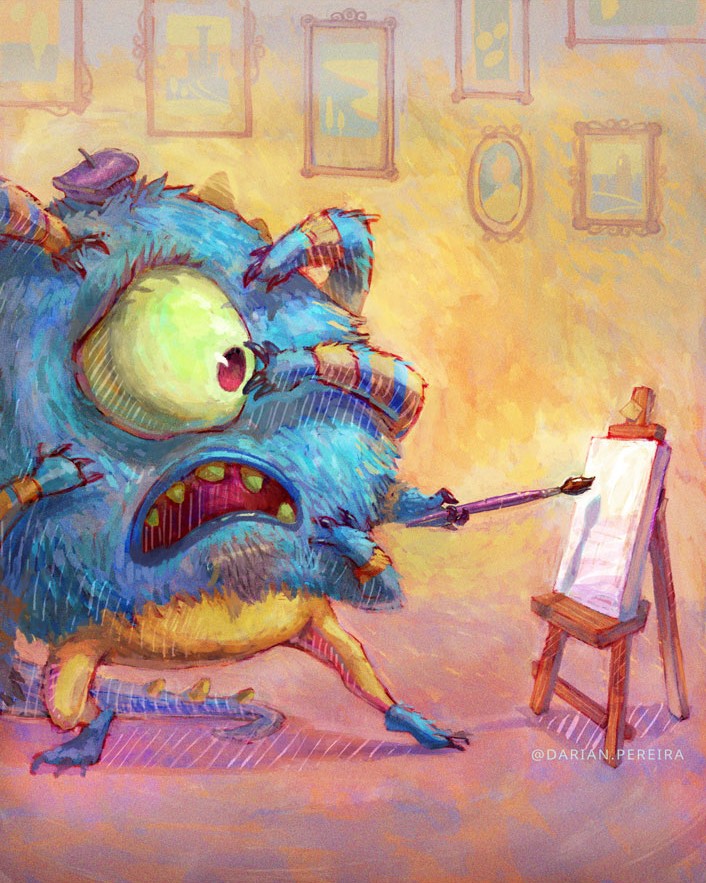
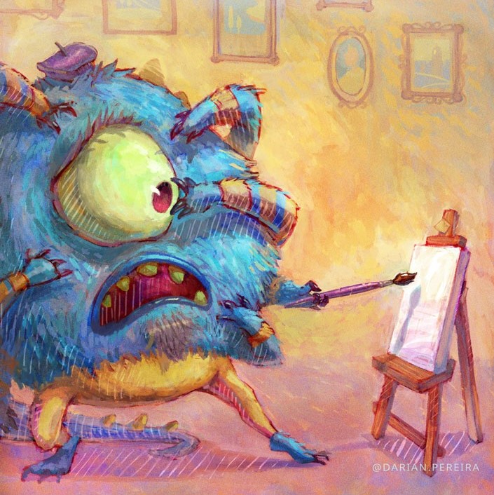
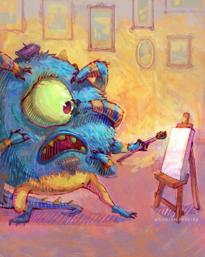
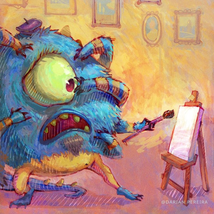
      Here's another illustration I was trying to figure out the final look of. Which one would you prefer in terms of colors?

      Option A
      food-fight-color-light-@darian.pereira.jpg

      Option B
      food fight - @darian.pereira.jpg

      Option C
      food-fight-colorfull-@darian.pereira.jpg

      What methods do you adopt in the final stages? I have tried seeing their values instead of the colors & have liked the muted color versions in grayscale. It's just that the vibrant ones look juicier..even in their thumbnails 😕

      https://www.instagram.com/darian.pereira
      https://www.behance.net/darianpereira-
      https://www.facebook.com/darianpereiraart

      1 Reply Last reply Reply Quote 1
      • Phil Cullen
        Phil Cullen last edited by

        These are great, I think I saw the first one on the Jimbob drawing show. Very cool illustration.

        I feel your pain. I sometimes go through the same thing and I think the same thing can happen with brush strokes or texture.

        My advice would be to vary the use of both muted and vibrance in your paintings. For instance make part of the image pop with vibrance and keep the rest muted.

        Like for instance the last illustration if you had the muted version and just let the ketchup bottle and maybe parts of the skin have that vibrance I think that would be cool.

        Hope that helps a bit

        www.instagram.com/phillip.cullen/
        www.facebook.com/phillipcullenillustration/

        Darian 1 Reply Last reply Reply Quote 3
        • Darian
          Darian SVS OG @Phil Cullen last edited by

          @Phil-Cullen Thank you for your input!

          I did do that in the very first image of the post where the character is more vibrant while the background is duller..would you say I went overboard with the background desaturation ?

          https://www.instagram.com/darian.pereira
          https://www.behance.net/darianpereira-
          https://www.facebook.com/darianpereiraart

          Phil Cullen 1 Reply Last reply Reply Quote 0
          • Phil Cullen
            Phil Cullen @Darian last edited by

            @Darian I don't actually think you went overboard with the background desaturation at all. To me it's still quite vibrant. I'd desaturate the background a lot more, almost too much and then bring it back a bit and see if it changes the image for you.

            But again I think what you have is really cool

            www.instagram.com/phillip.cullen/
            www.facebook.com/phillipcullenillustration/

            1 Reply Last reply Reply Quote 1
            • Darian
              Darian SVS OG last edited by

              thank you @Phil-Cullen . i think i'll need to figure out the right balance between the vibrance & the desaturation..hmmm..maybe more experimentation is required.

              The timeline of posting within a week doesn't help either..haha !

              https://www.instagram.com/darian.pereira
              https://www.behance.net/darianpereira-
              https://www.facebook.com/darianpereiraart

              1 Reply Last reply Reply Quote 0
              • Chip Valecek
                Chip Valecek SVS Team SVS OG last edited by

                I prefer when they are more vibrant. I tend to pump up the saturation a little in my final stages of a painting. It seems to give it a little more life.


                https://www.instagram.com/chipvalecek/
                https://www.facebook.com/cvalecek
                http://www.cshellmedia.com/

                Darian 1 Reply Last reply Reply Quote 1
                • Darian
                  Darian SVS OG @Chip Valecek last edited by

                  @Chip-Valecek thanks! so would you go for the more vibrant one of the two in the post?

                  https://www.instagram.com/darian.pereira
                  https://www.behance.net/darianpereira-
                  https://www.facebook.com/darianpereiraart

                  Chip Valecek 1 Reply Last reply Reply Quote 1
                  • theprairiefox
                    theprairiefox last edited by theprairiefox

                    I have the feeling that the answers you are going to get are going to be heavily based on personal taste. I prefer the muted colors personally.

                    But... I would say you should use the vibrancy to your benefit. The question you have to ask yourself is what feeling are you going for and which vibrancy accomplishes that?

                    For example: if your concept for the monk drawing is that it has a feeling of "old times" or a "dusty chaos" feeling then I would go for a more muted palette. If your keywords are more along the lines of "fire in the calm" or something like that I would go for the higher vibrancy.

                    It is difficult to give better advice without knowing your intent for the piece. Good luck, I love the energy and fun of these pieces, they are really great.

                    -The Prairie Fox
                    https://www.instagram.com/theprairiefox
                    https://www.theprairiefox.com

                    Darian 1 Reply Last reply Reply Quote 2
                    • Darian
                      Darian SVS OG @theprairiefox last edited by

                      thanks @theprairiefox ! for the frightened creature, the mood i was going for fearful but with a touch of humorous vibe. I liked the dull one completely at first only to wonder later if the vibrant one was a better choice.

                      So, I guess what I would like to know is whether the dull version is too dull on an average or is it just right 🙂

                      https://www.instagram.com/darian.pereira
                      https://www.behance.net/darianpereira-
                      https://www.facebook.com/darianpereiraart

                      1 Reply Last reply Reply Quote 0
                      • Chip Valecek
                        Chip Valecek SVS Team SVS OG @Darian last edited by

                        @Darian yes I would go for the vibrant ones.


                        https://www.instagram.com/chipvalecek/
                        https://www.facebook.com/cvalecek
                        http://www.cshellmedia.com/

                        1 Reply Last reply Reply Quote 1
                        • ?
                          A Former User last edited by

                          Definitely more vibrant colours!

                          1 Reply Last reply Reply Quote 1
                          • Laurie
                            Laurie last edited by

                            This is something I struggle with also, as I love doing detail work and tend to overwork a painting because i can't seem to stop myself...... 🙂 I just took Will Terry's Light class and one thing that I took away from that class(probably because I never do this) is that he said throughout the class, emphasize the main subject/theme by clear details, color usage etc. and downplay everything else, by desaturation and fuzzier lines, etc..... that being said, I love how your pieces are turning out, brightly colored and detailed throughout, soooooo not sure what to tell you, other than, Good Luck! I agree with @theprairiefox where your answers may be based on personal taste!

                            www.instagram.com/lmuggliart/
                            www.lmuggliart.etsy.com

                            Darian 1 Reply Last reply Reply Quote 1
                            • VitoPetra
                              VitoPetra last edited by

                              ohhh what!? crazy good work! : I would go for a bit duller color range less vibrant! it's too much information to take, i would rather direct with a strong cast shadow on an actual character where would you like your viewer to look . : )

                              Vito Petra
                              Illustrator and Graphic designer
                              www.vitopetra.com
                              @vitopetraart

                              Darian 1 Reply Last reply Reply Quote 1
                              • Darian
                                Darian SVS OG @Laurie last edited by

                                Thank you @Laurie for some really good pointers. I do try and implement it but I guess I get carried away sometimes 😕

                                Thank you for your feedback. It helps!

                                https://www.instagram.com/darian.pereira
                                https://www.behance.net/darianpereira-
                                https://www.facebook.com/darianpereiraart

                                1 Reply Last reply Reply Quote 1
                                • Darian
                                  Darian SVS OG @VitoPetra last edited by

                                  @VitoPetra Yes! I think 'too much information' is the right way to put it! Thank you for that point of view! Strong cast shadow is certainly another good idea to highlight the focal point.

                                  https://www.instagram.com/darian.pereira
                                  https://www.behance.net/darianpereira-
                                  https://www.facebook.com/darianpereiraart

                                  1 Reply Last reply Reply Quote 0
                                  • First post
                                    Last post