The Moment before WIP
-
@xin-li This is fantastic! I get a real ominous feeling from the whole thing. Like the shadow's saying 'not yet, guys. Not yet"
I see keywords and a pitch

-
Thanks for all the feedback on this piece so far. I really enjoyed the process of doing this one. Finally back to the drawing board after a long Easter break.
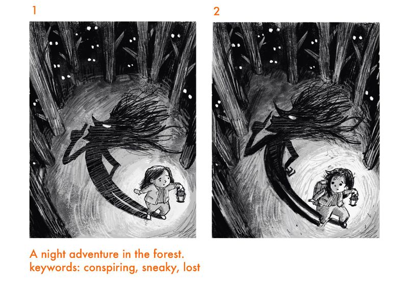
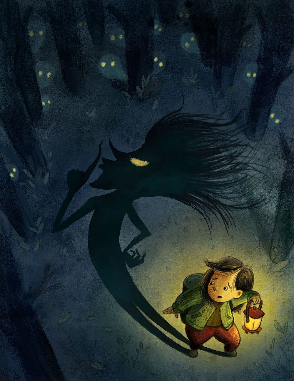
I struggled a bit of getting the posture right for the girl. I want her to feel a bit lost, a bit scared, but has gathered herself together enough courage to move forward in a dark forest. She is taking every step carefully. The camera angle is really high up, making the viewer feel that the girl is being watched by something from the dark forest.
I made changes on my previous sketch (no. 1) based on @Jon-Anderson feedback. Do the posture and facial expression on no.2 sketch convey what I want?
-
@xin-li I personally think you nailed it! It's amazing how subtle changes can make a better impact on an image. I get the keywords you were going for and am wanting to turn the page to find out what happens next.
-
@xin-li , your last sketch is really great! And working with keywords sounds a pretty good idea, never thought about it before.
I have to say that I liked the emotion on the face of the little girl on your first thumbnail, she is lost and can feel the 'danger' but she's not impressed")
But the last one reads really well, I can feel her heart beating! (maybe because I used to be sacred of the dark )
) -
@marine Definitely try working with keywords. It works best if the keywords you are chosen is adjectives, something viewers are suppose to feel when seeing the image. I learned to work with keywords from @Lee-White and @davidhohn 's class on SVSlearn. I found it very helpful for decision making while working with an image, and it is also very helpful when asking for feedback. I got more useful/relevant crits this way :-).
-
@Jon-Anderson thank you. I am moving on to color study tomorrow

-
Here is my color study. I find it difficult working with color studies.
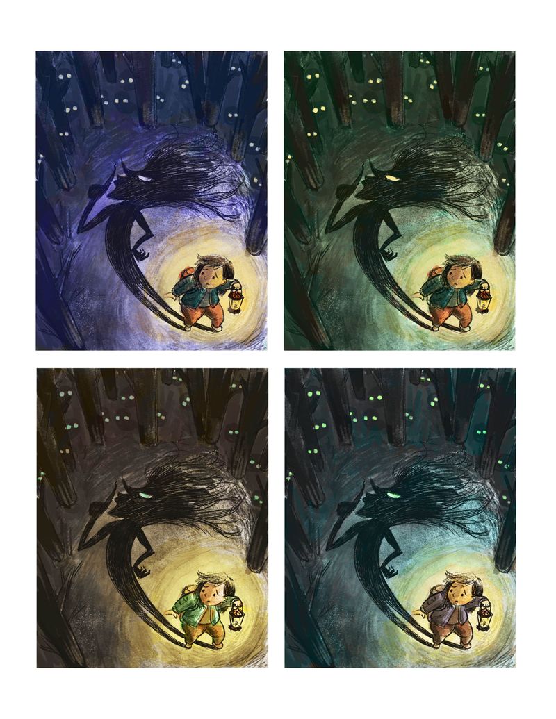
I made a new layer on top of my value study layer in photoshop and set the new layer to color blending mode. I find it hard to pick colors when the layer is set to color blending mode, I feel like I never know what color will turn out before I put it down. In the end, my color study is either too saturated or too muddy.
I also tried to use multiply layer for coloring, I always get very muddy color. Does anyone have tips? How you go about from value study to color study in photoshop?
-
@xin-li have you tried using a different colour brush in overlay blend mode? That'll give you a colour glaze. Should help to make it pop.
-
@xin-li I have a hard time doing colour studies, too
")
Right now at the colour comp stage I try and think of it as a light map with splashes of local colour.
As for the technique, I think mine'll translate to photoshop (I use painter). I do my finished sketch (linework) then do a value study (pretty rough, I mostly pick the basic shapes). Overtop of the value study on a colourize layer (just colour in photoshop, I think) I do a 'light' layer where shadows are cool and faces the light hits are warm. Over that I do another colourize layer with my local colour set at between 80-90% (or less) depending on how strong the lighting is. After that, I flatten the value and colourize layers and throw em' overtop of the linework as an overlay layer (with a layer of mid grey under the linework). Keeping the colours as an overlay over the linework means the colour will flavour the lines, but be non-destructive.
I think it's pretty close to what we did in the turbocharging class
My big problem with colour comps is that I wanted them to be perfect and look exactly like the finished painting. But they never will be
I always need to get in there and tweak things for a good few hours before it starts to look okay. These days I try and give it a day or two before coming back and throwing on an adjustment layer to saturate/desaturate lighten/darken and such.Colour comps give me most the puzzle pieces. I still need to put them together
I think it looks fantastic so far. I'm leaning toward the purple darkness in the top right, bit I also like the greeny blue in the bottom right. You could even play with the eyes being a nice reddy colour maybe.
-
@sigross nope. I have not tried with the brush blend mode. Definitely try this tomorrow. Thanks for the suggestion.
@Braden-Hallett I get what you mean by wanting the color comps to be perfect. I always ended up making a lot of decisions on the final painting as well. Color comps give me a rough idea. I wanted to make more decisions on this phase. However, I find it would take too much time. I need to experiment more to find a more efficient way to work with it. Currently, I try to follow David's method from the turbocharging class. It is quick enough, but I want it to be more predictable when picking the color, and a bit more precise, if it makes sense.
I went back to check Will's video on 10 steps of digital painting. His color study was just a multiply layer. But when I tried that on my piece, it gets so muddy. I think maybe he has a much lighter tonal sketch. Maybe this method will work for me if I am doing something else than a night forest scene.
I am leaning towards greeny blue in the bottom right. I will give it another go tomorrow.
-
@xin-li I'm leaning toward most towards that top left (purple toned) and then the bottom left (orangish yellow toned). I think the first one adds to the fear factor with the cool purple colors around the shadow.
I get confused by Will's 10 step process when it comes time to add color, too. Maybe the light bulb moment will happen for us soon and it'll get easier.
-
I think I finally made most of the major decisions for this piece. From here, I am going to paint and tweak. I followed the process from the turbocharging class, but I still feel I don't really know what I am doing most of the time. I guess it really comes down to do this process over and over again till it becomes second nature.
-
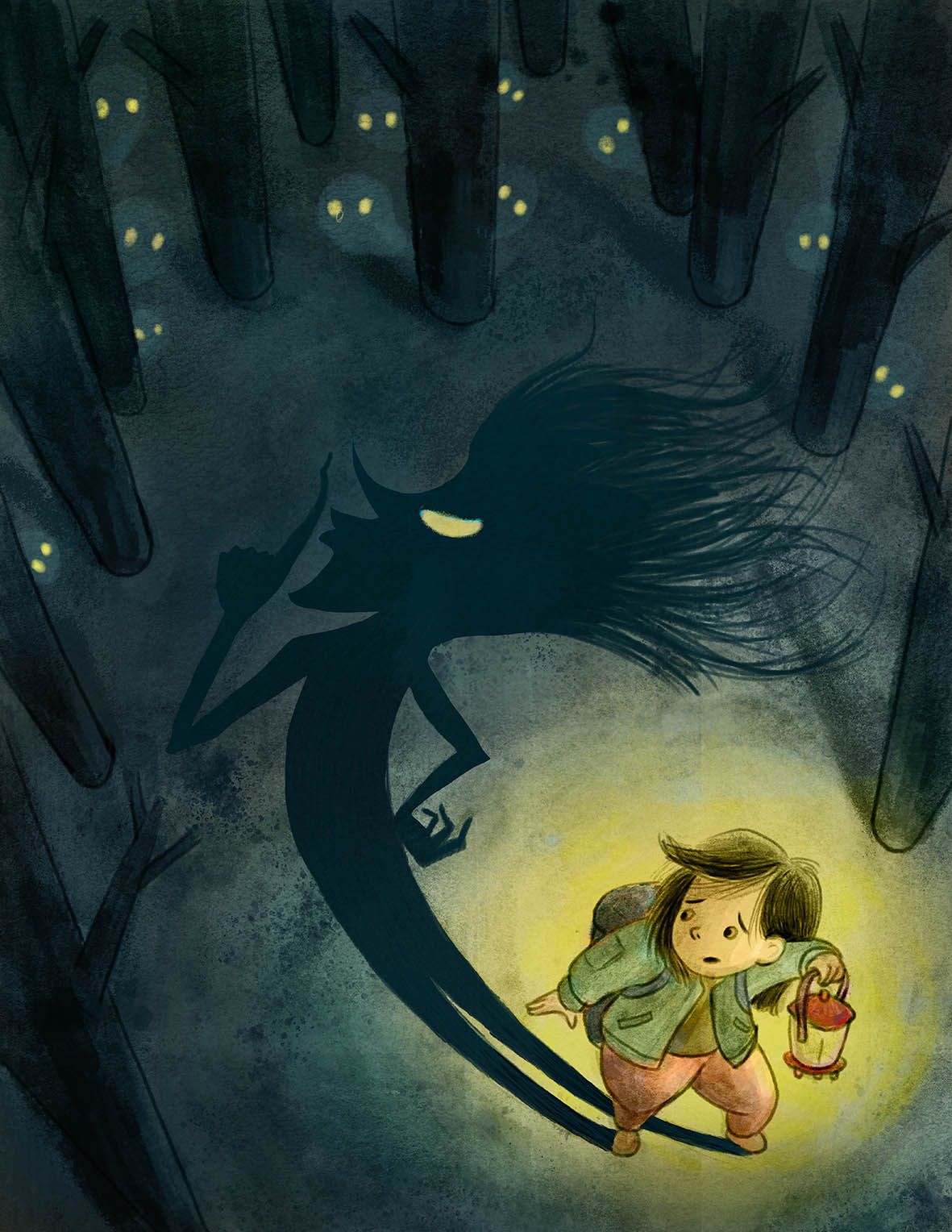
Aahhh! I love this! I absolutely love the concept - it definitely was the creepiest to me. I love the design of the shadow. It's just perfect.
-
@xin-li this is looking really good. It feels so scary.
-
@xin-li my one suggestions is to add shadows on the girl on parts of her that are not lit like the side of her face, the back for her arms, etc in order to emphasis that it is dark and the only source of light is the lantern.
Portfolio: nyrrylcadiz.com
Instagram: https://www.instagram.com/nyrryl_cadiz/
YouTube: https://www.youtube.com/channel/UCbJCF1Im8ZO7hpGWTKOJMuA -
@nyrrylcadiz thanks for the feedback. I will work on that. The girl still requires a lot of work :-).
-
When do you guys call a painting done? I always have a problem finishing a painting. The last 10% often takes 50% of my time, then I would end up feeling I have overworked a painting. Does anyone have thoughts on how do you know when a painting is done?
Is there anything I could work on a bit more before I submit?
-
@xin-li I understand what you mean about when to know a painting is finished. I think it comes down to zooming out of the image and see if it works out as a whole in terms of composition & readability.
Another way is to squint your eyes & see if anything is standing out to you that shouldn't be standing out..which can happen as we paint along & have to re-focus the purpose of the image
I think it works great, I'd suggest blurring the edges of the shadow that are further away from the character to make the shadow look more believable. Another thing you could do is cool down the shadow areas of the character holding the light source.
-
@xin-li This is looking so cool! Reminds me of the shadow creatures in 'Don't Starve'.
-
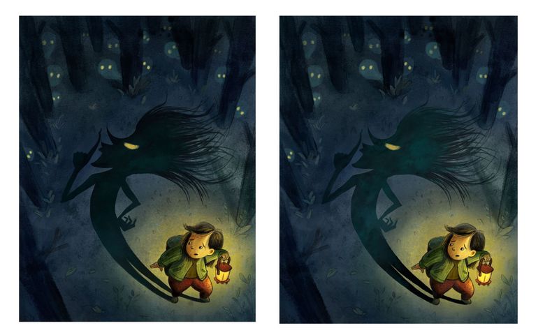
I am still noodling the piece. I found myself lost in the last 5%. @Darian suggested on blurring the part of the shadow which is further from the character to create depths and more believable shadow. I like the suggestion of making the shadow more blend-in and believable. But I did not like the blur effect for this particular piece. So I played with changing the value slightly on the shadow. Does this help? (left: before changing the shadow; right: after changing the shadow)