Does the rest of this comic scan?
-
@ErinCortese Thanks
") I think it's turning out okay so far. Thanks for taking a look
I think it's turning out okay so far. Thanks for taking a look 
-
@Aleksey Oh wow, man! Thank you
That's a lot of really good feedback I wouldn't have thought of. Condensing dialogue is something I actually haven't heard of when it comes to writing comics (but absolutely something I should think about considering I'm verbally repeating elements that I'm also showing visibly
)I think I'll be keeping some of it (It has a certain rhythm that needs pauses and sighs that I want to keep) but I'd be very interested in seeing what else you think could be cut to make it leaner.
I'm already thinking about some of the dialogue that's not necessary :smiling_face_with_open_mouth_cold_sweat: . If you feel like giving me your take on the rest of it that'd be really awesome. Feel free to just say 'page four, panel two' and so forth
Thanks again! There's definitely some changes I'll be making based on your feedback!
-
@Braden-Hallett oh yeah I’ll definitely do it tomorrow when i am free. I love this stuff. I read all the will eisner books and loved them and some of it overlapped with the comics writing classes I took. You dont have to cut any of it if you don’t wanna, some people use dialogue to go with their images but it’s just more impactful when the viewer realizes that’s what the image is doing without the bubble.
-
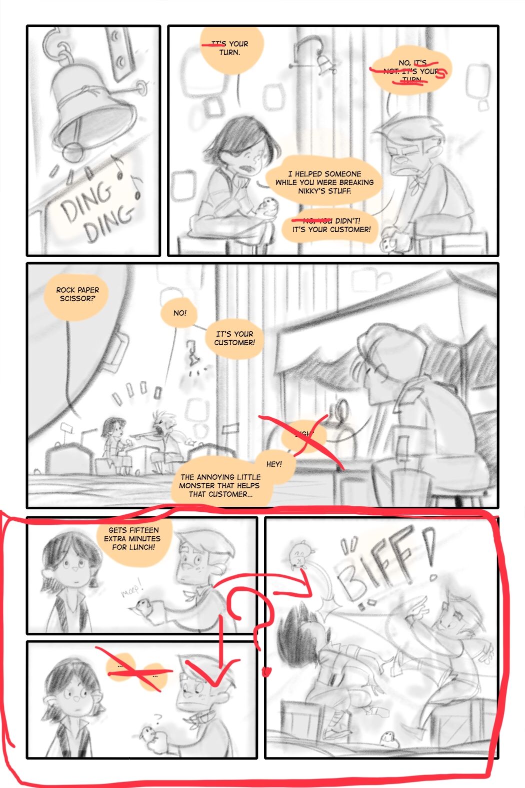
Alright since I did page 2 lets start at page 3
These kids are very well spoken for a bunch of orphans? Squires? Peasants? Either way they have good grammar for kids. I’d try to make the way they speak a bit more fun, so that when I’m reading I can pretend I am imagining what they sound like, cutting out words to fit that speech pattern may help. That’s what I did in panel 2 and around the whole comic Generally. This is the main character im gonna hear his voice in my head. Another storytelling element you can mess with.
Especially kyle, he’s given 1 word answers in the previous page so why not keep that going.I got rid of the “sigh” generally when i read “sigh” it makes me cringe a little. Your art speaks for itself when it comes to displaying emotions, try to avoid writing sigh or ugh or little things like that if you can.
The panel layout is fine-ish. In the bottom you’re using a panel flow that is recommended you avoid, recommended of course you dont have to but because people read from left to right, this particular kind of grouping can break the flow of the reading because it’s very slightly confusing and that’s enough to break the flow. If you feel like redoing this, you don’t need to have a wide panel in the middle, we know nicole is the only other person in the scene at the moment you can have her speak off panel which would allow you to condense it but of course if you wanna show her frustration you dont have to. Her calling them “monster”
is enough for me to know she’s annoyed.
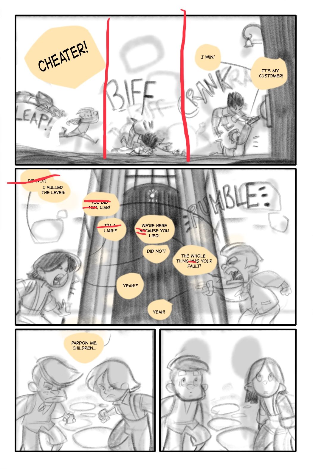
Page 4
Ok this first panel - is the prime location to use this panel lay out, where you have the same background but instead of using 1 big panel you break it up into 3 and use that to show the action. I try to use this method whenever I can because its very fun to draw and look at.For their dialogue in the center panel you can cut some words here and there but because they’re arguing your method of back and forth speech bubbles is very affective, id just try to keep in mind the thing I mentioned about their grammar and speech.
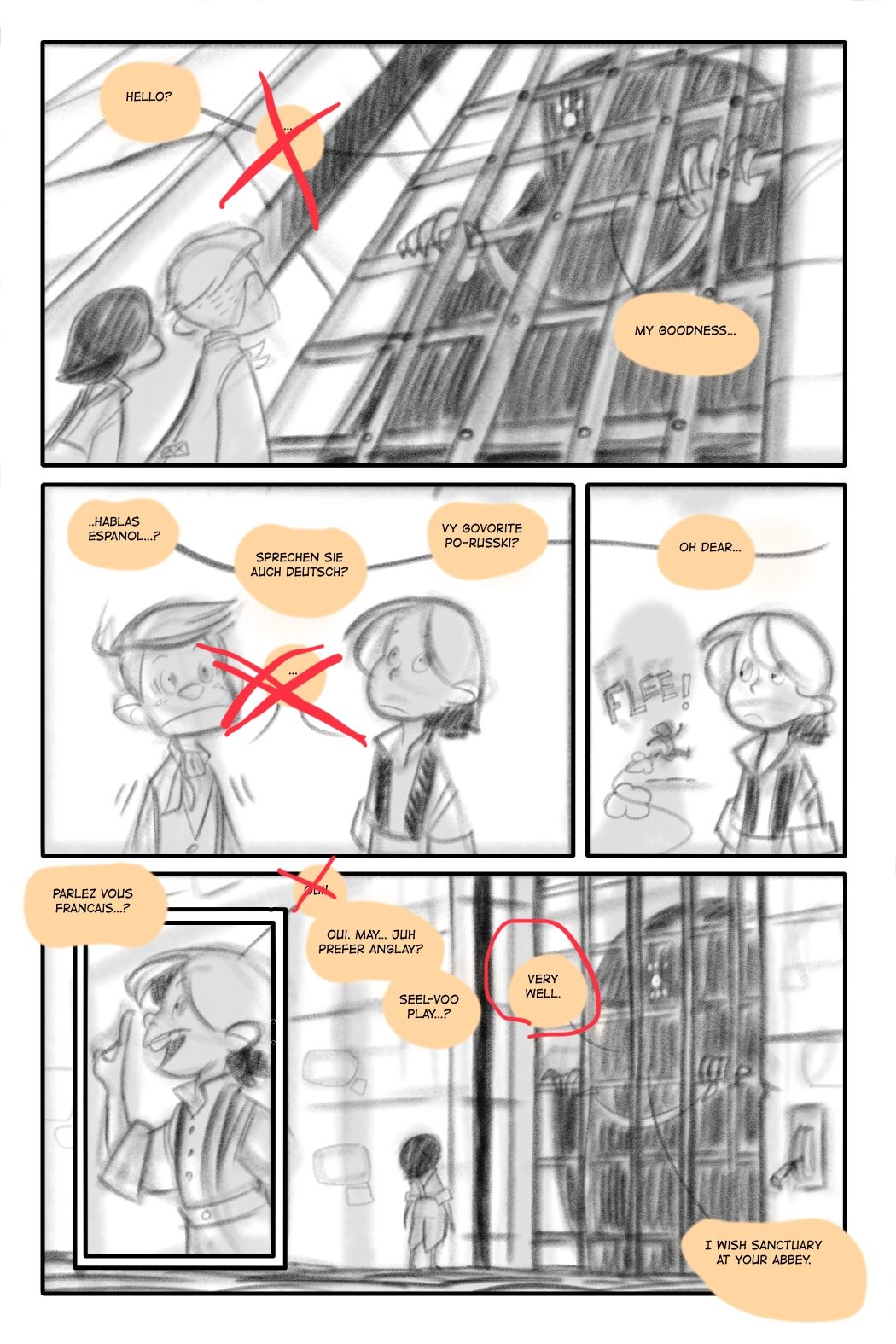
Page 5
Panel 1 -Instead of using the ellipsis (3 dots) just add 2 before the “hello” it’s more affective. (Great angle btw)Panel 2- great job on showing their terror, dont need the dots!
Panel 3 - very good
Panel 4/5- perhaps cut the “very well” that thing did start speaking in English already maybe add a pause before “I Wish” or just cut “very well “ and see what it sounds like?
This page is very good.
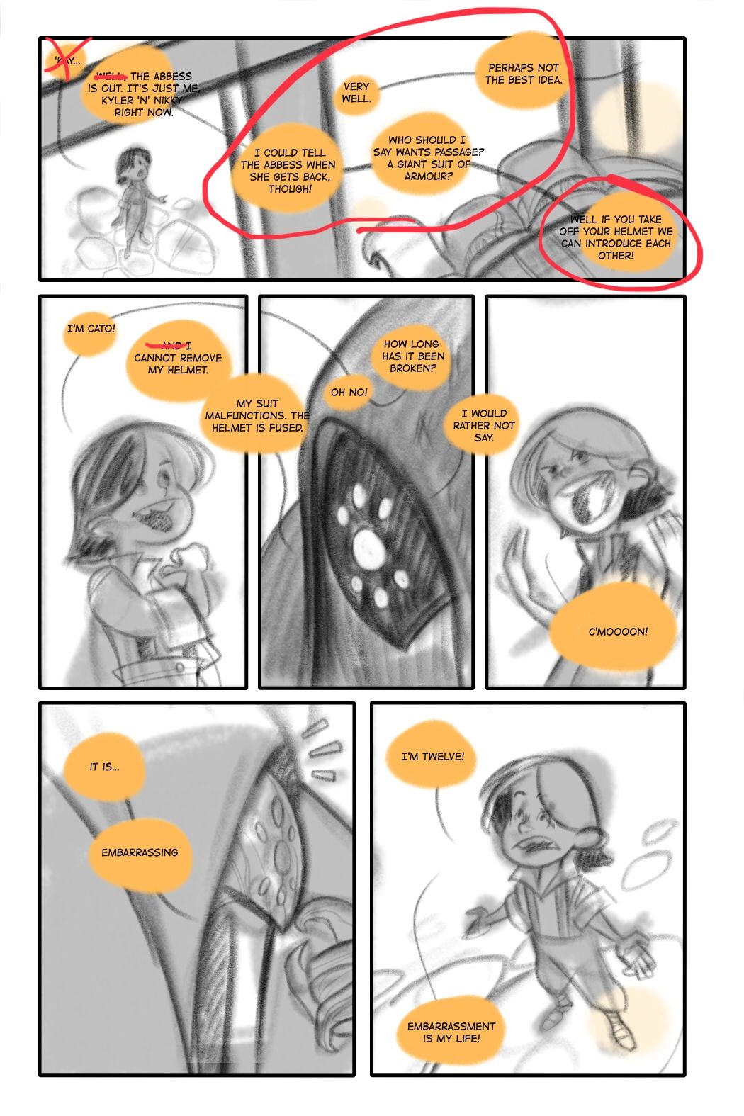
Page 6
Panel 1: the flow of dialogue:
The first word bubble “the abbess is out it’s just me kelyer n nikky right now” you dont need the “well” in fact you could just do “the abbess is out right now” the only people youve shown at the moment were kyler nikky and cato. So you can leave it at that, but the main issue in this one is really the flow, after the first bubble my initial instinct was to go to “very well” then “i could tell...” either way you read it it doesn’t really hinder the conversation but it did break the flow for me. I would definitely try and condense this conversation a tiny bitThe following panels similar issue just condensing it a bit. “My suit malfunctions, i cant remove the helmet, it’s fused” would probably be enough. Also keep in mind the grammar thing I mentioned before with the kids speech.
Page 7
Panel 1: chop off the last 2 wordsPanel 2: Sounds nasty or seems nasty
Panel 4 is fine I think I circled it by accident but the next 3 panels have the same problem as before where it can break the flow. But either way in panel 5 you don’t need both “well” and “hmm” just 1 does the job of pausing.
The final panel is great! I just would cut some minor stuff.
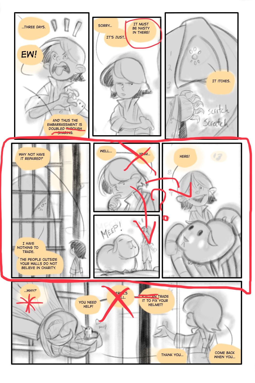
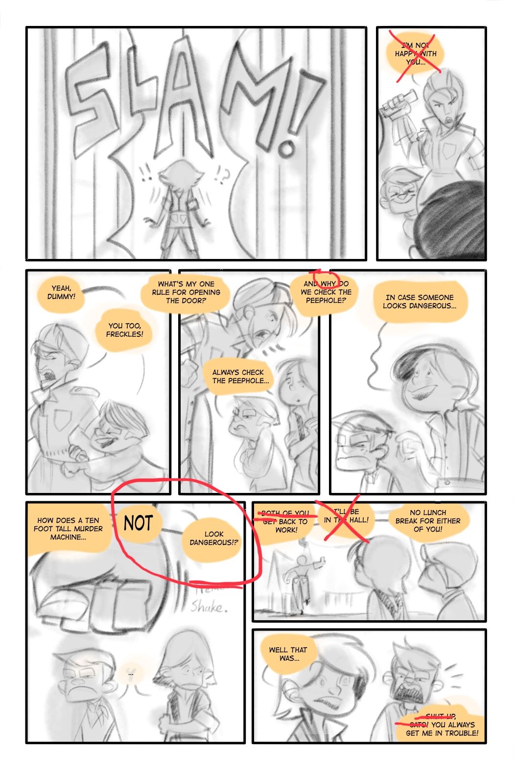
Page 8
Panel 2 you can clearly see the expression on her face you can cut that bubble if ya wanna it doesn’t add anything for mePanel 4 this is a technique that helps control the internal voice of readers. When you have conversations like these you can emphasize words to make the conversation sound more natural and interesting to read.
Bottom layout panels 6-8 great layout!
Panel 6 - i would change the emphasis to “Look Dangerous” instead of Not. Having the emphasis at the end of the panel makes is read stronger. Having it peak at NOT isnt as affective.
Panel 7
Small panel with 3 word bubbles, feels crowded. Cut some of the dialogue.
Page 9
This is good i love the last panel. But i want to make the last bit of dialogue more affective. Has he been planning to escape? Why does he need “one more day” if it’s a new thought I would change it to “I’m so outta here” or something. Because nothing prior to this has given me the idea that he’s been planning an escape. Which it doesnt have to but this is just another dialogue thing.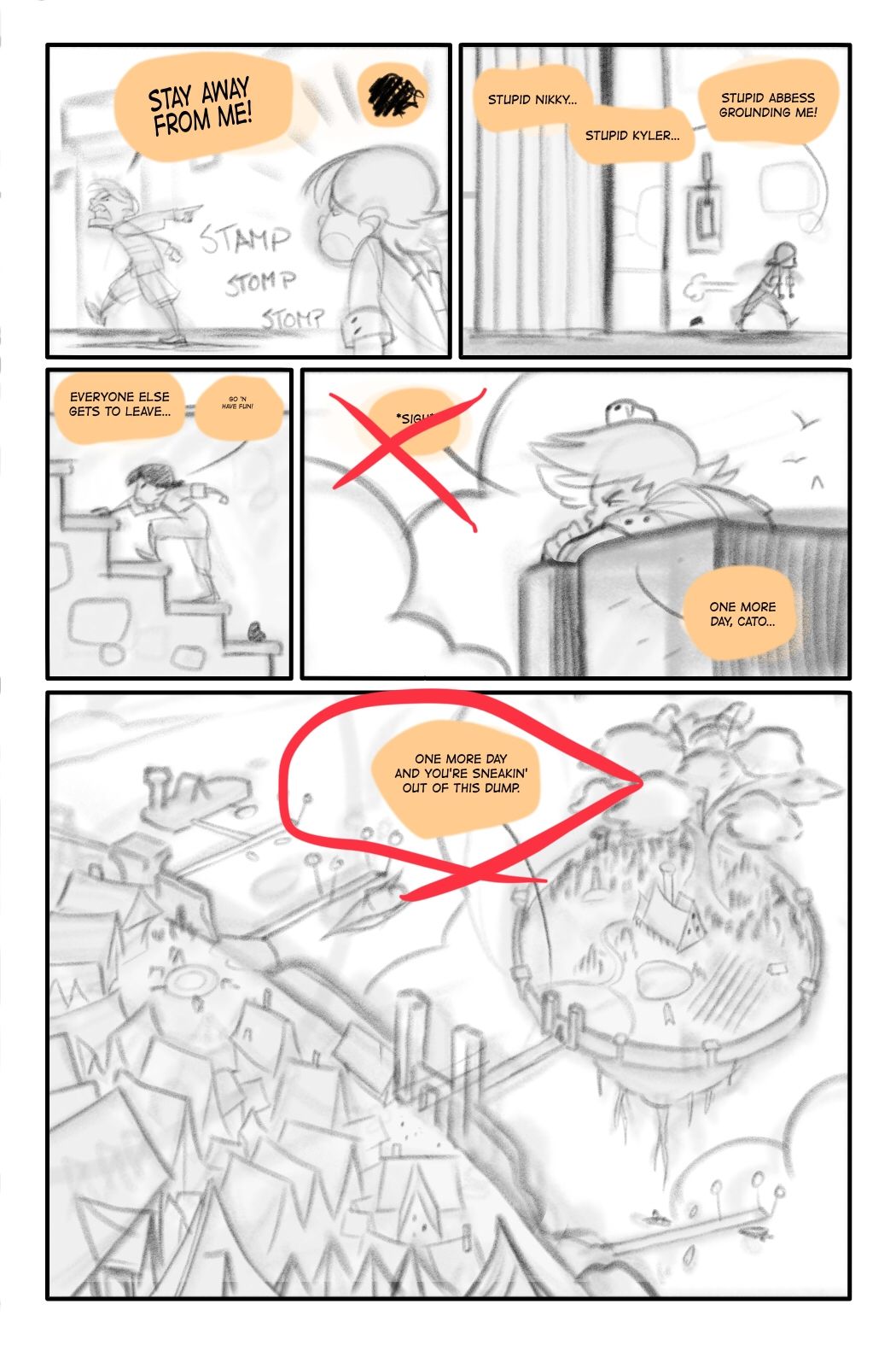
Overall advice:
Mind the panel flow, it’s better to avoid the confusing “do i go down or do i go right” panel formats, like people arent dumb they’ll figure it out, but it causes them to break away from the story flow and I would avoid that.
Act out the dialogue outloud if you have to and ask yourself:
Do people talk this way?
Would this character speak in a certain manner? (Because this does add to how the readers construct the characters in their heads)
Try to avoid “sigh” or “hmm” if you can, redundancy with the art makes the art less impactful. Let the art speak for itself, people pause at panels with no dialogue, it makes them more invested in the story and the characters.
It seems you rely on the flow of speech bubbles to move your comic forward. Which isnt a bad thing, but remember your art and panel layouts are just as important! Use it! They are more affective tools!So all of this are changes I would make you dont have to follow any of this, your comic is fine and your art is good. I just think you can make it better. Keep what you wanna, toss out what you dont. Hope this helps!
Sorry for the long post! Hope this helps. I tend to ramble because i type like I speak.
instagram and twitter: @artofaleksey
alekseyillustration.com -
@Aleksey Dude, this is all solid gold.
Thanks you
I'm gonna let things sit for a little bit then make some changes.
-
@Braden-Hallett good thinking. I’m glad to help!
-
@Braden-Hallett it wasn't hard, and actually a pleasure to read all 9 pages. I was left wondering after you posted the first page--and now I'm intrigued as to just what's going on here. And I think that's the point-we're just getting going.
I picked up on the same challenge that @Aleksey pointed out at the top of page 6. I thought his comments on condensing the dialog were excellent.
There were some other places where I wasn't instantly sure which balloon went with which character--I think this was largely because the balloons are so clearly marked with the light orange background, that the grey tails are currently lost. That looks like a draft issue-as you made them all white in the first page which looks finished.
I can't wait to read more-do you plan on continuing with it, or are you stopping here with this being enough to add to your portfolio?
-
@Aleksey What generous comments you've taken the time to type out! Can you share a little about the comic writing course that you took?
-
@Susan-Marks sure it’s an sva continuing education course i took online
http://www.sva.edu/continuing-education/uhum/writing-for-comics-19-cu-olc-2619-aWhat helped me mostly though was the will eisner books on visual storytelling
-
@Susan-Marks Thanks! 'A pleasure to read' is a good thing
Thanks for the feedback! I'll be making changes once I get back from the Calgary comic convention.
This particular snippet of comic is actually a chapter out of my webcomic redone as a fantasy, so I'll just be using this little bit for my portfolio. I won't be continuing it since it's all already finished and posted (400 some odd pages).
I'll be sure to repost these pages once they're inked and coloured