Character lineup design advice
-
I was hoping to get some advice from the great people here.
I'm working on creating a series of chapter book style portfolio pieces using the same characters to show consistency. I'm trying to design my main lineup first before I start working on more details compositions.
The idea is a lively girl that believes in fairies finds an alien that crashed in her backyard and mistakes her for a fairy.
The main line up would be the girl, the alien that looks a little like a fairy and the girl's pet dog.I designed the alien first. Then the girl on the left and I did like her but I worried she looked a bit old for a chapter book and I thought I should explore a bit more before settling on a design so I did the girl on the right. I like the energy of the girl on the right more and I think she fits the brief well but I worry she no longer looks cohesive with the alien, who now looks stiff and boring. I don't know how to fix this since I like the contrast of different personalities.
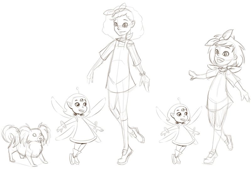
Does anyone have advice on creating calmer characters that still have energy?
-
@CukiArtist cool story idea. Whenever I think about energy of a character I always think of expression. The girl on the left has a simple smile where the girl on the right has a open smile and displays more energy. As far as showing consistency, I think you get that here with these designs. If you want to make the girl look younger maybe make her head bigger and body smaller. Looking forward to see more!
-
Like the style!
I agree with Chip, one of the best ways to show energy is in the expression, particularly, in my opinion, with the eyes. Skottie Young has good examples of characters that are definitely energetic, but you can tell when they're in their 'calm' mode. Maybe see if you can incorporate some of his style into your's?
Hope that helps!
-
This is a neat concept and I like your style even in the sketch. As Chip and Josh pointed out I think the first thing I would try is the smile/expression on the alien. Try the closed mouth smile that you have on the first girl to see if that comes across the way you want. Another suggestion I have if you are going to show the characters this close together is to have them interacting somehow. Maybe have the alien looking up at the girl or move the alien to eye level so it looks like they are looking at each other. It's amazing what subtle tweaks can do to an image or character. Hopefully you find what you like soon.
-
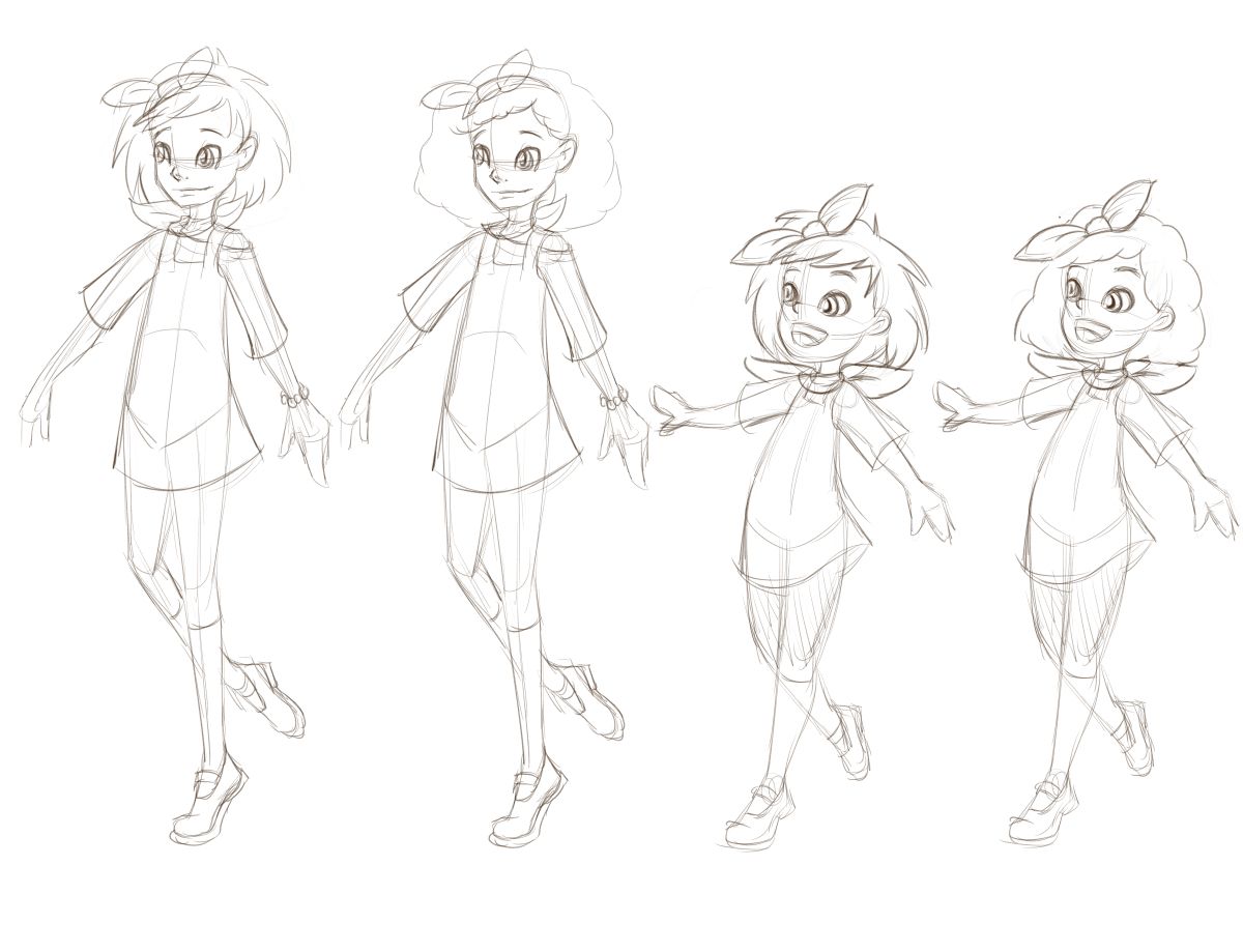
Thanks for everyone's supportive feedback. I tried the two ages with the two hair styles. I think I do like the younger girl with messy hair, I think it makes her look more reckless. Even with the energetic pose and expression I feel the curly hair makes her more girly and sedate. But welcome other people's opinions on which is the more appealing design.
I also tried the alien with some other expressions and poses. I think people were right that the actual designs for both work together (I was worrying for nothing
 ). It's just a case of using good expressions and poses to compliment them. Honestly I think the biggest problem with the base version is the pose which lacks personality.
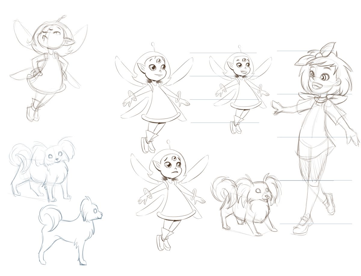
So here is my progress, including her dog.
-
@CukiArtist I really like the alien in the upper left-I think it has the most zing of the alien poses; I like the sad/wary looking one on the bottom the best. Both of these pique my curiosity as to what's going on.
I think you've definitely gone in a good direction for an energetic but younger girl. If you wanted to add another degree of calm-how about making her eyes a little smaller?
I'm impressed with your consistency!
-
Hey @CukiArtist, these are really great! I love your linework, its very clean with confident strokes. The characters look pretty calm to me already but maybe play with the posing and drop the shoulders a bit to make her look more loose and see how that looks!
Nice work!
-
@CukiArtist very cute artwork, I am especially impressed with the dog! I like what you are doing with the expressions. The thing that sticks out the most to me is that the alien and girl look very similar to each other in design (same length of hair, same eye shape, "wings"). What do you think about changing up some of the features to let them compliment each other. Maybe try the eyeshape on the girl to make her look a little less fairy-ish and see what you think.