WIP comp critiques, please :)
-
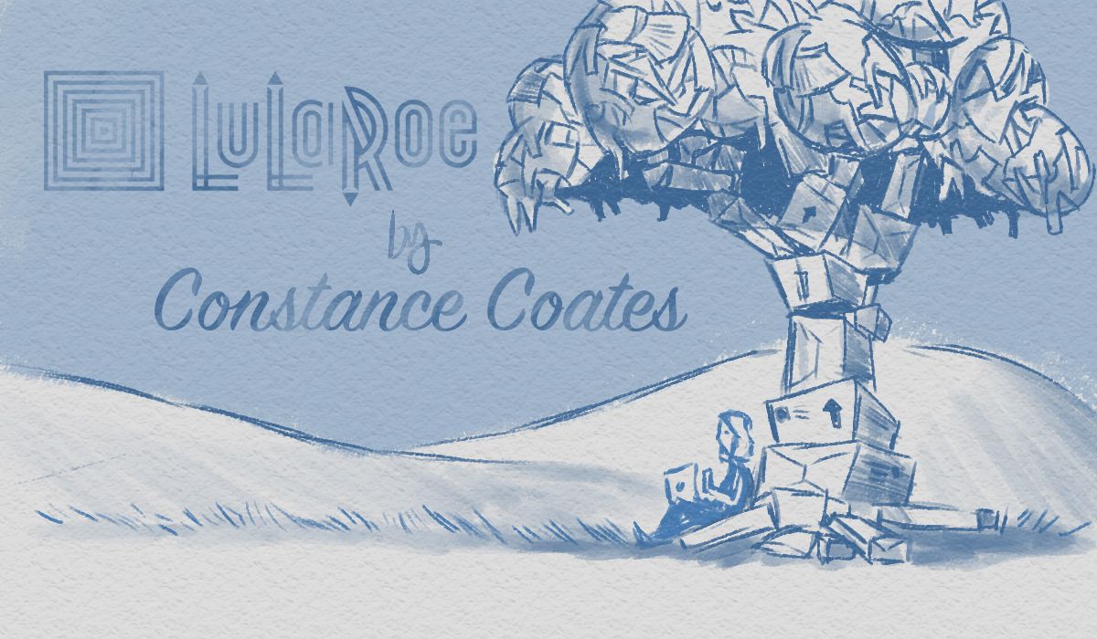
Would love some critiques on my composition. I think the idea is what I want to stick with, but getting the letters working with the image is a toughy.

Rex Watkins
-
@ewatkins09 is she writing a letter or typing on a labtop? I dont see anything wrong with your composition. Are there torn letters in the tree? What is this for? I am curious.
")
Instagram: www.instagram.com/heatherboyd.illustration/
Website: https://heatherboydillustration.ca
Shop: https://www.inprnt.com/search/products?q=HeatherBoydIllustration
Ko-Fi: https://ko-fi.com/heatherboydillustrationBe blessed,
-
@Heather-Boyd hey! this is a sketch of an idea/rough draft, so the finished product will be in watercolor and will have much clearer/sharper lines. This is for a friend's Lularoe business' facebook page. She works for this direct sales company selling all kinds of clothing, which is what the tree is made of...im thinking when the clothing is all different colors it will be more distinctly obvious as to what it is. Also, she does allot of online "live events" through facebook live, so I have depicted her here, using a laptop.
-
-
I would like to see how it would look if all the words were stacked on top and with the same width. If you know what I mean.
-
Very interesting image
Don't know if you are aware of the dimensions for FB page images. Your image looks a bit tall compared to an average banner I saw on FB. Here is a guideline I found on FB website: https://www.facebook.com/PagesSizesDimensions/
Hope this helps.From the image, I get a sense of "Calm, and quiet" feeling, is that what you are going for?
On minor composition thing: the two hills are almost the same hight, you might want to vary a bit. -
This is really cool, i love your composition with the tree and how it's made of clothes, is the trunk made of boxes? I also like your friends logo!
For me though, the text is looking a little squished and it's not balancing the image that well, I think the box by the company name is distracting me - is that part of her logo? If that was removed, the name Lularoe made bigger to fill that space and then "by Constance etc" underneath like you have it already would look great. But I understand if that box is part of her logo and you can't remove it.
I'm really looking forward to seeing this in colour, it's going to be beautiful!

-
@xin-li Thank you so much!! ya I've been kinda eyeballin' the banner sizes, but the link is very helpful
thanks for taking the time to share -
@hannahmccaffery Thanks for compliments and Crit:) unfortunately....the logo must not be altered...I was pretty bummed when I found out because originally I had a similar idea! lol I'm looking forward to getting it painted as well, but after taking into consideration the different points given here, I will make some adjustments and what for sign-off on the sketch before painting
Ill be sure to post here and tag y'all when I do tho