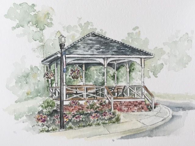
Commissions make me nervous. Any helpful tips on the painting are appreciated!
-
@Whitney-Simms It is beautiful! I am finishing a commission this week, and the tip that really helped me was to remember that cool colors recede. I was working in acrylic, so I'm not sure how it translates to watercolor, but leaving my background trees cool and putting a warm wash on the building and foliage in the foreground popped it for me!
-
I think this is lovely, and you really don't have anything to worry about, your work is great! Remember, the audience is not likely to be a bunch of artists who are there to critique your work. They are looking for a nice painting that is recognizable as the landmark, and you nailed it. If you took it into photoshop, you could possibly make adjustments if you chose to, but it looks great as-is.
-
@juliepeelart yeah, I’ve got to add some warm colors in the front!
Thanks @Kat , you’re right, they aren’t artists so probably won’t pick it apart.But... I showed it to them today. They did love it! Yay. But wanted a little more pops of color. I’ll probably change the flowers to yellow in photoshop for the prints and cards. Duh- the flowers are the same color as the brick! Oops. And they were thinking it was going to be more whimsical. The next one will be more stylized. The one of their store front. They did think their clients were going to love it.
I was just so nervous I couldn’t loosen up! But now they saw that Style and still want it to be a little loser it’s okay. Sometimes it is hard because loose doesn’t feel like I’m trying as hard. Which means it’s not good. The DUMB things that go through our artist brains!
Thanks again for all your support.
Plus side, they asked me to come and be part of their mother’s day event in their store. How fun! It’s like a booth at a fair or a comicon, but I’m the only artist and spotlight it on me! How freaking cool is that! I’ll probably just paint future cards or personalize some mother’s day cards. They said come with inventory and we will settle up at the end of the day. Fun right!!! Seriously, the store is so charming i could paint in it all freaking day!
-
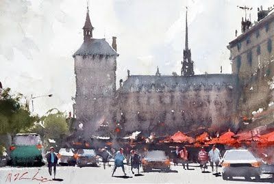
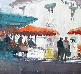
@Whitney-Simms This is very nice and I like the effects you are getting with the watercolor. A couple of things I would suggest. When doing anything in watercolor, the first thing to ask yourself is "What is going to be light and what is going to be dark". Keeping things simple is tricky and sometimes it means changing what is in the photo by a lot. So, is this a light building over a dark backound? Or a dark building in front of a light background? The reason that you can't answer that very easily is that it's right in the middle. The roof, trees bricks, and almost everything else in there is all a middle value (with the obvious exception of the white support structure).
So I would suggest just answering that easy question as you plan your next painting. What is going to be light over dark and what is going to be dark over light.Here's a few images for inspiration. These are from the great Joselph Zbukvic
-
@Lee-White thanks so much! That makes sense. I will keep an eye out for that next time. I’ve never really thought about it so cut and dry. I was trying to make the trees in the back light so they would be in the background, but then I needed them dark for the columns. I got pretty confused! I’ll keep it in mind. I haven’t really done a value study before in regards to a scene like this. With the idea of what’s light and what’s dark, that will help in the planning stages for sure! Once it’s dark on watercolor paper you’re kinda stuck! Thanks for your help!
-
@Whitney-Simms I'm so glad that they loved it and there are opportunities going forward! Great job!
-
@Whitney-Simms I have the same problem—timid with the darks
 and this already looks lovely, so I understand your reticence. But I agree with the advice I fear myself—push the contrasts. Commissions make me nervous too!
-
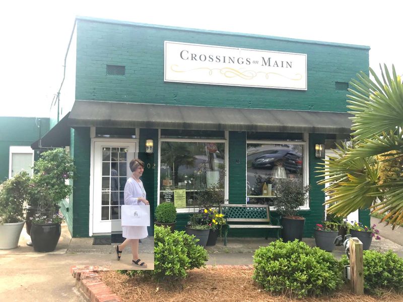
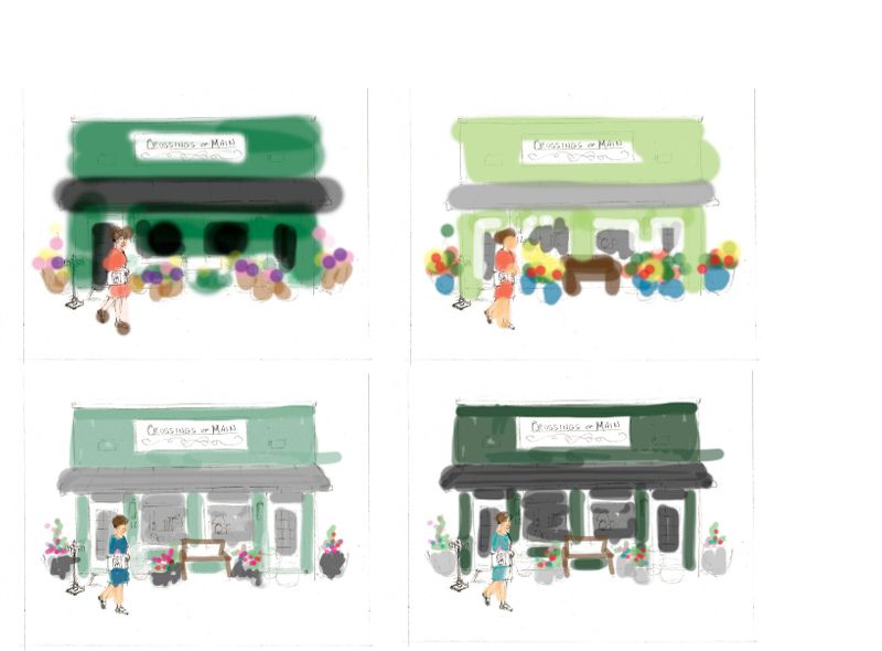
Okay, here is the next item for them. They wanted it to be more whimsical. I decided to draw it freehand and hopefully it would loosen things up. Now to the value. The building is a deep forest green. Look at the two bottom thumbnails. Do I make the building subtle and pop the figures in the front or the figures stay light in value and the building get super dark. Help?
@Lee-White are you free for an opinion?
Any other words of advice are welcome as well. Thanks y'all. And the mother's day event is in two days! Ahhhh. Say a prayer for me.
-
I can't say which one you should choose, but I will say that typically you don't need to go exactly by what the photo shows. For example, if the figure is going to be light, I'd move her in front of a dark area. And if the building or part of the building is going to be light, I might change what she is wearing to something dark (like you did in the lower left).
The real question to answer first though, is this painting about the building or the person? Depending on your answer to that, I would adjust accordingly.
-
Thanks @Lee-White . Thank helps. That’s kinda the the problem I’m toying with. The store is the focus, not the shopper. They want to use this on their social media to advertise their store. Why can’t people just ask me to paint flip flops. I think i will scooch her over a bit in front of the window, but not dead center. And I will make the building the dark and the plants and shopper the light. That will make the contrast of the sign and the building pop. It’s really cool. It’s a stand alone building just before the cluster buildings start on Main Street.
Thanks again for your help! I opted for spoonflower challenge and actually finishing work vs this month’s competition. I felt a little like, crap I missed the crit from lee. So, super thanks for helping with these paintings!!! I’m going to do redraw on the bandstand too. I can’t stand for them not to be in the same style if they are going in the shop together. This time with the darks all on the bandstand!
-
Here we go. I shrunk the lady and tried to pull back on the value of the front objects. But if you squint everything is mid value. Ah! I’m probably going to leave it be for a while. Right now I just need to walk away. This is so hard.
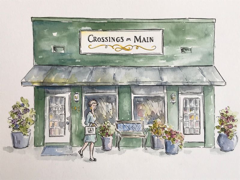
-
I added more paint. Now I’m seriously done with their commissions. Yuck! But if I want them to sell my cards in their store, I should probably paint a few things that force me out of my comfort zone. And they know licensing people and stuff.
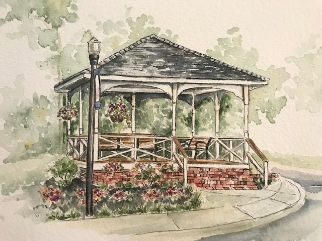
-
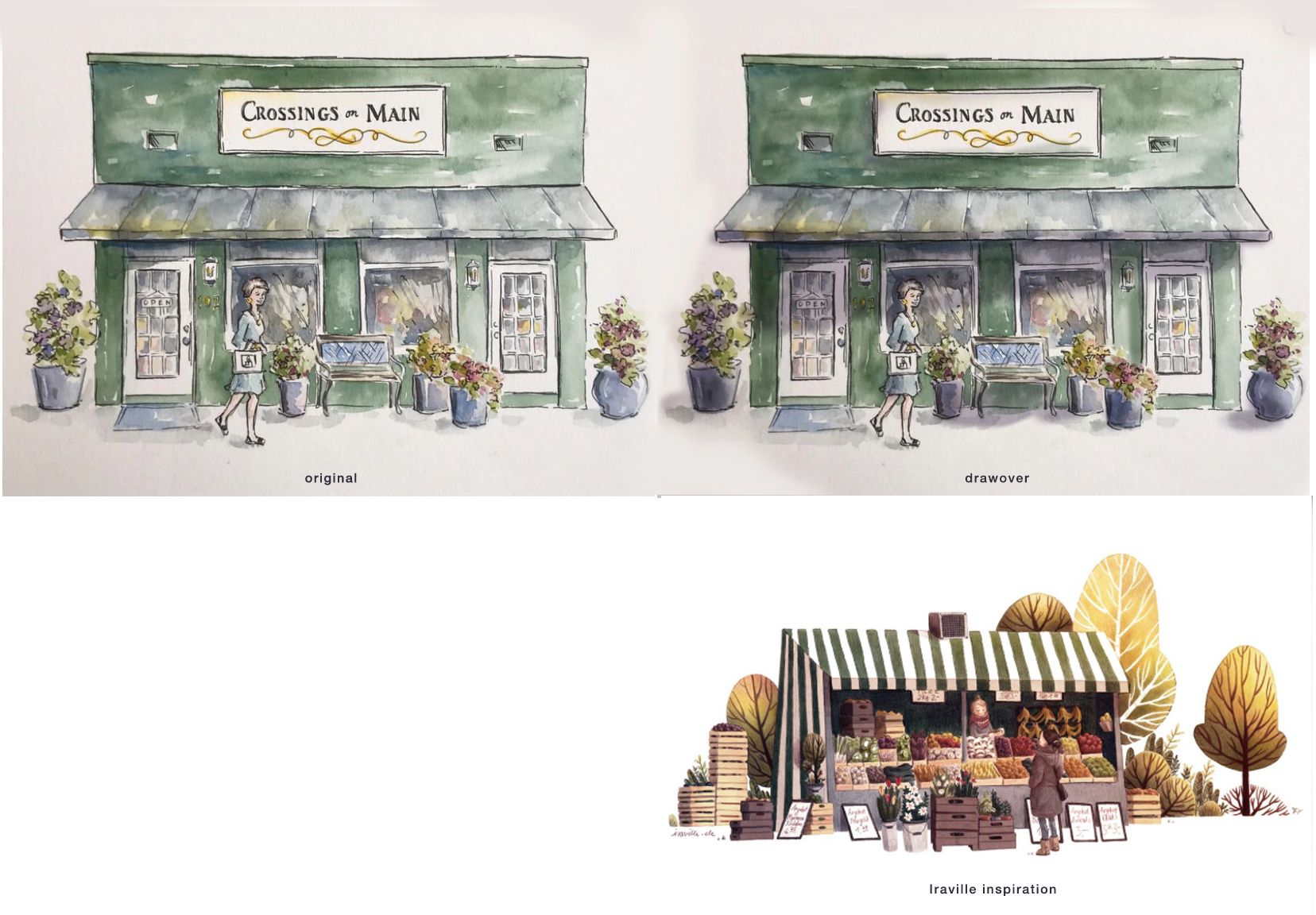
@Whitney-Simms I think this watercolor looks gorgeous. Maybe to help differentiate from the mid-values, you could deepen some of the shadows with a thin wash of purple, esp. under the awning? I did a rough drawover showing what I mean, plus added a piece by Iraville for inspiration.
-
@Johanna-Kim youre the best! Thanks for the tips. I did go and deepen the greens and grays already. I went to scan and said , ugh. One more try. But the shadow from the awning is fantastic! I’ll totally add that in. It adds tons to the painting
I totally love that artist you posted. I follow her and love her work already.
Thanks for the tips and feedback!
-
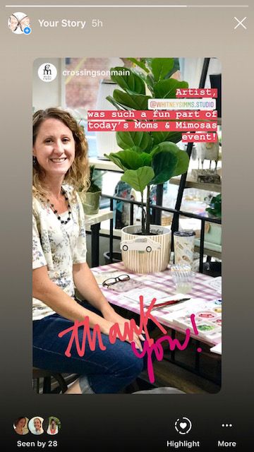
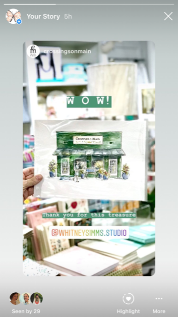
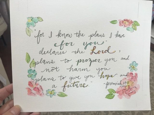
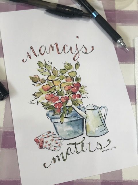
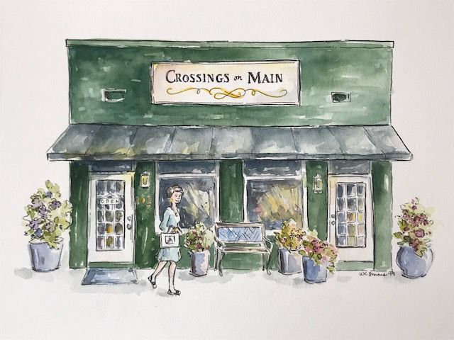
Here are the final images! And shots from the mother’s day event. It was tons of fun. I’ve alreayd gotten a bunch of new followers. A commission I politely said no to, approached by another store to possibly carry my cards and took my card to pass it along to an entirely different store, interviewed and post on a town blog. So much fun! Next I need to come ready with a few big ticket items as well. But for a week prep, I think I did pretty good!
-
Wow. This is impressive. Way to go!