Mermay Concept Thumbnails - Critiques Wanted
-
@Amber-Lynn-Benton So here is a question for you guys. When researching for reference I came across another book design with a super similar concept - not the light and dark mermaids but the same composition. I just scrolled past trying not to let that image get into my head. I know there are no new ideas under the sun - do you scratch your comps when this happens or just move forward pouring yourself and your own ideas into your piece?
-
@Laurasketches Facing each other is something I didn't consider. I did have an idea about having them have a tug of war over a trident or spear so that might work in that situation. Do you think people will get the tales/tails reference without it being spelled out? In my packaging work sometimes I can spell things out and people still totally miss the whole point.
-
I like the idea of the figures looking in because it keeps the focus moving into (as opposed to away from) your design.I like the idea that they have conflict over a spear (maybe disguised as a writing device, like a pencil?.. which would "sell" your story of "tales" even more visually. Go!
-
@Laurasketches Oh, that might just nail the concept for a non-fiction book!!! Concept over craft, right?
") And you take all credit for that idea! I'll definitely be taking both 1 and 2 into more thumbnails but you've put a twist on #1 enough to sway me in it's favor so far.
And you take all credit for that idea! I'll definitely be taking both 1 and 2 into more thumbnails but you've put a twist on #1 enough to sway me in it's favor so far. -
#2 has my vote!
shinjifujioka.com
https://www.facebook.com/shinjifujiokaart
IG: @shinjifujiokastudio -
@shinjifujioka Thanks, Shinji! Your illustration portfolio is so beautiful! Your illustrations are a rare mixture of innocence and adventure. While your style and techniques differ I think they evoke the same feelings/emotions of David Weisner's work.
-
I only had time to work up one thumbnail tonight. Thank you @Laurasketches - I really love this concept!
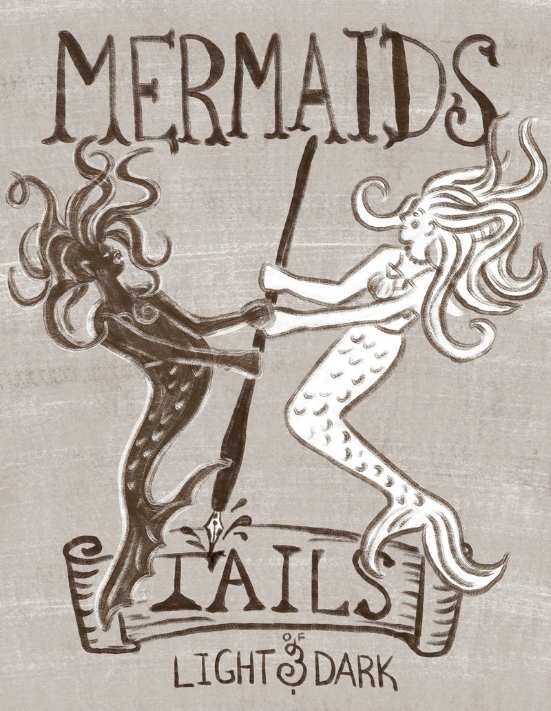
If I go with this concept I thinK I need to work on the scale of MERMAIDS vs TAILS and just the lettering layout in general.
-
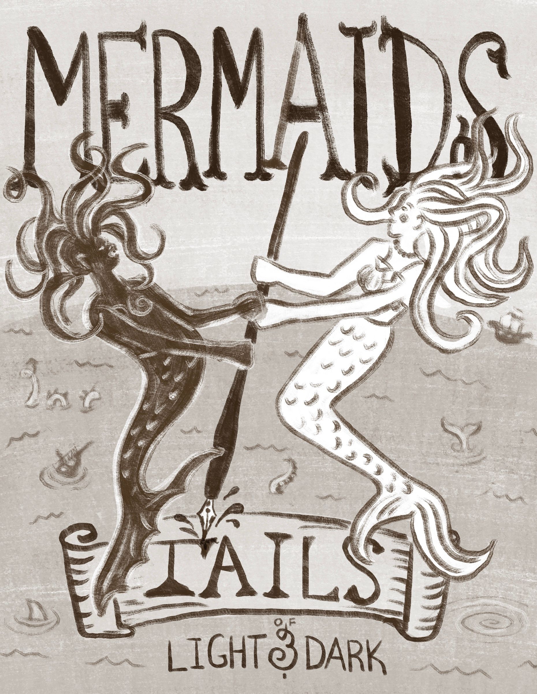
Couldn’t help but tweak and doodle around with last nights work before moving on to a fresh one today.
-
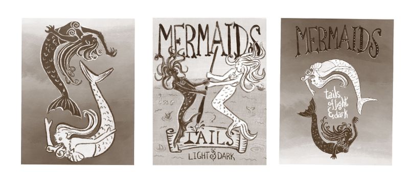
New thumbnails for comparison.
Only the middle is drastically different; cred to @Laurasketches for the idea. I think it fits the book concept more and will be the one I take to comp though the other design may make it into the overall cover design - on the back perhaps?
-
@Amber-Lynn-Benton you could always do #1 as a back cover and # 2 as the front cover.
-
@chrisaakins I would agree. I think #2 is the strongest visually and story telling wise (it draws me in the most). It is telling me the story of 2 mermaids trying to write their version of the story.
#1 looks to me like it should be small on the back cover with a bunch of text. I think I would make it even more round, giving it an even stronger ying/yang feeling.
-
@Amber-Lynn-Benton Thanks, that's extremely generous to be compared to the likes of David Weisner.
I think your thumbnails are looking so good—can't wait to see more progress on it!