Society of Visual Storytelling

    SVSLearn Forums

    • Register
    • Login
    • Search
    • Recent
    • Tags
    • Popular
    • Users
    • Groups
    • Search

    Mermay Concept Thumbnails - Critiques Wanted

    General Discussion
    mermay bookcover critique
    10
    25
    2753
    Loading More Posts
    • Oldest to Newest
    • Newest to Oldest
    • Most Votes
    Reply
    • Reply as topic
    Log in to reply
    This topic has been deleted. Only users with topic management privileges can see it.
    • ?
      A Former User last edited by

      It's the second or third concept for me!

      1 Reply Last reply Reply Quote 1
      • Kerisa
        Kerisa last edited by

        I really love the second concept! I like the idea of them being intertwined even though they're opposites and the positioning of their bodies are beautiful and fluid like they are swimming. That's my vote, but all of the concepts are great!! Can't wait to see how it develops!

        Wish you a singin’ dancin’ good time,
        KERISA GREENE


        https://kerisaillustrates.com/
        https://www.instagram.com/kerisaillustrates/

        Amber Lynn Benton 1 Reply Last reply Reply Quote 1
        • juliepeelart
          juliepeelart SVS OG @Amber Lynn Benton last edited by

          @Amber-Lynn-Benton #2

          www.juliepeelart.com
          www.instagram.com/juliepeelart/
          www.facebook.com/juliepeelart/
          www.facebook.com/Wundersplat/
          www.wundersplat.com

          1 Reply Last reply Reply Quote 1
          • chrisaakins
            chrisaakins last edited by

            I like the second one. It is reminiscent of the Pisces symbol which is wholly appropriate for mermaids. I also like how it is a little like the scrafitto on a Greek Vase. Cool idea. I am excited to see your progress.

            Chris Akins
            www.chrisakinsart.com
            www.instagram.com/chrisakinsart/

            Amber Lynn Benton 1 Reply Last reply Reply Quote 1
            • Coreyartus
              Coreyartus Moderator last edited by

              #2 for me, too!

              Children's Illustration Portfolio: https://www.coreyartusillustration.com
              Art Portfolio: https://www.coreyartusimagery.com
              Mastodon: https://mindly.social/@Coreyartus
              Pixelfed: https://pixelfed.social/Coreyartus

              1 Reply Last reply Reply Quote 1
              • Amber Lynn Benton
                Amber Lynn Benton @chrisaakins last edited by

                @chrisaakins I’ll reference some Pisces pieces for sure. Thanks for the feedback!

                http://www.amberlynnbenton.com/
                https://www.instagram.com/amberlynnbenton/

                1 Reply Last reply Reply Quote 0
                • Amber Lynn Benton
                  Amber Lynn Benton @Kerisa last edited by

                  @Kerisa You describe what I was attempting to communicate. I appreciate all the feedback and will use it to push me forward.

                  http://www.amberlynnbenton.com/
                  https://www.instagram.com/amberlynnbenton/

                  1 Reply Last reply Reply Quote 0
                  • theprairiefox
                    theprairiefox last edited by

                    I would also say #2 but you might think about using a middle value for the background so that the light one pops more. You could also do something like put them in a mid value water drop or something if you don't want to do the whole page?

                    When I "squint it down" I the dark mermaid stands out much more than the light one.

                    Just a thought... good luck.

                    -The Prairie Fox
                    https://www.instagram.com/theprairiefox
                    https://www.theprairiefox.com

                    Amber Lynn Benton 1 Reply Last reply Reply Quote 1
                    • Amber Lynn Benton
                      Amber Lynn Benton @theprairiefox last edited by

                      @theprairiefox Thanks - good stuff. Yes, I did include some value in these but they are mostly concept thumbnails. I think the consensus is for #2 which is my favorite concept - #1 is pretty predictable and #3 relies heavily on handlettering. I'm pulling together a mood board now and have gathered reference for my mermaids - underwater belly dancing is a thing, lol. Then I'm going to explore a few options within that concept before going to comps.

                      http://www.amberlynnbenton.com/
                      https://www.instagram.com/amberlynnbenton/

                      1 Reply Last reply Reply Quote 0
                      • Laurasketches
                        Laurasketches last edited by

                        I like #1..but I wonder how the figures would look facing each other? I think you could still have the graphic design of the heart (intended?) And also play with the placement of the tails around the word "tails" Although... You might want to use the other spelling and let the play on words be visual...?
                        I also like the yen and yang of #2.. So maybe combine the value of #2 with design elements from #1. (Yeah! more work!)
                        Nice thumbnails!!

                        Amber Lynn Benton 1 Reply Last reply Reply Quote 1
                        • Amber Lynn Benton
                          Amber Lynn Benton @Amber Lynn Benton last edited by

                          @Amber-Lynn-Benton So here is a question for you guys. When researching for reference I came across another book design with a super similar concept - not the light and dark mermaids but the same composition. I just scrolled past trying not to let that image get into my head. I know there are no new ideas under the sun - do you scratch your comps when this happens or just move forward pouring yourself and your own ideas into your piece?

                          http://www.amberlynnbenton.com/
                          https://www.instagram.com/amberlynnbenton/

                          1 Reply Last reply Reply Quote 0
                          • Amber Lynn Benton
                            Amber Lynn Benton @Laurasketches last edited by

                            @Laurasketches Facing each other is something I didn't consider. I did have an idea about having them have a tug of war over a trident or spear so that might work in that situation. Do you think people will get the tales/tails reference without it being spelled out? In my packaging work sometimes I can spell things out and people still totally miss the whole point.

                            http://www.amberlynnbenton.com/
                            https://www.instagram.com/amberlynnbenton/

                            1 Reply Last reply Reply Quote 0
                            • Laurasketches
                              Laurasketches last edited by

                              I like the idea of the figures looking in because it keeps the focus moving into (as opposed to away from) your design.I like the idea that they have conflict over a spear (maybe disguised as a writing device, like a pencil?.. which would "sell" your story of "tales" even more visually. Go!

                              Amber Lynn Benton 1 Reply Last reply Reply Quote 0
                              • Amber Lynn Benton
                                Amber Lynn Benton @Laurasketches last edited by

                                @Laurasketches Oh, that might just nail the concept for a non-fiction book!!! Concept over craft, right? 😉 And you take all credit for that idea! I'll definitely be taking both 1 and 2 into more thumbnails but you've put a twist on #1 enough to sway me in it's favor so far.

                                http://www.amberlynnbenton.com/
                                https://www.instagram.com/amberlynnbenton/

                                1 Reply Last reply Reply Quote 1
                                • shinjifujioka
                                  shinjifujioka SVS OG last edited by

                                  #2 has my vote!

                                  shinjifujioka.com
                                  https://www.facebook.com/shinjifujiokaart
                                  IG: @shinjifujiokastudio

                                  Amber Lynn Benton 1 Reply Last reply Reply Quote 1
                                  • Amber Lynn Benton
                                    Amber Lynn Benton @shinjifujioka last edited by

                                    @shinjifujioka Thanks, Shinji! Your illustration portfolio is so beautiful! Your illustrations are a rare mixture of innocence and adventure. While your style and techniques differ I think they evoke the same feelings/emotions of David Weisner's work.

                                    http://www.amberlynnbenton.com/
                                    https://www.instagram.com/amberlynnbenton/

                                    shinjifujioka 1 Reply Last reply Reply Quote 0
                                    • Amber Lynn Benton
                                      Amber Lynn Benton @Amber Lynn Benton last edited by

                                      I only had time to work up one thumbnail tonight. Thank you @Laurasketches - I really love this concept!

                                      E49B7216-46FF-45E7-AC67-D8BEB05A127E.jpeg

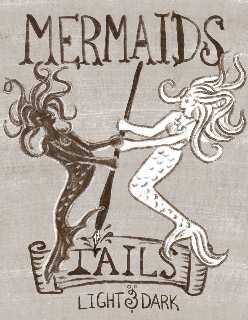
                                      If I go with this concept I thinK I need to work on the scale of MERMAIDS vs TAILS and just the lettering layout in general.

                                      http://www.amberlynnbenton.com/
                                      https://www.instagram.com/amberlynnbenton/

                                      Amber Lynn Benton 1 Reply Last reply Reply Quote 0
                                      • Amber Lynn Benton
                                        Amber Lynn Benton @Amber Lynn Benton last edited by

                                        Couldn’t help but tweak and doodle around with last nights work before moving on to a fresh one today.

                                        745CE304-AF2B-40FE-8CFB-8882FA3E2006.jpeg

                                        http://www.amberlynnbenton.com/
                                        https://www.instagram.com/amberlynnbenton/

                                        1 Reply Last reply Reply Quote 0
                                        • Amber Lynn Benton
                                          Amber Lynn Benton @Amber Lynn Benton last edited by Amber Lynn Benton

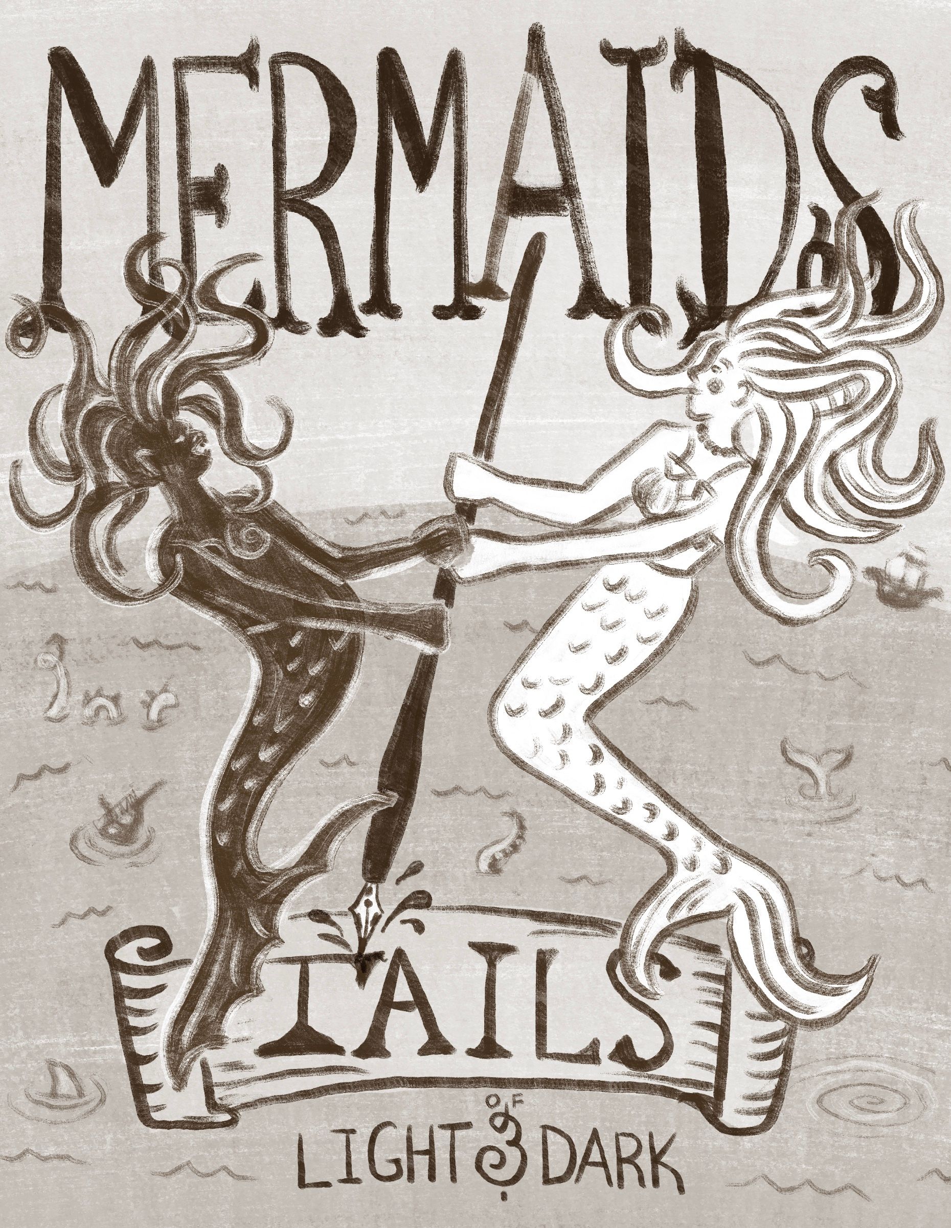
                                          New thumbnails for comparison.

                                          Only the middle is drastically different; cred to @Laurasketches for the idea. I think it fits the book concept more and will be the one I take to comp though the other design may make it into the overall cover design - on the back perhaps?

                                          5547E42D-F584-4E2C-9623-7220A43200BF.jpeg

                                          http://www.amberlynnbenton.com/
                                          https://www.instagram.com/amberlynnbenton/

                                          1 Reply Last reply Reply Quote 0
                                          • chrisaakins
                                            chrisaakins last edited by

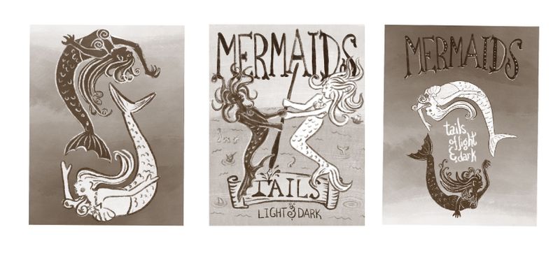
                                            @Amber-Lynn-Benton you could always do #1 as a back cover and # 2 as the front cover.

                                            Chris Akins
                                            www.chrisakinsart.com
                                            www.instagram.com/chrisakinsart/

                                            theprairiefox 1 Reply Last reply Reply Quote 1
                                            • First post
                                              Last post