Society of Visual Storytelling

    SVSLearn Forums

    • Register
    • Login
    • Search
    • Recent
    • Tags
    • Popular
    • Users
    • Groups
    • Search

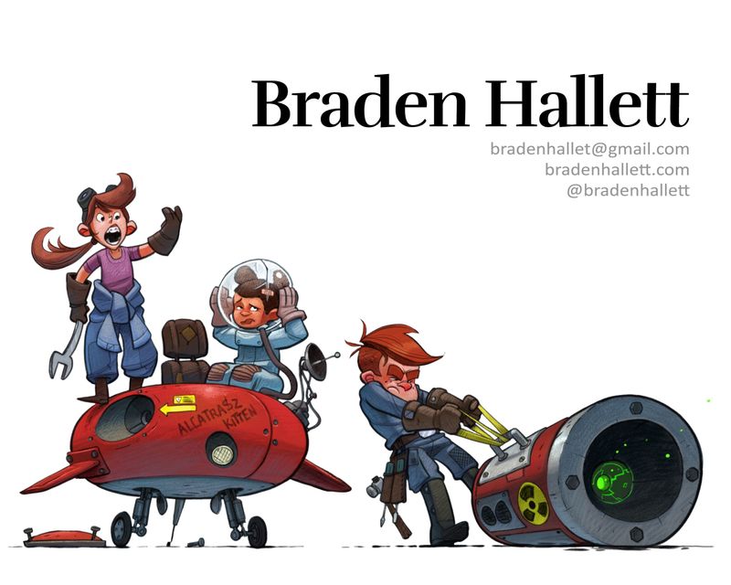
    If you saw this as a portfolio title page, what would you think?

    Artwork
    16
    33
    1827
    Loading More Posts
    • Oldest to Newest
    • Newest to Oldest
    • Most Votes
    Reply
    • Reply as topic
    Log in to reply
    This topic has been deleted. Only users with topic management privileges can see it.
    • ArtofAleksey
      ArtofAleksey last edited by

      I would use 3 for your name, and 4 for the sub info

      instagram and twitter: @artofaleksey
      alekseyillustration.com

      1 Reply Last reply Reply Quote 1
      • JerrySketchyArt
        JerrySketchyArt last edited by

        I like 2, 1, 5 - in that order.

        1 Reply Last reply Reply Quote 1
        • braden H
          braden H last edited by

          I made a poll 😃

          https://forum.svslearn.com/topic/7475/which-font-works-best

          1 Reply Last reply Reply Quote 1
          • Laurasketches
            Laurasketches last edited by

            I"m late to this party...but, it's always very instructive to hear what other SVSers say. I'm going to weigh in with Font choices: #3 for your name (it matches your artistic style the best-rounded edges, interesting dimensions in the individual letters, still clean and readable) and #4 or #7 for your subtext: #4 for readability, #7 for re-inforcing the idea that you are an artist.
            getting my portfolio online is my summer project, so it's great to see how others work through this task... if you don't mind sharing your processes (how you are choosing page layouts, images included-or not, how you organize the information, etc) I'd be interested....

            braden H 1 Reply Last reply Reply Quote 2
            • Erin.Cortese
              Erin.Cortese Moderator @braden H last edited by Erin.Cortese

              @Braden-Hallett Oooooh awesome! I am really liking #7 and #8, they really mesh well with the illustration! Also, #3.

              1 Reply Last reply Reply Quote 1
              • NessIllustration
                NessIllustration Pro last edited by NessIllustration

                @Braden-Hallett I think your problem is that you're using the same font for your name (title) and the smaller text! I actually think the original font you chose for your name was nice and bold (maybe with some more spacing like some said) but the problem is that you used the same font again. If you have a nice bold serif font (or hand drawn) for title, then pick a clean sans serif font for your smaller text, and maybe make it a paler color so it doesn't fight as much with the title and to improve readability. And then also the whole thing a bit smaller to give a bit more breathing room.

                What do you think:
                braden.jpg

                vanessastoilova.com
                instagram.com/vanessa.stoilova/

                Check out my Youtube channel for tips on how to start your career in illustration! www.youtube.com/c/ArtBusinesswithNess

                1 Reply Last reply Reply Quote 1
                • Heather Boyd
                  Heather Boyd @braden H last edited by

                  @Braden-Hallett

                  I like number 1
                  I like number 3 but you need to put some space between the lines -overlapping a bit
                  I like number 8 fits in with your yelling/screech I think

                  🙂

                  Instagram: www.instagram.com/heatherboyd.illustration/
                  Website: https://heatherboydillustration.ca
                  Shop: https://www.inprnt.com/search/products?q=HeatherBoydIllustration
                  Ko-Fi: https://ko-fi.com/heatherboydillustration

                  Be blessed,

                  1 Reply Last reply Reply Quote 1
                  • shinjifujioka
                    shinjifujioka SVS OG last edited by

                    Really awesome art. There's so much "fun" in your images!

                    shinjifujioka.com
                    https://www.facebook.com/shinjifujiokaart
                    IG: @shinjifujiokastudio

                    1 Reply Last reply Reply Quote 1
                    • theprairiefox
                      theprairiefox last edited by

                      I think this is little bit on you to know what you are going for. You know, how you want to make your impact. Because this what you want to do. Fonts work like colors and value to evoke feelings. Maybe you need keywords to help you decide. 😉

                      Here are the keywords I associate with each of your examples.

                      1 - Soft, loose
                      2 - Soft, professional
                      3 - Steampunk, techno
                      4 - Bold, solid
                      5 - Soft, cartoony
                      6 - Conservative, plain
                      7 - Loose, Rage, Paint
                      8 - Loose, Soft

                      Think about how you want to make an impact and it will help you decide. And note that the info text does NOT have to be the same font and shouldn't be if it is difficult to read, because your goal with that is to convey information as quickly as possible.

                      Marketing (which this is) is very similar to composition and design... you want all of the same ideas to build on each other.

                      -The Prairie Fox
                      https://www.instagram.com/theprairiefox
                      https://www.theprairiefox.com

                      1 Reply Last reply Reply Quote 2
                      • braden H
                        braden H @Laurasketches last edited by

                        Thanks everyone for the feedback and compliments! Lots to think about.

                        @Laurasketches so far my process for setting up my portfolio has been asking others for feedback (I FINALLY got in contact with a local-ish illustrator group and they gave me some feedback) But if you ever wanna chat about it gimme a PM 🙂

                        @NessIllustration I'll definitely be going with something like that! The different font for the subtext really does read better. Thank you 😃

                        @theprairiefox Said it in the other thread, but thanks for reminding me about those keywords :smiling_face_with_open_mouth_cold_sweat: It's amazing how thinking about them beforehand (BEFOREHAND, BRADEN! BEFOREHAND!) really does help.

                        1 Reply Last reply Reply Quote 1
                        • First post
                          Last post