Society of Visual Storytelling

    SVSLearn Forums

    • Register
    • Login
    • Search
    • Recent
    • Tags
    • Popular
    • Users
    • Groups
    • Search

    Which font works best?

    Artwork
    16
    21
    1214
    Loading More Posts
    • Oldest to Newest
    • Newest to Oldest
    • Most Votes
    Reply
    • Reply as topic
    Log in to reply
    This topic has been deleted. Only users with topic management privileges can see it.
    • braden H
      braden H last edited by

      @MichaelaH let me know that I can actually create a poll! I needed to create a new post for it, though. Ah well!

      So my poll! Which font do you like best? Check all that apply ๐Ÿ˜ƒ Thanks guys!

      alt text

      Elizabeth Rose BichonBistro demotlj sigross 4 Replies Last reply Reply Quote 2
      • Jon Anderson
        Jon Anderson SVS OG last edited by

        I voted 2, 3, and 8. I think 8 is the better handwritten version but I love the "name" font of 3 (reminds me Batman: The Animated Series) but the sub info is very cluttered and muddled. I selected 2, also because it's simple and appealing without taking away from the art which is what this is all about.

        instagram.com/jonandersonillu

        1 Reply Last reply Reply Quote 1
        • Elizabeth Rose
          Elizabeth Rose @braden H last edited by

          @Braden-Hallett For the Title font, I like number #8 best. Its playful like your characters, yet easy to read.

          For subtext I'm not sure which would go with #8 Title font. Maybe #2, #4 or #5 subtext font? Something san serif for sure. Serif is kinda formal looking.

          https://elizabethrosehoffman.com/
          https://www.instagram.com/elizabethrosehoffmanart/
          https://linktr.ee/elizabethrosehoffman

          1 Reply Last reply Reply Quote 1
          • BichonBistro
            BichonBistro @braden H last edited by

            @Braden-Hallett I think #8 best matches the energy of your work, but #1 looks good with the image too.

            For what itโ€™s worth, I have read in some typeface books that mixed case serif fonts are easier to read, so you might want to consider that for your contact info.

            https://www.instagram.com/bichonbistro
            http://www.heartfeltimpressions.com
            https://www.facebook.com/patty.burke.9655
            https://twitter.com/BichonBistro

            1 Reply Last reply Reply Quote 1
            • NessIllustration
              NessIllustration Pro last edited by

              @Braden-Hallett I missed this post and posted it the old one, woops! Haha.. Here is my suggestion:

              braden.jpg

              vanessastoilova.com
              instagram.com/vanessa.stoilova/

              Check out my Youtube channel for tips on how to start your career in illustration! www.youtube.com/c/ArtBusinesswithNess

              Nyrryl  Cadiz 1 Reply Last reply Reply Quote 2
              • ArtofAleksey
                ArtofAleksey last edited by

                Several of these look good. I still think picking a font that doesnโ€™t take too much focus away from your amazing art is the most important thing to consider. So I donโ€™t think 7 or 8 are good ideas.

                instagram and twitter: @artofaleksey
                alekseyillustration.com

                1 Reply Last reply Reply Quote 1
                • theprairiefox
                  theprairiefox last edited by

                  I missed the new thread and posted in the old one too...

                  I think this is little bit on you to know what you are going for. You know, how you want to make your impact. Because this what you want to do. Fonts work like colors and value to evoke feelings. Maybe you need keywords to help you decide. ๐Ÿ˜‰

                  Here are the keywords I associate with each of your examples.

                  1 - Soft, loose
                  2 - Soft, professional
                  3 - Steampunk, techno
                  4 - Bold, solid
                  5 - Soft, cartoony
                  6 - Conservative, plain
                  7 - Loose, Rage, Paint
                  8 - Loose, Soft

                  Think about how you want to make an impact and it will help you decide. And note that the info text does NOT have to be the same font and shouldn't be if it is difficult to read, because your goal with that is to convey information as quickly as possible.

                  Marketing (which this is) is very similar to composition and design... you want all of the same ideas to build on each other.

                  -The Prairie Fox
                  https://www.instagram.com/theprairiefox
                  https://www.theprairiefox.com

                  braden H 1 Reply Last reply Reply Quote 2
                  • demotlj
                    demotlj SVS OG @braden H last edited by

                    @Braden-Hallett I love your work but have to say that the poll is pretty cool too! You should teach everyone to do that because it would make voting on thumbnails etc. much easier and it's fun to see the tally.

                    Laurie DeMott
                    instagram.com/demotlj

                    1 Reply Last reply Reply Quote 3
                    • StudioLooong
                      StudioLooong last edited by

                      whichever option you go with, I would consider making your contact information normal-case as opposed to all caps, it goes with what @theprairiefox is saying about legibility.

                      Taylor Woolley
                      (Formerly Taylor Ackerman / StudioLooong)


                      Website: www.woolleystories.com
                      Instagram: https://www.instagram.com/woolleystories/

                      1 Reply Last reply Reply Quote 1
                      • Coreyartus
                        Coreyartus Moderator last edited by

                        #8 for me. I don't think it competes with the art. I think it augments and comments on the art. It's informal, yet professional.

                        Children's Illustration Portfolio: https://www.coreyartusillustration.com
                        Art Portfolio: https://www.coreyartusimagery.com
                        Mastodon: https://mindly.social/@Coreyartus
                        Pixelfed: https://pixelfed.social/Coreyartus

                        1 Reply Last reply Reply Quote 1
                        • Erin.Cortese
                          Erin.Cortese Moderator last edited by

                          I echo what others are saying about the subtext/contact info, uppercase does not work so well. It could also benefit from additional line spacing. Looking forward to seeing your final! Great poll by the way, such a neat function.

                          1 Reply Last reply Reply Quote 1
                          • braden H
                            braden H @theprairiefox last edited by

                            @theprairiefox I really need to think of those keywords ๐Ÿ™‚

                            Breaking down the examples by keyword really does help. Thank you! Next time I'll start with those as I should have done (ignore me as I tear out my hair :smiling_face_with_open_mouth_cold_sweat: )

                            @demotlj There's a little button that looks like a graph when you make a new post. It makes a poll ๐Ÿ™‚

                            @generally everyone I most certainly won't be using all caps on the final ๐Ÿ™‚ I work with text mostly in comics so I think that's why my brain looked at it and said 'yeah, looks fine' ๐Ÿ˜ƒ

                            Thanks everyone for the feedback! I'm gonna let it sit for a little bit and percolate. I do like the different fonts for heading and subheading. I'll defs do that.

                            1 Reply Last reply Reply Quote 0
                            • xin li
                              xin li last edited by

                              Wow, @theprairiefox very smart suggestion regarding the keywords :-). I definitely will think of that when I am going to do my printed portfolio.

                              I personally like No7 for your name. But I hesitated to recommend that. Now I read @theprairiefox 's comments, I think I know why - I do not feel your work is "Loose, rage, rough". I think option No.8 for your name might work better, it goes with your art style.

                              Web: www.lixin.no
                              IG: www.instagram.com/lixin.illustration/

                              theprairiefox 1 Reply Last reply Reply Quote 1
                              • Nyrryl  Cadiz
                                Nyrryl Cadiz SVS OG @NessIllustration last edited by

                                @NessIllustration @Braden-Hallett This is exactly what I was looking for. Simple yet prominent name and small caps, grey sub text. This might be coming late into the game but could it be possible to only put your website on the card? After all, you already have a โ€œcontact meโ€ section on your website to further simplify your card. Just a thought tho.

                                Portfolio: nyrrylcadiz.com
                                Instagram: https://www.instagram.com/nyrryl_cadiz/
                                YouTube: https://www.youtube.com/channel/UCbJCF1Im8ZO7hpGWTKOJMuA

                                braden H 1 Reply Last reply Reply Quote 1
                                • theprairiefox
                                  theprairiefox @xin li last edited by

                                  @xin-li I had a similar feeling about No 3. I liked it best personally, but wasn't sure if Braden was going for a "Steampunk, Techno" feel. I personally like the whole steampunk stuff but don't know about him.

                                  -The Prairie Fox
                                  https://www.instagram.com/theprairiefox
                                  https://www.theprairiefox.com

                                  1 Reply Last reply Reply Quote 1
                                  • Curtis_H
                                    Curtis_H last edited by

                                    I choose number 7.. Based on the flow of the cover.. The words from and move along with the flow of the cover..

                                    1 Reply Last reply Reply Quote 1
                                    • sigross
                                      sigross @braden H last edited by

                                      @Braden-Hallett 3 and 8 have my vote - they stood out in my mind from all the rest. 3 looks the coolest and suits the illustration style. But I also like 8 for the DIY nature of the image.

                                      www.grossiebazaar.com
                                      www.sigross.com
                                      www.instagram.com/sigross/

                                      1 Reply Last reply Reply Quote 1
                                      • braden H
                                        braden H @Nyrryl Cadiz last edited by

                                        @nyrrylcadiz I've been told that the more steps you have to reach your contact info, the more likely people are to bounce.

                                        As in, getting all my info in one step (all on the business card/intro page) is better than two-three steps (business card to website to contact page).

                                        Kinda like an index that takes you to different parts of the index instead of just giving you a page number ๐Ÿ™‚

                                        I'll do some research on that, though, I could be wrong.

                                        1 Reply Last reply Reply Quote 1
                                        • braden H
                                          braden H last edited by

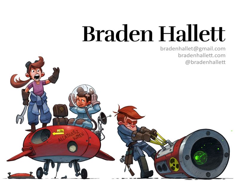
                                          Thanks everyone! I went with #8 ๐Ÿ™‚

                                          theprairiefox 1 Reply Last reply Reply Quote 1
                                          • theprairiefox
                                            theprairiefox @braden H last edited by

                                            @Braden-Hallett good choice. Of what I have seen of your work, I would say it is the most representative.

                                            -The Prairie Fox
                                            https://www.instagram.com/theprairiefox
                                            https://www.theprairiefox.com

                                            1 Reply Last reply Reply Quote 1
                                            • First post
                                              Last post