• Recent
  • Tags
  • Popular
  • Users
  • Groups
  • Search
  • Register
  • Login
Society of Visual Storytelling

SVSLearn Forums

  • Register
  • Login
  • Search
  • Recent
  • Tags
  • Popular
  • Users
  • Groups
  • Search

Group run through creative environment design week 6 art and feedback

SVS Class Work
9
69
5.4k
Loading More Posts
  • Oldest to Newest
  • Newest to Oldest
  • Most Votes
Reply
  • Reply as topic
Log in to reply
This topic has been deleted. Only users with topic management privileges can see it.
  • ArtofAleksey
    ArtofAleksey @Susan Marks last edited by 19 May 2019, 00:45

    @Susan-Marks ohhh good points. Ty.

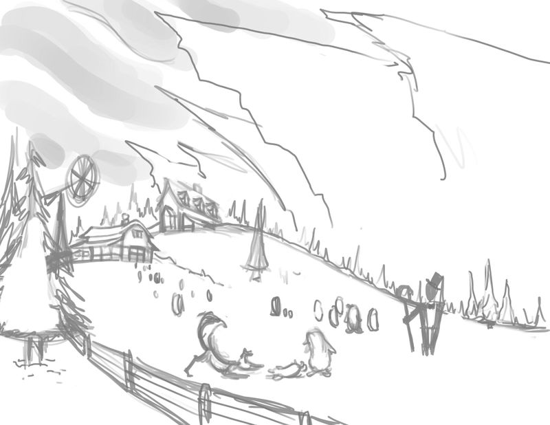
    The weird clouds are different things depending on which one. Some are tree lines, some are giant glaciers jutting out. Kinda like this:
    gettyimages-480847403-1515796564.jpg

    instagram and twitter: @artofaleksey
    alekseyillustration.com

    Susan Marks 1 Reply Last reply 20 May 2019, 23:37 Reply Quote 0
    • ArtofAleksey
      ArtofAleksey last edited by 20 May 2019, 04:09

      Ok progress so far.
      DF3D572C-7EB5-4F52-ACFD-76893455D58D.jpeg

      instagram and twitter: @artofaleksey
      alekseyillustration.com

      Heather Boyd 1 Reply Last reply 12 Jun 2019, 18:20 Reply Quote 4
      • Susan Marks
        Susan Marks @ArtofAleksey last edited by 20 May 2019, 23:37

        @Aleksey Glaciers hadn't occurred to me. And good points that when you do these value studies, the shapes that you see may be representing a consistent value, but the shape could be made up of multiple things (i.e. the top border of buildings and trees could make a single shape).

        ArtofAleksey 1 Reply Last reply 20 May 2019, 23:51 Reply Quote 1
        • ArtofAleksey
          ArtofAleksey @Susan Marks last edited by 20 May 2019, 23:51

          @Susan-Marks yeah. I treat them as a place holder and try not to lose track of them.

          instagram and twitter: @artofaleksey
          alekseyillustration.com

          1 Reply Last reply Reply Quote 0
          • JerrySketchyArt
            JerrySketchyArt last edited by JerrySketchyArt 21 May 2019, 21:54 21 May 2019, 21:53

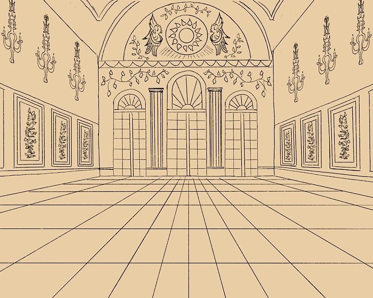
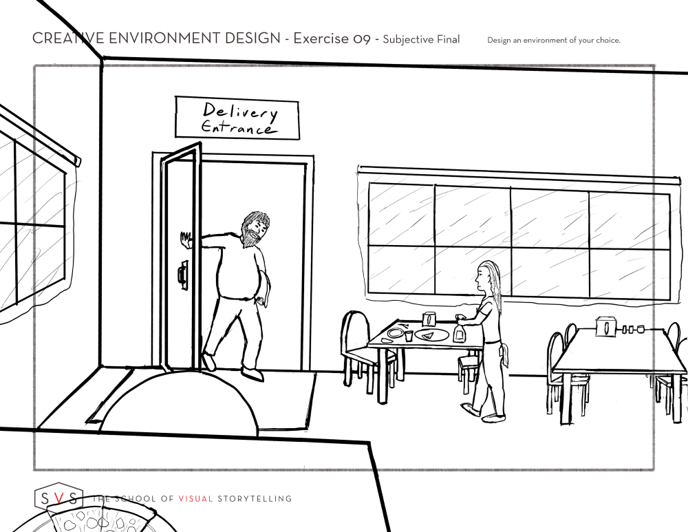
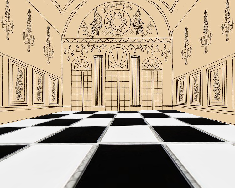
            Mine ended up as an interior scene. This is for a game about a grumpy pizza delivery guy who hates his job. Sketch phase:

            CED_Workbook2_Page_6 sketch.png

            ArtofAleksey 1 Reply Last reply 21 May 2019, 23:21 Reply Quote 1
            • ArtofAleksey
              ArtofAleksey @JerrySketchyArt last edited by 21 May 2019, 23:21

              @JerrySketchyArt are you going with this perspective view?

              instagram and twitter: @artofaleksey
              alekseyillustration.com

              JerrySketchyArt 1 Reply Last reply 21 May 2019, 23:42 Reply Quote 1
              • JerrySketchyArt
                JerrySketchyArt @ArtofAleksey last edited by 21 May 2019, 23:42

                @Aleksey Nah. I've already decided I don't like the angle and need to rotate it a bit so it's not so straight on. Might do an outside view. Time for more thumbnails. šŸ˜›

                1 Reply Last reply Reply Quote 1
                • braden H
                  braden H last edited by 21 May 2019, 23:44

                  I dd a very objective view of things before I realized that this was the subjective final (woops!) so I'll post my subjective final tomorrow (gonna do things a little bit backwards)

                  1 Reply Last reply Reply Quote 1
                  • demotlj
                    demotlj SVS OG last edited by 22 May 2019, 01:31

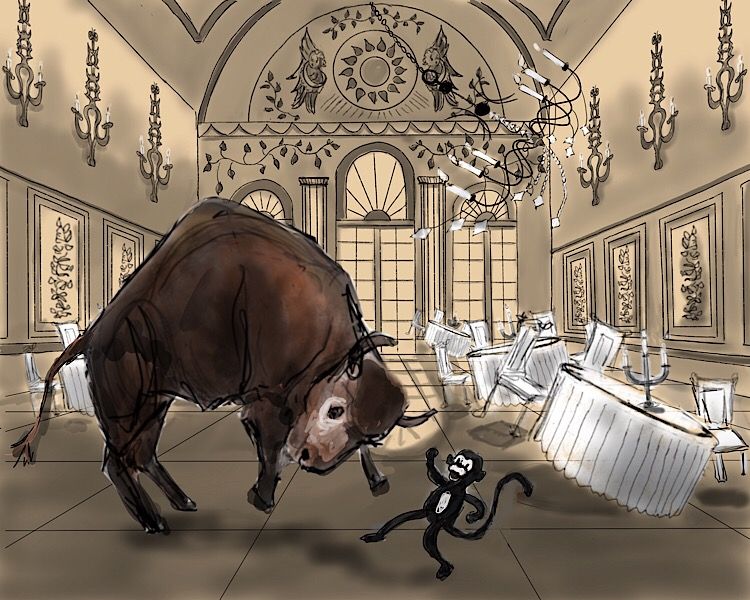
                    I’m doing a picture of a dancing bison and wanted to push myself on doing interiors so thought I’d do it for this assignment. Here is what I have so far with both the interior and some really really rough ā€œplaceholdersā€ for characters and furnishings. I’m not worried about developing the characters yet since the assignment is really about the environment design - just wanted to make sure things would fit - but I’m assuming that I should think about lighting and stuff, right? Or is it subjective already because it’s only showing part of the room?
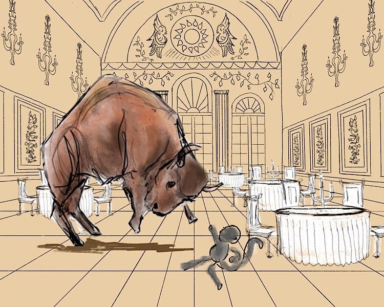
                    954AB4D5-CC9A-46B1-A5F8-B3537861F0EB.jpeg

                    E44FBFDC-6D41-493D-85DD-CAD5F7701FF7.jpeg

                    Laurie DeMott
                    instagram.com/demotlj

                    ArtofAleksey JerrySketchyArt 2 Replies Last reply 22 May 2019, 18:16 Reply Quote 0
                    • ArtofAleksey
                      ArtofAleksey @demotlj last edited by 22 May 2019, 02:16

                      @demotlj good choice on the low angle makes the bison look much bigger.

                      instagram and twitter: @artofaleksey
                      alekseyillustration.com

                      1 Reply Last reply Reply Quote 0
                      • ArtofAleksey
                        ArtofAleksey last edited by 22 May 2019, 02:16

                        E0A48D01-95CE-4094-BAD9-13256B5DCB95.jpeg

                        I think I’m onto something with the values.

                        instagram and twitter: @artofaleksey
                        alekseyillustration.com

                        1 Reply Last reply Reply Quote 1
                        • braden H
                          braden H last edited by 22 May 2019, 15:48

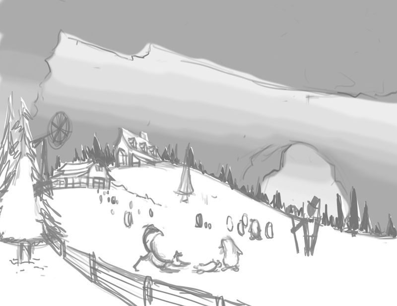
                          Okeedokee! I finally get to play in my local DND game, so I'm all into the generic fantasy settings. I may finish this one day!

                          The puzzle pieces I'm trying to juggle: Composition (thirds and fifths) silhouette, balance, proportion (thirds and fifths again) and value. Are there any principles I'm forgetting off the top of my head?

                          alt text

                          Erin.Cortese 1 Reply Last reply 7 Jun 2019, 19:04 Reply Quote 7
                          • JerrySketchyArt
                            JerrySketchyArt last edited by 22 May 2019, 18:11

                            Planning to paint this eventually, but since this class is on design I'm going to call this homework complete.

                            Side note: The odd cropping and extra space on the outside are due to game design best practices. We have to plan for a wide range of aspect ratios (think ultra wide screen vs an old 4:3 TV screen) which can shift the visible area by a decent bit.

                            CED_Workbook2_Page_6 complete.png

                            1 Reply Last reply Reply Quote 0
                            • JerrySketchyArt
                              JerrySketchyArt @demotlj last edited by 22 May 2019, 18:16

                              @demotlj This is a really nice scene! Even with scribbled in characters the story is really there. I think the floor tiles should be larger in the middle and get closer together as you go out though.

                              demotlj 1 Reply Last reply 22 May 2019, 18:39 Reply Quote 0
                              • demotlj
                                demotlj SVS OG @JerrySketchyArt last edited by 22 May 2019, 18:39

                                @JerrySketchyArt I assume you mean the horizontal floor lines not the vertical ones. The tiles against the far wall are much smaller than those in front but I didn't increase the size evenly as they come closer. I'll have to fix that.

                                Laurie DeMott
                                instagram.com/demotlj

                                JerrySketchyArt 1 Reply Last reply 22 May 2019, 18:59 Reply Quote 0
                                • JerrySketchyArt
                                  JerrySketchyArt @demotlj last edited by 22 May 2019, 18:59

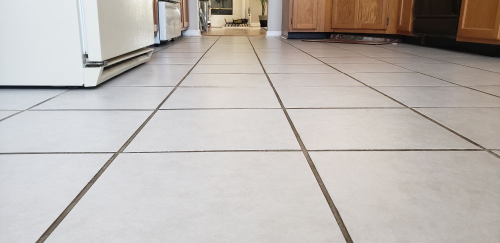
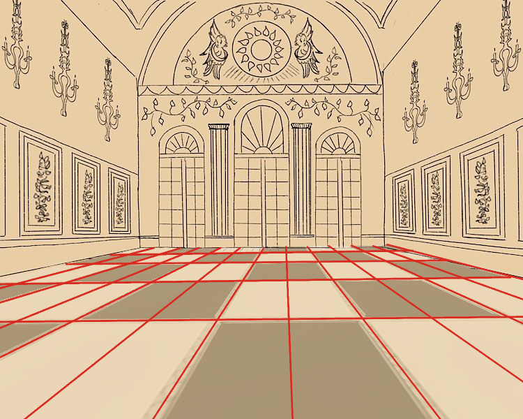
                                  @demotlj Both lines should get closer together as distance from the viewer increases. The ones in front of the camera should be the most square. Example:

                                  20190522_145353.jpg

                                  demotlj 1 Reply Last reply 22 May 2019, 19:03 Reply Quote 0
                                  • demotlj
                                    demotlj SVS OG @JerrySketchyArt last edited by 22 May 2019, 19:03

                                    @JerrySketchyArt On the vertical lines, I just followed the Procreate perspective tool so those should be right but the perspective tool doesn't space the horizontal lines and I admit I was just eying that... badly! (Some of it may be that I wasn't thinking of the tiles as being square but as rectangular.)

                                    Laurie DeMott
                                    instagram.com/demotlj

                                    JerrySketchyArt 1 Reply Last reply 22 May 2019, 19:49 Reply Quote 0
                                    • JerrySketchyArt
                                      JerrySketchyArt @demotlj last edited by 22 May 2019, 19:49

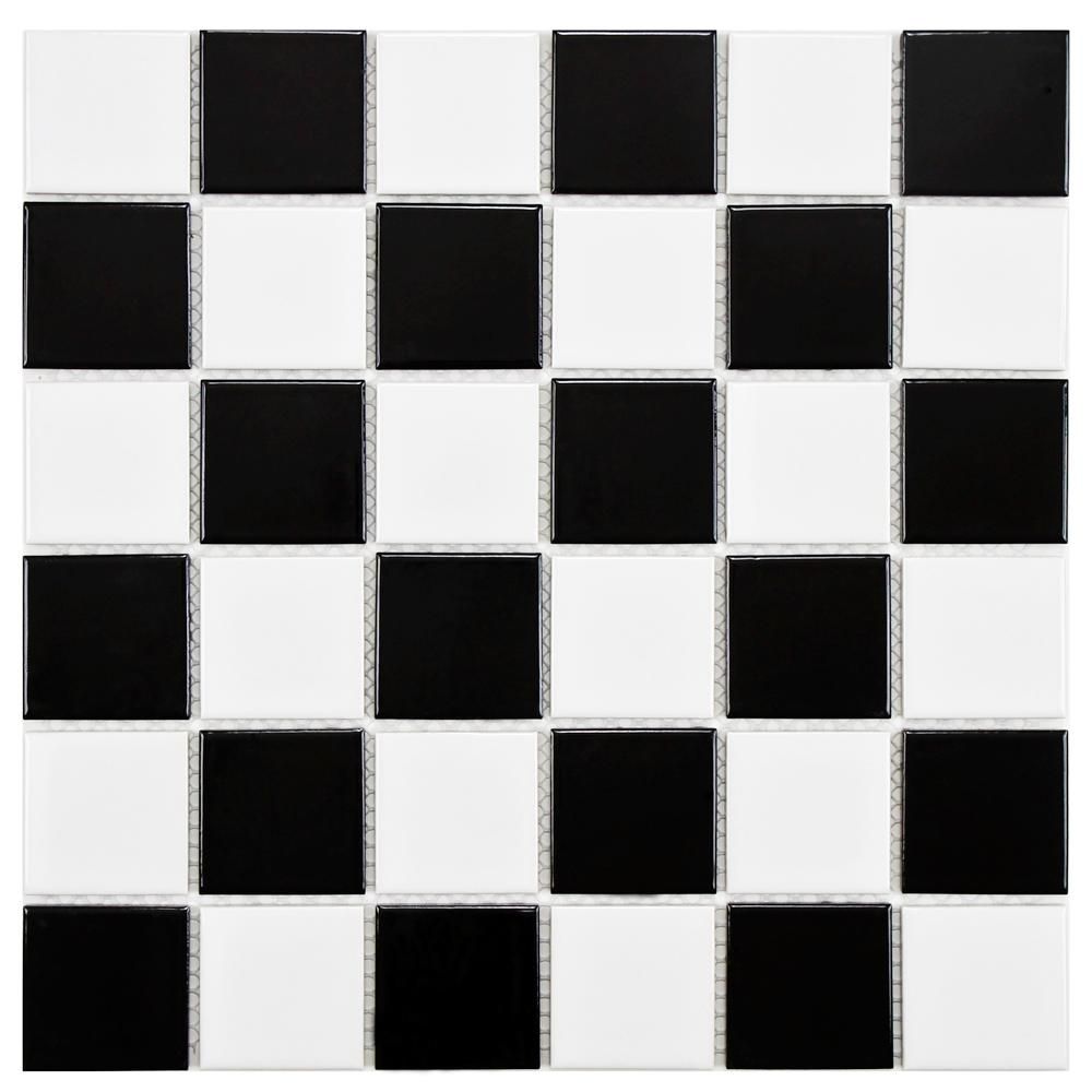
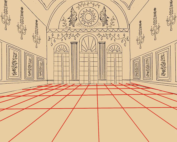
                                      @demotlj I'm yet to find a good tool for quickly creating grid lines. Clip Studio has perspective rulers too, but it doesn't force proper spacing either. Argh! My solution is to find/make a checkered square grid. Import that grid and do a "free transform" into the shape of the floor/wall/ceiling/whatever. Then you can use that as a guide for your marks. šŸ™‚ If you want more rectangular lines just add an extra line down the middle. Example over your drawing:

                                      (Random grid from google)
                                      black-and-white-high-sheen-merola-tile-mosaic-tile-fyfb2sch-64_1000.jpg

                                      Free Transform to match floor/wall lines
                                      floor grid.png

                                      Draw lines with grid for better estimation
                                      floor grid marks.png

                                      Rectangular floor tiles in perspective
                                      floor grid fixed.png

                                      demotlj 1 Reply Last reply 22 May 2019, 20:41 Reply Quote 1
                                      • demotlj
                                        demotlj SVS OG @JerrySketchyArt last edited by demotlj 22 May 2019, 20:43 22 May 2019, 20:41

                                        @JerrySketchyArt That does look better. I think the problem is that the perspective lines aren't supposed to be used for spacing like I was doing whereas your method keeps that spacing. Thanks -- I'm going to try that.

                                        Laurie DeMott
                                        instagram.com/demotlj

                                        1 Reply Last reply Reply Quote 1
                                        • demotlj
                                          demotlj SVS OG last edited by 24 May 2019, 01:03

                                          I’m going to call this done. It’s still very rough (don’t look at it too closely) and I will add other characters, tweak the placement of things, and improve the line art but for this exercise, I think this is as far as I need to go. I really had to think about interior design more than I ever have before so it was really a helpful exercise.
                                          51745826-E5C8-47EC-8145-FD7BF7293726.jpeg

                                          Laurie DeMott
                                          instagram.com/demotlj

                                          1 Reply Last reply Reply Quote 0
                                          15 out of 69
                                          • First post
                                            15/69
                                            Last post