Poe Cover Late Crits Welcome Revised x3
-
@gimmehummus Thanks for the feedback, I'll test that out and see if it feels more dramatic.
-
Here is a revised version...
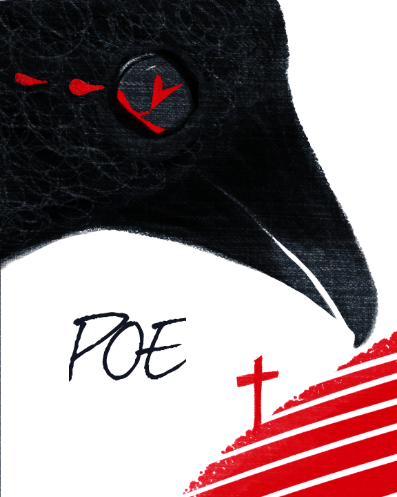
-
Here is one with a quick border on it, since it is getting a bit lost against the white site page.
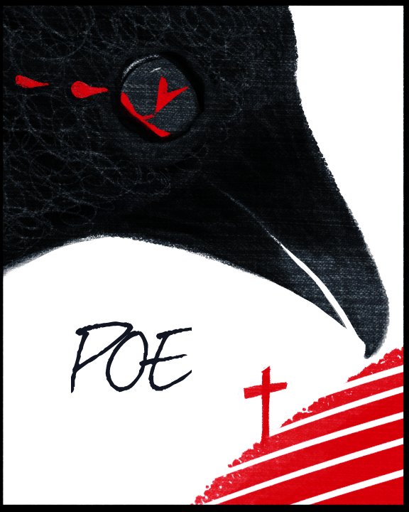
-
I love your aesthetic. This piece is evolving nicely too. Did you consider putting the elements on a toned gray background instead of the stark white? Even the shade of red could be more ominous. Perhaps with some of your texture and shadow. Poe is so dark and this piece is somewhat bright. The other think that I noticed first was the direction of the tears. It's right in your first iteration, but now that the bird is facing down, the direction of flow would change also. Consider what makes sense and ignore the rest.

-
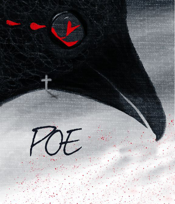
Thanks Suzy. Testing out a darker background and added some splatter.
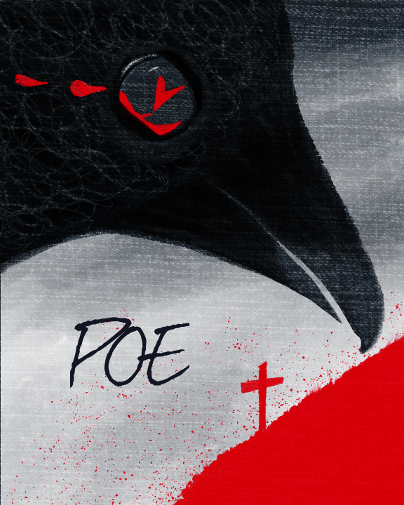
-
I pulled back a bit on the gray on the bottom to let some of the white through.
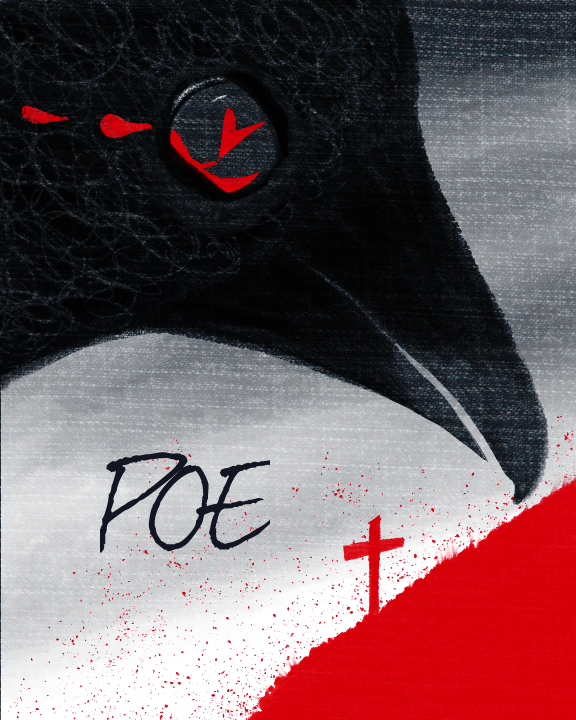
-
@Charlie-Eve-Ryan These are awesome! I think I like the second one with a little white coming through. Its too bad you didn't have a chance to enter!
-
With his head angled down he looks more hopeless. Nice! I looked at the negative space in his neck and it made me think of a hill so what about this....?
-
@Thrace-Shirley-Mears Thank you! I'll do next month for sure, I had a few things going on so I didn't enter this time. It was a fun one to work on though.
-
@gimmehummus Oh nice! Good eye, that is pretty sweet looking!