Portfolio piece- Anthropomorphic Animals- WIP
-
@nyrrylcadiz I think it is looking great so far. I don't think you need to add any more characters into the back. It might get to crowded back there. My suggestion would be to flip the duck to face right and the other girl to flip and face left so they are facing each other. Looking forward to how it turns out.
-
@nyrrylcadiz Love it!
-
@nyrrylcadiz This is lots of fun and I love the movement all the characters are showing. Only one small ( take it or leave it ) observation. When I look at the chicken girl, her legs look mor like a cat or a dog legs to me. It seems like she could have thinner legs and maybe some knobby knees. But really I love the piece and it will be a great one to show in your portfolio for sure.
-
@MichaelaH because the coconut is below the horizon line her perspective is good. You would see exactly what she drew.
-
@chrisaakins For me the horizontal line was at the feet of the dancing ducks, so I thought with the pizza principle - the cup would not have so big pizza but little bit more narrow pizza. But I am not a pro in perspective, so thanks.
-
As usual, I think your design looks phenomenal.
") You're going to have such a beautiful portfolio (though I think you already do).
You're going to have such a beautiful portfolio (though I think you already do).Perhaps the piece could be strengthened by considering what else could tell the story you're aiming for. If I didn't read your description, I would have probably just considered it a dance party scene (with one dancer more serious than the others). What could invite the viewer to go deeper into the story?
Why isn't the duck the star? What's different about her that keeps her from getting attention? Is she not as good of a dancer? Is the chicken wearing a super flashy costume? Is there a spotlight on the chicken?
Anyway... just some brainstorming beginnings in case it's helpful.Thank you for sharing!
-
I think it looks good, and then with color and value you can make the dancers pop out, and everything else meld together a bit, so its not too busy
-
@nyrrylcadiz Such a fun piece! And you've expertly incorporated so many different animals into your composition. I'm looking forward to seeing how you highlight the two main characters with color and value and lighting.
-
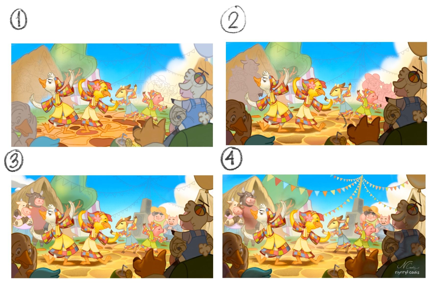
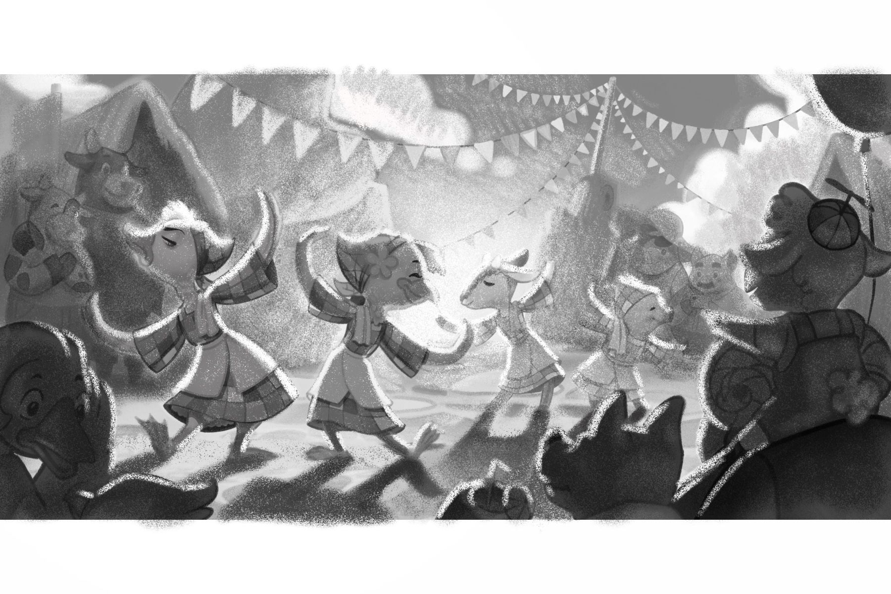
Hi, everyone! I’ve been working on this piece for a while. Below are my progress. This piece was really tricky. I struggled a lot to make my 2 dancers standout. I’m still not finished but. Hopefully i’m on the right direction. I’ll. get back to you guys tomorrow.
Portfolio: nyrrylcadiz.com
Instagram: https://www.instagram.com/nyrryl_cadiz/
YouTube: https://www.youtube.com/channel/UCbJCF1Im8ZO7hpGWTKOJMuA -
@nyrrylcadiz This looks really lovely, and already looks mostly finished. The values work really well on the foreground (the baby lamb and the other animals), which help frame the picture and lead our eyes to where the action is.
Though the background has muted colours and lighter values, I feel like the difference between those and those used on the two main characters is quite negligible. The values are still very close, so my eyes cannot focus entirely on the two main characters just yet. I'm wondering if the saturation on the background characters can be lowered a tad bit more so we could focus more easily on the main ones.
Gorgeous piece, though - the colours are so vibrant, and the characters are very fun to look at.
-
I love it, it is so nice colorful illustration. I would desaturate(or make lighter in values) the tree and the left pair, more like the right side of the picture). I love the movement of the two characters, really nice...
-
NICE WORK!!!
-
@nyrrylcadiz This is a really lovely image but I want to echo a couple things others have already hit on. The two main characters are blending in a little too easily with the background. This may be fixed with a subtle value shift. Also, I can't see why the duck is grumpy other than the facial expression. Maybe adding more clues (maybe her dress is dirty or not as shiny, etc.) to show that there is tension between them instead of the duck just having a bad hair day. Your color choice and rendering is a pleasure to see. I'm looking forward to seeing the final.
-
@animatosoor @Jon-Anderson @MichaelaH @evilrobot thank you so much for the suggestions. Yes, I agree. The duck and the chicken girls are not standing out that much. I really need to fix that. I also need to add more details to emphasize my story.
I will be stepping away from this piece for a day or two though. I feel like my eyes are getting really tired looking at it that I can’t seem to notice things that are off. I hope after a couple of days I’ll have fresh eyes on the piece and continue working on it. Again, thank you so much everyone!

 ️
️Portfolio: nyrrylcadiz.com
Instagram: https://www.instagram.com/nyrryl_cadiz/
YouTube: https://www.youtube.com/channel/UCbJCF1Im8ZO7hpGWTKOJMuA -
@nyrrylcadiz It's amazing the amount of good taking a break from a piece and coming back with fresh eyes can do. I have no doubt you'll find a good solution when you come back to it.
-
@nyrrylcadiz This is looking SO good!
-
Such a fun piece with a great story! My only input is to look for tangents because they can be a distraction. For example, when I follow the ducks wings, I'm led to the cow's elbow almost touching, and then the tree limbs, which I'm sort of getting lost in.
I love the bright and colorful mood you've got here! Great work.
-
fabulous!
-
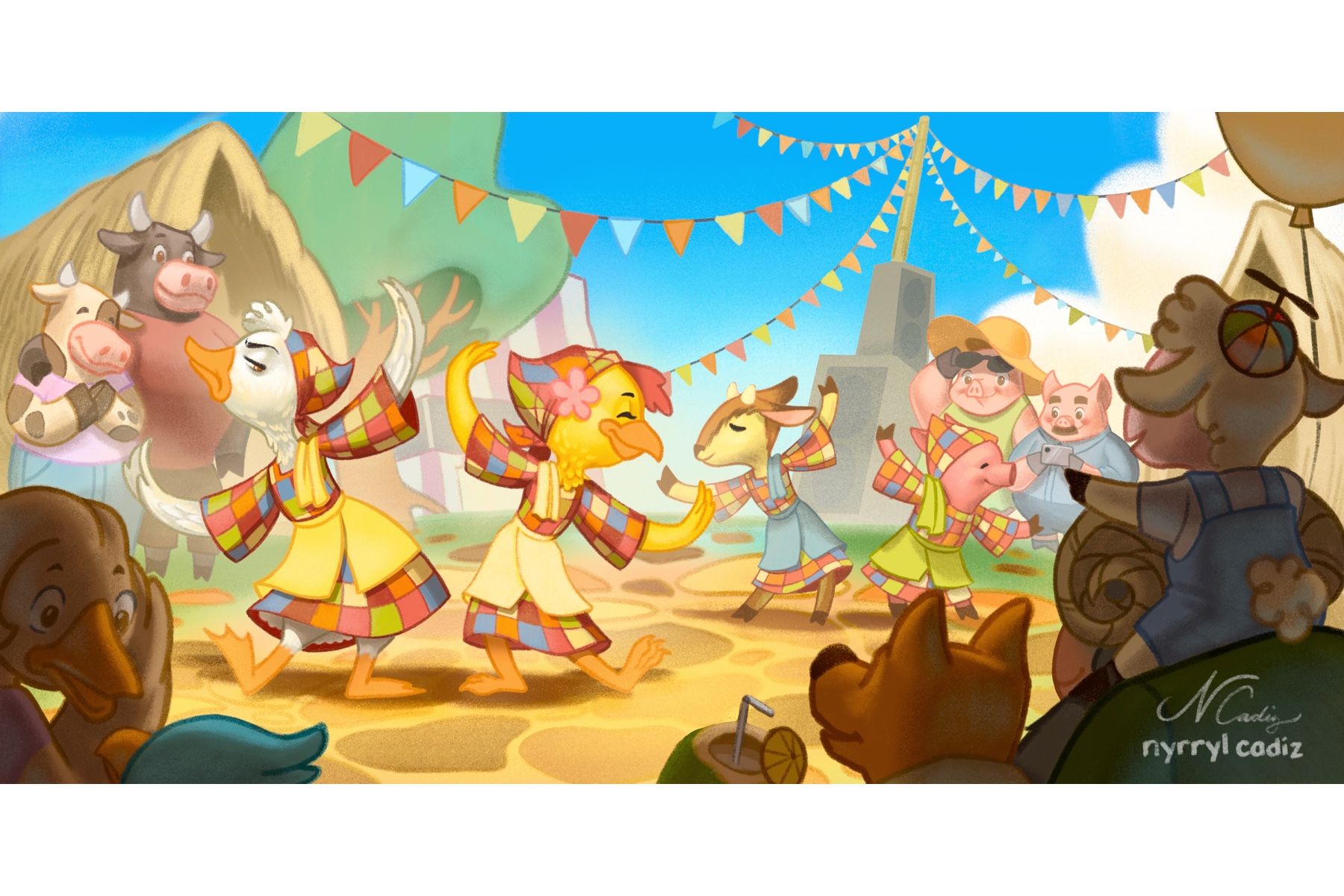
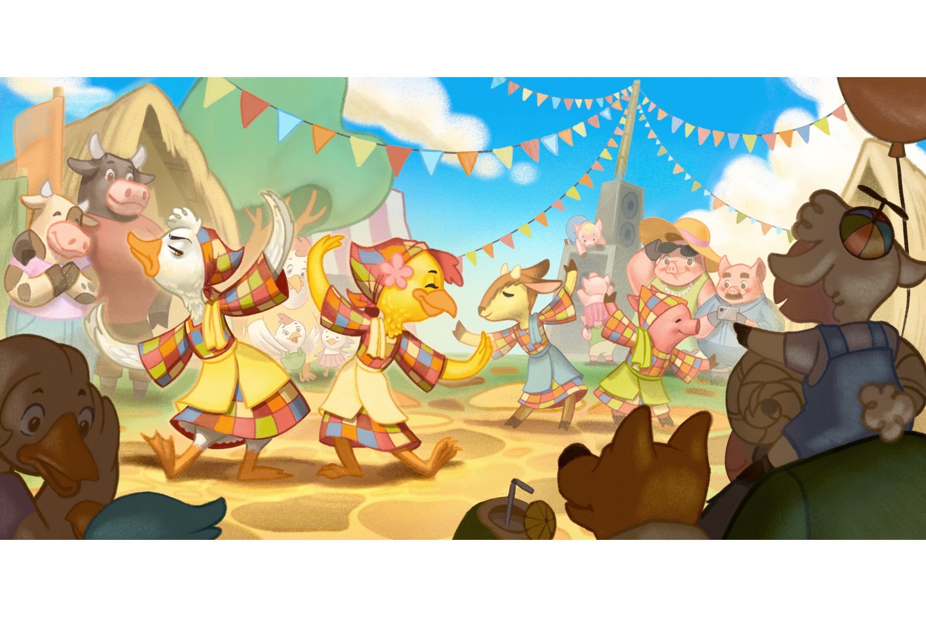
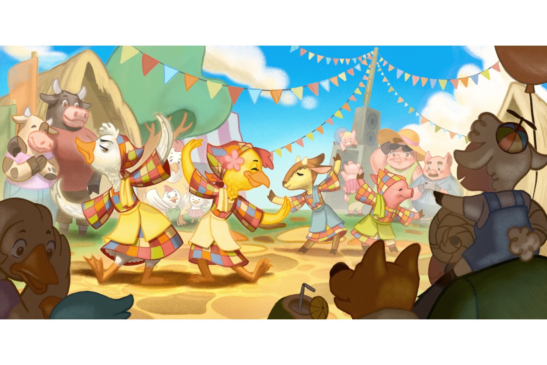
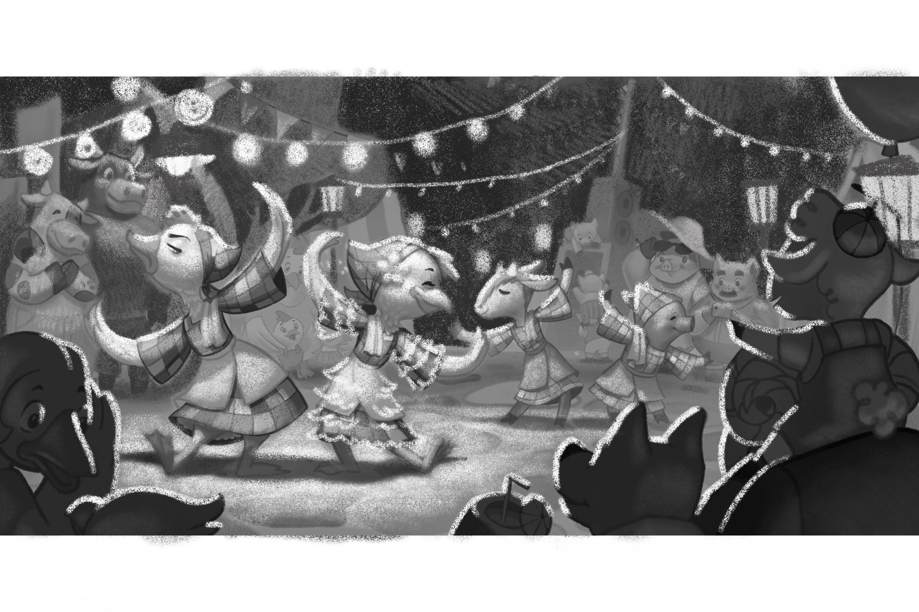
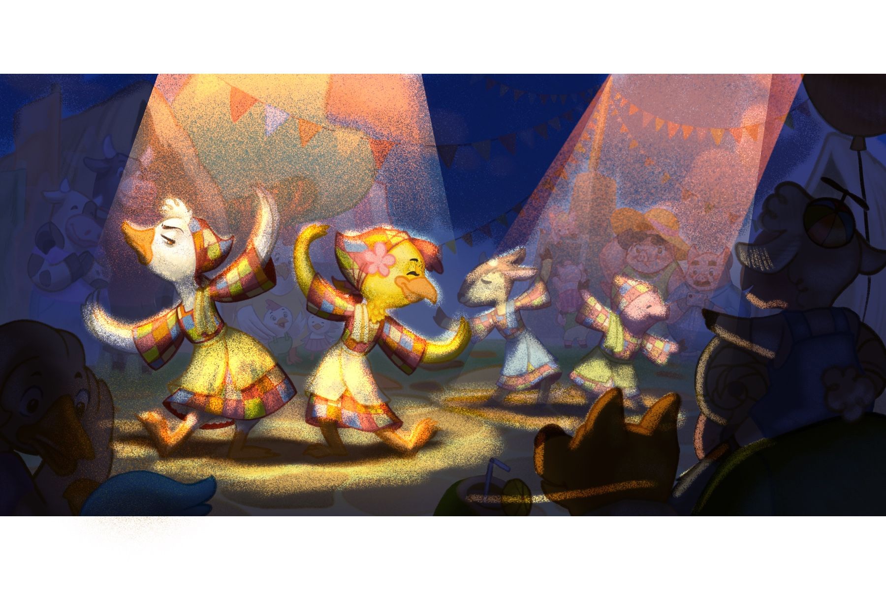
Hi, everyone! I’ve been working on the piece. I really felt that my values felt weak with my illustration so I went ahead and experimented with various lighting as seen below. I tried a late afternoon scene as well as an evening scene. However, none of them sit well with my idea for the piece. I wanted this work to feeling light and joyous but the other lighting were not really sending out that message in my opinion. The afternoon one seemed a tad bit too dramatic than I’d prefer while the evening scene just seemed like a different story all together. Especially that third piece below. It made the scene look like it was a dance party or something. I love the colors tho. I might use it in the future.
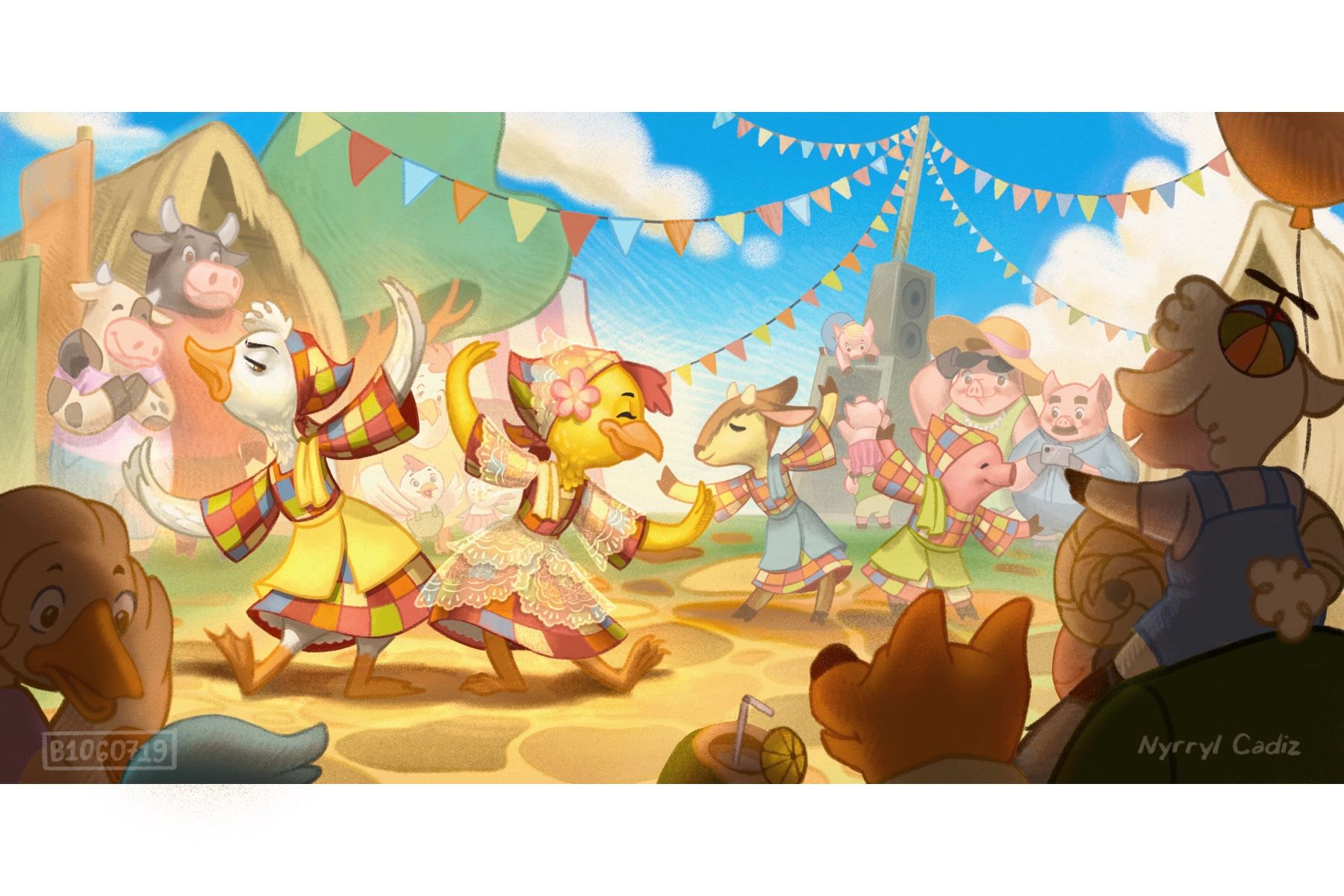
Aside from the rivalry of the 2 dancers up front, I created this in order to showcase this folkdance from my country. And with the other lighting, it just made the piece inauthentic. Based on my experience, this dance was performed during day time and everyone had fun watching it. It was just an overall happy feeling. With the other lighting, it just felt like a total departure from that memory. That is why I chose to settle with my initial lighting. It just plainly showed how I wanted the piece to feel.
I added a low-opacity, white layer on the background characters and then a color dodge layer on the main characters. I remember Will Terry mentioned that in order to increase focus on an object, it must have a high contrast in relation to its suroundings or be in red. Hopefully those vibrant reds are enough to make the characters pop. I also spruced up the chicken girl’s dress. I didn’t want to go overboard with the accessories since I want the piece to be as faithful to the real thing as possible though my take on it is fairly romanticized. ( dancers of Itik-itik wear very simple costumes).
So, yeah, here’s my piece. I’ll still have to tweak a few details but it’s almost done.
-
This is such a lovely piece and it's been great to see your process, you're so good at lighting scenes

I personally like the nighttime one with the spotlights, it really helps to make the two main characters stand out - maybe you could make the spotlight on the couple at the back just slightly lower opacity so that we can really focus on the main characters. Apart from that I think it's such a great piece!