Finishing Drills for a Chronic Dabbler.
-
Your third sketch reminds me of walking through the hobbits home, it’s very quaint. You rolling these out inspired me to pump out my Godzilla so thank you so much, keep going!
-
@animatosoor Really lovely room illu. Like the many toys. I am missing some toy which the girl is holding or what is the story to this picture? And other picture, I so offen commenting, do You mind to tell me what your first name is or how I can call you? soo or rya or J?
-
@Heather-Boyd Thank you for the kind words; I love that you've been inspired in this way!
 Your entry for Godzilla looks really good.
 -
@MichaelaH Thank you, Michaela!
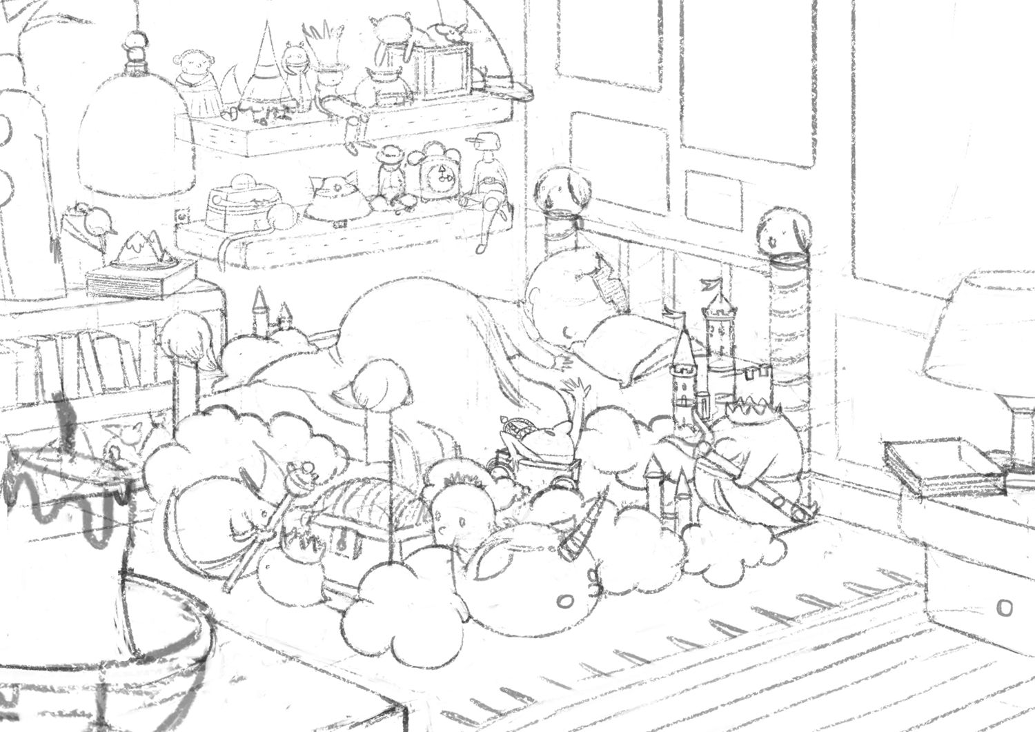
As far as the story goes, it is my interpretation of a line in the poem that speaks of the bed being like a kingdom. While I've placed many toys in the room, I also wanted to show the foundation of the bed itself being built of magical things: mythical creatures, legendary kings and queens, treasure chests, etc.
Right now many of those are still represented by spheres. My idea is to also give them almost the same rendering as the ghost girl when I get to that stage, so that they are clearly shown as "dream-like" images, and not real objects attached to her bed frame. XD
If there are ways you (or anyone else) can think of to better represent this idea, I'd love to hear them!
And other picture, I so offen commenting, do You mind to tell me what your first name is or how I can call you? soo or rya or J?
You can address me as Soorya. Your comments are always deeply appreciated.
-
@animatosoor wow sounds like good story, till now I don't have anything to add .) It looks great Soorya

-
@MichaelaH Aww, thank you.
Here's an updated version of my drawing. I'll be moving on to values, but if there's anything problematic with the composition I'd be willing to go back and make changes.:
-
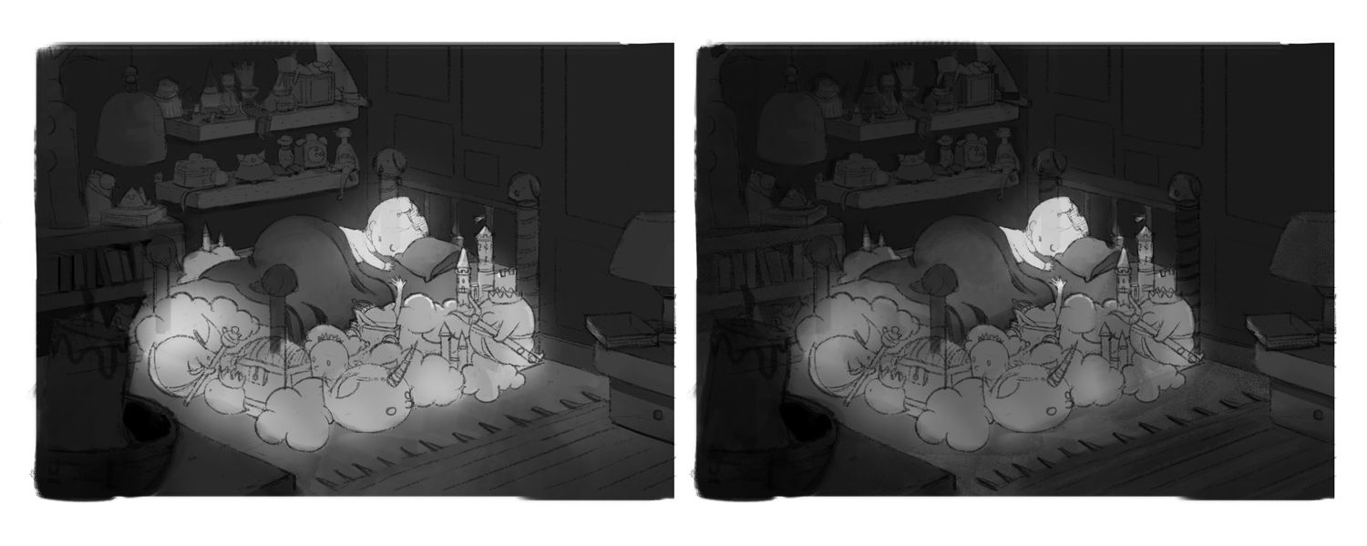
Value studies for the previous drawing:
I've been developing the next illustration in the series simultaneously.
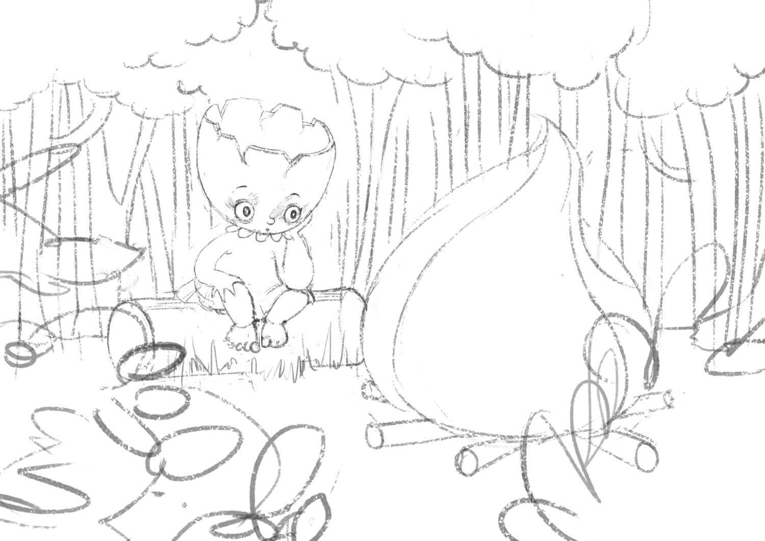
Thumbnails for the next illustration in the series:
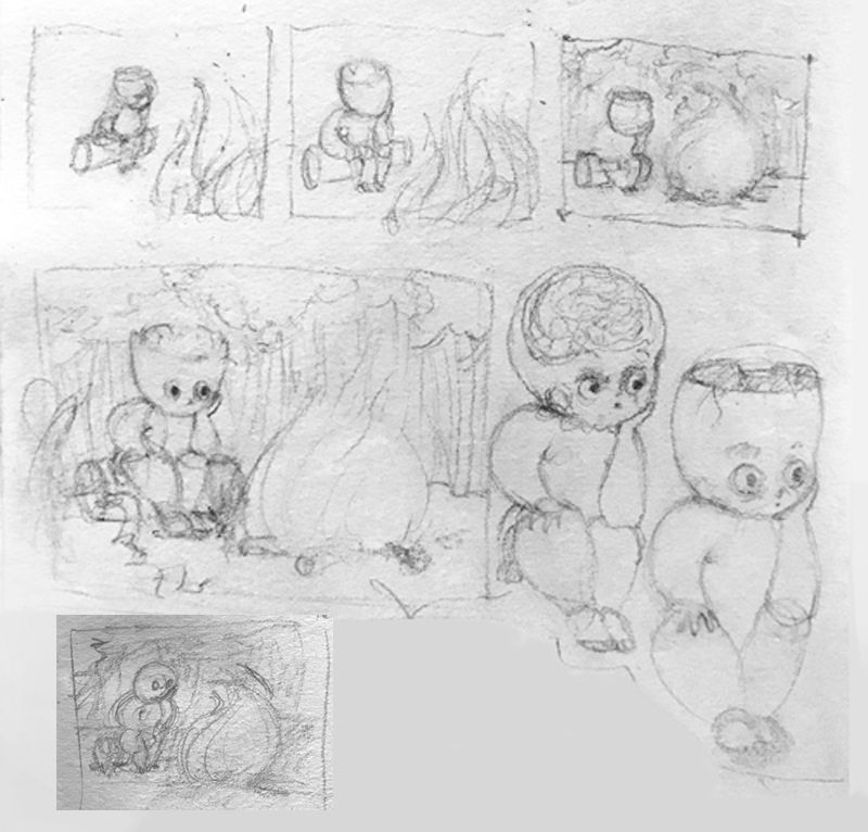
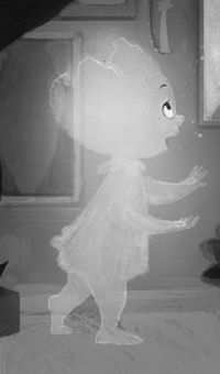
If anyone is able to provide their input on this: does the ghost girl still look like the same ghost girl from before (even with her crazed expression?)
-
@animatosoor I like the left value illustration and for the crazy girl, I think the head is ok, but the original girl has very short legs, like the knee till feet should be much smaller.
-
@MichaelaH You're right - I didn't notice her legs were so long. She'd be very tall if she stood up from that log, haha.
I have her legs dangling over the log now, so the feet no longer touch the ground. I think I will have to explore the gesture some more, if this is still not working.
-
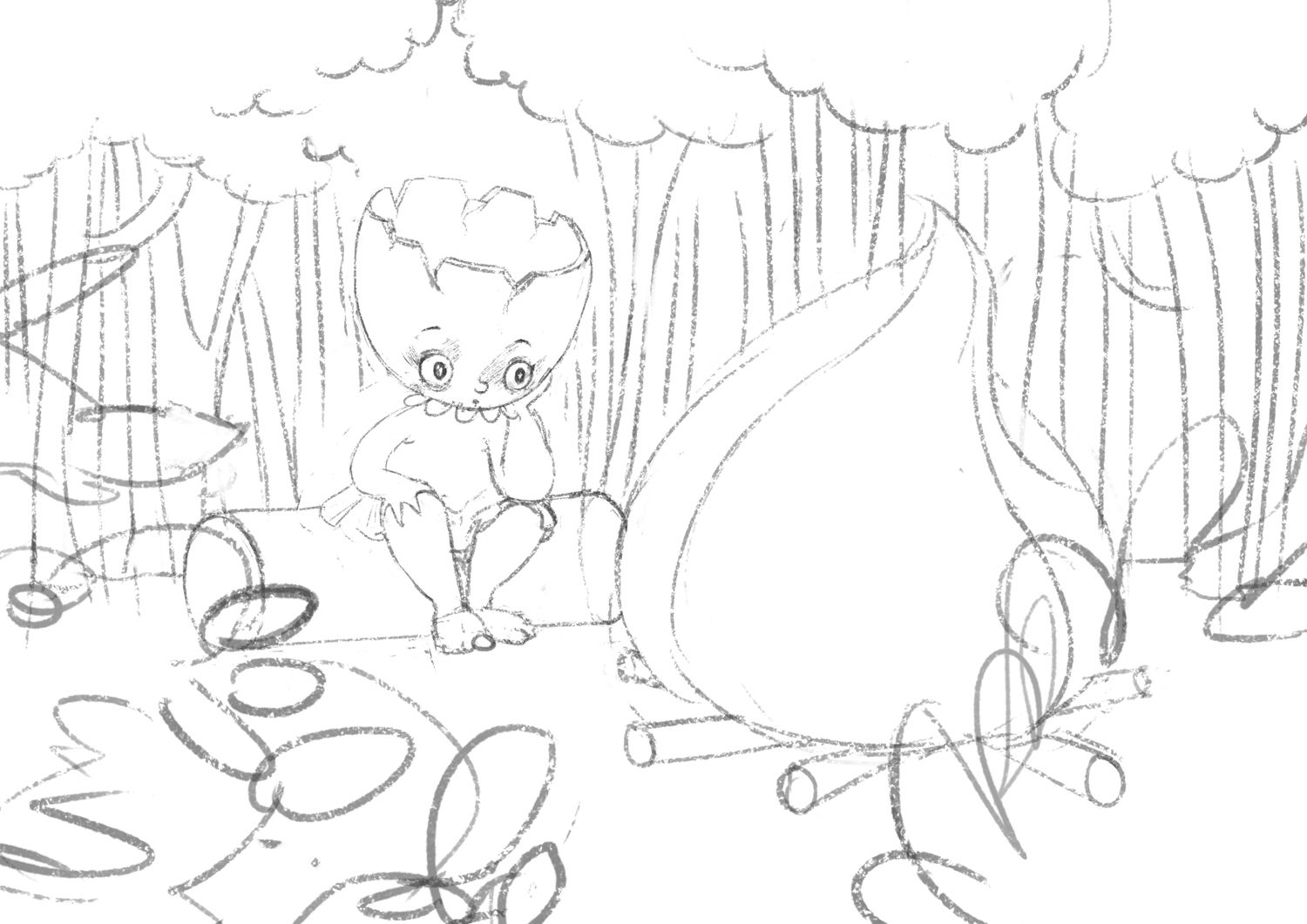
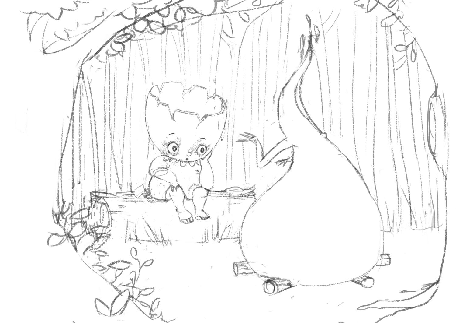
New sketch for the campfire illustration. There's very little going on in this image, and I don't really know how to arrange the elements in a pleasing way. I'm also not happy with the foreground just yet,:
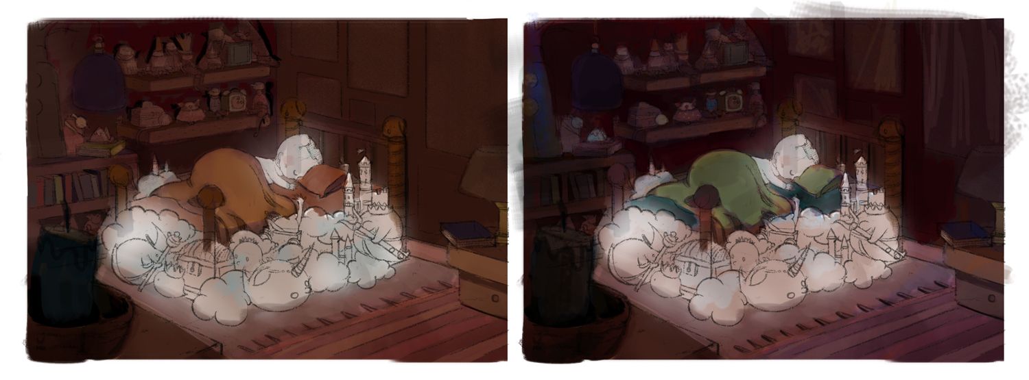
Colour studies for the bedroom illustration. I didn't want to do another blue painting (I'd recently done one), and wanted to explore showing night-time in cool reds/purples.
-
I think I am missing some bush or leaves or in the background, except they are only big trees in the background. The foreground, there could be some more wood for the fire? or stones...
-
@MichaelaH Thank you for the tips, Michaela! I'll explore those options. I was seriously drawing a blank with that one.
-
This is my progress so far with the bedroom illustration.
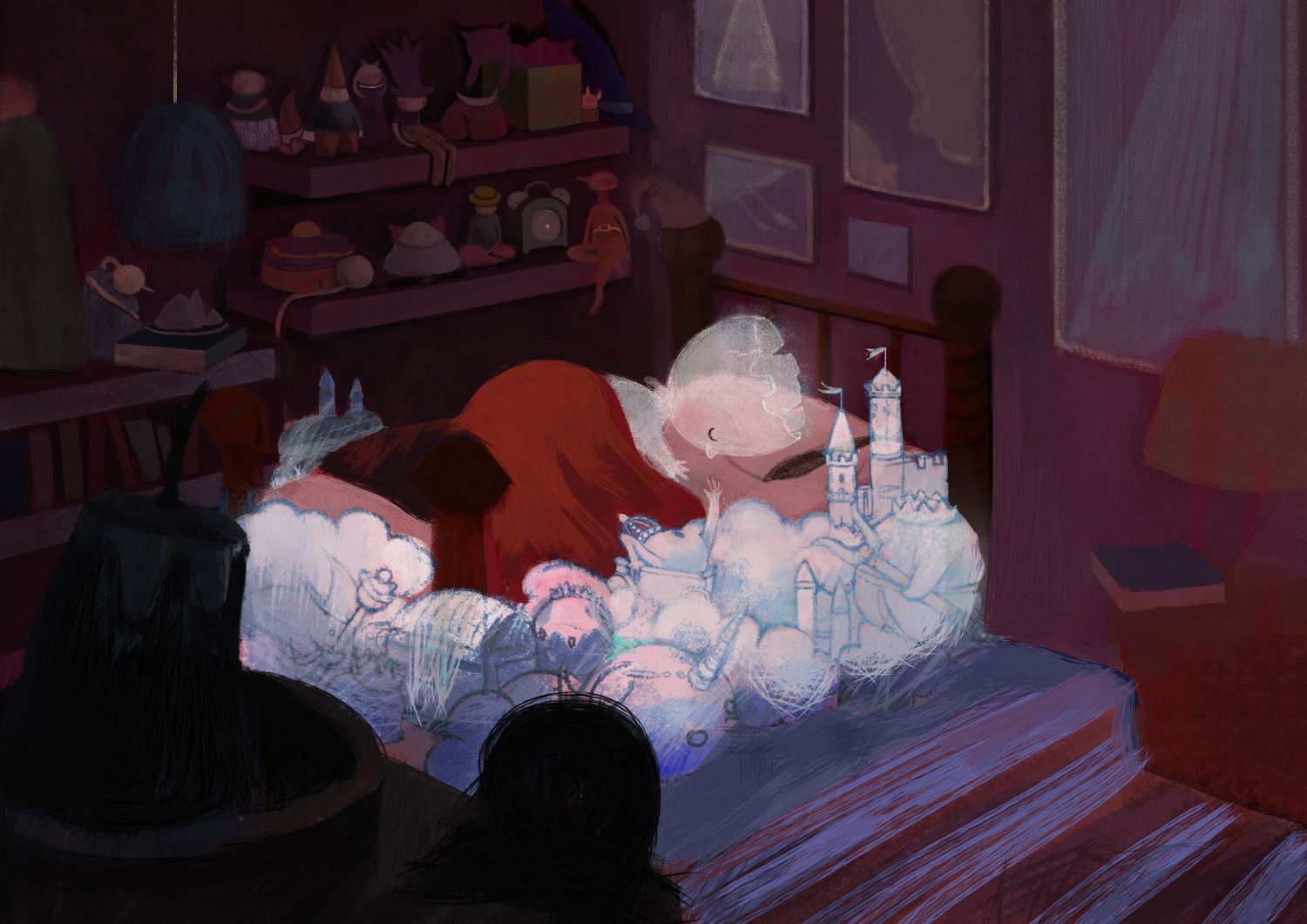
I know I'd said in an earlier post what the story was, but I'm wondering if it still reads as clearly now that it's a painting, and no longer just line work?
I would appreciate any insight on this!
-
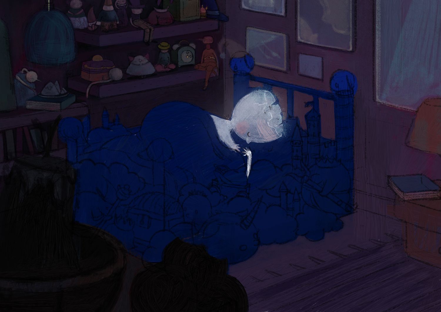
Feeling a bit stuck and trying this instead:
-
Amazing progress Soorya!
Was unsure what exactly you were stuck on, but I think both versions look great (as well as both your colour studies a few posts up!) The more red coloured one has a warmer look whereas the blue feels a bit more like 'middle of the night' - am not sure if that helps but there you go
Also, the scene in the woods by the fire, I think your latest sketch looks good, foreground and all. It may be worth giving the foreground trees some slight texture so they don't look so blocky, but I wouldn't worry about there being 'not much going on' unless it's missing any story elements!
-
@animatosoor It looks so peaceful and night time---I love it, you are so good with dark values and shadows, I am fully afraid of these things and background...so I am happy to learn from You also
-
I appreciate it, @AndyIllo.

Oops, yes, I didn't even mention what I was stuck on, haha. It was definitely the colour scheme that I was struggling with. I had already narrowed my options down to "cool reds/purples," so I think I sort of complicated matters for myself by rendering the whole thing in that warmer pink palette in the earlier picture. I think I have to take a break from night-time scenes for a while after this series, and explore all sorts of brightly lit situations. XD
Thanks for the note on the scene by the campfire. I will be revisiting that. As for the story: I wanted the keywords to be "awe," "weird," and "warm," and the picture has the two major elements I needed to include. I'm kind of nervous about painting it, haha.
-
@MichaelaH I appreciate that you think so, especially since I'm still learning those things. We can learn from each other to improve on our weak spots.

-
You have such amazing pieces. I enjoyed it very mich scrolling down your posts. They’re all amazing!
-
@animatosoor haha no problem, in that case I think you're bang on with your latest version - great work
 Well all your practice has definitely paid off anyway because your night time scenes are ace !