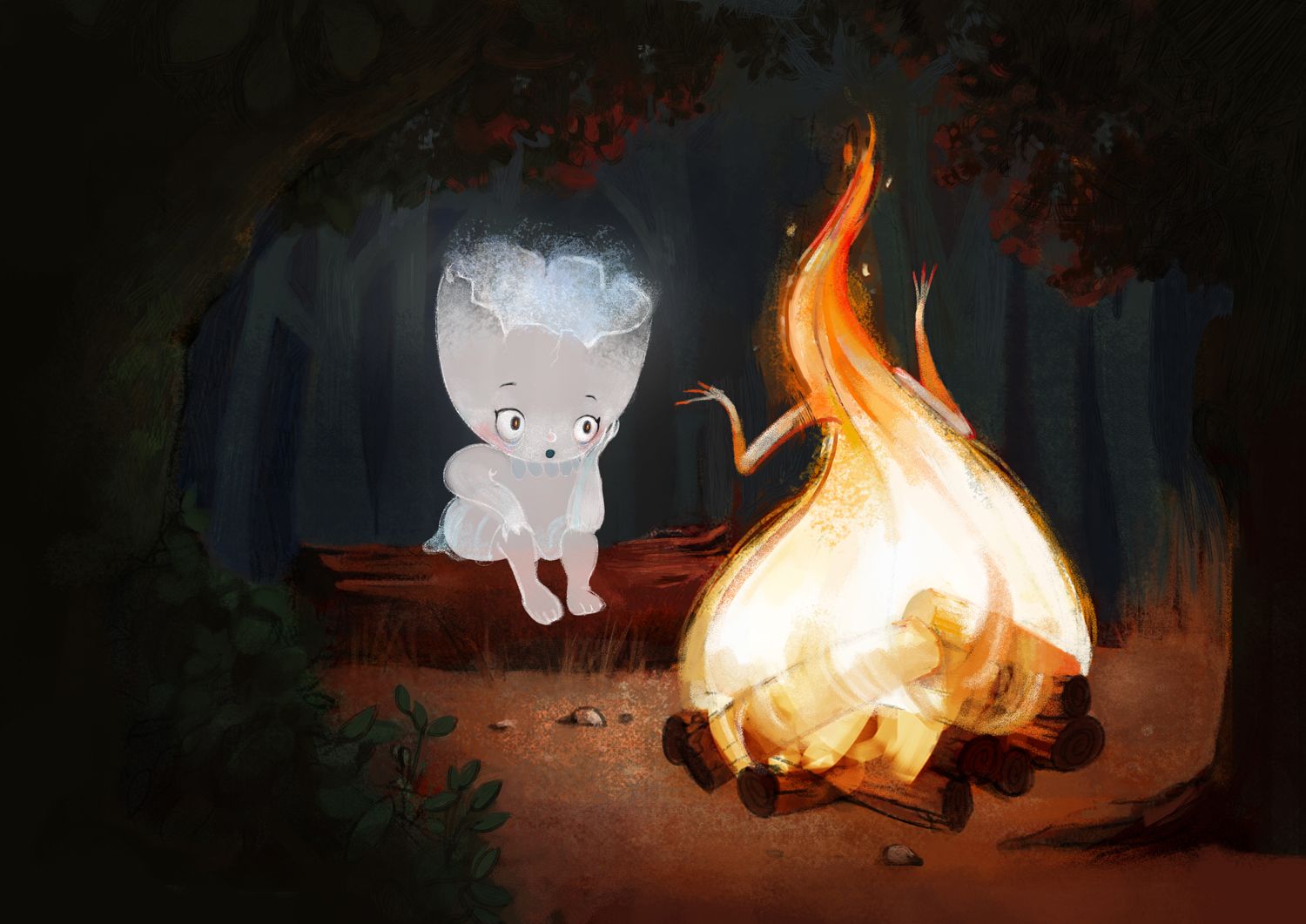
Finishing Drills for a Chronic Dabbler.
-
@animatosoor Thanks. It's oils. I find them really soothing to work with. They stay open so long ond go on so smooth.

-
@ThisKateCreates It's been a long while since I last touched them, but they are indeed awesome.
-
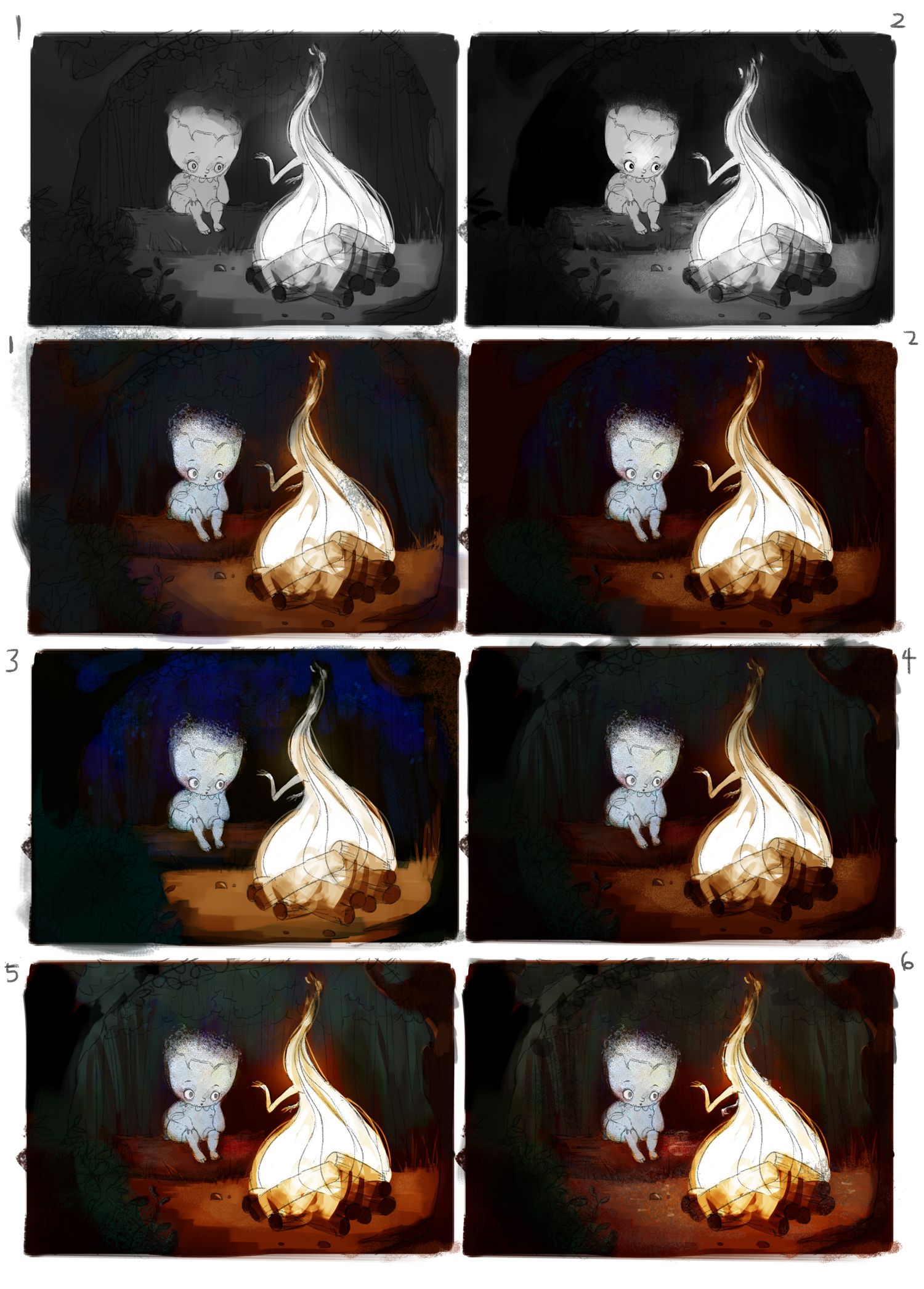
These are my value and colour studies for the campfire scene. I am leaning towards #6 for the colours.
Critique is always welcome!

-
@animatosoor I like the first Value and colors the 5 and 6 the most, maybe you can go little ligter in values? It is still very dark. but maybe it will get better later when you do the real colors. And PS: It looks great, love this colors of the fire
-
@MichaelaH Thank you! I agree that it's still too dark. I'm going to work on improving 5/6 to make the values slightly lighter. There's too much black at the moment, I think.
-
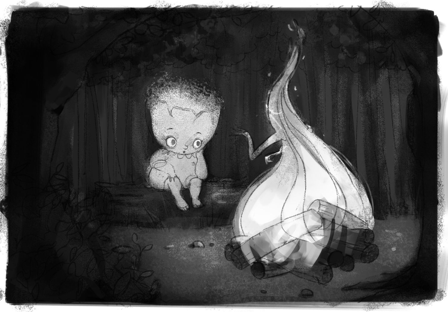
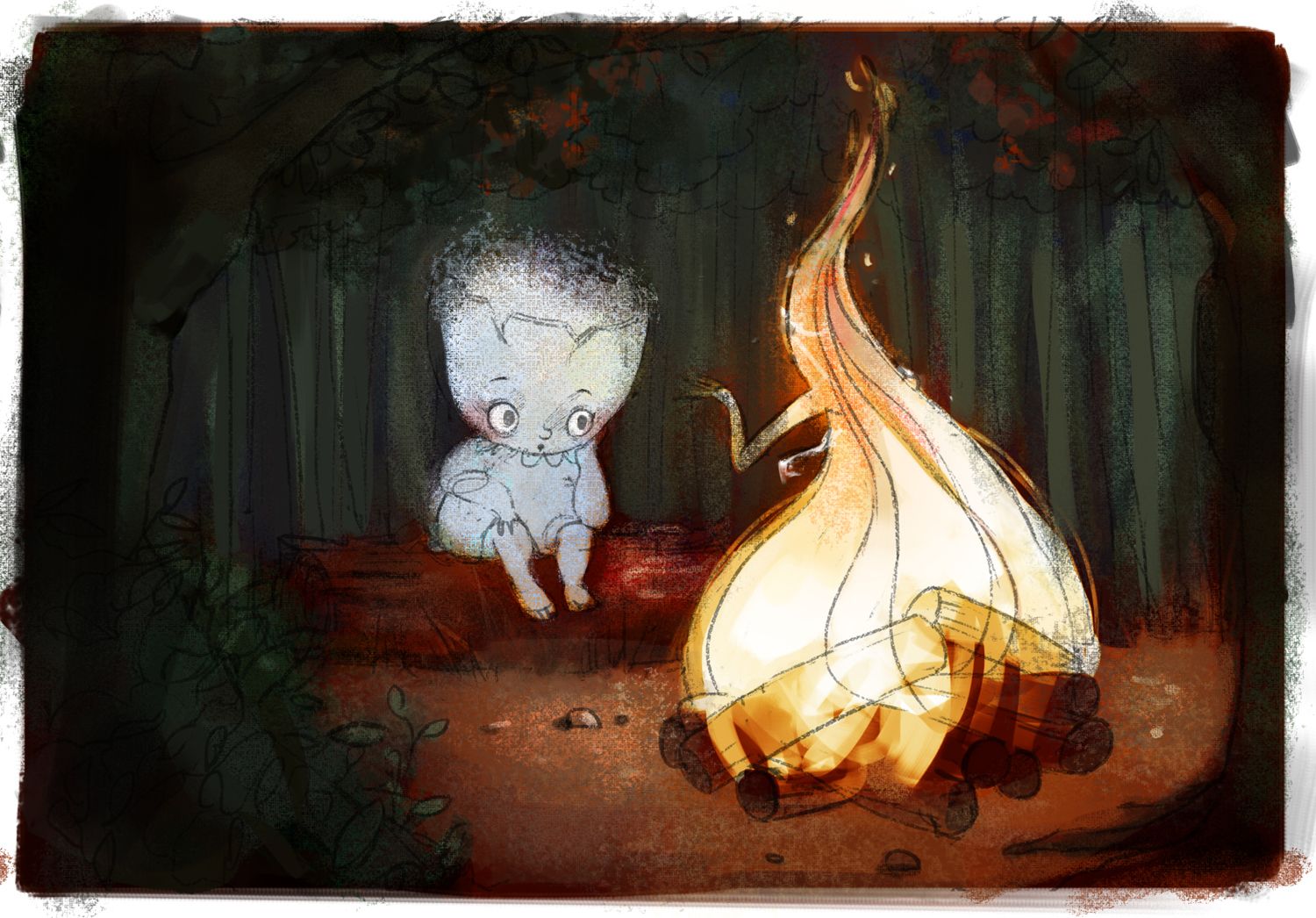
I've arrived at this value study and colour study. I'm thinking the values are no longer too dark - especially in the background! I know it's still overall a really dark image, though.
-
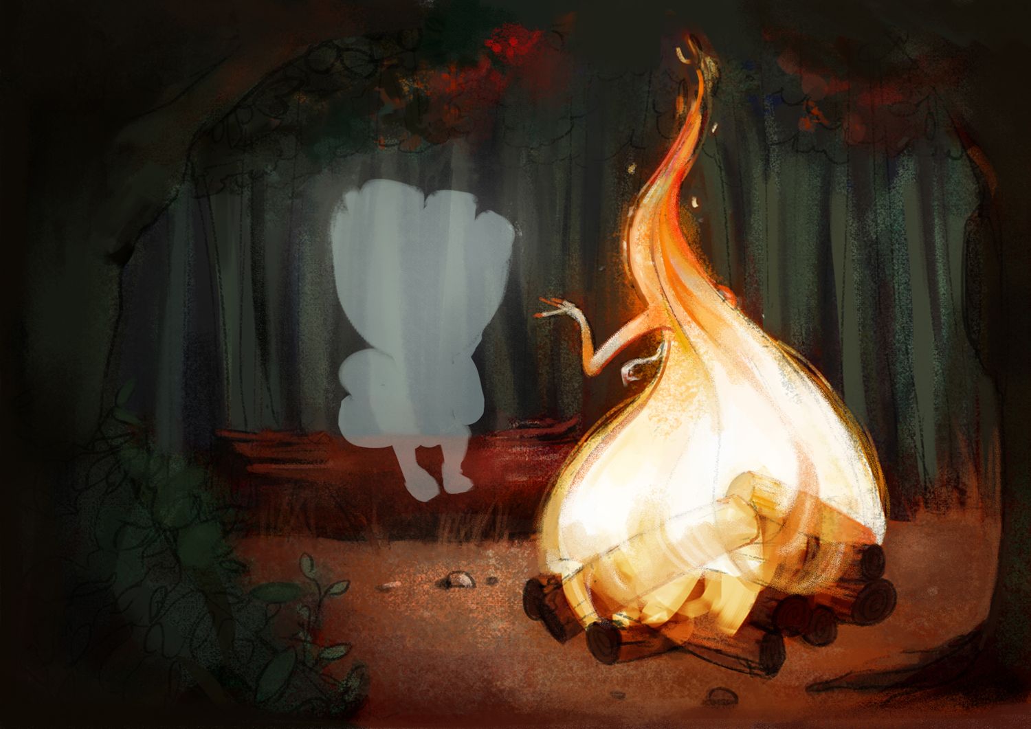
This is my progress with this illustration. I would love critique.:
-
@animatosoor wow I love Your fire, it looks great. The tree on the right and the bush on the left will be much brighter?
-
@MichaelaH Thank you! That's a great point. I was honestly quite confused about how much light would be hitting the trees and bushes, haha. But you're right, they should be getting light from the fire and should be brighter. I'll work on that.

-
@animatosoor Love the progress!! there's so much energy in that fire. good work!
-
Oh this is awesome!
Just see that the tip of the flame does not form a tangent with the top edge of the picture..maybe desaturate the tiny flames a little?
Are you using photoshop layer blend modes to overlay the color on the values or are you starting of with color directky with the value study as a guide?
Looking good so far!
-
Love the concept of the flame friend.
I took me the second look to notice the hands - which is the most interesting element of the concept for me once I saw it. I wonder if the hands could be more prominent somehow. -
Thank you so much, @AndyIllo!

-
Thank you, @Darian! You’re right about the top of the flame potentially forming a tangent with the top edge of the picture. Thanks for pointing it out - I will make adjustments to avoid that.
As for colours: for my colour studies my approach was to use blending modes in separate layers to get a certain combination of colours. For this final, more detailed piece that I’m working on, I’m merely using the value study as a guide while I plop “fresh paint” onto the picture, if that makes sense. No more blending modes at this stage.
-
@xin-li Thank you for your feedback! I agree with your note on the hands - they could be made more prominent. I’ll explore a few different gestures for the flame and post them here.

-
Here are my updates! These are the changes I've made after the last round of feedback:
- I increased the distance between the top of the flame and top edge of the picture to avoid a tangent.
- I tried making some of the leaves on the trees and bushes slightly brighter.
- I explored two different gestures for the flame's hands:

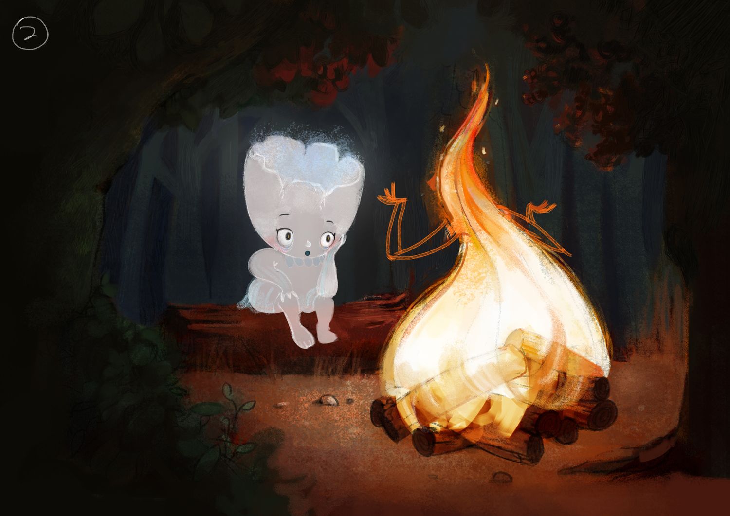
Critique is always welcome!

-
It looks still great, I like the fire hands before, these little sharp long fingers...
-
Thank you, @MichaelaH! I've retained the long, sharp fingers. I just wanted to block in the arm placement in the above post, haha.
This is what I have now.:

-
@animatosoor Something doesn't fit with the right hand, now. Maybe the right elbow doesn't fit the wrist angle. I love the long sharp fingers.
-
@MichaelaH I had a hard time figuring out the angle, haha. You were right about it being skewed. I went ahead and rendered three different versions of the flame's hands so we can see them side by side.
1: original

2:

3:
