Society of Visual Storytelling

    SVSLearn Forums

    • Register
    • Login
    • Search
    • Recent
    • Tags
    • Popular
    • Users
    • Groups
    • Search

    Finishing Drills for a Chronic Dabbler.

    Artwork
    25
    217
    33071
    Loading More Posts
    • Oldest to Newest
    • Newest to Oldest
    • Most Votes
    Reply
    • Reply as topic
    Log in to reply
    This topic has been deleted. Only users with topic management privileges can see it.
    • animatosoor
      animatosoor last edited by

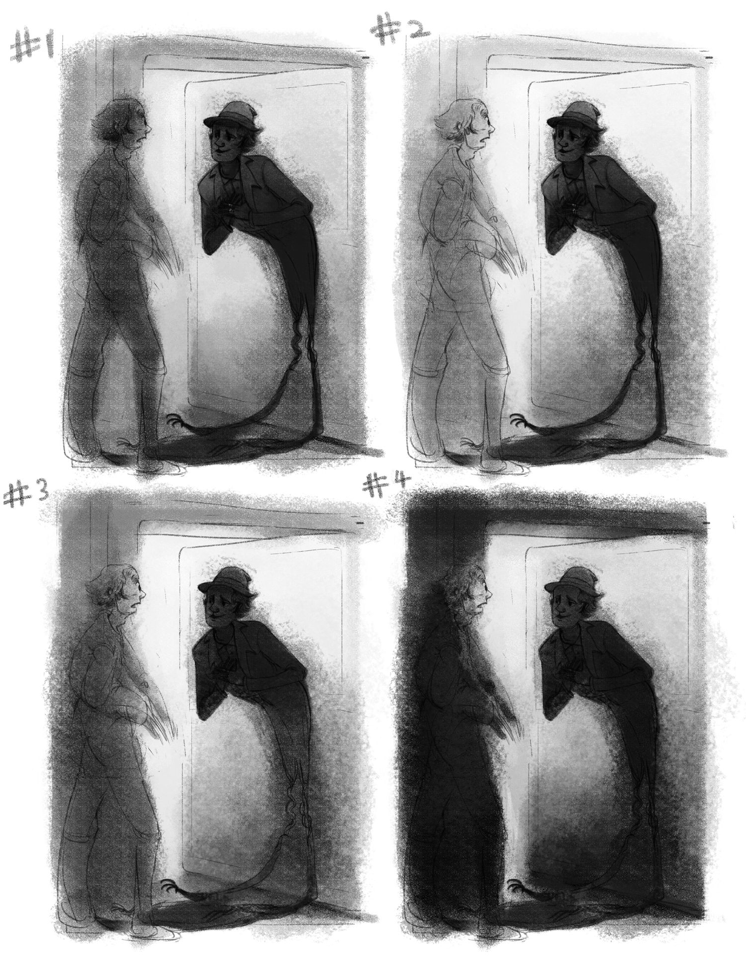
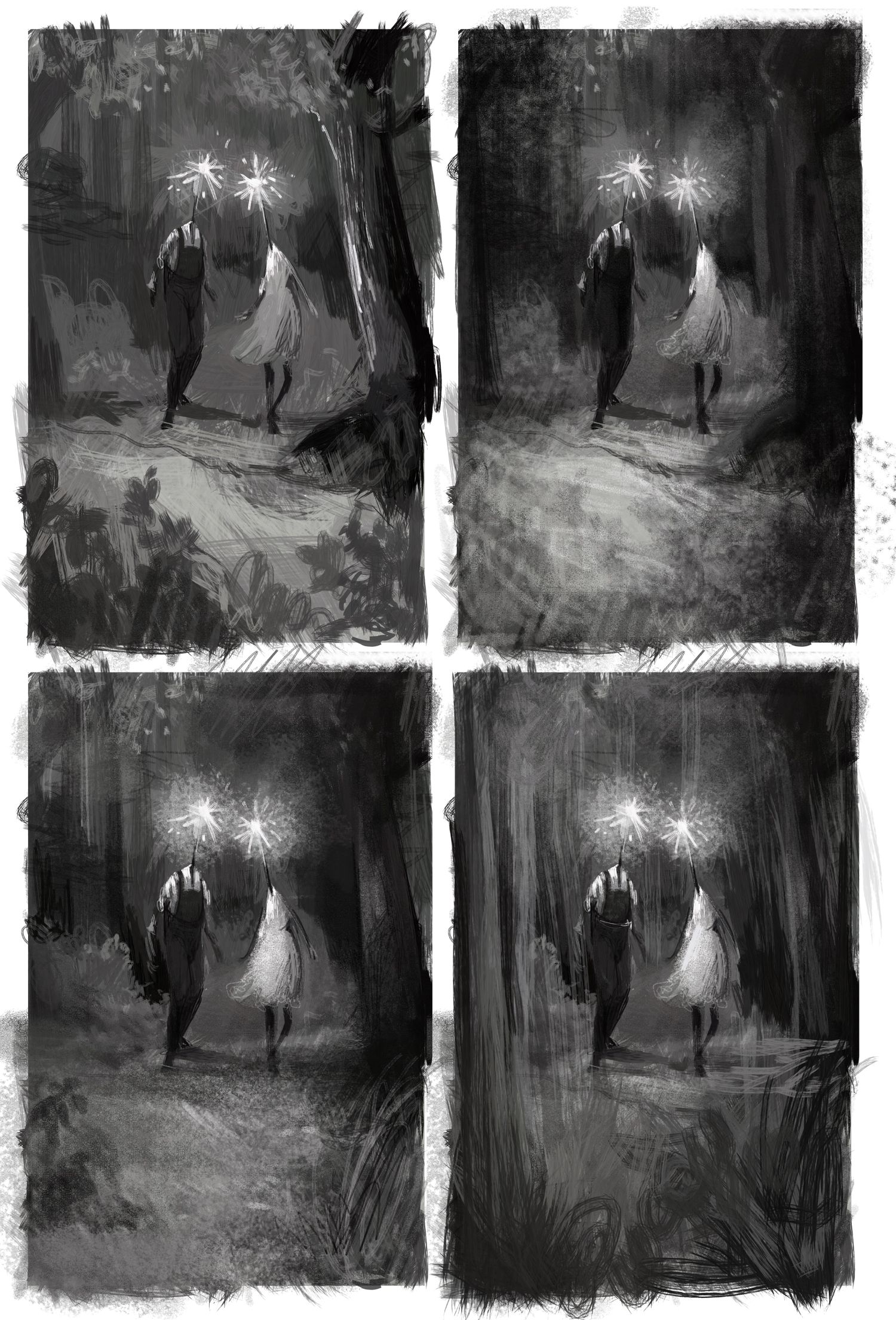
      These were as much value studies for me as they were "rendering and mood studies." I'd like the end result to have a fuzzy feel as well, especially around the shadow. I'm leaning towards #3 and #4, personally!

      value studies.jpg

      https://www.instagram.com/sooryajart/

      The Beatles: "Roll up, roll up for the Mystery Tour!"

      1 Reply Last reply Reply Quote 2
      • MichaelaH
        MichaelaH last edited by

        I liek 3 the best, wil be good for the mood, 4 is great also, but maybe it will be to dark? Or maybe something between 3-4

        https://www.instagram.com/michaelaheimlich/
        https://www.heimlich-illustration.de/

        animatosoor 1 Reply Last reply Reply Quote 1
        • animatosoor
          animatosoor @MichaelaH last edited by animatosoor

          I agree, @MichaelaH. I will be going for something in between #3 and #4. Thank you. 🌻

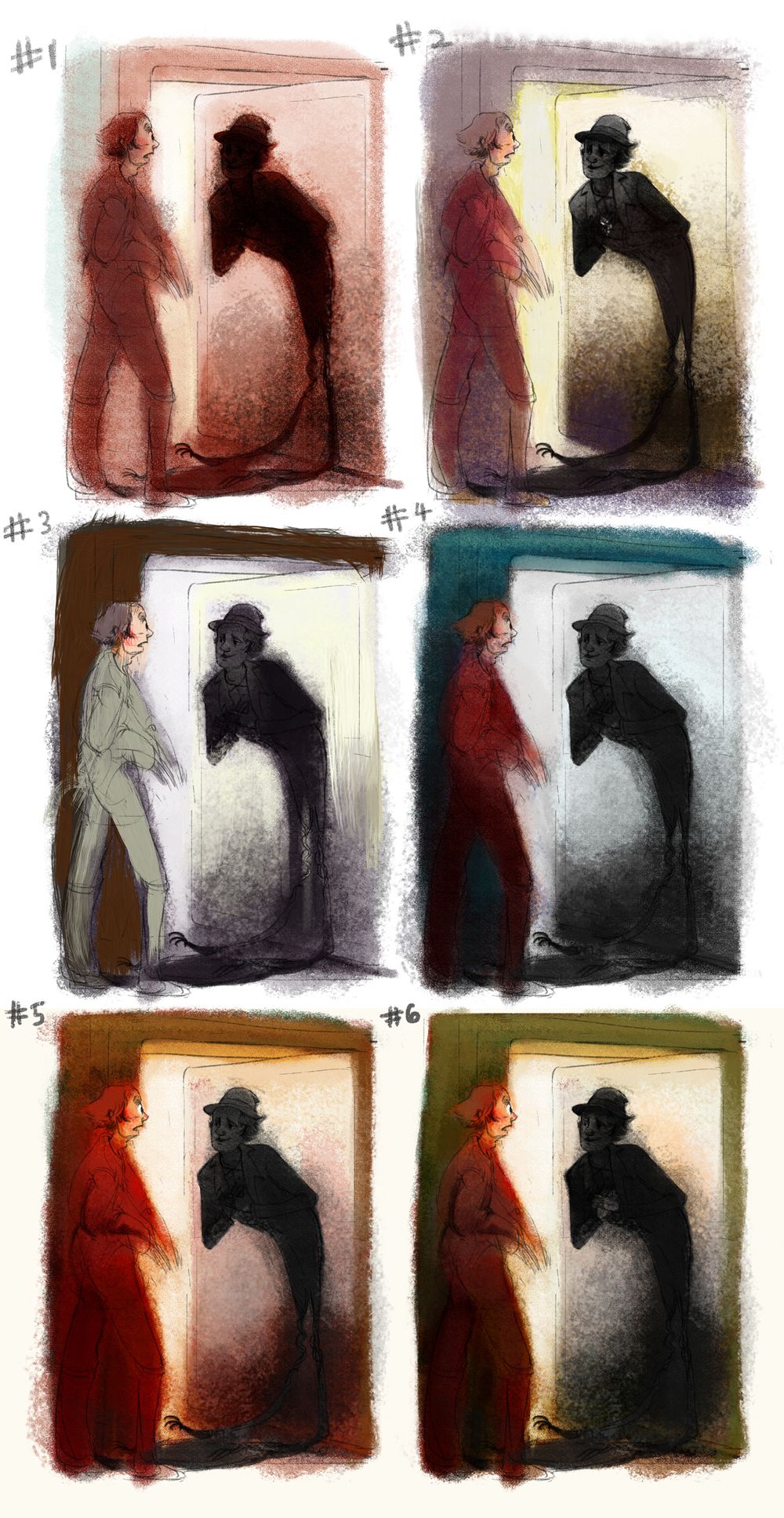
          I have been doing these colour studies. I plan to do some more till I find something I really like.:

          colour studies.jpg

          Overall, though, I've run into a failure this week: It's Monday, and I'm still at the colour studies stage with this. I'm realising how much of a struggle it is for me to pose human figures properly and have them interact in a convincing way.

          https://www.instagram.com/sooryajart/

          The Beatles: "Roll up, roll up for the Mystery Tour!"

          MichaelaH 1 Reply Last reply Reply Quote 0
          • MichaelaH
            MichaelaH @animatosoor last edited by

            @animatosoor I like 2 the best, after that maybe 6. Yeah I am also late, had to do some custom order...

            https://www.instagram.com/michaelaheimlich/
            https://www.heimlich-illustration.de/

            animatosoor 1 Reply Last reply Reply Quote 1
            • animatosoor
              animatosoor @MichaelaH last edited by

              @MichaelaH Thanks for your input! I know it can be hard to manage various deadlines. We can do this, though! You have my support.

              Progress shot:

              shadow_5.jpg

              https://www.instagram.com/sooryajart/

              The Beatles: "Roll up, roll up for the Mystery Tour!"

              1 Reply Last reply Reply Quote 2
              • animatosoor
                animatosoor last edited by

                I had to take a hiatus to deal with some personal stuff, but now I can do this again!

                Week 8:

                Exploratory sketches:
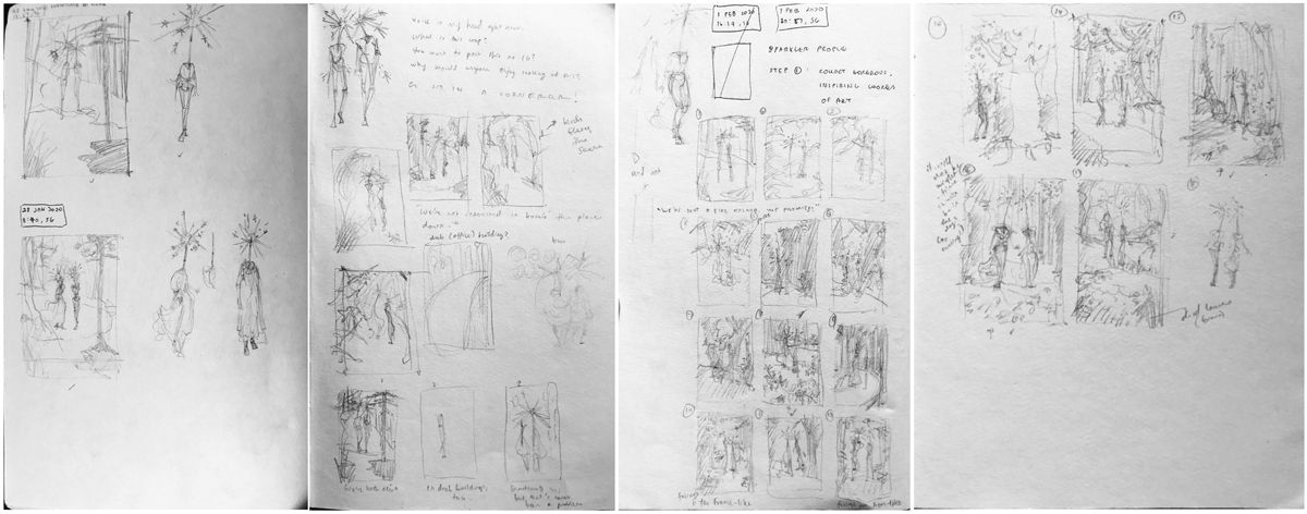
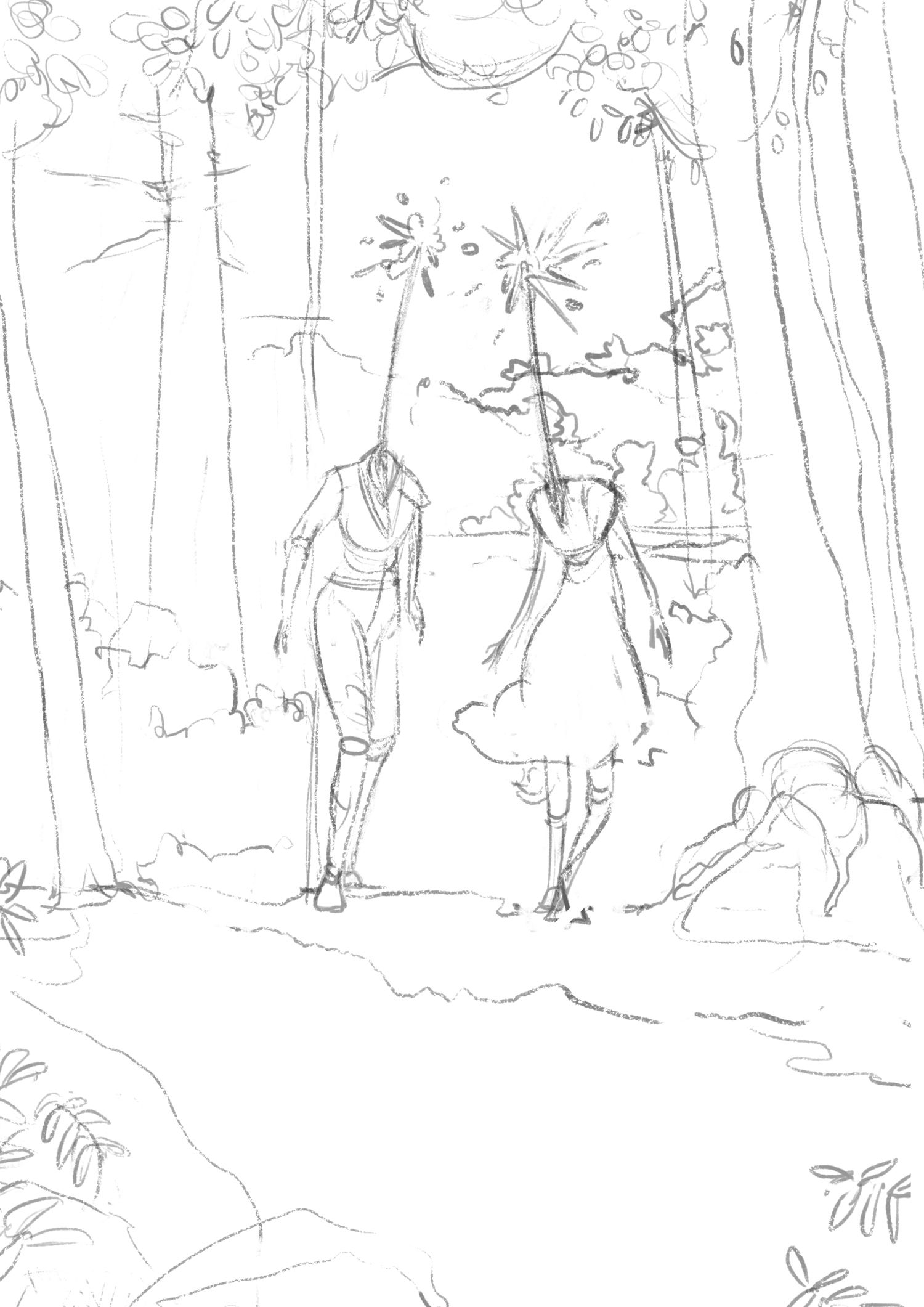
                Sparkler People_sketches_small.jpg

                Sketch:

                Linework_small.jpg

                Value studies:

                Value Studies_small.jpg

                Colour studies:

                Colour Studies_small.jpg

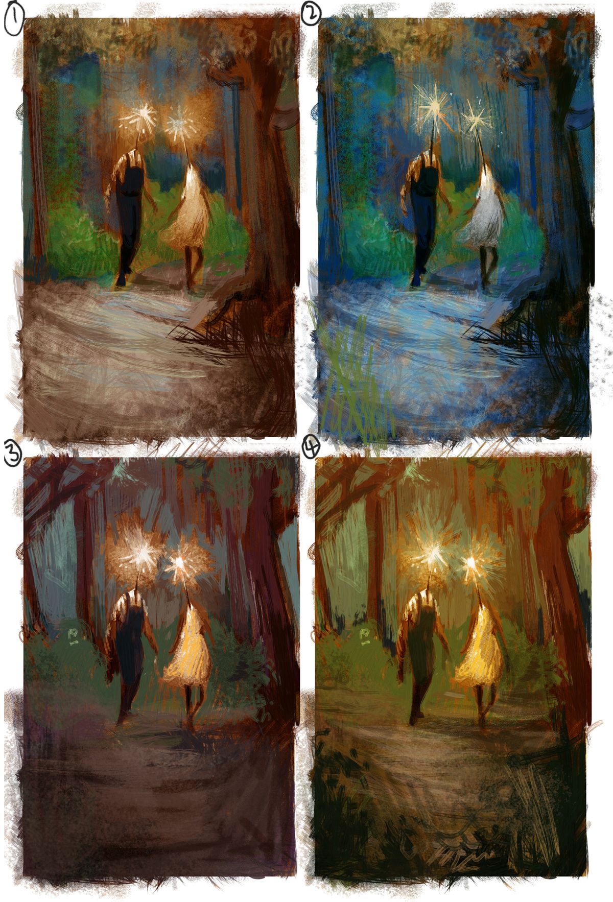
                I would love feedback on this, please! Do any of the colour studies work? At this stage, is there anything I should change in the drawing? 🙂

                https://www.instagram.com/sooryajart/

                The Beatles: "Roll up, roll up for the Mystery Tour!"

                Heather Boyd KaraDaniel 2 Replies Last reply Reply Quote 5
                • Heather Boyd
                  Heather Boyd @animatosoor last edited by Heather Boyd

                  @animatosoor 4 is my favourite, I was deciding through the others (1-2) before seeing number 4 and couldn't confidently decide. But when I saw 4 I thought wow yes! It was warm like number 1 but has a warmer autumn summer mix glow (my words do no justice how I feel about number 4). I also like the darker scribbles in the foreground. It encourages me to see you found a green that works so well in the warmer colour study of number 4. ❤

                  Instagram: www.instagram.com/heatherboyd.illustration/
                  Website: https://heatherboydillustration.ca
                  Shop: https://www.inprnt.com/search/products?q=HeatherBoydIllustration
                  Ko-Fi: https://ko-fi.com/heatherboydillustration

                  Be blessed,

                  1 Reply Last reply Reply Quote 1
                  • TessaW
                    TessaW last edited by

                    Welcome back! I appreciate this thread, as I'm also a chronic dabbler and have a hard time finishing pieces. It's inspirational to see you get so much quality work done.

                    Color is one of those areas that can be pretty dang subjective- and I think you've gotten all 4 to look appealing already! My personal favs are 1 and 2.

                    Website: www.tessawrathall.com

                    Instagram: www.instagram.com/tessawrathall_art/

                    1 Reply Last reply Reply Quote 1
                    • KaraDaniel
                      KaraDaniel @animatosoor last edited by

                      @animatosoor I love this thread you have created! I can really relate! I think all your color studies are great but if I had to choose one I'd say #1.

                      instagram.com/sha_kara
                      karadaniel.net

                      1 Reply Last reply Reply Quote 1
                      • baileyvidler
                        baileyvidler last edited by

                        @animatosoor Just wanted to pop in and say that I really admire your dedication here! It's very inspirational to a fellow dabbler. Keep up the good work!

                        Bailey Vidler
                        Portfolio: baileyvidler.com

                        1 Reply Last reply Reply Quote 1
                        • animatosoor
                          animatosoor last edited by

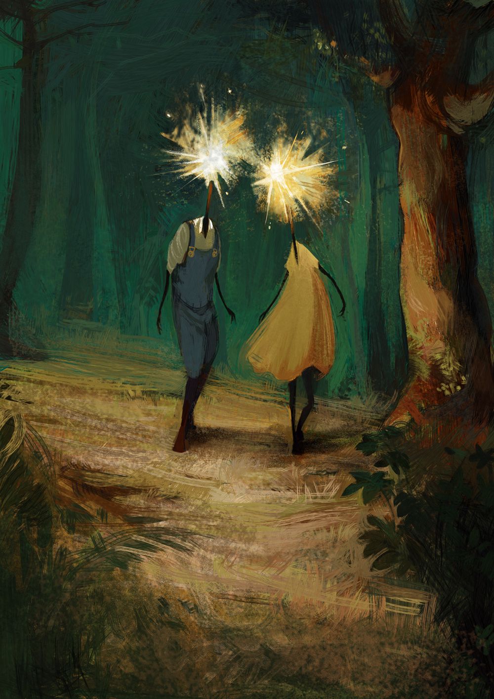
                          @Heather-Boyd Thank you for the lovely feedback! I was also leaning towards #4 and tried to make it work, but quickly realised that the glowing heads against the warm, light coloured background was light against light. D= I had to then choose a darker background so that I could have light against dark.

                          @TessaW Thank you, and I feel you - I still struggle with finishing my work. You can do it! We can support each other. 🙂

                          Thank you, @KaraDaniel - I did end up going with the cooler colours, haha. 🌻

                          @baileymvidler That's really sweet - thank you. All of you are so supportive.
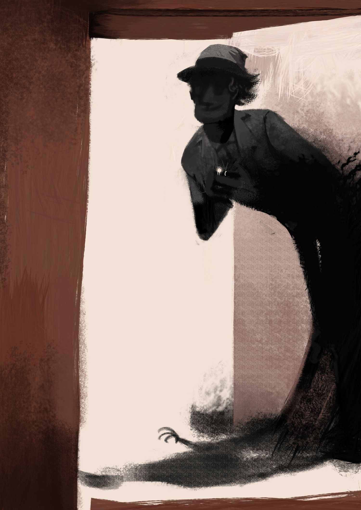
                          Progress shot:

                          Sparkler People_1.jpg

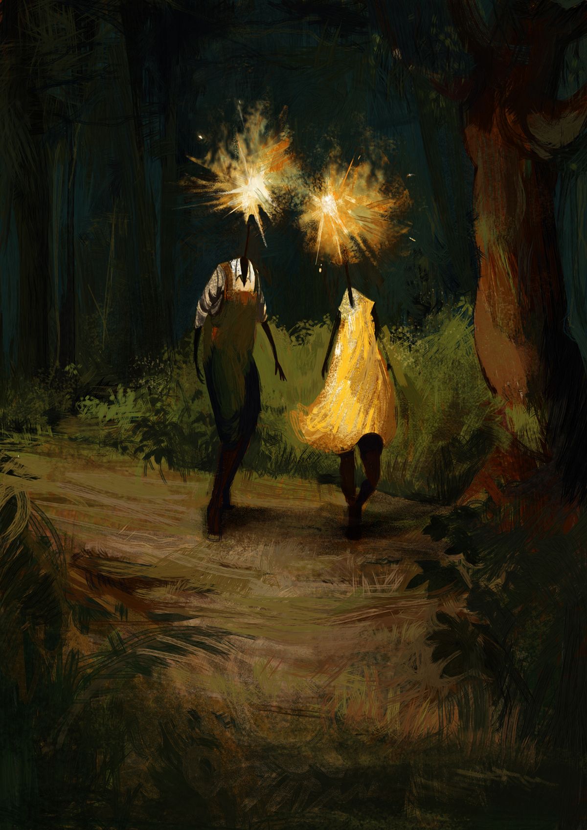
                          I was trying hard not to do yet another night-time scene, and yet here I am, lol. I do want to explore a variety of lighting situations and colour schemes in subsequent paintings. For this one, I am going to go and continue with the detailing. Any feedback would be welcome, as always. ❤

                          https://www.instagram.com/sooryajart/

                          The Beatles: "Roll up, roll up for the Mystery Tour!"

                          1 Reply Last reply Reply Quote 1
                          • animatosoor
                            animatosoor last edited by

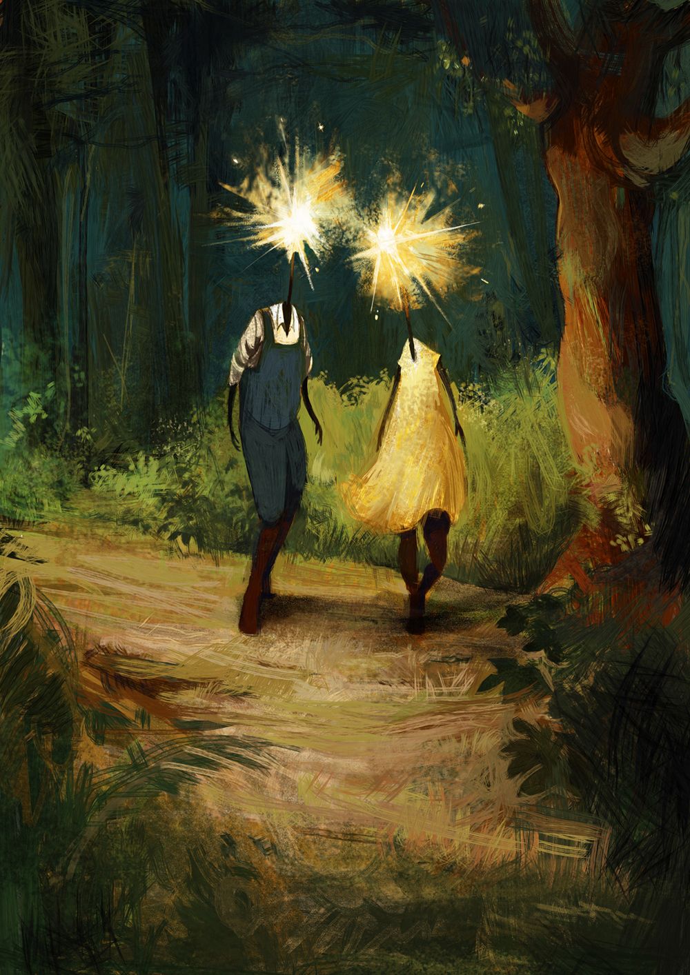
                            Another progress shot:

                            Sometimes I wonder if the rough-looking strokes I've used here make the illustration look unfinished and unrefined?

                            Sparkler People_3_small.jpg

                            https://www.instagram.com/sooryajart/

                            The Beatles: "Roll up, roll up for the Mystery Tour!"

                            1 Reply Last reply Reply Quote 1
                            • animatosoor
                              animatosoor last edited by

                              I went and changed quite a bit because I felt the light value of the bushes in the background and the lady's dress were competing with the focal point - the glowing heads. I removed the bushes entirely because I felt they were making it hard to focus on the characters.

                              [Notes to self] Weak points to work on in subsequent pieces:

                              • Drapery - Struggled to draw and paint it
                              • Evening light - I don't know what colours to use
                              • Rendering style - How much texture do I really want in my work, and what kinds of strokes do I want to see in my work? Revisit dream portfolio.

                              Final:

                              Sparkler People_5_small.jpg

                              https://www.instagram.com/sooryajart/

                              The Beatles: "Roll up, roll up for the Mystery Tour!"

                              1 Reply Last reply Reply Quote 2
                              • First post
                                Last post