Finishing Drills for a Chronic Dabbler.
-
@Susan-Marks Your initial comment helped immensely with that. Thanks once again.

-
It's Monday here!
Final:
Thank you everyone for all of your invaluable input. Moving on to the next project.

-
Week 3!
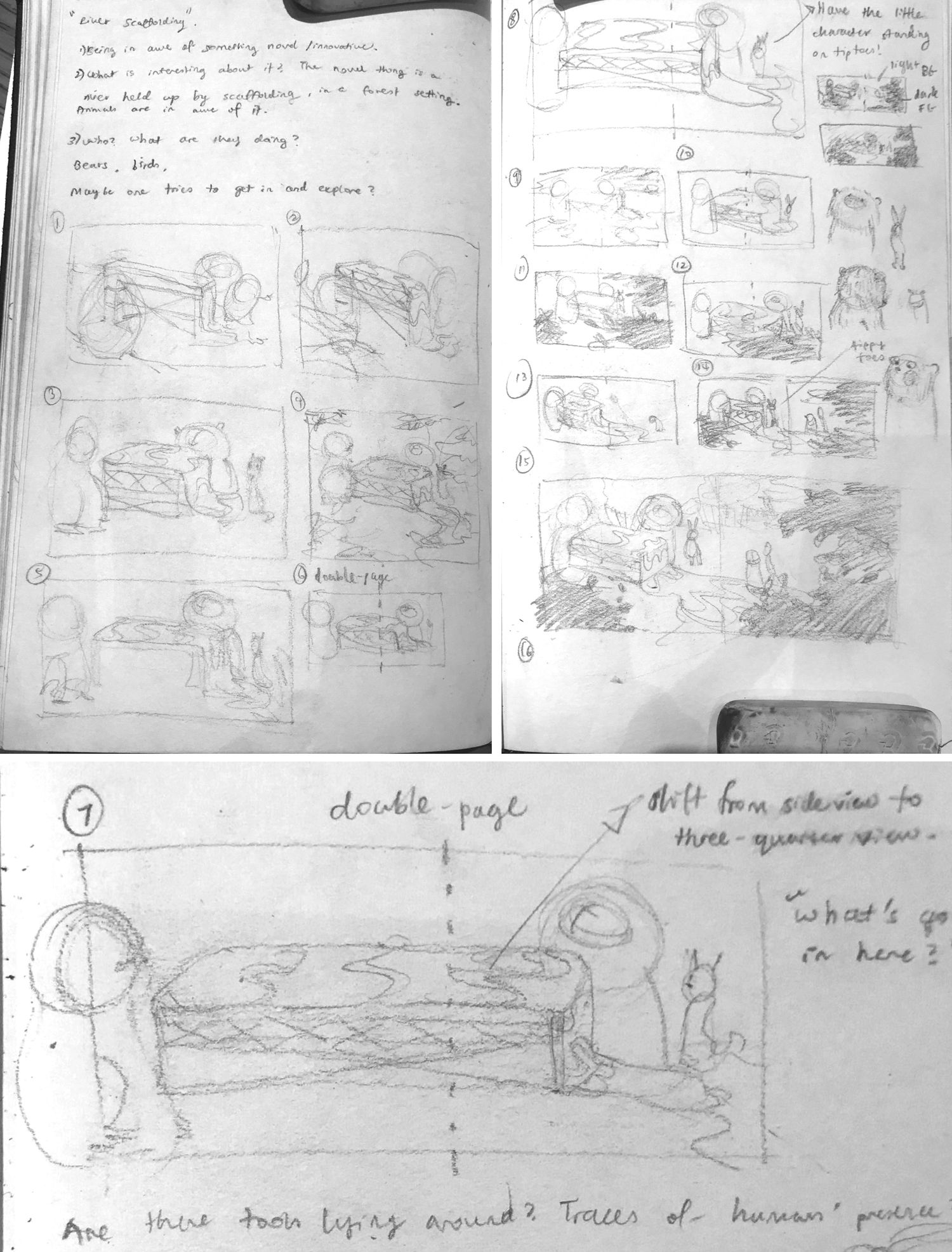
Thumbnails and a set of slightly more comprehensible idea sketches for a new illustration I'm working on. This would be my first attempt at a double-page spread for my portfolio, and also my first serious attempt at including animal characters in any composition. :S I'm quite nervous, lol.
-
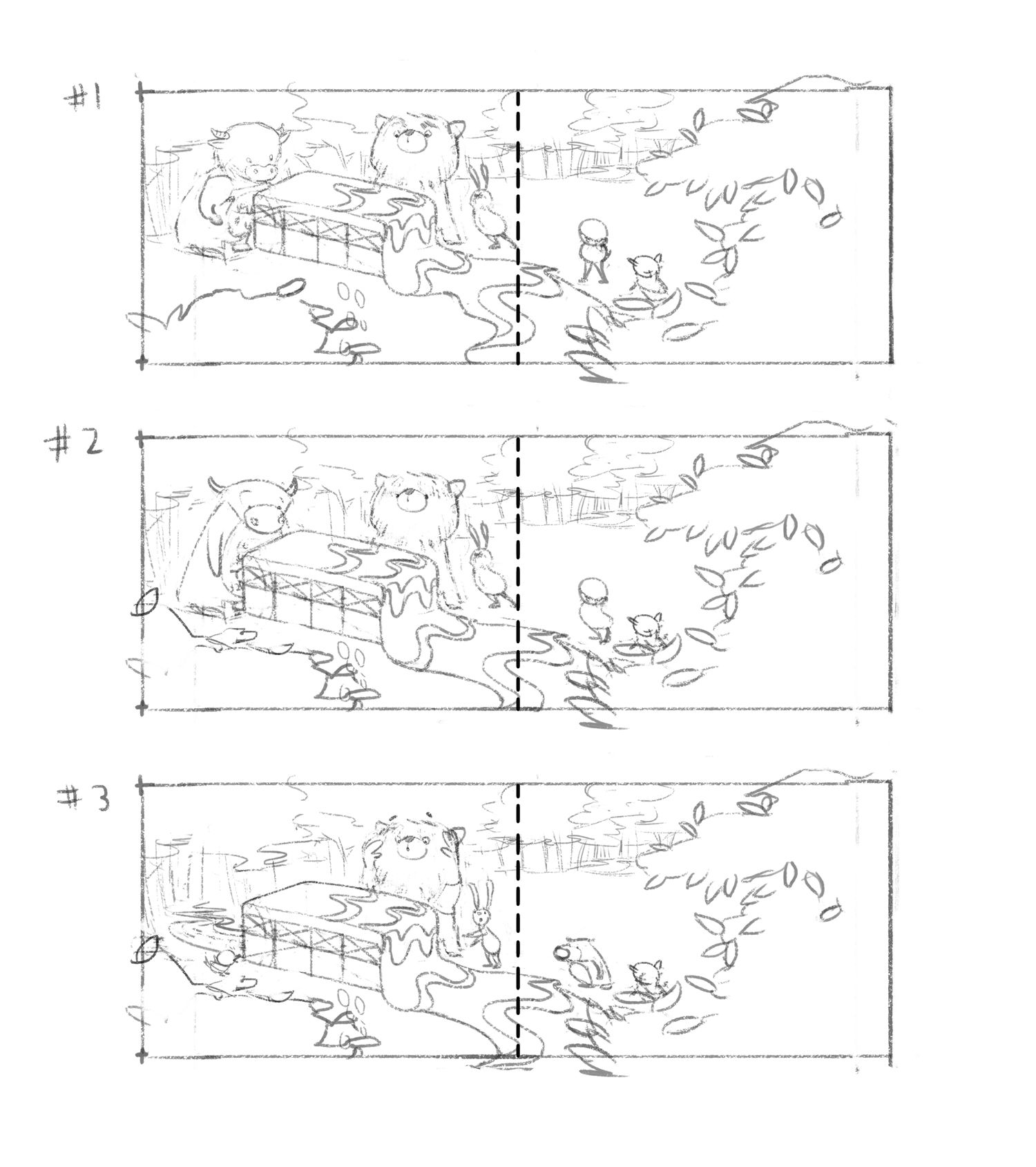
@animatosoor I like the third option. The expressions of the characters are clear and the character themselves look just funny

Maybe you can try the foreground bush on the first page to overlap the box ? (i am not exactly sure what it is) . The perspective feels kinda flat to me - so this might help it.
But I like that you added the mark behind it instead of the cow. That on the other hand is deepening the perspective well
Anyways it looks fun! Good luck

-
@Jonas-Zavacky Hi, and thank you so much for your feedback!
I realise what’s on the foreground on the first page looks like a bush, but it’s meant to be the leaves of a tree and we have a bit of a bird’s eye view with this one, so you’re right, it should overlap the box a little bit.
As for the box itself: your comment made me smile, lol, because I think the concept hardly makes sense to begin with and it’s perfectly understandable that you don’t know what it is. Let me have another go at the box and see if I can make that bit make a bit more sense. XD I might also eventually add a page before this to give this weird structure some context, haha.
Thanks again.

-
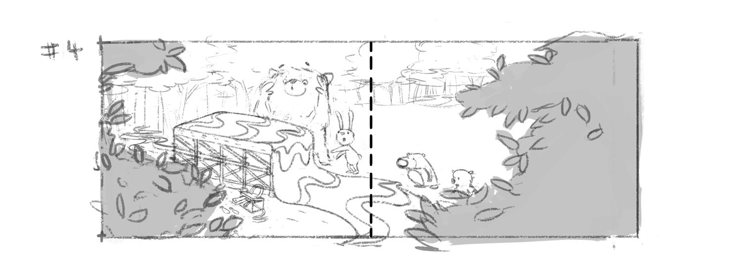
I've worked on it a bit more, and now I have this. I have experimented with adding a couple more details in an attempt to provide some context, but I'm thinking this still may not be making sense to viewers. I would like to hear how you guys interpret this!
-
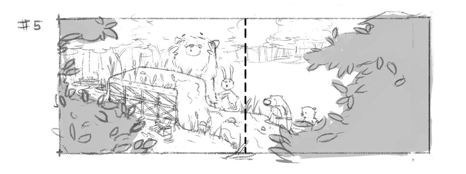
Fifth iteration - with several changes, in an attempt to make the idea clearer:
-
@animatosoor I like more characters in number one but I agree with @Jonas-Zavacky about the expressions. If you could add more expression to #1 that would be good. I also like the spacing in #1 vs #2 but haha now I see you have committed to the last one
 anyways -still really cute.
 -
@animatosoor I like how this is coming along. In earlier versions I wondered if the box was something that was melting-which I was curious about. Now it looks like the ground has grown over it? how, why?
Are you leaving for text? If not-the right hand side looks vacant compared to the left.
It's fun to see how you're developing this.
-
@Heather-Boyd Yeah, I removed the cow after versions #1 and #2 after a while, as I began to worry if there was just too much going on. If I could still find a way to add it in and make it work, I'll do so.
Thanks, Heather.

-
@Susan-Marks Thank you! I can see now why the box previously would have looked like it was melting, but yes, your latest guess about the ground comes close. It's a river that's nonsensically being held up, but apparently the way I've drawn the water, it still doesn't read that way yet, haha.
Yes, I'm leaving room for text, and I plan for it to be on the second page.
-
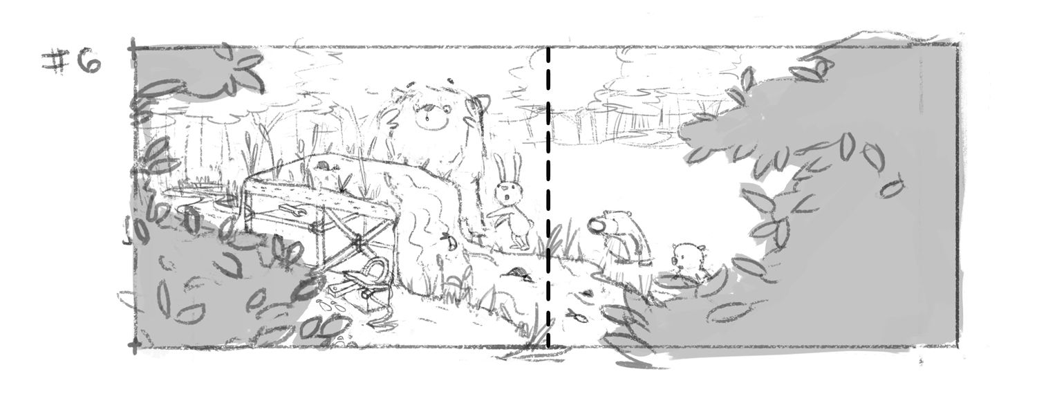
Sixth version:
-
@animatosoor I like the last version, I did understand the river from the first time. I ask myself where do you write the text? On the right bush,than I would make the right bush in the middle more wide and on the top of the page I would end it like the left bush, right on the edge of the page. or is the text in the river? Than I wold make the right bush more narrow and more to the right side. Will there be an animal watching from behind the left bush???
-
@MichaelaH It's good you could tell it was a river from the start. I think the confusion was understandable considering how I'd previously drawn it, and also because it was without all of these extra visual cues (the little pebbles, the fish, etc.)
Thanks for the note on the text - my idea was to have it near the top on the second page. Since the text will be made up (by me), maybe it would be beneficial to put it in at this stage and experiment while I'm refining the composition and all the various elements.
I don't plan on having an extra animal character behind the tree on the left, but I'm thinking there could be some more traces of human presence in that area.
I like this last version best, too, and I'm excited to try some tonal studies!
-
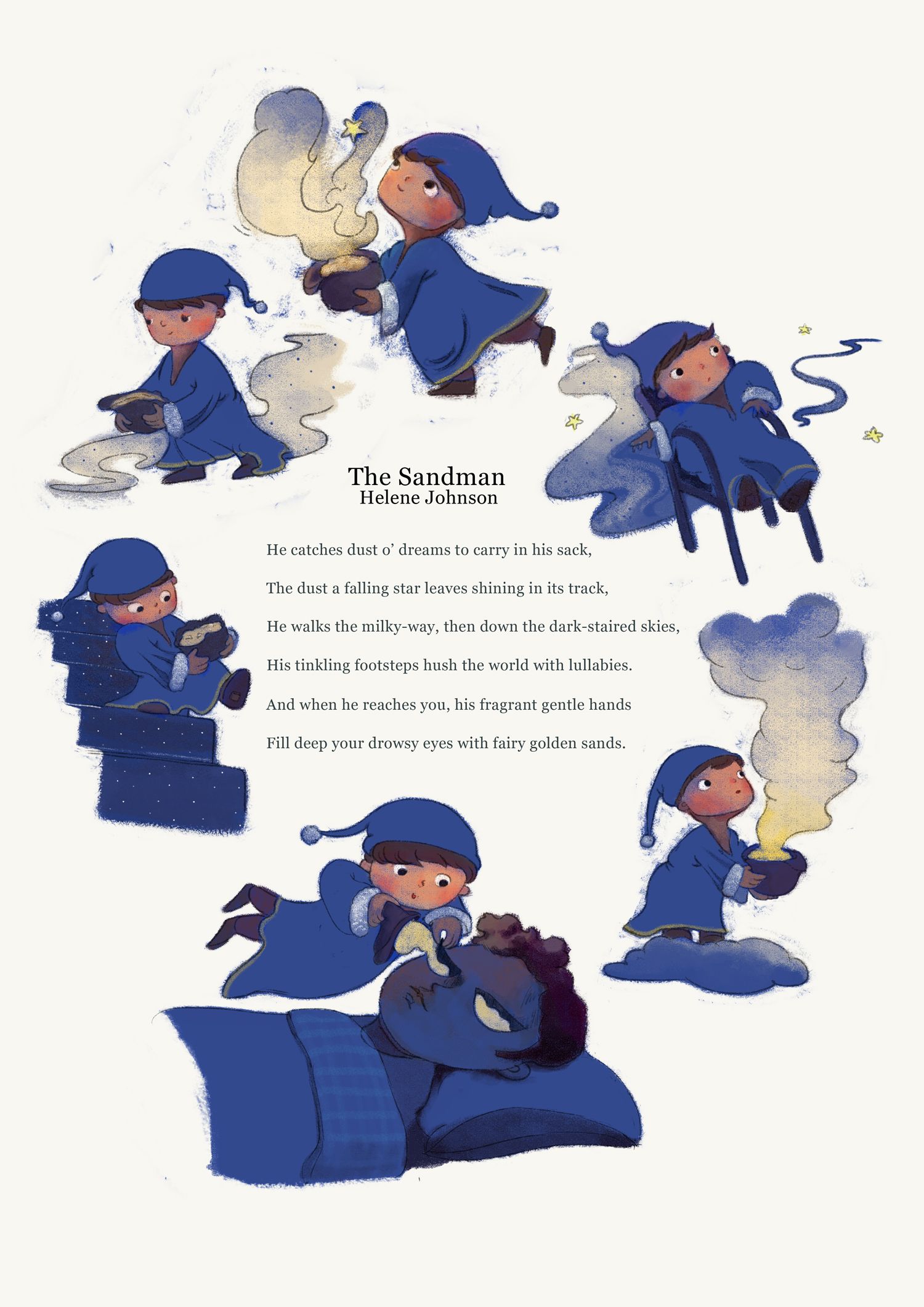
While the double-page forest illustration is in its planning stages, I've simultaneously been developing another illustration. This one will be a part of the poetry/prose collection.
"Night Voices" is beautiful and eerie - I had to illustrate it.:
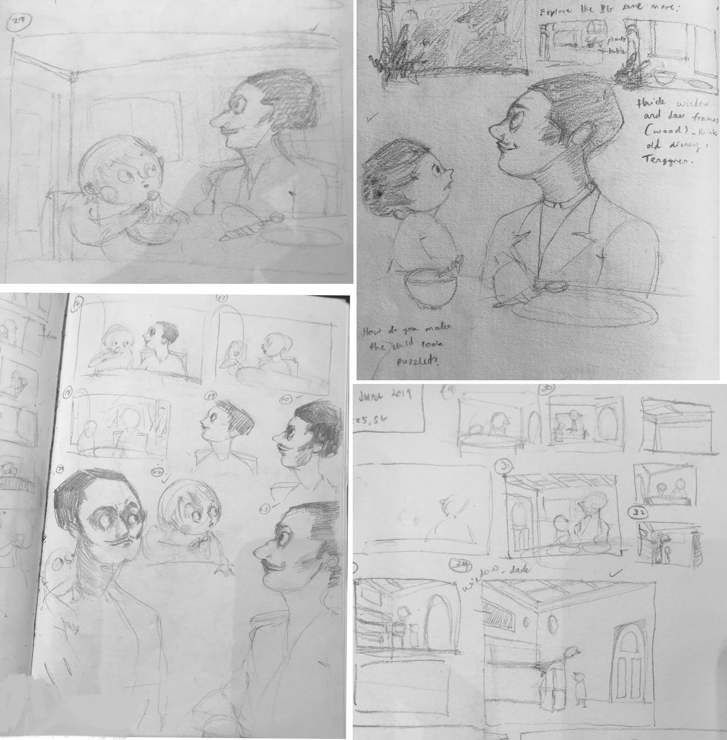
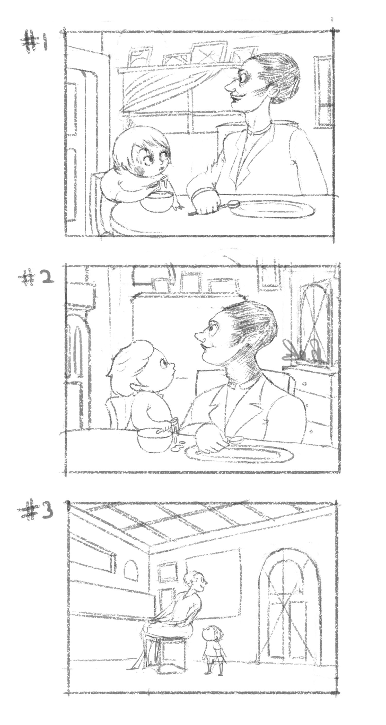
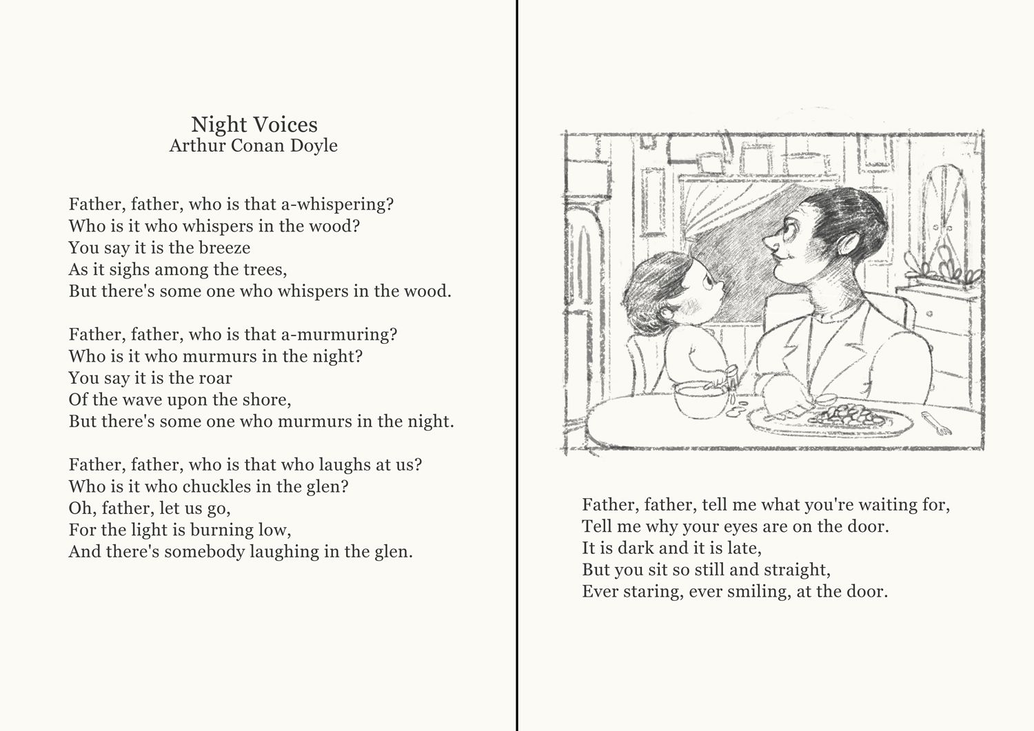
Please feel free to tell me what could be improved on, as always!
-
@animatosoor Once you put the words with this, the illustration really came alive. I think you captured the mystery and eerie quality of the poem as well as the child's persistent questioning.
-
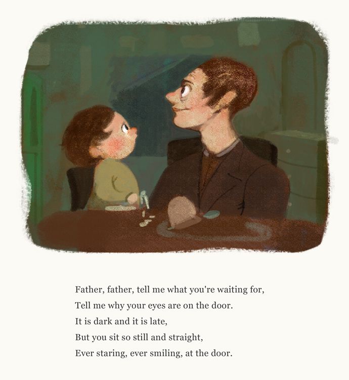
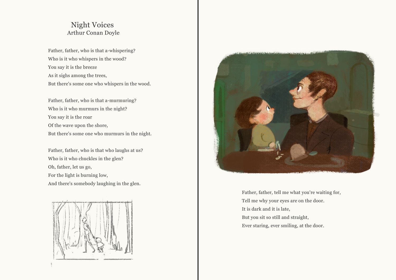
I've started painting this vignette for "Night Voices." I'm a bit unsure if this whole thing should just be in black & white or monochrome given the subject matter, but I thought I should decide only after at least trying colour. Knowing myself, I'd happily just leave it as a drawing, and it would be a very sneaky cop-out of the colouring process. XD
-
@animatosoor oh I love this. It is super engaging. I think the colors are lovely and are playing well with the subject matter.
wants me to illustrate some text as well hehe.
-
@Jonas-Zavacky Oh, do it, haha! I toyed with the idea for so long, and now I'm doing a #100illustratedtexts challenge that I've set for myself just so I can take some of the fear and mystery out of the process. It's going to be a long road, but that's okay by me.
Thank you for your note on the colours. I will post more updates as I go along.
-
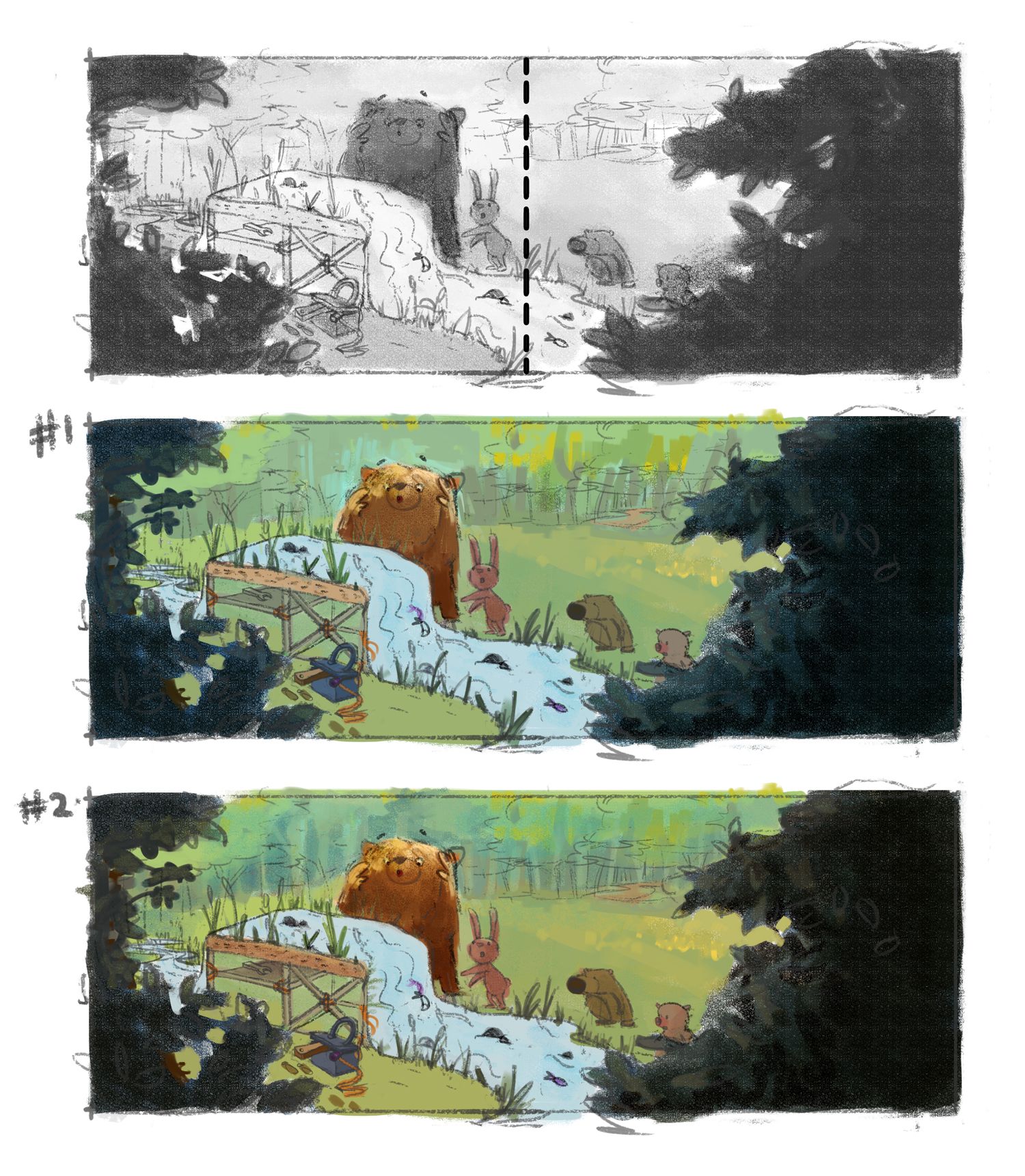
Progressing with value and colour studies for the double-page spread:
There are very subtle differences between #1 and #2, I realise. I definitely want it to be daytime, but don't really know what other colour palettes to explore to convey the mood I want apart from these two. I'm going to be pushing further to see what other colours I could use before I decide on one.
(Brutally honest) critique always welcome!

