Dues to the Landlord - Painting Critique requested (WIP)
-
Hey guuuuuys!
I have just been thinking that I never really request critique on my pieces and as a result I feel I never push as far or spend as much time as I could on an actually solid portfolio piece.
So I'd just like to put something I;m working on at the moment that I feel quite good about on here, and see if maybe I am missing out on a chance to make this much better!
So this is the piece:
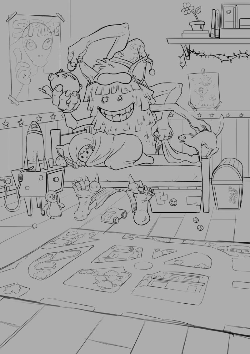
The concept is the monster under the kid's bed paying his rent for the week. I didn't spend much time on thumbnailing, I just sketched the concept out a couple times without real comparison until it felt alright.
Honest critique would be super appreciated!
Thank youu! -
I like the concept and drawing approach. The arms creep me out and look a bit impossible, but it is a monster so I may be supposed to find him creepy. The only thing I would point out is the page is split right in half around the bottom of the bed/monster and besides the compositional challenge of that I'm not sure the play rug taking up half the page makes sense. It isn't really the star. I might crop it so more like a third of the page is the rug trailing away and two thirds is all the activity around the monster.
-
I like the story, so go for it, really cute monster. The second bedpost is missing on the right. The perspective is not right in all places. The box under bed needs lid to be seen. I love the carpet idea, maybe put some cars or building bricks(blocks) on it. Hope I could help little bit
-
Thank you guys so much, Imma work on this tonight and over the weekend! You're absolutely right about the perspective, I hadn't even considered drawing over it for once. XD and i even have a tool for perspective drawing so i don't know why I don't use it!
Experimenting with the cropping. Part of me wants to leave lots of floor space to breathe and litter it with lots of toys and details later, but it's also correct that it shouldn't really be the focus... -
I agree with @ThisKateCreates & @MichaelaH in their observations. This is a neat concept and looking forward to seeing it fleshed out. The one thing that jumps out at me is the arm making the deposit doesn't attach in the same area as it's counterpart on the other side with no real reason why (hunched back or growth etc.) So it feels as though they should attach in the same way. Shift the "shoulder" to match and maybe foreshorten that arm to make it work since it has to reach over his body to reach the bank being held in front of him. Also, maybe make it match the hand on that side unless he is supposed to have three left hands. Hope that helps.
-
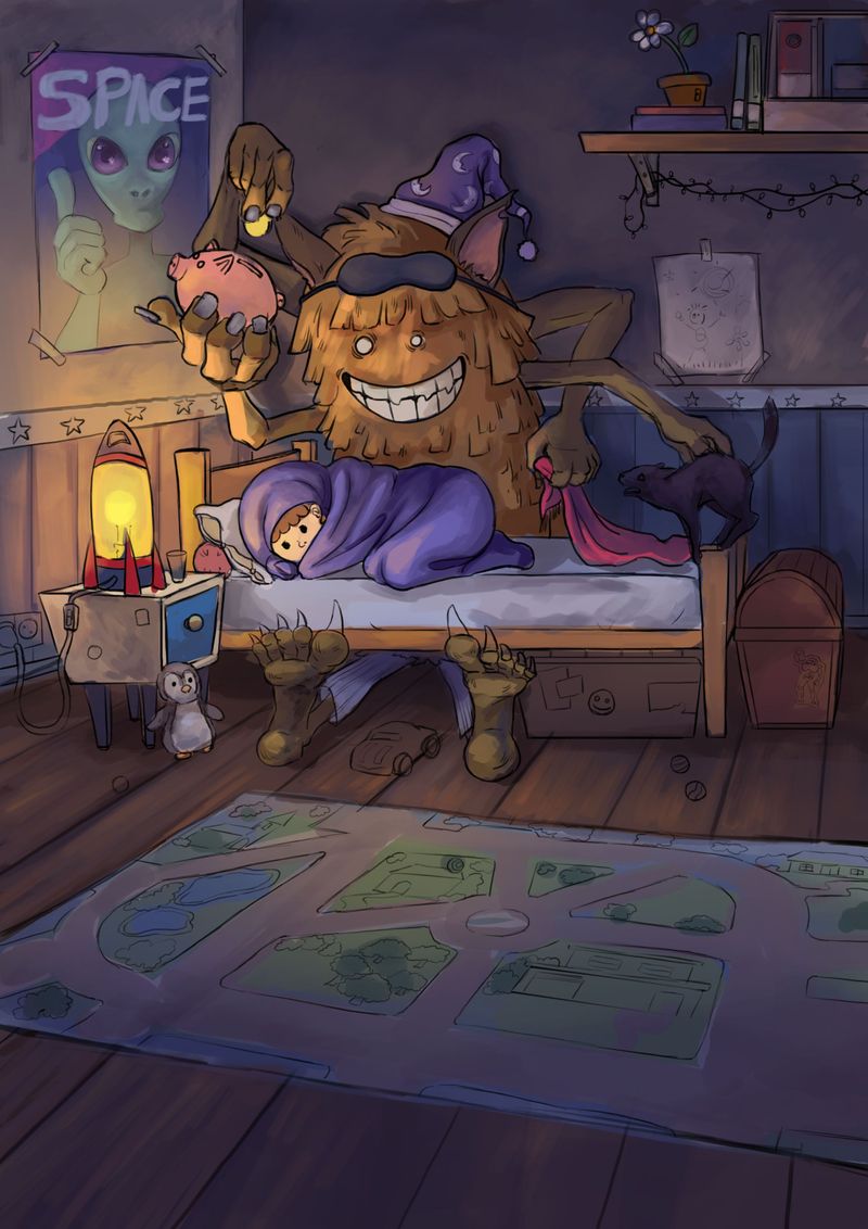
Thank you guys! Here's an update with rough colours. I tried a new position for the arm so it would come forward more.
My main worry now is that the values might not read clearly enough...there'll be some stronger highlights to use around the lamp still, but the arms are rather close in value to the wall. How would you try to push values in a night time setting? or is a degree of indistinction maybe even useful to low-light, if I push the darkness more?
I'll leave cropping to the end to retain some options until then.

-
@Nathalie-Kranich The change feels much better! Night scenes are challenging but I've heard Will and others say that the values don't have to be very dark even for a night scene. One thing that might help is to lighten the wall behind your character because there would be some light that gets there from the lamp as the character isn't completely blocking it. That might also help the silhouette pop.
-
Heya! After some rendering, the values didn't bother me so much anymore and I'm really pleased with the final painting. I kept the lower half in. I don't know why, really, it just feels right to me. Below the final image!
Thanks for all your help!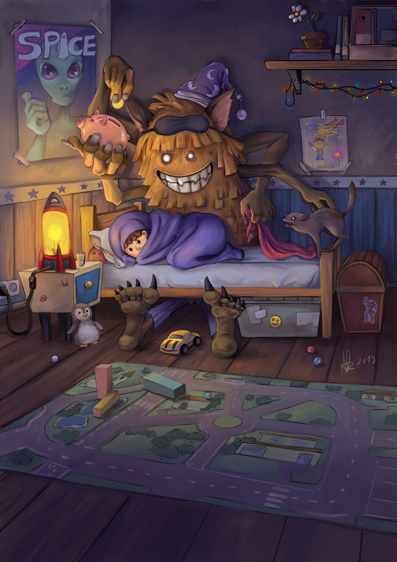
-
It is really great, like the colors and the texture

-
This is a super fun idea! Love the details, especially the penguin just waiting to surprise us as we look around the room. The monster kinda reminds me of a "Pokemon evolved" version of the McDonald's fry kids. I've never thought of monsters under the bed as "landlords" haha what a great concept!